In the world of podcasting, in which thousands of new shows pop up every day, it is important to stand out. Podcast logos are the keys to this goal. It is a visual expression of the identity of the show, creating a tone of what the listener should expect. Just as a book cover invites a reader to open the book, a good logo can invite a potential listener to click play. The article explains the significance of podcast logos, why they need, and some practical tools and tips to help you come up with a logo that fits your show’s essence.
Part 1: Understanding the Importance of Podcast Logos
Podcast logos are very vital parts of your branding identity. A lasting impression occurs when your audience gives your podcast the correct eye appeal. This section explains why podcast logos matter, as well as the most important design elements that make a logo memorable, clear, and effective.
1. Why Podcast Logos Matter
The Face of Your Podcast
Your podcast logos are probably the first thing an interested listener will encounter about your podcast. It can be a visual way to give someone a glimpse into the theme of your podcast as well as your vibe. The more interesting it is, the more likely the listener will go deeper. It is very different on Spotify and Apple Podcasts, where a thousand logos try to stand out.
Branding and Marketing
A logo is not just a picture; it’s a tool for branding to help communicate the message and values of your podcast. Consistency and recognizability will do well to create that much-needed feeling of trust and familiarity in the audience. Your podcast’s logo being shown as a feature within search results, marketing materials, or merchandise further enhances your brand and helps in identifying it to others.
Listener Recall
A great podcast really does depend a lot on repeated exposure. A clean logo will also help those who heard your program and enjoyed it once remember and find it easily again. More importantly, your podcast becomes easily shareable. Most people can’t keep silent about something they can see.
2. Key Elements of a Great Podcast Logo
Simplicity and Clarity
The best podcast logos are simple and impactful, meaning keeping away the clutter while maintaining a single idea of what that podcast theme conveys. They ensure that the logos become legible and attractive irrespective of their usage size or where they are applied, either as an app icon or a banner on social media.
Color Psychology and Font Selection
Colors make people feel different and evoke mood. For instance:
- Bright colors like red and yellow are energy and excitement and will best fit comedy or lifestyle podcasts.
- Dull tones like blues and grays make it look more professional and are ideal for business or educational content.
Lastly, fonts play a significant role. A bold sans-serif font will give a modern feeling, confidence, and edges, while a delicate script font will have a feel of elegance and creativity. The secret is in the thematical alignment to your podcast.
Scalability and Versatility
A great logo is flexible. It needs to look as solid on a podcast directory thumbnail as it does on a large banner or merchandise. This means you’re branding will be consistent and striking no matter where it ends up.
Part 2: 10 Inspirational Podcast Logo Examples for Any Niche
The right podcast logos reflect your niche and attract the right audience. In this section, we’ll explore 10 inspiring logo examples across various genres, from business to comedy to true crime. You’ll see how different design elements come together to convey a podcast’s unique personality and tone.
1. Logos for Business Podcasts
The Boardroom Brief
A clean logo with a simple design. The icon is a black briefcase with slight gold, showing professionalism and success. Font is modern sans-serif bold for confidence, while the tagline below reads “Where ideas meet execution” in a softer gray to balance out.
Startup Stories
A motion logo with geometric forms that form a rocket blast off, showing growth and innovation. Gradient colors of blue and green would connote trustworthiness and creativity. The clean, rounded font depicts approachability toward budding entrepreneurs.

2. Comedy Podcasts Logos
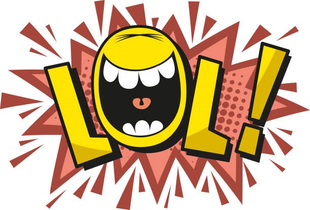
Laugh Out Loud
An interactive logo: it would depict a cartoon microphone, complete with an exaggerated open smile and comically oversized headphones. Color would burst forth in bright yellow and orange, energetic and funny. The wording in the playful, bold font may be slightly distorted to give the whole thing that little extra quirk.
Giggle Hour
This design features a neon sign aesthetic, with glowing pink and blue colors. The words “Giggle Hour” are written in a looping, handwritten-style font, giving a casual, late-night comedy vibe. A subtle laughing face emoji is incorporated as part of the “O” in “Hour.”
3. Logos for Tech Podcasts
Tech Talk
An icon in the form of a podcast microphone, where technology and communication merged together. Clean design with a futuristic atmosphere is matched with sleek dark navy and electric teal, giving off a very modern and refined feel.
Byte-Sized Insights
This logo is pixelated to indicate a computer mouse clicking on the lightbulb, representing the bright and new tech ideas that are bright in the world of technology. A digital-style metallic gradient is the font of this text. Some dotted pattern was added to provide texture while bringing out the technological theme.
4. Lifestyle Podcast Logos
Simply chic
The logo for this podcast is classy and minimalist. It features a soft pink background and within that is a clean line illustration of a coffee cup and a plant leaf. The use of a font style in a beautiful serif form has given it a very polished, high-end feel, which suits the topics on lifestyle such as fashion, wellness, or home design.
The Everyday Escape
It is made to make the audience feel relaxed, with a hammock between two palm trees. The pastel sunset gradient gives the logo an extremely relaxed appeal. The fonts are casual, hand-drawn, and casual, giving out the same feeling as the podcast.

5. Education Podcast Logos
Learn in Minutes
The hourglass will feature icons of books, a globe, and a lightbulb pouring out instead of sand. This will be enhanced by the sans-serif bold font, reinforcing clarity and efficiency, and by the colors blue, green, and orange, which will bring vibrancy and optimism.

History Unveiled
This design is made as an old scroll with soft, detailed textures that can be likened to old parchment. The text is in a serif font with such a classic dark brown and gold color scheme that feels timeless and classic. A small magnifying glass icon on the side conveys discovery and exploration.

6. Logos for True Crime Podcasts
Crimson Chronicles
It is dark black with a background and contains a single red fingerprint at its center. The filled fingerprint is made up of tiny cracks to create suspense. Compared to that, bold white sans-serif written text is presented; one letter on the word will have a dripping blood effect added to add extreme suspense.
Motive and Mayhem
A dark, moody logo with a magnifying glass floating over an outline of faint crime scene tape. The text is in distressed font style with shades of gray and red, and even subtle shadowing adds to the ominous aesthetic.
7. Health & Fitness Podcasts Logos
Health and fitness logos should have the energy, strength, and motivational feel. The majority of the logos are presented with icons, for example, with dumbbells, kettlebells, or running shoes, and the listener already knows what he is going to listen to in the podcast. The bright colors used, such as red, green, or orange, give it a lively design, while the blue or teal can make a person feel more balanced and fit.
8. Food & Cooking Podcast Logos
The logo of a food and cooking podcast would have to make the listener happy about food, and warm colors such as those reds and oranges and yellows can cause interest and maybe even a temptation of flavor. Food-related icons such as chef’s hat or knife or a spoon immediately communicate your theme of the cooking, as well as with playful fonts giving it an invitational feel to it.
9. Logos for Music Podcasts
Music podcast logos should be like a genre or style of music being discussed, whether it’s pop, classical, or indie. A very sharp image or concept of musical notes, vinyl records, or headphones can easily be exhibited for the musical theme. Modern color that will blow out loud in styles includes black, silver, and gold with a nostalgic feeling towards something vintage, like cassette tapes.

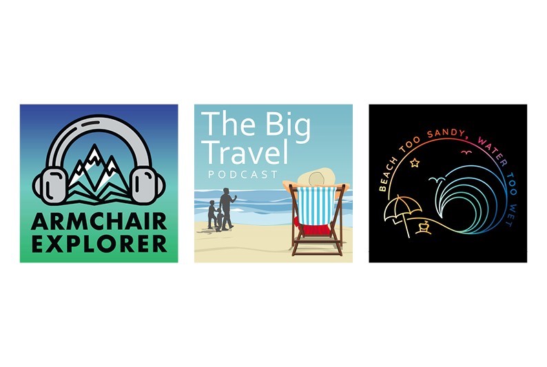
10. Travel Podcast Logos
The podcast logos must evoke adventure, discovery, and the desire to roam. Plane, globe, or suitcase symbols are used to indicate travel. Bright colors like blue, yellow, or orange capture the energy of exploration, whereas more sophisticated designs with a globe or compass might appeal to the luxury travel crowd.
Part 3: Tools and Tips to Create a Stunning Podcast Logo
Creating a podcast logo doesn’t need advanced design skills. Using the appropriate tools, with easy strategies, one can create an ideal logo, capturing the podcast’s realness and getting it closer to their listeners’ ears. Here are some useful tools and essential design tips.
1. Top Free and Paid Logo Design Tools
Canva
Canva is a design platform that includes templates, graphics, and bulk fonts. The logo of the podcast can be customized within no time even for those who do not know anything about designing. It has got drag-and-drop interface and is very inexpensive while providing professional outcome, hence it is the best for the creators.
BrandCrowd
BrandCrowd is an AI-generated logo maker that will help you make customized designs in minutes. It provides a library of icons and templates for niches, and by inputting your preferences, BrandCrowd will generate a list of logos from which you can easily tweak to fit your vision.
Adobe Illustrator
Adobe Illustrator is one of the best design tools for high-quality, scalable vector logos. It is recommended for professional users who want control over every minute detail of the design. Illustrator has advanced typography, color tools, and customization options that never end, which makes it suitable for creating a unique and detailed logo.
2. Tips for Designing a Podcast Logo That Stands Out
Understand Your Audience and Niche
Think about who your target audience is and what they would expect from your podcast’s visual aspect. Consider what kind of emotions or ideas you might want your logo to elicit. For example, a high-tech information podcast may consist of sleek futuristic-like designs, whereas a comedy podcast might consist of bright colors or even funny fonts.
Incorporate Your Podcast Theme
Your logo should reflect the theme of your podcast. Use symbols or icons that create a connection to your topic. Consider colors and fonts too. If this is all serious and official, one will require more neutral tones with clean fonts. If this has to do with art, music, fun, or creativity, one can use bright colors and quirky fonts.
Test and Refine Your Design
Design a few different versions of your logo with slight changes in layout, colors, or fonts. Share these designs with friends, family, or your audience for feedback. Consider A/B testing different logos on social media to see which one gets the best response.
Focus on Scalability
Your logo should be readable at any size-from an app icon that’s small in size to a large banner. Test your logo at different resolutions to ensure it is clear and readable everywhere.
Use Mockups for Real-World Preview
Before finalizing your design, mock up how your logo would look in real-life settings, like on podcast directories or promotional materials. This is when you would notice any changes that need to be made before publishing.
Part 4: How Arvin AI Can Help You Create Stunning Podcast Logos
A logo for a podcast can be a daunting task if you don’t have a design background. But with the tools that Arvin AI provides, it becomes more accessible, with powerful features to create professional-looking logos fast and easily. Whether starting from scratch or perfecting an idea, the features of Arvin AI bring a vision to life.
Key Features
- AI Design Support: Arvin AI uses the most advanced algorithms to produce ideas for the logo of your podcast. Just provide all your details to the AI, and it would come up with customized designs for you to save time and efforts.
- Customizable template: You can opt from hundreds of professionally designed templates. Every template is fully adjustable so that you could adjust all its colors, fonts, and icons according to the personality of your podcast and its branding.
- User-friendly interface: This makes creating logos intuitive and accessible even to beginners. Drag-and-drop simple tools, plus clear navigation, allow Arvin AI to bypass the learning curve commonly associated with most graphic design software.
- Font Suggestions: Doubt which colors or fonts to use? Arvin AI analyzes your niche and comes up with color and font combinations based on your podcast’s theme and audience expectations to ensure that everything looks cohesive and appealing.
- High Quality Export Options: It offers you high-resolution files of logos, whichever platform you have decided. That means, regardless of the app icon for your small project or social media banner, your exported logos will always come out with sharp professionality.
- Real-time Feedback: Instant design feedback with an in-built Arvin AI tool for judging the designs, picking up areas needing improvement in regard to readability, color contrast and so much more, while doing so in real time.
Steps to Design a Podcast Logo Using Arvin AI
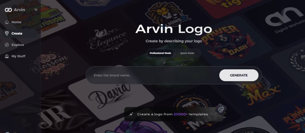
Step 1: Go to the Arvin AI Website
Open your browser and go to Arvin Logo Maker to get started on creating your unique podcast logo.
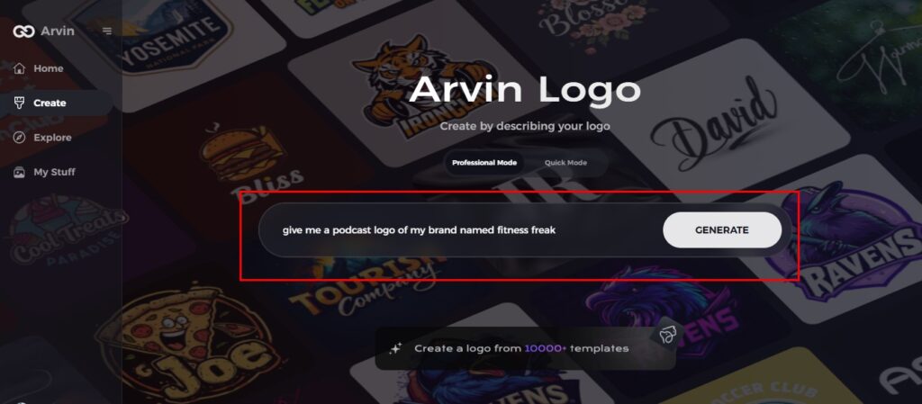
Step 2: Input Your Podcast Information
Enter your podcast name and select the genre or niche. This is where the AI will create some logo concepts based on your podcast’s identity and purpose.
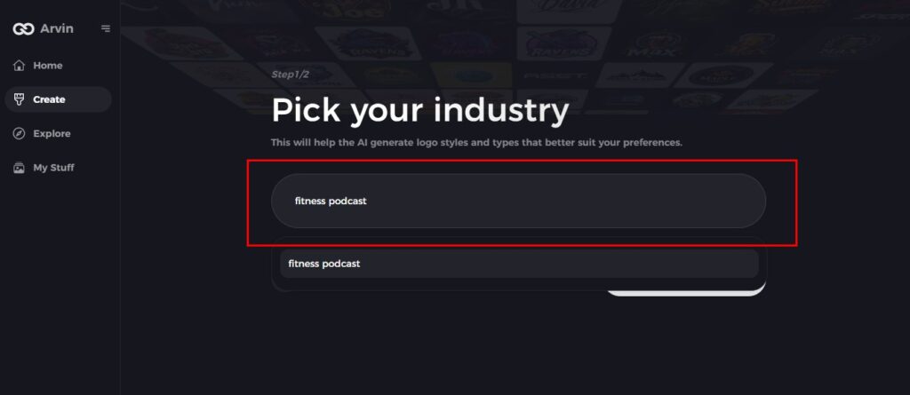
Step 3: Choose Your Podcast Category
Select the category that best describes your podcast’s theme. This will ensure that the AI designs a logo that fits your niche, whether it is comedy, true crime, tech, or something else.
Step 4: Select a Design Style
Select a design style that suits the tone of your podcast. If you are willing to be surprised, choose “no style” and let the AI surprise you with a variety of options. This style will dictate the visual approach for your logo.
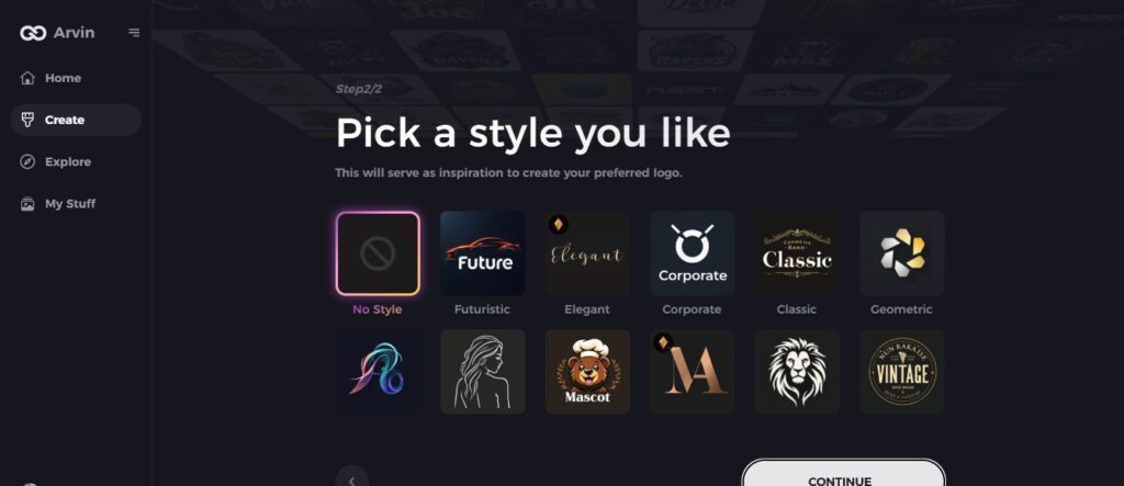
Step 5: Browse Logo Concepts
Arvin AI will provide you with a few logo ideas based on the information you give. Scroll through them to pick one that feels like the right fit for your podcast’s personality and character.
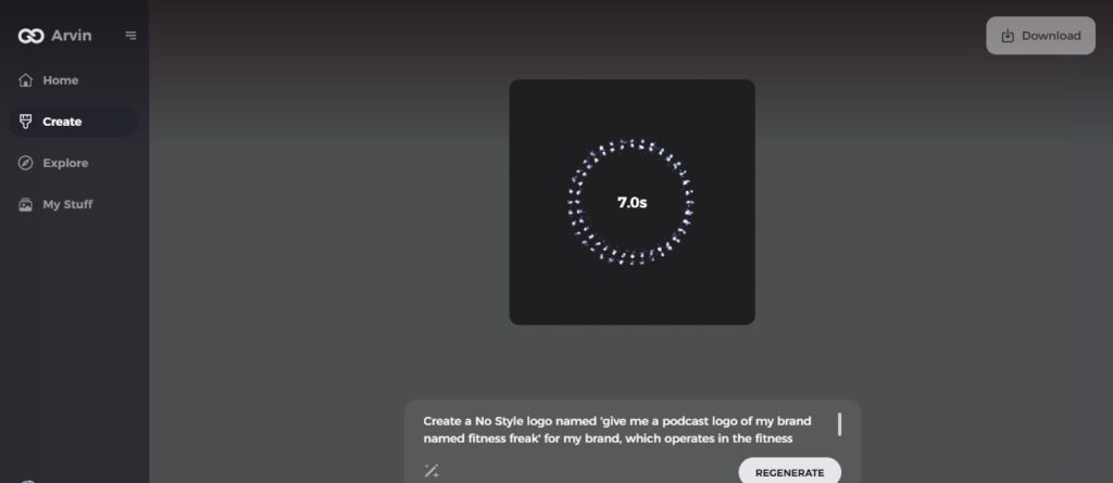
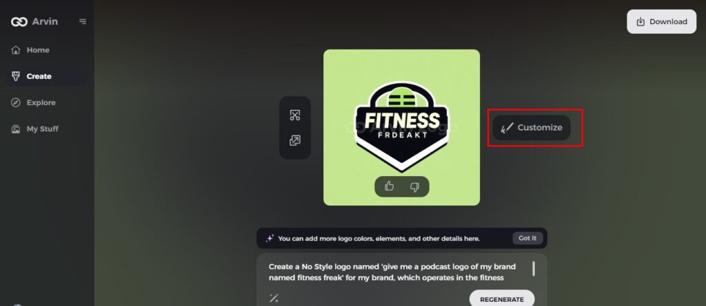
Step 6: Refine the Logo
You’ll select a logo concept that you feel is great, and you’ll refine it by adjusting the colors, fonts, and icons. This is where you can fine-tune the design so that it meets your podcast’s brand and style.
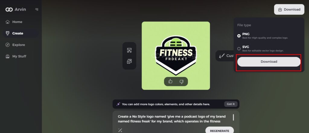
Step 7: Download Your Final Logo
After finalizing your design, download your logo in formats such as PNG or SVG. These versatile formats are perfect for use across various platforms, from podcast covers to social media and promotional materials, ensuring a consistent and professional look.
Part 5: Mistakes to Avoid When Designing a Podcast Logo
The design of podcast logos are an essential part of the brand building process. However, easy mistakes will easily creep in to affect the final outcome. These common mistakes should be avoided for your logo to represent your podcast and connect well with your target audience.
Overloading the Design with Text or Elements
A cluttered logo is confusing and hard to read. Too much detail, such as overtext, over-icons, or graphics, creates confusion and has a lesser impact on the design. Keep it simple by using one or two core elements that express your podcast’s identity.
Choosing Colors or Fonts
Wrong colors or fonts might give the wrong tone for your podcast. Bright, playful colors may not go along well with a serious true-crime podcast, and too formal fonts may be too stuffy for a comedy show. Always pick colors and fonts that align with your podcast’s theme and audience expectations.
Ignoring Scalability for Different Platforms
Your logo will be used in various sizes for both pod directory sites, as well as social media and merchandise. Smaller text or fine details in your design will probably appear blurry or illegible at smaller sizes. Test your logo at resolutions to ensure clarity and recognizability everywhere.
Skipping Audience Feedback During the Design Process
When designing in isolation, you’ll most likely end up with a logo that does not connect with your audience. Missing an opportunity to gather feedback may also blindside you when learning what works and what does not. You should share your logo drafts with friends, family, or listeners and ask for their opinions to make refinements in your design based on their feedback.
Conclusion
The right podcast logos would be at the core of the identity for your podcasts. A logo should therefore send all the right tones or themes or portray professionalism towards a podcast. Now, more than ever before, with Arvin AI, you can go about designing your unique logo as you wish and you do not need any skills to design logos for your podcasts. Do not let the design process amaze you. Start making your podcast logo today with Arvin AI.
FAQs
How much does it cost to create a podcast logo?
You can design a free podcast logo using Canva or LogoMakr. More advanced, paid options, and professional designers start at $50 up to several hundred with Adobe Illustrator.
What Size Should My Podcast Logo Be?
Most platforms, such as Spotify and Apple Podcasts, recommend square logos at 3000 x 3000 pixels. So, your logo will always look clean and professional on any device or platform.
Can I Design a Podcast Logo Without Graphic Design Experience?
Absolutely not! With tools like Arvin AI and Canva, for non-designers, you can do this. They provide templates along with ease of customization, so relatively easy to create a great logo for your podcast.
How Often Should I Update My Podcast Logo?
Change your logo whenever you rebrand, update it, or for audience feedback. The changes must be meaningful and communicated so the listeners recognize the new design.
