One of the most successful and recognizable teams in the NFL is the New England Patriots. They have become the leading franchise in American football thanks to their on-field success and powerful branding. Central to that branding is the Patriots logo, which has undergone a lot of changes through the years. From a basic design of a triangular hat to the current “Flying Elvis” logo, the Patriots logo has been changed several times. Each version marking a new chapter in the team’s history. The transformation emphasizes that a logo is a critical aspect of a team’s identity and brand recognition.
PART 1: The Importance of Team Logo in Sports
A team’s logo is more than just a symbol; it reflects the team’s spirit, its history, and its identity. As a unifying symbol for fans that are players alike, it generates pride and a sense of belonging. A solid logo allows a team to develop a recognizable brand that can easily be spotted across merchandise, media, and promotions. For the New England Patriots the logo is a big part of their brand. On a jersey, a helmet, even on brochures, the Patriots logo is a mark of distinction.
PART 2: The Transformation of the Patriots Emblem
The Patriots logo has undergone a few redesigns since the team founded in 1960. Every adjustment was a reflection of the team’s growth, modernization and identity evolution. So, let’s take a look back at the evolution of the Patriots logo through the years.
1st Patriots logo (1960–1961)
The team established in 1960 as the Boston Patriots and with it, their first official logo. It was a straightforward design showing a blue triangular hat with white embellishments. The triangular hat referred directly to the American Revolution, linking the team to New England’s rich history. The design was representative of the team’s patriotic theme, but it didn’t have much depth and character. For this reason, the logo would not last long, only staying with the team for a single season before the subject decided to adopt a more dynamic identity.
The Pat Patriot Period (1961–1992)
The Patriots introduced a new logo in 1961 featuring “Pat Patriot,” a revolutionary soldier in red, white and blue attire. The mascot depicted crouched in a stance to snap a football, striking a pose of power and readiness. It was, however, very detailed and visually arresting, encasing the team in a sort of unique, recognizable identity. Pat Patriot immediately became a fan favorite, combining the scrappy spirit of the team with its historical connections to the American Revolution.
Refinements Over the Years
In the years that followed, Pat Patriot received a few minor tweaks. The colors and details tweaked slightly for designing purposes, but the overall idea remained the same. Though the logo was beloved of fans, it did have a couple of short comings. Its complexity made it hard to replicate, both on helmets and merchandise. By the early 1990s, the team felt it was time for a new, modernized look that could be adapted for branding.
The Modern Logo (1993–1999): The Birth of “Flying Elvis.”
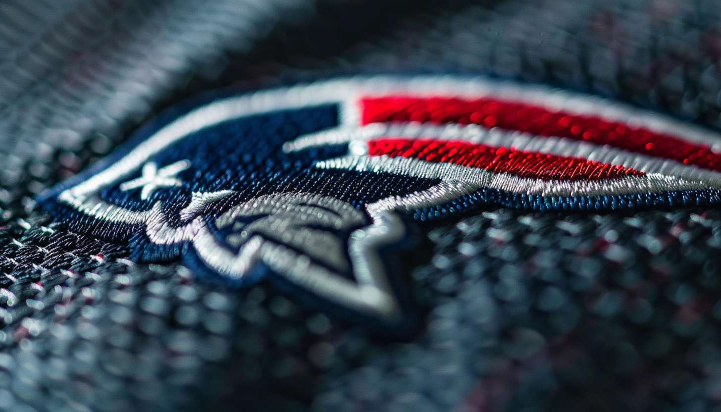
The 1993 change was the most drastic, with the removal of the Pat Patriot logo and switching to a sleeker, more modern-looking logo. The new design, known as “Flying Elvis” to fans, had a stylized loyalist’s head with a shiny revolutionary hat and a long red and white ribbon behind it. Graphic designer Ken Loh created the design with Patriots’ fans. The new logo resembled speed, strength, and progress, which the team used to reiterate their ambitions of being successful in the field.
Why the Change Was Necessary
Fans had mixed reactions to the transition from Pat Patriot to Flying Elvis. Many of them had become attached to the old logo and were resistant to the new design. But the switch turned out to be a wise move. The updated logo was easier to reproduce on helmets, uniforms and merchandise. This gave the team a more polished and dynamic image, allowing them to create a strong visual brand.
New England Patriots Logo in the 21st Century (2000–Present)
In 2000, the Patriots once again tweaked their logo, making canny adjustments that helped the mark retain its tautness while smoothing out its nooks and crannies. The most significant difference was that a darker shade of blue used, which helped give the logo depth and made it pop more. This logo version became the signature logo of the Patriots’ most successful era. This design, that came after several Super Bowls and that became one of the most dominant franchises in the NFL.
Why the Current Logo Works
The current Patriots logo is a very simple, clean, and powerful logo. It’s simpler than the detailed Pat Patriot design, so easier to apply on different branding material, from digital media to physical merchandise. The swirling ribbon of the crest imparts a sense of motion, embodying progress and forward momentum. And most notably, that logo carries with it the notion of success. Expectations change when you see the Patriots emblem, because that comes with championship victories, elite players, and a winning culture.
The Impact of the New England Patriots Logo on Branding & Marketing
The Patriots logo itself is not just any image but a direct reflection of one of the most successful teams in history. It is a symbol of hard work, determination and winning. Devotion, era, designs and memorabilia are inextricably intertwined with the Flying Elvis design, which has been present in both the fire behind the flame and the peak of the greatest moments in the team’s history, as even the uniform has become iconic in the world of sports.
New Era of Merchandise and Fan Engagement
Merchandise sales heavily influenced by logos, and the Patriots logo is no different. When worn on jerseys, on hats, or on collectibles, the logo is recognizable and marketable. It is clean, modern design is appealing even to those fans and supporters who may not have been around as long.
Legacy and Recognition
Most teams have adopted their fair share of major logo changes, but the Patriots have retained the strength of their brand with little tinkering That consistency has helped solidify their identity, and the Flying Elvis design is one of the most recognizable logos of any team in professional sports.
Part 3: Elements in the Design of the Patriots Logo
The Patriots brand is grounded in strong colors, strong symbolism and strong type. Every element has a tremendous impact on the team’s identity, and how fans around the world can instantly recognize the logo
Patriot Logo Colors
New England Patriots logo: The New England Patriots logo has a color scheme very powerful and patriotic. Red, white, and blue are the two colors from the ply, mentioned as the colors of the American flag. Red represents passion and determination, blue is strength and trust, while white represents integrity and unity. 1 Detroit Pistons logo shape and colors, blue, heather grey, red The blue, heather grey, and red in these logos are not just for show; they serve to reinforce the team’s character and dedication to quality.
Patriots Logo Meaning and Symbolism
The logo for easy identification that translated to “Patriot” is a stylized figure dressed in a tricorne hat, one of the significant symbols of the American Revolutionary War. This is a nod to the historical patriots who fought for the country’s independence. The star in the logo signifies excellence, leadership, and the pursuit of greatness, embodying the team’s goal of being among the most successful franchises in the NFL. This visual identity is as tight as it is with Patriots fans in mind, and represents the strength, awareness and tradition of the team.
Typography and Font in Patriots Branding
Typography is also a vital part of sports branding, and the New England Patriots have selected fonts that embody their strong and bold identity. The team’s branding uses bold, all-caps fonts that are straightforward, impactful, and easy to identify. Patriots merchandise, stadium banners, and digital content use typography that instills confidence and power. A single font used consistently for all branding elements, allowing the Patriots to present a cohesive and professional face. The bold font choice echoes the team’s logo, further cementing their status as a powerhouse in the league.
Part 4: The evolution of the Patriots logo with the team
Over the years, and as the team matured and thrived, the Patriots did evolve their logo. From historic redesigns to merchandise influence, each update further solidifies the team’s brand.
Changes That Reflect Team Success
Each logo redesign has come in conjunction with significant moments in the team’s history — rebranding efforts, Super Bowl appearances and management shake-ups. The original logo simple and traditional when the team was founded. As the Patriots grew into a powerhouse in the NFL, though, they removed the time-honored logo in favor of a slicker. More dynamic version that matched their competitive zeal. In 2000, the logo was refined slightly with a darker shade of blue and cleaner lines, emphasizing the team’s dominance and forward-thinking attitude.
On Merchandise and Uniforms
New England Patriots merchandise and uniforms feature the Patriots logo extensively, making it one of the most recognizable symbols in professional football. The logo appears on team jerseys, helmets, jackets, hats and countless items of fan gear. The design of the logo has been a bit adjusted to different branding materials over the years. But the key elements remain unchanged. That consistency is important; it helps keep the Patriots’ identity strong and something people instantly recognize, cementing their place as a top franchise in the NFL.
PART 5: Design Your Professional Logo
Designing a professional logo can be very challenging and time consuming, but AI powered tools such as Arvin AI has changed the way logos are designed. AI eliminates the complexity of logo designing by processing data to find themes in design, and delivers a better quality of logos within few minutes based on user preferences. The design process becomes collaborative and iterative, where users can try out as many design variations as they like, easily adjust elements, and create professional-looking results without the need for having to hire a designer.
Key Features of Arvin AI for Logo Design
- Intelligent logo suggestions: Arvin AI analyzes team preferences and generates logos that align with the brand’s vision and theme.
- Customizable color palettes: Users can modify colors and fonts to create a unique and personalized logo.
- High-resolution output for branding: Logos created with Arvin AI are optimized for various platforms, including digital and print.
- User-friendly interface: The tool is designed for easy navigation, making professional logo design accessible to everyone.
Steps to Design a Logo with Arvin AI
Step 1: Create an Account and Log In
Go to the website of Arvin AI logo maker, create an account, and log in to access the feature of designing the logo.
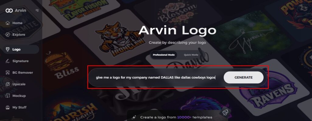
Step 2: Insert Brand Details and Preferences
Inputs are made by filling out your brand name, slogan, and industry. Specify your design preferences, such as font styles and image themes.
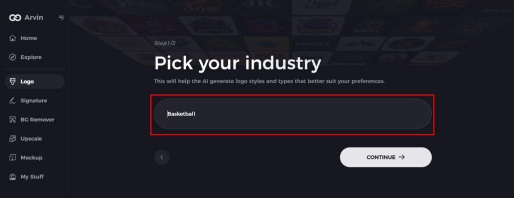
Step 3: Choose an Industry
Please select the industry or niche so Arvin AI could get an idea of logo styles pertaining to your business needs and vision.
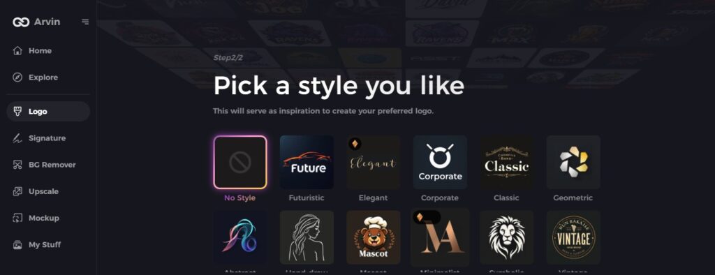
Step 4: Choose a Style
Just choose the style of logo that appeals to you. From it, Arvin AI will get ideas for designing your logo.
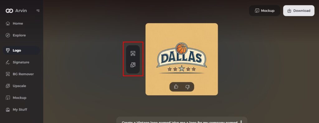
Step 5: Customize Your Design
Once the AI creates your logo, personalize it using tools for font style, layout, and symbol positioning. Play around with different designs until you’re satisfied.
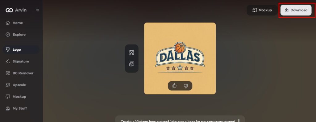
Step 6: Save and Download Your Logo
Preview your final logo and download it in high resolution, suitable for both print and digital use.
Conclusion
The Patriots logo has been a critical driver in the team’s success as a brand, a well-crafted logo is a must for any sports team or business of any kind. With all new AI-driven tools like Arvin AI, designing professional, bespoke logos has never been easier. Providing intelligent design characteristics, easy customization, and great quality output, Arvin AI makes it easy to build a strong brand image. Sign up for Arvin AI now and generate a fresh, expertise-grade logo for your crew!
FAQs About the Patriots Logo
What does the New England Patriots logo represent?
On regal blue uniforms, the Patriots logo symbolizes the franchise’s bold identity and American patriotism. The tricorne hat represents the historic patriots of the American Revolution and the star represents excellence and achievement.
What does the current Patriots logo represent?
The current logo, often called the “Flying Elvis,” symbolizes patriotism, strength, and modernity, featuring a stylized depiction of a Revolutionary War-era figure.
Who designed the current Patriots logo?
The current Patriots logo, created by Ken Loh in 1993, updated in 2000 to improve its modern appearance and color palette.
Can you make a similar sports logo on Arvin AI?
Absolutely! Well, Arvin AI is a powerful AI design tool that helps you create custom sports logos with professional-quality elements. Arvin AI gives simple options to customize the logo with intelligent suggestions.
