Papa Johns, the world’s third largest delivery pizza chain with more than 5,500 stores in 49 countries and regions, has come a long way since its inception. The history and transition of the Papa Johnes logo reflects a wide range of trends, including marketing, design and consumer expectations, while providing a glimpse into how branding and corporate identity have evolved in the fast food industry. Here we introduce the origins of Papa Johns, the birth of the first logo, the growth of the company, the transformation of strategy, and subsequent changes.
Part 1: Meaning and History
John Schnatter founded Papa Johns in 1984. It began when his father’s tavern in Indiana was remodeled. The goal is an excellent pizza with better materials. The first pizza was sold to bar customers. It grew rapidly and franchised in 1986. By 1997, 1,500 stores had opened worldwide. In 2001, online orders began, and the company continues to take innovative steps. This logo is one of the cute logos for your brand.
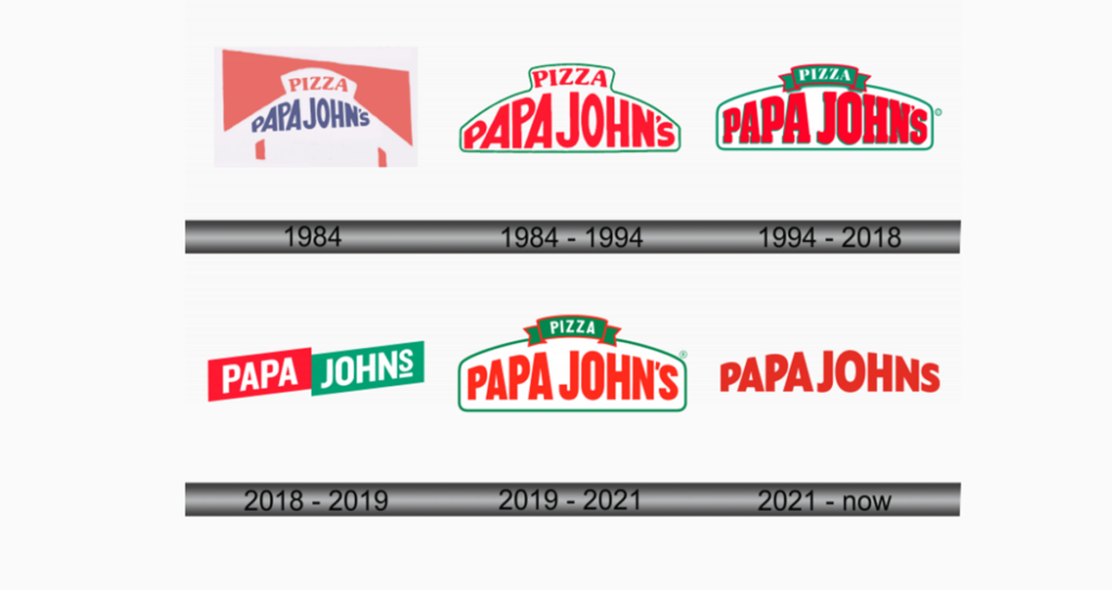
1984
This logo is a stylized tent with the bold character “Papa John’s” arched under the capital letter “PIZZA.” The background is bright red, giving off a warm and appetizing appeal. Under the letters, a simple outline of pizza-baking paddle (peel) is designed to symbolize the craftsmanship of pizza making. This emblem combines tradition and familiarity, and aims to remind you of hearty handmade dishes every time you see them.
1984 – 1994
This variant of the logo represents “PAPA JOHN’S” with a prominent red block character. “PIZZA” is above it, reversing the green arch and visually echoing the mouth of the kiln. The color scheme is a classic Italian tricolor, reminiscent of the vitality of the Italian flag. The entire logo is surrounded by green edges, emphasizing the brand’s freshness and commitment to vibrancy.
1994 – 2018
This logo adopts a more sophisticated elongated shape, and has a bright red “PAPA JOHN’S.” The green banner-like element stylishly overlaps the top and proudly described as “PIZZA.” The green and red palettes, which are the roots of Italian cuisine, remain intact, and the design is smarter and more contemporary.
2018 – 2019
The logo shifts to a bold two-tone rectangle design, with PAPA and JOHNS split into red and green blocks, respectively. The white text in each block stands out sharply, emphasizing clarity and modernity. There are no arches or banners, and a straight, geometric approach adopted that suggests modern rebranding. This minimalist design reflects a sophisticated, unadorned attitude, focuses solely on names.
2019 – 2021
The 1995 logo renewed in 2019. The typeface of the serif replaced by a simple, more modern form of serif, and the green shadow of the letter removed. The outline was refreshing and enhanced, and the green color became deeper and brighter, evoking a sense of success and professionalism.
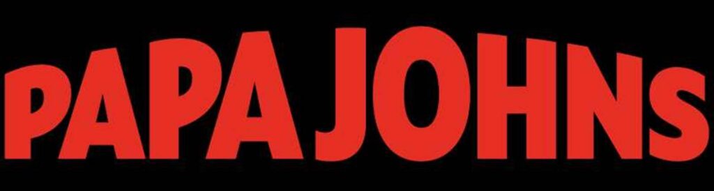
2021 – Present
Papa Johns logo expressed in powerful red letters, eliminating graphic decoration. It eliminates all green and additional elements and embodies minimalism with an emphasis on brand name awareness. The simple design reflects the modern trend towards clean and impactful branding. It is a bold step towards a more contemporary visual identity and emphasizes confidence in the brand’s position in the market.
Part 2: Design Elements of Papa Johns Logo
Following are the main design elements Papa John Logo:
Color
Have you ever wondered why the Papa Johns logo is red and green? These are not chosen appropriately from the color palette. They tell a lot about this brand and its products.

See Red
Red is often a color reminiscent of passion, energy and love. In the Papa Johns logo, red represents the passion and dedication of each pizza.
Green
On the other hand, green symbolizes freshness. This means the fresh ingredients famous for Papa Johns.
Font
Now let’s talk about the logo fonts. That characteristic script spells “Papa John’s” in the logo. It’s not just a typeface. It is a statement.
More Than a Character
The font used for the Papa Johns logo is customized and a unique character that can be seen at a glance. Like the founder himself, it creates a friendly and welcoming atmosphere.
Inscribed Identity
Unique characters also emphasize the personality of the brand. It is a constant reminder that Papa Johns is not just a pizza chain, but a brand with its own identity and values.
Part 3: Impact of Papa Johns logo
As well as logo colors and fonts, logos have a significant impact on brand identity and cognition.
Memorable marks
The Papa Johns logo is characterized by its circular, unique font, and bold colors. It is an impressive mark that stands out among the crowded pizza market.
Fulfilling Your Promise
Do you remember the promises I mentioned earlier? This logo is a constant reminder of the promise of better food and better pizza. It expresses the brand’s commitment to quality visually and resonates with customers every time they see it.
Part 4: Papa Johns Logo Versatility
It is often overlooked, but equally important is the versatility of the Papa Johns logo. It is not just a logo, it is a chameleon of design that adapts to various uses while maintaining identity.
Fit like gloves
Whether in a pizza box, in-store, or digital advertising, the logo fits seamlessly. Simple and rounded designs can be easily adapted to various media without losing their essence.
Colorful
The color scheme of this logo is also versatile. Red and green are reflected in various backgrounds, ensuring that the logo stands out wherever it is placed.
Part 5: Future of Papa Johns Logo
The Papa Johns logo has undergone subtle changes over the years, mostly faithful to its original design. But what will happen in the future?
Maintaining legacy
Although we cannot predict the future with certainty, we can speculate that the Papa Johns logo will continue to inherit its legacy. The core elements – circles, unique characters, red and green – will remain.
Responding to Changes
However, the logo may further improved to remain appropriate in the ever-evolving market. The essence of the brand may remain intact and become a more modern touch. One thing that is certain is that we are seeing the next piece of Papa Johns’ logo story.
Part 6: Arvin AI: Your Last AI Logo Designer
Very challenging to do especially if the Papa Johns logos are just newly founded. With high technology and ease of usage in Arvin AI, that stress can be removed. Modernly smooth, classy, elegant and so many other styles it has everything. Arvin AI makes sure that imagination and common sense to express a logo representing a brand and attracting audiences.
Key Features of Arvin AI
- Customizable Templates: Over a thousand templates fitting your label style.
- AI-driven Suggestion: Suggestions based on the heart and soul of your brand
- Color Pallet: Choose from thousands of color combinations that resonate with your audience.
- Typography option: Find the right font that will make your brand stand out from the rest
- User Friendly Interface: Design your logo easily without any technical skill.
- instant previews: See instant previews of how your logo will look on album covers, merchandise, and much more.
Steps to Use Arvin AI for making Logo
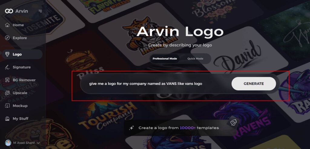
Step 1: Access the Arvin AI Logo Maker
Open your preferred web browser and visit the Arvin AI logo design page to begin crafting your logo.

Step 2: Input Business Details
Provide key details about your business, such as its name and category, to help the AI generate tailored logo designs.
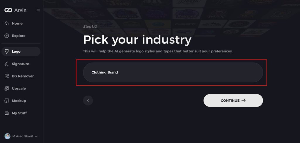
Step 3: Choose Your Industry
Select your industry from the available options. This step ensures the AI refines its design suggestions to align with your brand’s focus.
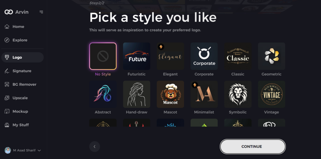
Step 4: Select a Design Style
Explore the style options presented and pick one that resonates with your brand’s personality. If undecided, skip this step, and the AI will default to its creative suggestions.
Step 5: Explore Logo Concepts
Review the diverse logo designs generated by the AI based on your inputs. Look for ideas that align with your brand’s vision and goals.
Step 6: Customize Your Logo
Adjust your chosen design by tweaking elements such as colors, fonts, icons, and layouts to make it uniquely yours, much like the evolving Vans logo.

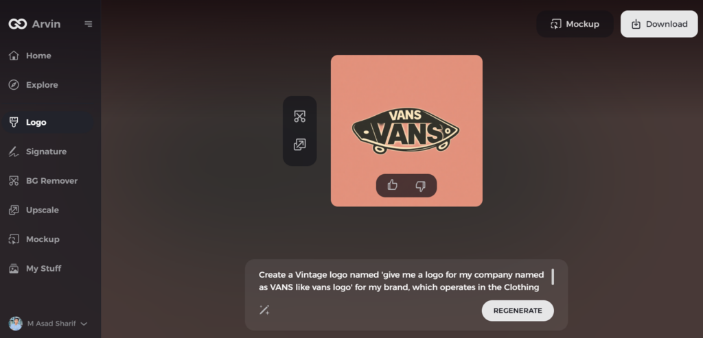
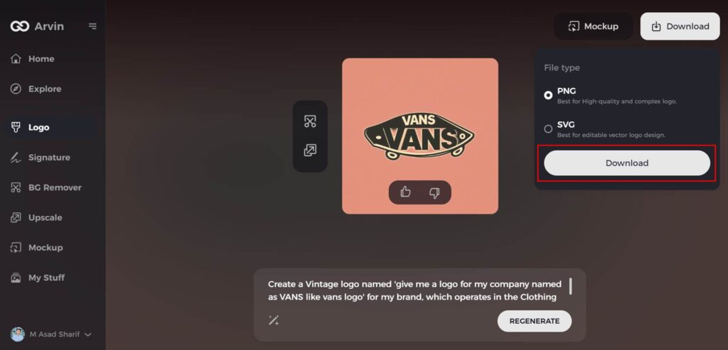
Step 7: Finalize and Download
Once satisfied with your design, download it in formats like PNG or SVG. These versatile formats are ideal for digital, social media, and print applications.
Conclusion
Papa Johns logo may combine the delicacy of a 10-ton track with the elegance of a pig wearing a tutu, but those who think it is a bad thing are outliers. If you like pizza, you know the name Dad Johns. And if you like Dad Johns, you also know this logo. The color scheme, typography, and icons utilized in the logo assist in projecting the company’s goal. you need a killer business logo, then you are in the right place with Arvin AI. It provides editable templates, intelligent AI ideas, and an easy interface.
FAQs
What does the Papa Johns logo symbolize?
The logo represents freshness, quality, and the company’s commitment to delicious pizza. It uses strong typefaces and colors to convey a sense of trust and tradition.
Why did Papa Johns change its logo in 2021?
The corporate rebranding goal was to obtain a contemporary modern professional image that aligned with digital ease.
What is special about Papa Johns?
We don’t use cheap and more processed ingredients. Whether it’s our signature sauce, toppings, our original fresh dough, or even the box itself, we invest in our ingredients to ensure that we always give you the finest quality pizza
How does a logo impact a brand’s success?
A well-designed logo enables brand recognition, trust, and differentiation in the market. It creates a strong visual identity that appeals to customers.