The Olympics is probably the world’s greatest sporting event wherein countries gather for the purpose of competition and togetherness. For a long time, Olympics logos became the vehicle by which culture, identity, and artistic expression expressed by a host country. From simple early designs to more recent digital creations, these logos have succeeded in transforming with changing styles and technologies. Each logo speaks out, expressing what its era breathed while carrying to this day all the quintessence of three core Olympic values: excellence, friendship, and respect.
Part 1: The Evolution of Olympics Logos
The Olympic Games are one of the biggest events in the world. Where all countries in the world gathered. Let’s take a look at how iconic logos have changed over the years and what these changes say about the times they represent.
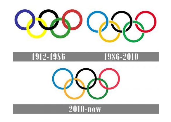
When designing individual emblems for each Olympic Games, the symbols of the five rings are always used. Due to its versatility, the ring is perfectly combined with other components of the image. The Olympic Committee of each country has an official emblem, but five rings are always used in the image.
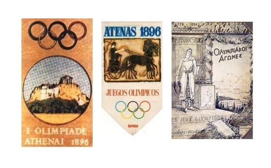
1912 – 1986
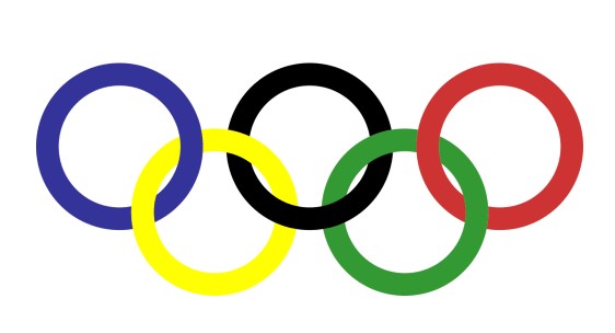
The original Olympic logo was designed with the iconic five rings in 1912. Thick, bold lines made the five colored rings quite visible. It used blue, yellow, black, green, and red as the logo colors meant to represent the five continents as unified. The badge appeared solid and bright, but compares to the new modern logos; this was a bit heavy and dark. This design has become lighter and streamlined over time as fashion trends change.
1986 – 2010
In the 1986 redesign, important changes were made to the Olympic logo. The edges of the rings were smoothed out and thin white lines were added at the point of overlap to create a cleaner, polished look. The colors of the rings were also modified to be brighter and more attractive. These modifications made the logo appear much more professional and stylish than the original design and gave it a fresher modern look, while still carrying with it the Olympic spirit.
2010 – Today
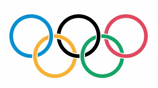
The 2010 version of the Olympic logo is more prominent with a lot of differences in the overall outlook. The rings are now slimmer and narrower, and their color looks much more fragile than before. Outlines for colorful rings are absent, and it made them look neater and fresh.
Part 2: Meaning of Olympic Logos
An Olympic logo represents the Games on the visual aspect but goes further beyond that; it carries a message. Each and every logo gives an impression related to the country that is hosting it, showing aspects of culture, history, and values of that country. This section of discussion will detail symbols and colors associated with the Olympic logos as related to the country heritage that hosted the Olympics. We’ll also explore the role of typography and fonts, and how they help convey the emotions and message behind the design.
Symbolism
Olympic logos are not only for looks but also carry a deeper meaning. Colors and symbols are selected to represent specific ideas. For instance, red often symbolizes energy and passion, while blue symbolizes calm and trust. Every logo is designed with elements that reflect the values and culture of the host country. Such choices make each Olympic logo feel connected to the country hosting the Games.
Cultural Significance
The Olympic logo designs are sometimes determined by the host culture. For example, in the Tokyo 2020, its deep indigo was a representation of the Japanese culture, while London 2012 used a blend of colors to represent diversity and modernity. Such logos aim to incorporate the character of the country but at the same time, they are not deviating from the Olympic values such as excellence, friendship, and respect.
Typography & Fonts in Olympics Logos
Fonts play a significant role in Olympics logos. In this sense, they can reflect feelings and express messages. Bold fonts, for instance, express strength, power, and stability. Minimalist fonts denote elegance, simplicity, and modernity. For instance, the logo for Barcelona 1992 features bold, geometric logo fonts to reflect growth in the city. For Beijing 2008, simple clean fonts were used to flow with harmony and unity. The text choice contributes to the creation of the event’s brand identity and gives a flavor to the Games.
Part 3: The Most Iconic Olympics Logos of All Time
Olympics logos are not just symbols; they are part of the identity of each Olympic Games. This section will introduce us to the most memorable logos for the Olympic Games and share why they work and others that simply don’t get it right.
Top 5 Most Memorable Olympics Logos
These are five of the most visually striking and effective Olympics logos ever produced for the Games:
Mexico 1968
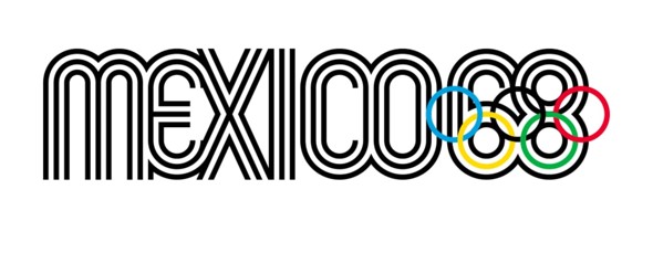
Mexico 1968 logo was highly colorful and prominent. It incorporated bright colors along with a peculiar Aztec-shaped form, thus representing the nation’s rich cultural heritage. The logo was among the first few to introduce modern and geometric styles used in later Olympic logos. The Mexico 1968 logo is highly remembered for its strong visual identity and connection with the historical roots of the nation.
Los Angeles 1984
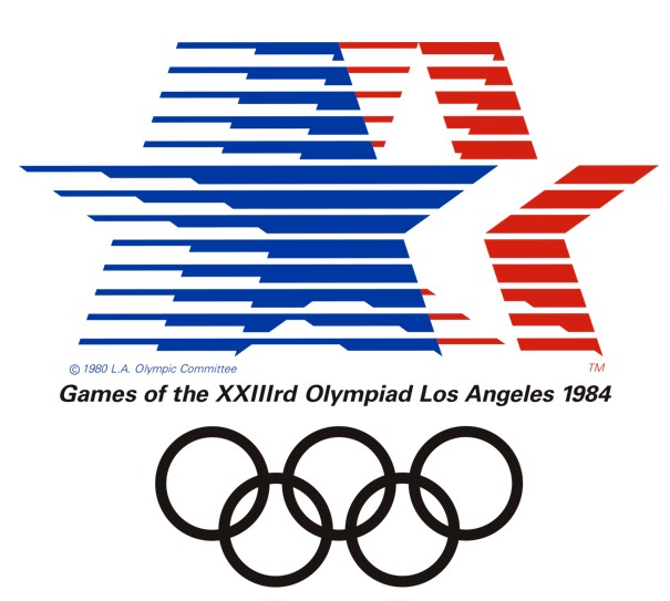
The Los Angeles 1984 logo characterized by clean and minimalist designing, yet rather dynamic and simple. It represented the Olympic rings together with an artful, stylized sunburst emblem, which reflected the sunny climate of California. This was quite flexible, being able to adapt remarkably in different media as well as merchandise, thus highly effective in global branding terms.
Barcelona 1992
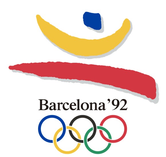
A signature style from Olympic Games, Barcelona 1992 has the world’s most colorful and vibrant Olympic logo. Based on modernism ideas from the modern school of art that emphasizes on artistic imagination, humor, energy and playfulness have all been successfully projected with a happy figure dancing away, a source of inspiration was seen in creating a very fresh, dynamic feel.
Sydney 2000
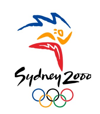
The Sydney 2000 logo was innovative with its stylized kangaroo design, reflecting Australia’s wildlife. It was unique with earthy tones and fluid lines, and the logo itself conceived as wonderfully emblematic of the warm and natural Aussie welcome. It remembered for being capable of both representing the Olympic Games and the distinct identity of the host nation.
London 2012
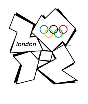
The London 2012 logo was an extremely modern as well as sci-fi logo and one of the Olympics logos in history to date. It embodied jagged and bright neon colors shapes, making them bold and ‘eye-catching. It criticized many times for over-complication but effectively stood out as reflective of London’s multicultural yet diverse identity.
Olympics Logos with Least Popularity
There were many Olympic logos that succeeded in their role but a few drew mixed reactions and even outright condemnation. The design or the general reception of some of these logos was what generated controversy.
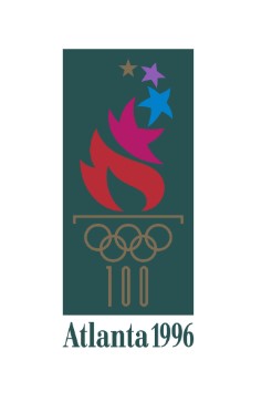
Atlanta 1996
The Atlanta 1996 Olympic logo considered one of the most abhorrent Olympic logos. The critics felt it was a far too out-of-date design that had no spirit of the Olympics. The logo consisted of a torch on fire, but the simplistic design did not reflect a part of Atlanta’s culture. People felt it failed to portray the excitement of the Games.
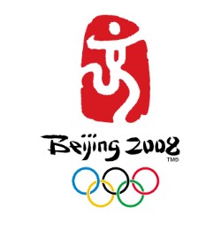
Beijing 2008
The Beijing 2008 logo admired in general, for its grace and elegance. However, criticized to be too common and without innovation. It used a traditional Chinese seal for inspiration, and this seen by many as not vibrant enough and representing the modern China of the moment. It is, however still one of the most recognized logos for its cultural significance.
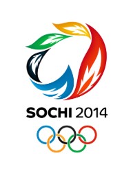
Sochi 2014
The Sochi 2014 logo criticized as too complicated and difficult to understand. The blocky typeface with a stylized snowflake seemed too busy to some people, and the logo lacked energy and spirit that the Winter Olympics should represent. Others said it didn’t have a good connection with Russian culture.
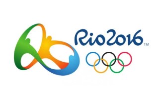
Rio 2016
The Rio 2016 logo came out unique and colorful, with a statement of interpretation controversy against it. In this case, the shapes did not seem to make sense to some of those who supposed to be the representation of the human form and the city’s famous landmarks. Though the logo praised as bold and creative, it did not stick well to the overall perception of an Olympic logo: too abstract.
Part 4: Role of Olympics Logos in Global Branding
For the Games, Olympics logos are very much more than mere images. They happen to be very symbolic marks that contribute to formulating the identity of the host country and the spirit of the Olympics. Let’s explore how Olympics logos have a long-lasting effect beyond just the Games.
Connecting the Host Country to the World
The logo of the host country is a visual representation of the nation itself. It symbolizes the culture, values, and aspirations of the country. The logo will be seen in all parts of the world be it in social media TV broadcasts or advertisements. This creates a bond between the host country and the global audience.
The Role of Logos in Merchandise and Advertising
One of the greatest effects of Olympics logos is the application to merchandise and advertisement. It features the logo on clothes, souvenirs, and the official uniforms of the athletes and so many more. They feature them in commercials and advertisements meant for the Games. All this will go a long way in branding the host country and create excitement enough to draw people’s interest to the Games.
National Pride and Identity
Some Olympics logos have become culture icons in and of themselves, representative of more than just the games. They represent a sense of national pride and a country’s sense of identity, marking them as being part of their history. One such example was the Mexico 1968 logo-its bold coloring and Aztec culture reference made this logo representative not only of the games but also an intense sense of national pride.
Long-term Consequences
Olympic logos are beyond the time span of the games. After the event is over, the logo remains in print and other forms of media, tourism, and branding. This ensures that the Olympic legacy continues and the event and its host country remain under the global limelight long after the closing ceremony.
Part 5: Designing Olympics Logos in the AI Era
Currently, designing Olympics logos is easier and more efficient using Arvin AI. This AI-based platform helps designers in fast logo production, with smart features that indeed make the whole design process quite different from the traditional design processes. Advanced technology uses to generate creative ideas by Arvin AI to result in unique professional logos. Its simple user interface makes it easy to design logos that are modern-looking and eye-catching. Whether it is for the Olympics or some other project, Arvin AI brings logo-making easily within reach.
Key Features of Arvin AI
There are following key features of Arvin AI:
- AI-Powered Suggestions: Get smart, creative design ideas in seconds.
- Easy-to-Use Interface: Simple design tools for beginners and pros alike.
- Customizable Templates: Choose from ready-made templates and make them your own.
- Color Palette Choices: Select from a wide range of colors to fit your brand or theme.
- Instant Feedback: Get real-time suggestions and adjustments to improve your design.
- Multiple File Formats: Download logos in different formats, perfect for web or print.
Steps to Use Arvin AI to Design an Olympics Logo
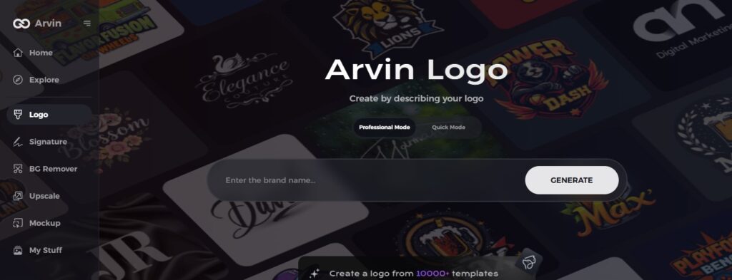
Step 1: Sign up and log in to Arvin AI
Visit the website of Arvin AI. Make an account, and then sign in to gain access to logo design tools.
Step 2: Enter brand details and preferences
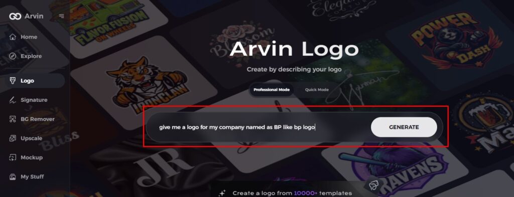
Input your brand name, slogan, and industry. Mention any design preference, such as font styles or theme ideas that will guide the logo creation
Step 3: Choose your industry
Choose an industry that your brand falls into. This enables Arvin AI to recommend styles and designs of logos that match your niche.

Step 4: Select a design style
Choose a design style that you like. This will inspire Arvin AI to create a logo that reflects your vision.

Step 5: Customize your logo
Use the tools provided by Arvin AI to modify any component you want; for instance, change the font, layout, and icon location. Test different versions of your logo until you satisfy.

Step 6: Save and download your logo
Have a final look at your design. Once you satisfy, save your high-resolution logo in both digital and print.

Conclusion
Olympics logos have come a long way from the initial simple design, now boldly creating symbols representing the spirit of the Games and that of each host country. Technology advances, and AI will mold the future Olympics logo designs. Where more speed and innovative ideas guaranteed. Arvin AI is the best tool to help designers achieve this with AI-assisted creativity to generate beautiful logos. With its user-friendly features, Arvin AI makes it easier than ever to design professional, unique logos for any event or project.
FAQs
What does the Olympic ring signify in the logo?
The rings symbolize the unity of the five continents and the spirit of universality embodied by the Games.
Which Olympics logos is considered the best?
According to one, many people consider the Mexico 1968 and London 2012 logos to be the best for their bold and creative design.
How are Olympics logos designed today?
Olympics logos made through AI, digital tools, and cultural research, each one a bit different, so you won’t forget.
Can I design an Olympics logos with Arvin AI?
Absolutely! Arvin AI provides you with easy-to-use AI tools for designing professional sports-themed logos easily and quickly.

