A logo is usually the first impression that a company makes. It is an extremely powerful graphic representation of values, vision, and mission. Nissan, the global automotive giant since 1933, always considered the logo as a core element in establishing its brand image. This article reveals the fantastic journey that Nissan logo has taken-from the humble beginning to the one it adopted in 2020. This in turn reflects not only the journey of the company but also how the automobile sector has developed in general.
Part 1: History and Evolution of Nissan Logo
The name Nissan literally translated into the Japanese as a “sun product” or a “birth of the sun” (“ni” stands for “sun”, and “ssan” means “birth” or “product”). And to be honest, visual identity reflected that meaning by always showing one’s roots in respect to a good tradition; at the same time, an idea of how the company pursues new design and technology for its worldwide automotive community.
1933 – 1940
First Nissan logo has been a emblem, which was based on red, blue and white colors; it also features the symbol of the sun, circle, rectangle, blue, and white colors. The all-cap word mark is written in a strong and forceful typeface. Which makes the brand name bold and confident.
1940 – 1950
During the 1940s, the brand experimented with the shape of the logo. Nissan’s logo during this time characterized by ingenious geometric shapes with six angles, four of which were rounded. And two at the top of the logo were sharp. The word mark written in a friendly, dynamic hand-drawn typeface with smooth lines and stretched out “A” characters. Also, it provides a bright look by cutting the edge of “S.”
1950 – 1959
In the first half of the 1950s, the logotype redrawn in order to simplify the logo. All-cap letters used in rectangles. The color scheme was the same – a combination of red and white. The font is more powerful, the letters are bigger. The round corners of the red rectangle and white edges give a soft and stylish impression.
1959 – 1960
The new Nissan logo is still a development of the previous one. The character becomes squarer. There is no more frame. The angular, lineal font represented the brand as advanced and strong.
1960 – 1967
The Nissan logo of the 1960s features the lettering of the writing body and sharp lines. It is modern and elegant. The word mark painted in red on white ground. This is a minimalist and sophisticated visual identity, and it stands out from other brand logos. When it is given a car accessory, it became silver and rather expensive and smart.
1967 – 1970
Word marks were now being experimented so that the absolute balance was perfected. The process of italic-rounded typefaces began for three successive years. Since it was rather short, then it was sure not typical at all for this company.
1970 – 1978
Nissan brings back the square frame. The literal word mark is all-caps once more, a heritage line typeface. Thin and linear lines make the logo a refreshing impression, and now feel a modern, technology-centric approach.
1978-2001
The brand goes back to its roots. The tradition of Nissan honored with a symbolic emblem and a new old logo featuring a rectangular wordmark. It’s full of confident and powerful lettering and with a custom typeface that gives the logo its impressive nature while being recognizable. The color palette is simple, monochrome gray-based.
1978-1988
In 1978, the Nissan logo evolved into a very classic black and silver color combination, with simply lettered engraving on a horizontal metallic flag. The lettering of the inscriptions followed from the previous design, but the character was much more geometric in the new scheme.
1988 – 1989
The shape of the Nissan logo, revived in a rounded geometric form of 1988, saw a rectangular banner placed across the solid circle. Both elements consisted of silver and black, and the background of the matte silver circle supported by letters written on plain black banners. This seemed to be very powerful and confident.
1989 – 1990
1989 The Nissan badge was modified into a very minimalist style. A very brutal and masculine impression is given by the bold and flat logotype which resembles quality and precision.
1990 – 1992
The idea of a round square was restored to the Nissan brand mark in 1990, but underwent many key alterations. The flag was held to a flat silver, and the black text was accompanied by both light rectangular and ring black lines of thickness, where the solid circles of the badges used in the late 1980s served as support.
1992 – 1998
In 1922, the silver shadow was eliminated from Nissan’s visual identity and the ring and banner concepts in black and white. The simplicity of the color scheme and the geometric shape of the badge really harmonized showing that Nissan is a very professional company.
1998 – 2001
In 1998, the line became smoother and elegant with an outline of an iconic badge by Nissan. Its color palette primarily consisted of white, while a black accent minimized its usage with the help of edging the letters and the logos.
2001 – 2012
The logo introduced in 2001 by Nissan is the adaptation of an older one; however, the new logo has made it much sophisticated and fashionable while using silver colours, the same is bold as well as luxury. The characters are placed at wonderful distances and based on the line of the typeface, either on the mark or as an independent one, this wordmark is mirrored.
2012 – 2020
In 2012, the color scheme of the Nissan logo was slightly altered, and the silver color tone has a warmer yellow tone, and the glossy surface is matte and smooth. New shades of light made the badge more volumy and the lettering banner spherical.
2020 – Now
The logo of Nissan for 2020 is a modern, stylish, minimalist badge with a flat monochrome and repeated symbolic emblem shape. Black letters written in capital letters placed between two arches, forming Nissan’s circular logo. Both ends of the arch sharpened with alligates, and by making the two parts look a little like horseshoe. The logo familiar all over the world for many years refined and giving a different creative impression.
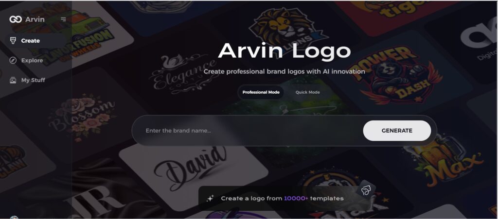
Part 2: Using Arvin AI to Design a Customized Logo
Arvin AI is a high-level design analysis tool using advanced algorithms to review logos and other visual identities. It checks aesthetics, brand-alignment, digital-readiness, and cultural appeal. Data-driven insights with recommendations for redesign empower businesses and designers with the creation of meaningful, malleable logos that resonate in their target market across industries using Arvin AI.
Key Features
- User-Friendly Interface: Arvin AI is simple to use to create logos even from a layperson. It boasts an intuitive interface with a seamless experience in design.
- Creative Templates: Select a vast array of pre-designed templates designed by professionals that can jump-start your logo creation process.
- Customizable Designs: Use colors, fonts, and layout to change or modify the original design as preferred. Your designs will look original and representative.
- Versatile Formats: Export logos in best format that can used on websites, business cards, or in advertisements. Your logo must look good everywhere.
- Efficient Time Saving: Save time by using fast design tools and making things easier through streamlined creation.
Steps to Use Arvin AI for making Logo
Step 1: Create an account and log in on Arvin AI
Visit the website of Arvin AI, open an account, and log in for the logo design feature.
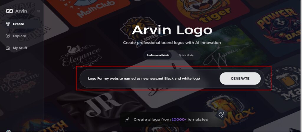
Step 2: Input your brand information and preferences
Input your brand name, slogan, and industry. Specify all your design preferences, which may include font styles or images themes.
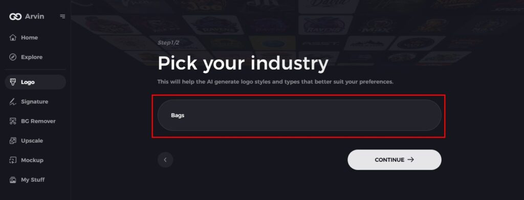
Step 3: Pick your industry:
Now select your industry related to your niche. This will help the AI generate logo styles and types that better suit your preferences.
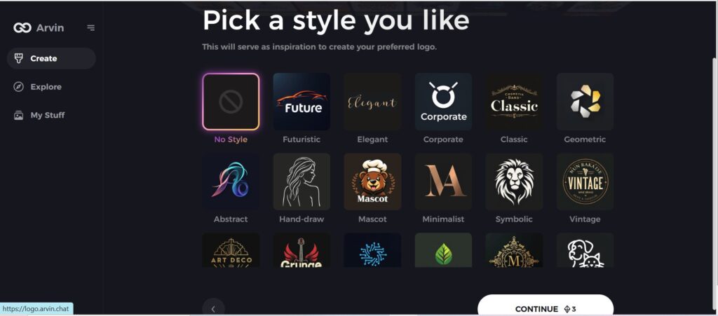
Step 4: Select Style:
Now select a style which you would like and continue. This will serve as inspiration to create your preferred logo.
Step 5: Design Personalize through the tools of Arvin AI
After Arvin AI gives create your logo, you can customize those logos with the tools that have elements such as font style, layout, and the positioning of symbols. Experiment on different designs until you like what you see.
Step 6: Save and download the final logo
Preview the finished logo and save it in a high-resolution format for both print and digital uses.
Conclusion
Nissan logo has been undergoing transformation from the stage of being a regional carmaker to a leader in innovation and sustainability around the world. With each stage of growth, it modified its graphics, not because of the increasing size of its business but through the tides of design and technology that wash over it. Arvin AI gives useful information for the business interested in deconstructing or envisioning their visual identification, hence finding a middle road between creativity and data-driven strategies. If you want to design customized logo then try Arvin AI today.
FAQs
Does Nissan have two logos?
There are two versions of the Nissan logo currently in circulation. One is the badge you’re likely to see on the Nissan cars from 2020 and before, with a full chrome circle and a thick silver bar showcasing the “Nissan” wordmark. The new Nissan design replaces the thick silver badge with a simple black outline.
What was the inspiration for Nissan’s latest logo design?
The idea of logos inspired by a commitment that Nissan has towards the future and a future with sustainability, which also supported by the generation of digital platforms.
How does Arvin AI help in logo design analysis?
Arvin AI uses sophisticated algorithms in judging logo aesthetics, brand alignment, and digital readiness. It gives actionable insights, making it a very important tool for designers and businesses.
Can Arvin AI be used for other types of design analysis besides logos?
Arvin AI is quite versatile and can analyze various design elements, including packaging, web layouts, and product designs, ensuring alignment with brand goals and market trends.
