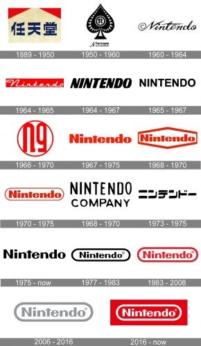
Nintendo is one of those rare names in the gaming business that have succeeded in becoming well known to people all around the world with more than a century-long heritage. Over these years, it has seen several incredible transformations to its logo depicting the growth as well as alterations in its positions in the marketplace worldwide. From playing cards, the brand went through various development stages to the top in the game world. Therefore, this evolution of the logo was with the expanded ambitions of the company and wider international coverage. Here, we talk about how Nintendo logo became iconic in the gaming industry.
Part 1: The Origins of the Nintendo Logo
1889-1950
The company had started off in 1889 as a playing card company. The early logo had reflected this focus, which was accordingly simple yet culturally relevant. It began experimenting with new markets and products to grow the company. It laid down some foundation for a globally recognized brand, though still very early during this period.
First Logo Design
The first logo of Nintendo used Japanese kanji, meaning the origin and the oldness of this company. The design was thoroughly connected with the Japanese background of mastery and goodness. Kanji characters portrayed a picture of the respectable company honoring its roots. This trend eventually followed this brand in the near future.
Early design choices: colors, shapes, and fonts
In its first decade, the Nintendo logo was very simple in color and text, mirroring its product, playing cards. The company opted for a safe, conservative design, as the business was based on local sales. These characteristics, though plain, started laying the foundation for the iconic brand that would come to be over the years.
Part 2: Evolution of Nintendo Logo (1950-1960)
1950 Redesign
In the 1950s, Nintendo changed its logo to have a spade emblem with English lettering, marking the attempt by this company to modernize its brand identity towards global markets. The use of the spade symbol invoked cards, which related it to its previous identity while introducing a global appeal.
Typography Choices
By the 1950s, sans-serif font and cursive fonts were utilized in the company’s logo. This contrast between modern and clean lines with more elegant cursive elements gave the whole a more mature look. It was part of a larger movement to position Nintendo as a contemporary, accessible entity on the global stage.
Emphasize the Modernization of the Logo to the Global Marketplace
1950-This design aimed at giving an international look to the brand name. Lettering in English with newer designs implied that the firm now looked elsewhere outside Japan to expand. The step marked was towards Nintendo emerging as a highly visible brand of its time throughout the world.
Part 3: The Shift to Simplicity and Elegance (1960-1970)
During 1960
In the 1960s, Nintendo changed their logotype from a block logo to a handwritten one, endowing it with a more flowing and elegant feel. A new look thus emerged, echoing the company’s aspirations to tackle a more complex market, internally and externally. The flowing manuscript made the image look timeless since it emphasized something simple and fashion-forward.
1964-1965 Redesign
As is tradition, in mid-60’s, the logos of Nintendo get updated with some more structured style of font; the new logos were cleaner yet bolder making the logo hold a stronger visual presence. Easy to read characters set the groundwork for more stable use across diverse markets and brands.
Introduction to the Red White Color Scheme:
In the 1960s, Nintendo introduced the red-and-white color scheme, which became one of the most recognizable elements of its logo. Red symbolized energy and passion, while white conveyed purity and simplicity. This color combination became synonymous with Nintendo, enhancing the brand’s identity and global appeal.
Part 4: Modern Era of Nintendo’s Branding (1975-Present)
During 1975
In 1975, the company updated the logo again this time with clean sans-serif lettering. This stressed a modern outlook that was then consistent with the company’s growing influence around the world on the gaming planet. The boldness of its typography reflected this growth in status for Nintendo-the global entertainment giant.
During 1983
Red-and-white became well-known at NES in 1983, whose color design promoted Nintendo’s high-vibrational lively and fresh qualities. For twenty years on this basis of being energetic, modern, the steady use of it has grown and become essential components of its identification and identification, worldwide.
2006 redesign
During the year 2006, Nintendo further perfected the logo to provide an image that depicted professionalism and stability. During the redesign of the logo, light-gray tones gave it a modern look as well as sleekness, inferring maturity. This transition depicted the company’s growth in stature as one of the leading gaming giants.
2016 redesign
This made the year 2016 become a renewal point of Nintendo logotype, now getting it chiseled towards its sleek design that sets pace with modernity. The very sharp lines are all about an amazing look: innovative in a line of gameplay, entertainment while also being greatly related to tradition.
The appeal of the simple and bold design.
That is why to this day, Nintendo’s logo is still very relevant since it’s simple yet incredibly powerful. From all the time spent redesigning the logo, there are things that remain the same-like clarity, legibility, and the visual might that push Nintendo straight to the center of the consumers.
Part 6: Arvin AI: Tool for Enhancing Brand Identity
Arvin AI is an advanced AI-powered tool for businesses that help them to design professional and unique logos for their specific brand identity. With advanced algorithms and design capabilities, Arvin AI offers businesses the chance to produce a logo that will stand out in a crowded marketplace.
Key Features
- AI-Driven Design: Arvin AI uses artificial intelligence to analyze your brand’s values and target audience, offering tailored design suggestions.
- Customizable Templates: Choose a template from hundreds of templates that can be changed according to your company’s vision.
- Color Palette Recommendations: Arvin AI offers color palettes based on your brand’s personality and current market trends.
- Typography Options: With an enormous number of fonts, Arvin AI can help you decide on the right typography to communicate the essence of your brand.
- Rapid Previews: Preview how your logo will look on all sorts of media and material, from business cards to Websites.
Steps to Use Arvin AI for making Logo
Step 1: Create an account and log in on Arvin AI
Visit the website of Arvin AI, open an account, and log in for the logo design feature.
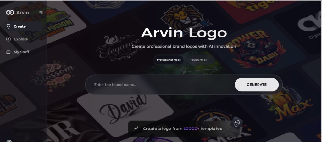
Step 2: Input your brand information and preferences
Input your brand name, slogan, and industry. Specify all your design preferences, which may include font styles or images themes.
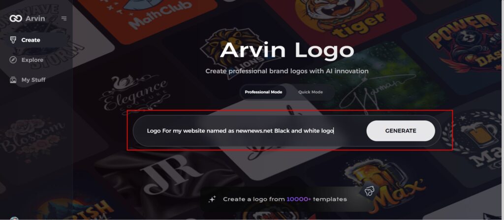
Step 3: Pick your industry:
Now select your industry related to your niche. This will help the AI generate logo styles and types that better suit your preferences.

Step 4: Select Style:
Now select a style which you would like and continue. This will serve as inspiration to create your preferred logo.
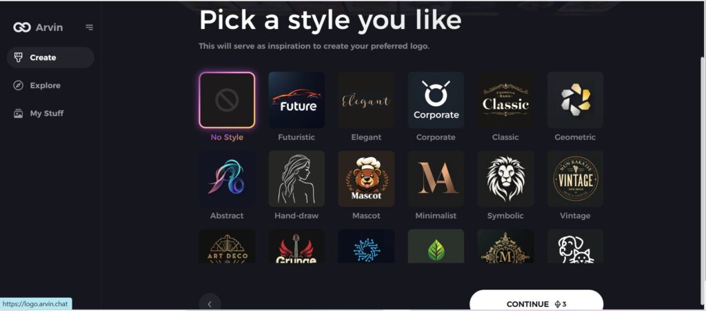
Step 5: Design Personalize through the tools of Arvin AI
After Arvin AI gives create your logo, you can customize those logos with the tools that have elements such as font style, layout, and the positioning of symbols. Experiment on different designs until you like what you see.
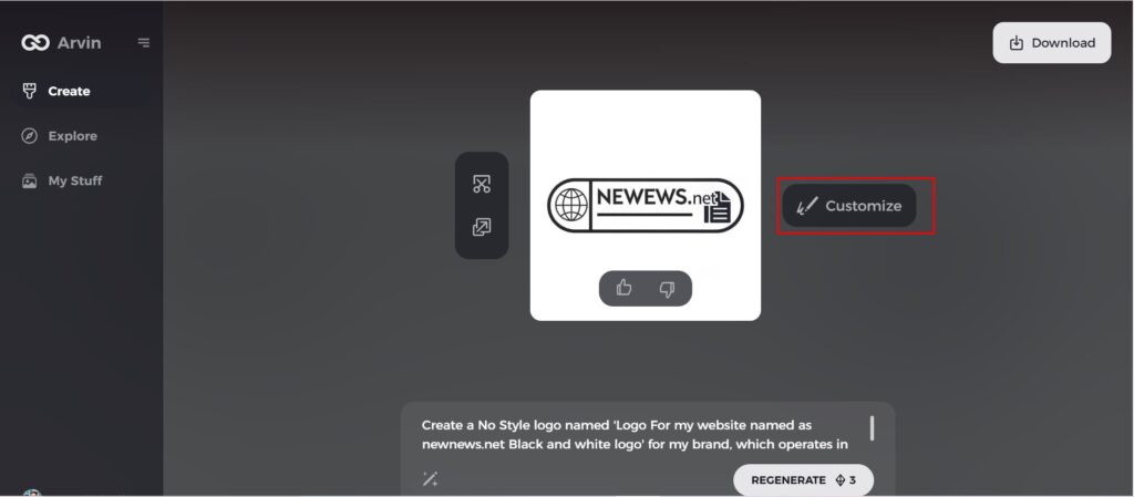
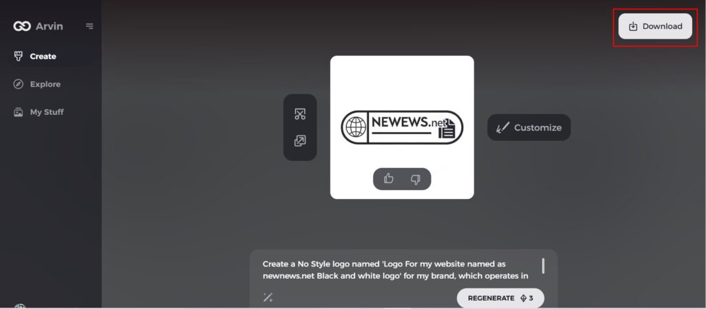
Step 6: Save and download the final logo
Preview the finished logo and save it in a high-resolution format for both print and digital uses.
Conclusion
From its early origin in Japan’s native cultures to its new refined expression, the evolution of Nintendo logo parallels the progress of the company itself. It represents the manner in which a great brand evolves along with time because of growth and success. Business entrepreneurs who are searching to design their own unique iconic brand would possibly need tools such as Arvin AI, which will allow you to design a logo that represents your company’s values and vision. Whether it is creating a new brand or rebranding an old one, Arvin AI will be your answer in making the powerful, lasting logo.
FAQs about Nintendo logo
What does Nintendo stand for?
The red and white colors symbolize confidence, energy, and playfulness, representing the dynamic and innovative nature of the brand.
What is the history behind the Nintendo logo?
From the playing card company to becoming the leading figure in the video game industry, this change depicts the growth and expansion of the company.
How has the Nintendo logo changed over the years?
The Nintendo logo has undergone multiple redesigns with a focus on typography, color schemes, and simplicity in expressing the change of nature about the brand.
Can Arvin AI help create logos for businesses like Nintendo?
Yes, Arvin AI offers AI-powered tools to help create professional logos tailored to a brand’s specific identity and design needs.

