It’s no surprise that it carries the name The New York Giants logo as such a great franchise has a long history, has passionate fans, and an unmistaken logo. The tale of their identity had been tied to several logo redos throughout the years. From the early years featuring dynamic illustrations to the modern, minimalist “ny” monogram, the Giants’ logo has evolved while maintaining its deep-rooted connection to the team’s legacy.
Part 1: The Illustrated Logos (1946–1949): The Early Years
New York Giants iconic logos were graphic ones as the dynamic images had the New York Giants linkage to football and New York. This New York Giants Logo featured a logo of football player in action wearing a red and white uniform and against the oval background that resembled a football. The New York Giants Logo around the perimeter written in a bold, capitalized font. So everyone could see this is the New York Football Giants.
1950-1956
In 1950, the logo also redesigned into a circular shape and the background changed color to red from orange. New York’s skyscrapers given a skyline to represent the city’s supremacy. In this version, there was an introduction of a white uniform with a blue detail, indicating the team started to pay attention to the branding consistency.
1956-1960
The logo was further polished by 1956, featuring a football player launching the ball above an illustration of a stadium. This design featured a muted blue color scheme, a first departure from the bold red and orange logo colors that were used in the previous logos. This marked the last of the illustrated logos before the team shifted towards more modern and minimalist branding.
Part 2: The Shift to Typography: The Birth of the “ny” Monogram (1961–1974)
The 1961 redesign was a radical departure for the New York Giants Logo, and the team shifted away from the complex illustrations of the earlier years. In their place came a bold, lowercase “ny” monogram that would go on to become one of the most recognizable symbols in the NFL. This logo featured a custom, extra-bold typeface with geometric serif logo fonts. The tail of the “y” extended in a curved manner beneath the “n,” adding a unique visual element. The use of lowercase rather than capitalized letters gave the team a more cohesive, humble, yet strong impression, rather than loud and aggressive.
The color palette was reduced to blue and white, which to this day stands as the underpinning foundation of the New York Giants Logo. This transition toward typography-based logos was a symptom of a bigger trend in the sports branding market, as teams moved toward simpler, cleaner designs that are often more versatile and easier to customize.
Part 3: The Experimental Years: The Mid-1970s Logos (1975–1976)
In 1975, the New York Giants Logo tried something different from the standard monogram. The “ny” had a blue border and a white inside, with connected letters. The tail of the “y” no longer was curved, but rather took on the form of two thick parallel lines running under the whole monogram. However, this version did not last long as the team made another significant change in 1976, replacing the monogram with a bold, italicized “GIANTS” wordmark. The letters crammed together. The result created a strong modern look and sense of seriousness: for the first time, it wasn’t particularly New York branding but rather team name branding in and of itself.
Part 4: The Return to Tradition: The Modern “ny” Logo (2000–Present)
In 2000, the start of the new National Football League season, the Giants made the decision to go back to its roots. It brought back the lowercase “ny” logo used in 1961. But gave it a modern twist this time around as it came with a red outline, thus making it crisper and modern. This revised monogram has ever since became the team’s signature logo and has been an enduring and recognizable icon in the NFL. Returning to the “ny” monogram underlined the allegiance of the team to its New York roots. But the clean and minimalist approach to the logo fit right into modern branding methodologies.
Part 5: New York Giants Helmets and Uniforms: A Reflection of Logo Evolution
The New York Giants helmets and uniforms have followed the course of evolution with their logos.
- 1940s and 1950s: they made use of basic blue-colored helmets with a white stripe and player numbers.
- In 1961: the lowercase “ny” emblem appeared on the helmets to denote brand identity.
- In 1975: the color used was darker navy blue along with a white uppercase “NY” emblem.
- 1976–1999: The team donned a big “GIANTS” wordmark on the helmets, akin to its logo.
- 2000-present: Since then, the Giants have donned the lower-case “ny” logo on helmets which flank now a red stripe running through the middle of the helmet and a silver facemask.
It also made the uniforms mainly consistent because the team mainly wore blue home jerseys and white away jerseys along with classic red, blue, and white accentuating the old colour scheme.
Part 6: Use of Arvin AI in logo creation, the game changer for businesses:
A professional and timeless logo is created by balancing creativity, branding knowledge, and technical expertise. AI-powered design tools like Arvin AI make the process simple for businesses, sports teams, and individuals to create stunning logos.
Key Features
Arvin AI uses cutting-edge artificial intelligence to generate logos that are customized, high-quality, and versatile. Key features include:
- AI-powered customization: Generates unique logo designs tailored to specific brand identities.
- User-friendly editing features: Users can easily change the fonts, colors, and layouts.
- High-quality export: Download logos in PNG, SVG, and other professional formats.
- Templates for industries: Suitable for sports teams, businesses, and personal branding.
- Brand consistency: Consistent visual identity across all channels.
For a more memorable and meaningful logo, there’s no tool more important than Arvin AI.
Steps to Use Arvin AI for making Logo
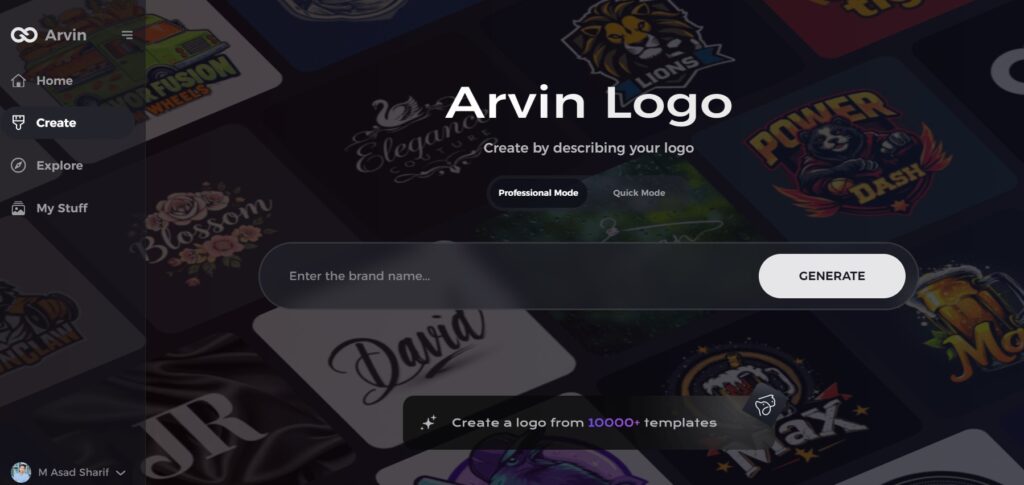
Step 1: Visit the Arvin AI Website
Open your web browser and navigate to the logo design page at logo.arvin.chat to begin crafting your emblem logo.
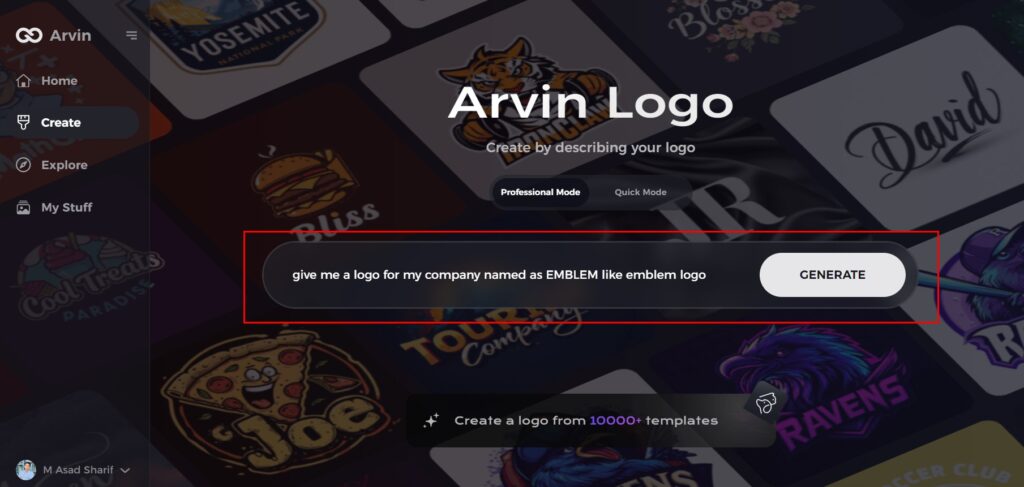
Step 2: Enter Your Business Details
Provide essential information about your business, including your business name and category. This helps the AI tailor designs that align with your specific brand identity.
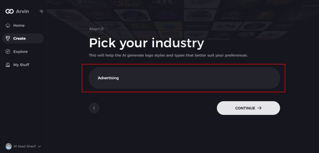
Step 3: Select Your Industry
Choose the industry your business operates in from a list of options. This step ensures that the AI refines the logo styles to match the trends and aesthetics relevant to your field.
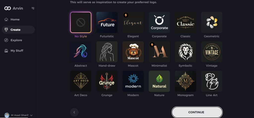
Step 4: Choose Your Design Style
Browse through the available design styles and select the one that best represents your brand’s vision. If you’re unsure, you can skip this step and allow the AI to generate logo ideas based on default inspirations.
Step 5: Review Logo Concepts
The AI will generate a selection of emblem logos based on the details you’ve provided. Take your time to explore the options and select the ones that best reflect your brand image.
Step 6: Customize Your Logo
Fine-tune your chosen logo by adjusting elements. Such as color scheme, font, icons, and layout to perfectly match your brand’s style and tone.
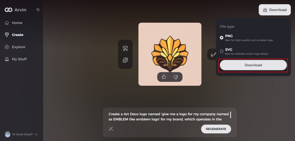
Step 7: Download Your Final Logo
Once you satisfy with your emblem logo, download it in high-quality formats like PNG or SVG. These formats ensure your logo is ready for use across websites, social media, and print materials.
Conclusion
The New York Giants logo has changed through the years, but its identity remains the same. From the early illustrated logos to the modern “ny” monogram, each design represents an era of the team’s history. Unlike some franchises that frequently change their branding, the Giants remain a true institution that has maintained the essence of their tradition. They have committed to excellence by upholding traditions while still presenting one of the most iconic logos in professional sports- simple yet strong and symbolic of heritage. Those inspired by the evolution of the Giants’ brand, Arvin AI offers a free and simple solution to develop an eye-catching logo. Try Arvin AI now and let your imagination flourish!
FAQs About New York Giants Logo
Why did NY Giants change their logo?
One year later, a new logo introduced and the uppercase “NY” logo disappeared. An italicized and underlined GIANTS became the team’s primary logo and took up residence on the sides of the helmet. The abrupt change prompted by the franchise’s move from New York to East Rutherford, New Jersey.
Why is the New York Giants logo lower case?
The lowercase “ny” monogram represents teamwork strength and humility, distinguishing it from aggressive sports logos in capitals.
When was the last time the Giants updated their logo?
The last update was in 2000 when the 1961 “ny” monogram was reintroduced with a detailed red outline.
How can I make a logo similar to the Giants’?
With Arvin AI, you can design a professional, AI-based logo tailored to your brand identity.
