A negative space logo cleverly utilises the “empty” spaces in a logo, and designers can weave deeper meanings, evoke emotions, and tell stories all within a simple visual.
Oscars
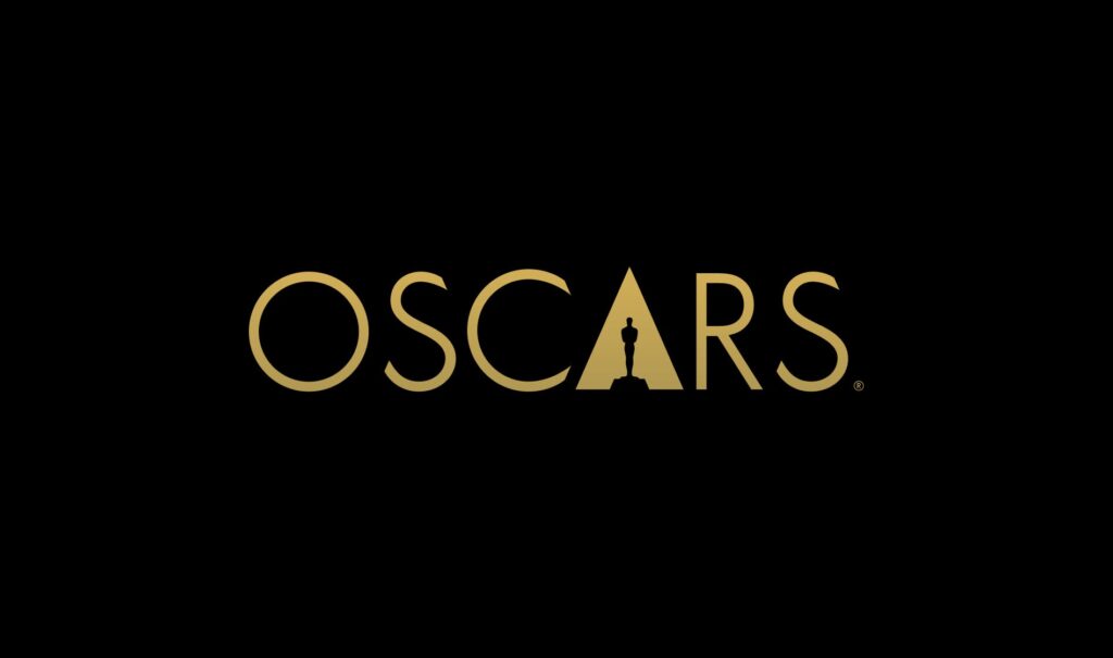
The Oscars logo is a masterclass in the use of negative space to convey meaning and sophistication. Designed by the creative agency 180LA under the direction of British designer Richard Harrington, the logo cleverly integrates the iconic Oscar statuette into a gold triangle. This triangle is not just a design element but a brilliant representation of the letter “A,” symbolizing the Academy.
“For me, it was all about the light that was behind the original logo. So we picked that light up and shone it down on top of the Oscar, and it created an ‘A’ shape.”
This use of negative space transforms what could have been a simple background into a meaningful design element, making the statuette and the triangle inseparable. Negative space is skillfully employed to highlight the statuette as the central figure, while the triangle subtly reinforces the Academy’s identity.
William Gelner, Chief Creative Officer at 180LA, further elaborates on the concept:
“They needed a unifying idea, regardless of whether you’re an archivist in white gloves taking care of treasures in film, or a Steven Spielberg type.”
By leveraging negative space, the logo embodies elegance and meaning, perfectly encapsulating the timeless prestige of the Oscars.
KOI
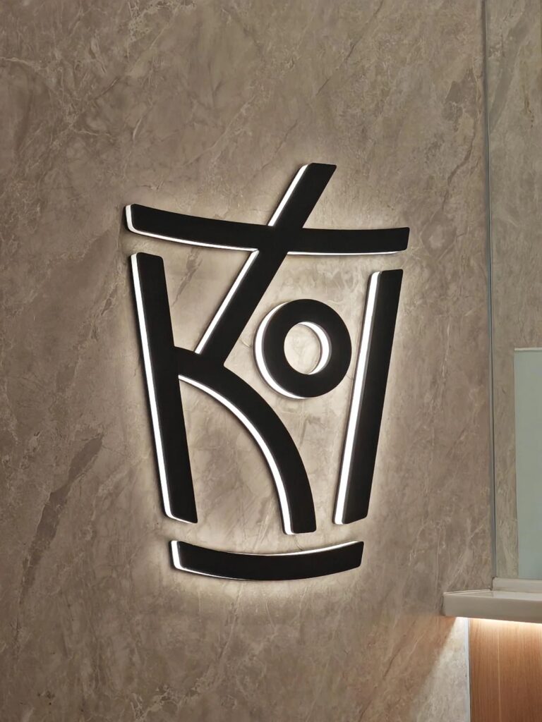
The KOI bubble tea logo is a striking example of how negative space can be used to tell a story while keeping the design simple and impactful. Representing a cup with a straw and a bubble, the logo cleverly integrates elements that instantly evoke the essence of bubble tea.
At first glance, the vertical and diagonal lines come together to form the structure of a cup and straw. Then, the circular element in the center, symbolizing a tapioca pearl, ties the design directly to KOI’s signature product.
Hope for African Children Initiative
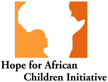
The Hope for African Children Initiative logo features the silhouette of the African continent as its primary element, but what makes it truly remarkable is how the negative space within the design reveals two faces—a larger adult face and a smaller child’s face, symbolizing care, guidance, and hope.
This ingenious use of negative space connects the organization’s mission directly to its visual identity.
The adult’s face, gazing protectively at the child, conveys themes of nurture and support, while the child’s upward gaze suggests trust and aspiration. The juxtaposition of these faces within the continent of Africa reflects the organization’s focus on empowering African children through community and aid.
The use of warm orange hues enhances the emotional resonance of the logo, evoking feelings of hope, vitality, and positivity.
The Bronx Zoo
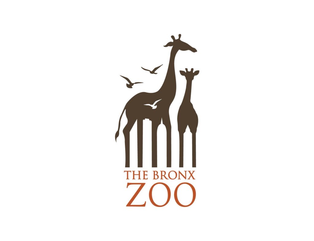
The Bronx Zoo logo is a beautifully crafted emblem brimming with symbolism that perfectly encapsulates the zoo’s unique identity as a natural sanctuary within an urban environment. Designed by Caroline Madigan, the logo is more than just an image of giraffes; it is a visual narrative that connects wildlife and the Bronx community.
At its core, the giraffes represent the majestic wildlife the zoo protects and showcases. Giraffes, often seen as gentle giants, evoke a sense of wonder and admiration, inviting visitors to step into a world of natural beauty. Meanwhile, the adult giraffe and calf symbolize family and the continuity of life, subtly reinforcing the zoo’s role in conservation and education for future generations.
The clever use of negative space adds a layer of depth to the design, transforming what could have been a simple wildlife depiction into a symbol of urban harmony. The spaces between the giraffes’ legs create the silhouette of the Bronx skyline, a visual nod to the zoo’s roots in the heart of New York City. This choice makes a bold statement: the Bronx Zoo isn’t just any zoo—it’s a unique bridge between nature and urban life, a haven where wildlife and city dwellers coexist.
The birds, placed strategically in front of and around the giraffes, add another layer of symbolism. They represent freedom and movement, bridging the gap between the grounded animals and the expansive skyline. The birds also guide the viewer’s eye across the design, gently encouraging them to see the interplay between the giraffes and the cityscape.
Sea of Thieves
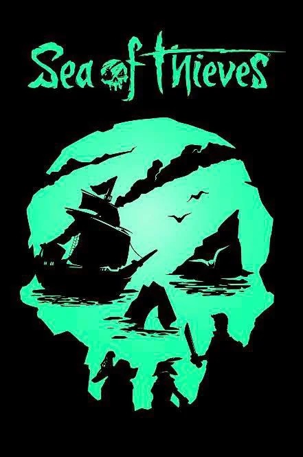
The Sea of Thieves logo is a brilliant example of storytelling through design, seamlessly using negative space to convey the adventurous and mysterious essence of the game. At first glance, the glowing skull shape grabs your attention, immediately evoking themes of piracy, danger, and the thrill of the unknown. Yet, as you take a closer look, the logo unfolds into a series of interconnected elements that weave the game’s narrative into its very structure.
Within the “forehead” and “eyes” of the skull, the silhouette of a ship cutting through the waves takes center stage. This ship symbolizes the player’s vessel, which is more than just transportation—it’s your lifeline, your ally, and your base of operations in the expansive open seas.
At the “jawline” of the skull, silhouettes of pirates wielding swords come into focus, adding depth to the design. This detail reflects the camaraderie and combat that are at the heart of the game, reminding players that survival often depends on teamwork and strategy.
The islands scattered throughout the skull represent the treasure-filled destinations players seek, while the birds soaring above add a dynamic sense of life and movement. These details subtly capture the serene yet adventurous exploration that balances the game’s intense action.
Near the waterline of the design, a shark’s fin emerges ominously, symbolizing the constant lurking threats in the game. Whether it’s a real predator or an enemy ship, the shark reminds players that danger is never far away.
NBC
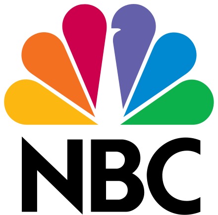
Known as the “peacock logo,” it features six colorful segments radiating outward, symbolizing the diversity of NBC’s programming. Each segment represents one of NBC’s divisions. However, the true genius of the logo lies in its negative space—the white form at the center cleverly outlines the shape of a peacock, a nod to NBC’s slogan when the logo was first introduced: “Proud as a Peacock.”
Kiilto
The Kiilto logo utilizes a subtle yet impactful design feature—a flag cleverly incorporated within the typography. At first glance, the wordmark appears sleek and straightforward, but closer inspection reveals that the dot on the letter “I” doubles as a flag, symbolizing stability and identity. This detail ties back to the company’s Finnish roots, as flags often signify heritage and pride.
Pittsburgh Zoo
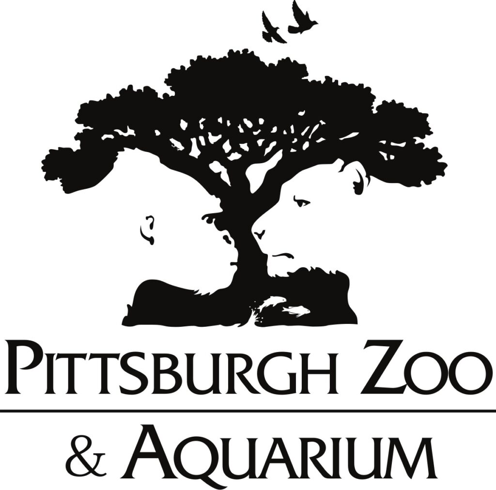
The Pittsburgh Zoo & Aquarium logo is a remarkable example of storytelling through design, using negative space to craft layers of meaning. At its core, the silhouette of a sprawling tree symbolizes life, interconnectedness, and the natural world that the zoo seeks to protect and showcase. Yet, hidden within this tree is a deeper story: the negative space reveals the profiles of two animals—a gorilla on the left and a lion on the right. These animals symbolize the diversity of land-based wildlife and evoke a sense of curiosity and respect for the creatures that call the zoo home.
The base of the design incorporates another layer of symbolism. The negative space subtly forms the outline of a fish, seamlessly representing the aquarium and its aquatic life. Above the tree, the birds in flight add a final touch of freedom and vitality, connecting all elements of nature—land, sea, and sky—into one harmonious visual.
Spartan Golf Club
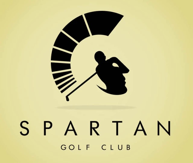
It depicts a golfer in mid-swing, an iconic representation of the sport. However, a closer look reveals that the golfer’s silhouette is strategically placed to form the profile of a Spartan warrior’s helmet.
Negative Space Logo Generator Free
If you’re looking for a free to use, easy negative space logo generator, look no further than Arvin AI’s Logo Maker!
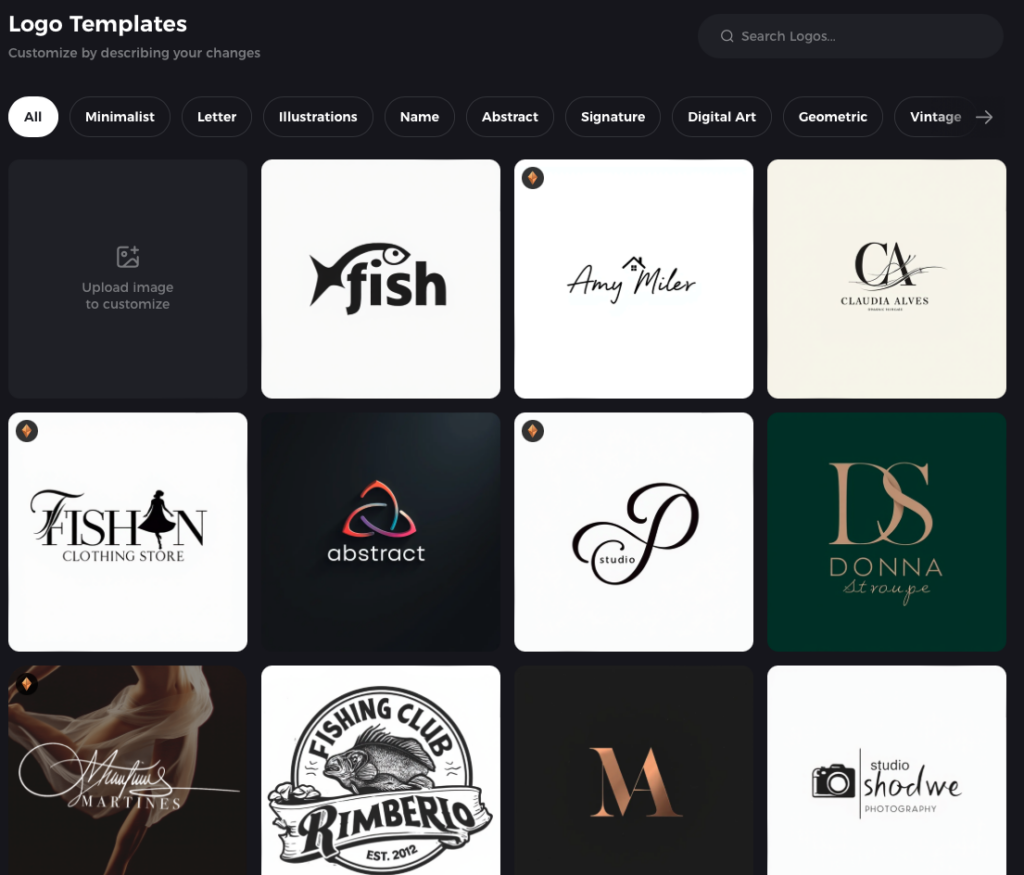
Arvin’s template options allow you to start with a minimalist, geometric, or abstract style—perfect for exploring how shapes and spaces interact. You can tweak these templates to bring out hidden details or clever illusions that align with your brand. Its AI-powered tools help bridge the gap between imagination and execution, making it possible to create a logo that’s both meaningful and visually unforgettable.
Final Words
Negative space logos aren’t just design elements—they’re storytellers, brand builders, and conversation starters.
With tools like Arvin AI’s Negative Space Logo Generator, creating a logo that embodies your brand’s values and narrative has never been easier. Whether you want to highlight creativity, sophistication, or depth, Arvin equips you with the resources to bring your vision to life—no design experience required.
FAQ
Negative space symbolizes creativity, balance, and depth in design. It demonstrates the thoughtful use of the “empty” areas around or within a design to create meaning, emphasize elements, or reveal hidden imagery. It often represents cleverness and duality, showcasing a deeper story or message within the logo.
The blank space around a logo, also known as “white space” or “clear space,” is the area intentionally left empty to ensure the logo is visually distinct and not overcrowded by other design elements. It provides breathing room, improving clarity and ensuring the logo’s impact and legibility.
A negative version of a logo is a design variation that uses inverted colors or contrasts, often displayed in black and white. The negative version ensures the logo maintains its integrity and visibility against dark or light backgrounds, making it versatile for various uses, such as printing, digital media, or promotional materials.


