The Gatorade logo is globally recognized as a symbol of energy, hydration, and peak athletic performance. Since its launch in 1965 and subsequent acquisition by PepsiCo. The line of flavored electrolyte beverages has established a strong presence worldwide. An integral part of these branding tools is the lightning bolt that reflects speed, power, and endurance, manifesting the core values of the brand. Over the years, the logo has transformed to adapt with modern design trends. But continues to deliver its hallmark visual appeal, particularly within sports marketing.
Part 2: Gatorade Logo and its History
In 1965, Gatorade’s logo was born and it has evolved quite a lot since then. The simplification of colors, and the growing assets of the brand’s lineup — like energy, hydration, and athletic performance are all something you would associate with the brand, and this evolution helped propel them towards becoming a leader on the competitive sports drink market.
1965 – 1970
Introduced in 1965, Gatorade’s original logo was simple, black-and-white, text-based. It had a grave appearance, the layers of text bracketed together to create a quite different kind of structured page. The bottom portion of the label read “Gatorade” in bold, capitalized letters, with additional elements such as “Stokely Van Camp’s Finest” above it. This design resembled a corporate badge more than a consumer-friendly logo, hinting at its past life as a medical hydration formula.
1970 – 1986
In 1970 Gatorade underwent a heavy rebranding, complete with its now-famous orange lightning bolt. This symbol stood for energy and hydration, and matched the purpose of the drink. It also included a strong green wordmark etched with a black outline and placed within a barely visible orange rectangular frame. Below it, the phrase “Thirst Quencher” appeared in blue. Acquired the previously popular Gatorade graphics made this logo unique, and people started recognizing it from sports and athletic works.
1986 – 1991
The Gatorade logo was modified in 1986. When the wordmark became bold and dynamic, and there were no more lines under and over it. The black outline on the letters was replaced with blue, the same color as the tagline. And the lightning bolt was also slightly refined in shape: now shorter than before but more prominent. The improved logo assists Gatorade in solidifying its brand identity and making it more aesthetically pleasing and memorable in sports advertising.
1991 – 1994
In 1991 Gatorade introduced a fresher, more energetic and modern logos with the wordmark angled diagonally giving a sense of movement and speed It was intended to give the logo a more dynamic and powerful feel, since the brand’s identity is very much associated with sports and performance athletes. The color scheme has been adjusted to make it easier to see. The new label reflected Gatorade’s rising popularity and setting it as an internationally known sports drink brand.
1994 — 1998
In 1994, Gatorade dropped their logo color palette to just the two hues of green and orange for a cleaner appearance. This is the gradient shading we added in the lightning bolt, giving it some depth and a more 3D-ish feel to it. This update was meant to make the Gatorade logo more attractive and modern branding-oriented. This also allowed the brand to establish itself as a leading player in the global sports drink market, becoming instantly identifiable by athletes and consumers everywhere.
1998 – 2004
The redesign in 1998 was a departure focusing on a sleek and modern feel. The green elements were eliminated, with the wordmark in bold black but the lightning bolt sustained in orange. This minimal design increased the brand’s recognizability, and provided a simpler logo that could be used effectively in both digital and print situations. As a whole, the design was minimalist, while maintaining a strong presence of Gatorade’s branding in a time where clean and polished logos were trending in corporate identity and advertising.
2004 – 2009
In 2004, Gatorade removed the rectangular frame altogether, though its logo had already been made bolder and more impactful. That enabled the wordmark the lightning bolt to stand alone, thus yield a much cleaner design. The color gradient of red was applied along the flowing lines of the lightning bolt to get more depth and power feeling. The updates ensured that Gatorade remained dedicated to athletic greatness, ensuring the logo truly became a symbol of energy and hydration for the athlete of all levels.
2009 – Present
In 2009 Gatorade launched an entirely different take on a logo system by using an oversized uppercase “G” instead of its full wordmark. However, the lightning bolt remained, which still kept the iconic energy symbolism within the letter itself. This design re-branding moved towards being minimalistic logo, which made the brand look very modern and powerful. A simple gray letter “G” paired with a yellow and red lightning bolt made for an instantly recognizable logo that positioned Gatorade to become one of the top-selling sports drink brands in the world.
Part 3: The Symbolism of the Gatorade Logo
The Gatorade logo is an iconic mashup of energy, strength and endurance. Like a bolt of lightning, it represents speed and rapid hydration, this iconry is perfect for a sports drink brand. Introduced in 2009, the bold “G” with its powerful, simple approach echoes the brand’s dominance in the sports beverage landscape. The Gatorade logo is a combination of dynamic elements with a clean, modern look, effectively representing its dedication to energizing athletes and enhancing performance, as well as making the brand easily recognizable.
Part 4: Font and Typography used in Gatorade Logo
The typography of the Gatorade logo has evolved over the years, incorporating a combination of custom serif and sans-serif fonts that embody a powerful, athletic look. The previous variants use bold, blocky text that emphasize full strength and reliability. Whereas the new “G” logo uses a fitting modern sans-serif font set that enables simplicity and clarity. In comparison to competitors such as Powerade and BodyArmor, Gatorade’s typography is detached. Because it conveys a slightly more elegant visual aesthetic that complements the image of the leader in sports hydration.
Part 5: The colors of the Gatorade logo
The color palette used in the branding of Gatorade is a vital aspect of its identity and recognition. The colors — orange, black, and white — represent energy, power, and purity. The orange thunderbolt denotes explosive energy and rapid hydration, and the black and white elements offer contrast — a bold, professional aspect. Throughout the decades, the colors have changed yet that bright orange tone has remained the one constant. This intentional color palette reinforces brand recall, and when combined with the bold Gatorade logo, ensures that the brand interpretation stands out across all marketing platforms.
Part 6: The Reason for Gatorade’s Logo Change
The third point associated with the logo of Gatorade logo is for the evolution of Gatorade logo. In the evolving landscape where minimal branding became the norm amongst consumers, the organization modified its logo design to keep it fresh and relevant. The 2009 redesign that introduced the round, bold “G” with the lightning bolt was instrumental in repositioning Gatorade as a modern, premium brand. Marketing trends also impacted the logos as cleaner, simplified logos became the name of the game. The shift solidified Gatorade’s reputation as an advanced sports drink for elite athletes.
Part 7: The Gatorade Logo in Marketing and Advertisement
The Gatorade logo is the pivotal part of advertising and branding. You’ll find it on product packaging, TV commercials, and digital ads, giving immediate recognition of the brand. Gatorade’s partnerships with top teams, athletes, and events help establish the brand. From partnerships in the NBA and NFL to endorsements at the Olympics, the lightning bolt has taken over as the universal symbol of sports performance and hydration. The naming system was crucial to Gatorade’s international success and goliath status in the sports drink sector.
Part 08: Design A Professional Energy Drink Logo
If you want to design a professional sports logo such as Gatorade, Arvin AI is the ideal solution. This AI-based logo creator makes the design process easy, enabling brands to design unique, high-quality logos within minutes. From a dynamic sports symbol to a sleek minimalist logo, Arvin AI offers the ideal solution for sports brands, fitness businesses, and athletic organizations.
Key Features Of Arvin Ai
- Intelligent Personalization: Logos customized around your brand values, etc.
- Advanced Color Selection: Predicts best color palettes to create a visual impact.
- Typography Suggestions: Suggests bold and legible fonts for your brand.
- Provides instant variations: These are logo mockups that can easily adjust for comparisons.
- High-Resolution Exports: Ensures professional quality logos to use for web and print.
Steps to Use Arvin AI for making Logo
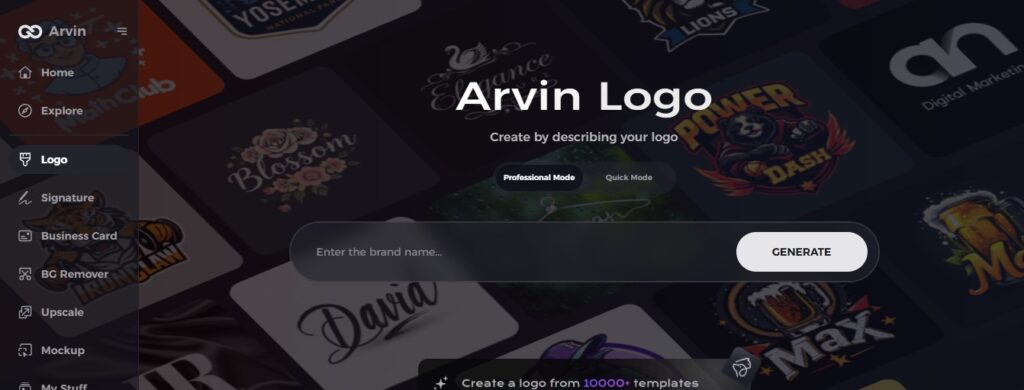
Step 1: Create an account and log in on Arvin AI
Visit the website of Arvin logo maker, open an account, and log in for the logo design feature.
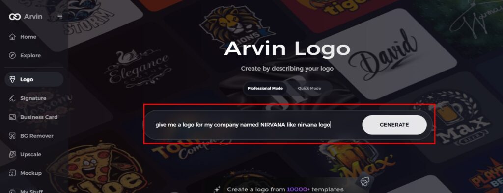
Step 2: Input your brand information and preferences
Input your brand name, slogan, and industry. Specify all your design preferences, which may include font styles or images themes.
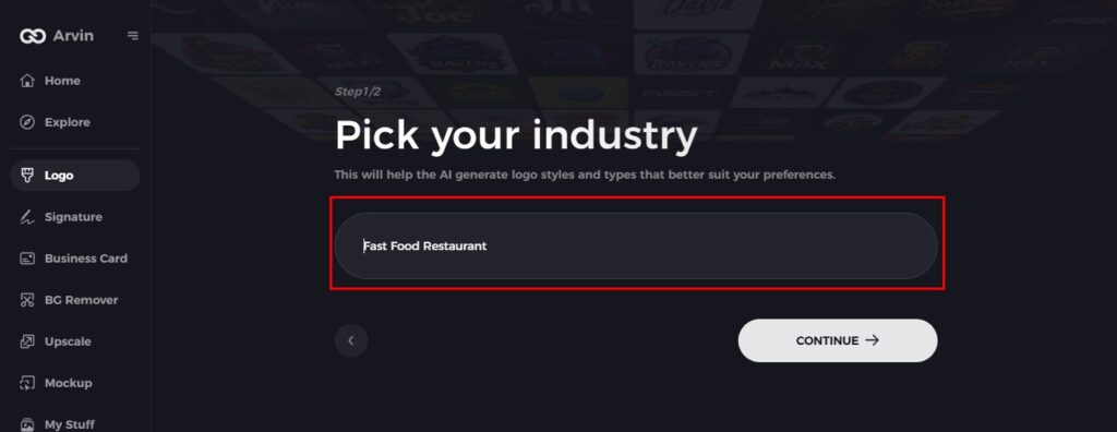
Step 3: Pick your industry
Now select your industry related to your niche. This will help the AI generate logo styles and types that better suit your preferences.
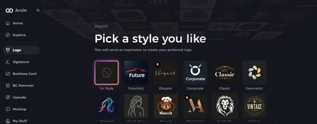
Step 4: Select Style
Now select a style which you would like and continue. This will serve as inspiration to create your preferred logo.
Step 5: Design Personalize through the tools of Arvin AI
After Arvin AI gives create your logo, you can customize those logos with the tools that have elements such as font style, layout, and the positioning of symbols. Experiment on different designs until you like what you see.
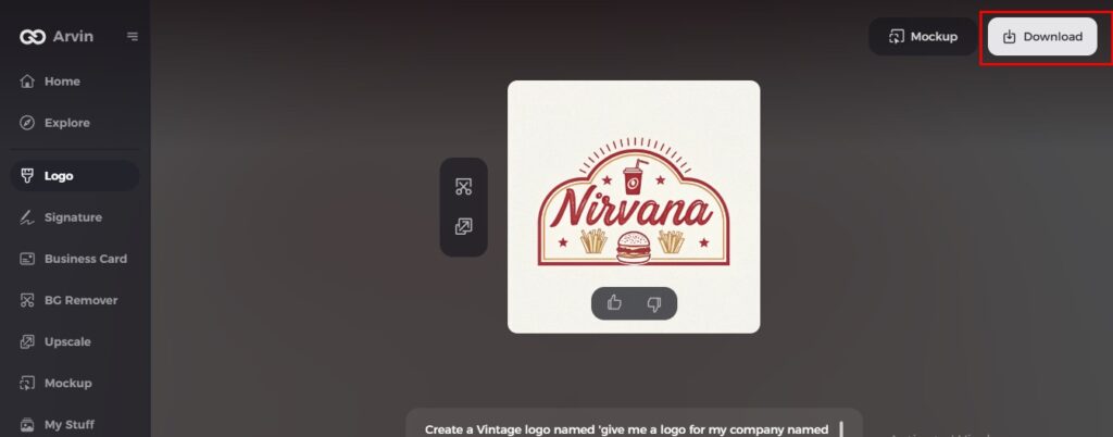
Step 6: Save and download the final logo
Preview the finished logo and save it in a high-resolution format for both print and digital uses.
Conclusion
Gatorade logo changed several times, each time adapting its symbols, typography, and colors to align with mission of the brand. From early text-based images to the modern, bold “G” with an energizing lightning bolt, the logo has always conveyed energy, strength, and performance. Arvin AI is probably the best tool in this line of tools if you want to create a professional and impactful logo that will help you build a solid brand identity. Use Arvin AI now to design a sports logo that breaks the mold in an oversaturated market.
FAQs About the Gatorade Logo
What does the Gatorade logo mean?
The Gatorade logo represents energy, power, and hydration, with the lightning bolt signifying an immediate energy boost.
When did Gatorade change its logo to the current design?
Gatorade introduced the bold “G” logo with the lightning bolt in 2009 as part of a major brand update.
Why did Gatorade simplify its logo?
The simplification assisted in updating the brand without sacrificing the lightning bolt as a form of recognition.
Can I create a similar sports logo using AI?
Yes! With Arvin AI, you can design a professional sports logo tailored to your brand’s needs.
