Mozilla is a well-known brand in the tech world and is known for its commitment to an open and accessible internet. As a company, Mozilla has greatly contributed to web technology advancement. A logo is vital to the display of a brand’s identity and values. Mozilla is no different, it is the visualization of the mission and spirit behind the brand. It’s about the development of the Mozilla logo over time. Analysis of these design elements has been enabled by the world associated with it.
Part 2: Mozilla Logo Meaning and History
The Mozilla logo encompasses the heart of the brand- openness, innovation, and community. It has evolved with time, based on the company’s milestones and technological advancement. Every version talks about Mozilla’s story and how it has grown from being an innovative pioneer of open web technologies to its agenda for inclusiveness and creativity at the moment. This design reflects Mozilla’s growth and keeping up with the rapidly evolving tech landscape.
Part 3: The Evolution of the Mozilla Logo
The Mozilla Firefox logo evolution is much more than a stylized fox circling a globe. The browser’s story comes in the form of colorful community growth and the mission to provide people with a web to control. Transforming the logo over the years, it represented a new milestone in its evolution.
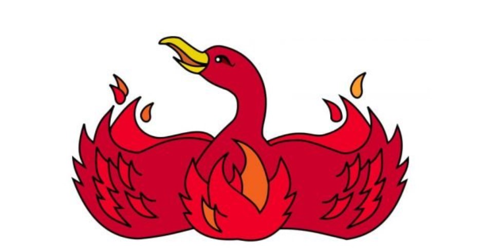
2002–2004: The Beginning
The Mozilla logo traces its origins back to 2002, when the browser was still called Phoenix. Due to trademark issues, the name had to be changed to Firebird and then to Firefox, so the logo we know today was born. The first logo featured a phoenix, representing rebirth and tenacity—a metaphor for the browser’s desire to change the face of the web.
2004–2005: The Fox
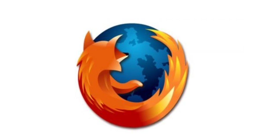
It was the time when the mythical phoenix was being succeeded by the symbol of the iconic fox. A fast, fire fox surrounded a globe representing speed, accuracy, and universal access. The globe symbolized the worldwide web, emphasizing that Firefox was interested to provide open, user-friendly browsing for everybody in the world.
2005–2009: Refining the Vision
There was the redefinition of the Mozilla Logo, not drastically but so as to have that more professional appearance. It refined the rendition of the fox; it gave its colors greater brilliance and life-likeness. These revisions pointed to how Mozilla Firefox is establishing itself in reputation as one dependable browser amid this digital scene shift.
2009–2013: The Enhancement
The gradient used was subtler, and the designs were more detailed. The changes were minimal, but they tried to keep the emblem fresh and reflective of the continuous development of the browser. The fox and globe icon remained prominent, representing the brand’s commitment to its mission.
2013–2017: Minimalism
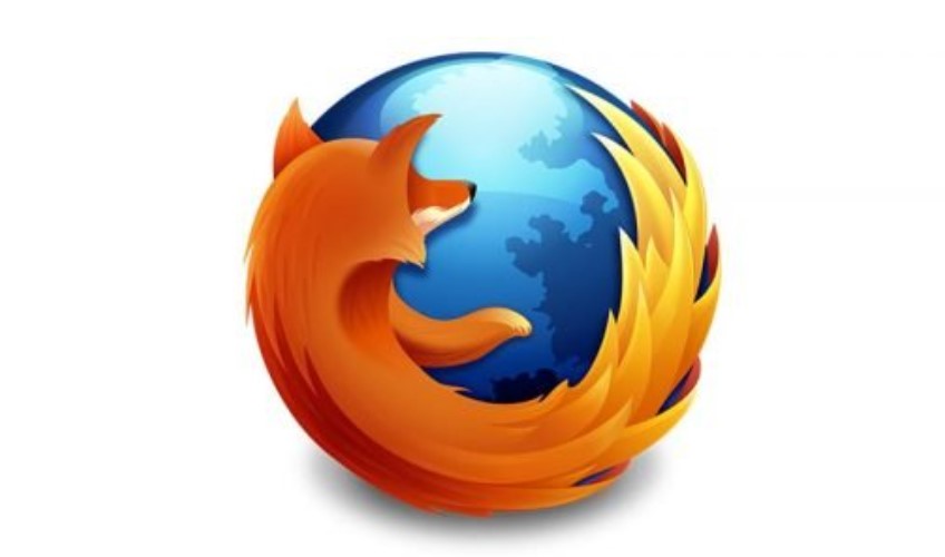
The Mozilla logo was made simpler as the design trend was towards clean, flat aesthetics. Details were cut down, and the colors were made more vibrant, which resonated with modern sensibilities. This update reflected Firefox’s changing features and commitment to being ahead in the competitive digital environment.
2017–2019: A Smoother Look
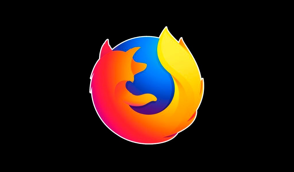
The period continued to see the flat design of the logo but refined further. The fox became even more abstract, and a new color palette showed the brand’s intent on staying fresh with the changing times in the rapidly evolving digital landscape.
2019–Present: A Modern Icon
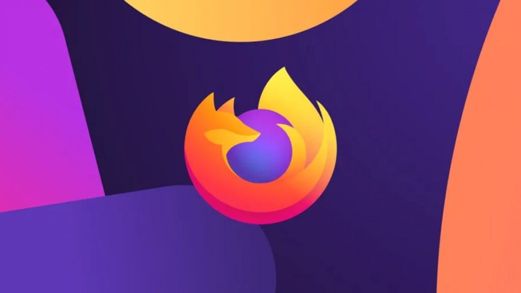
It’s most recently updated regarding simplicity and abstraction. The tail of the fox was transformed into a fluid dynamic line encircling a gradient globe. Such a minimalist approach which is quicker, more modern browsing experience yet retains the soul of the original design. Today, Mozilla Firefox is still a symbol of reliability, innovation, and global community that continuously promotes its further development.
Part 4: Key Design Elements of the Mozilla Logo
The Mozilla logo reflects an excellent form of integration between form and function. Every feature reflects the brand, from the typeface to the color scheme, all detailing the creation of a modern, memorable, meaningful visual identity. Knowing these kinds of details can help us understand how Mozilla’s logo effectively communicates the brand’s values and vision.
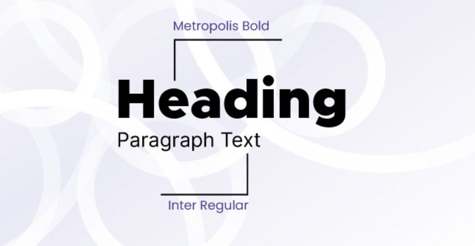
Font
The typeface of the Mozilla logo is modern and geometric, simple and clear. The choice of logo fonts is also a reflection of Mozilla’s forward-thinking and innovative nature, which ensures that the logo will be legible and impactful in all mediums.
Color Scheme
Color gradients show creativity, energy, and diversity in the color scheme. The bold application of logo color will really give an impression of seeing a dynamism view of the logo while at the same time being extremely eye-catching and memorable. These colors represent the open and inclusive nature of the internet as envisaged by Mozilla.
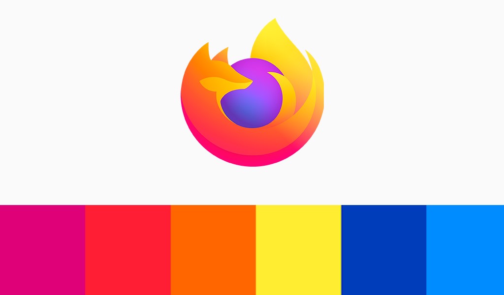
Color Codes for Mozilla Logo
| Color Name | Hex Color | RGB | CMYK | Pantone |
| Electric Purple | #B53AE3 | 181, 58, 227 | 20, 74, 0, 11 | PMS Purple C |
| Medium Slate Blue | #6A62E7 | 106, 98, 231 | 54, 58, 0, 9 | PMS 2665 C |
| Royal Purple | #5939AF | 89, 57, 175 | 49, 67, 0, 31 | PMS 266 C |
| Corn | #FFED4A | 255, 237, 74 | 0, 7, 71, 0 | PMS 107 C |
| Selective Yellow | #FFBA25 | 255, 186, 37 | 0, 27, 85, 0 | PMS 1235 C |
| Dark Orange | #FF8717 | 255, 135, 23 | 0, 47, 91, 0 | PMS Bright Red C |
| Dogwood Rose | #E10E68 | 225, 14, 104 | 0, 94, 54, 12 | PMS 1925 C |
Symbolism
This \”://\” identifies the web URL structure and represents Mozilla’s connection to the internet. It makes the brand a force in defining the digital landscape and its allegiance toward innovation and accessibility.
Part 5: Arvin AI: Design Professional Logo with AI
A brand needs a powerful visual identity, Arvin AI is an advanced tool that lets businesses and designers create logos which are more reflective of the true spirit of a brand. Arvin AI is a powerful tool for analyzing designs and logo to come up with creative ideas. It helps users in the area of design, trend and resource use for logo that identifies brand’s identity and values. From reviewing existing designs to providing inspirational creativity, this tool makes sure that each logo is impactful and timeless.
Key Features of Arvin AI
- Logo Design Analysis: This feature analyzes existing logos to give detailed points of strength and areas for improvement.
- Custom Suggestions: It offers particular design suggestions based on brand values and objectives.
- Color Palette Suggestions: It gives color palettes that will make the brand stronger and more visible.
- Typography Know-how: It suggests typefaces that define the tone and intent of the brand.
- Trend Updates: It also keeps users updated with the latest design trends to keep in pace with the trends.
- User-Friendly Interface: It simplifies the design task using self-explaining tools and features.
Steps to Use Arvin AI for making Logo
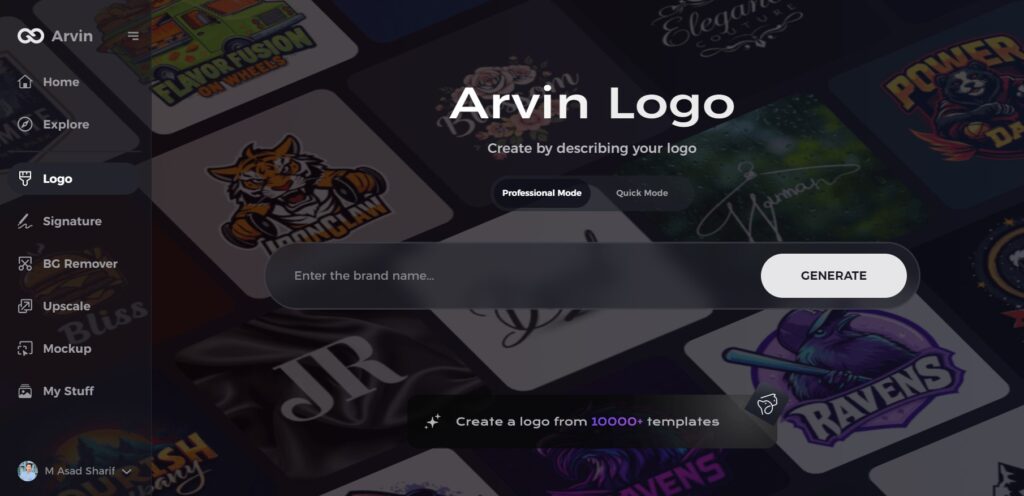
Step 1: Visit the Arvin AI Website
Open your web browser and navigate to the design page at Arvin AI to begin your logo creation journey.
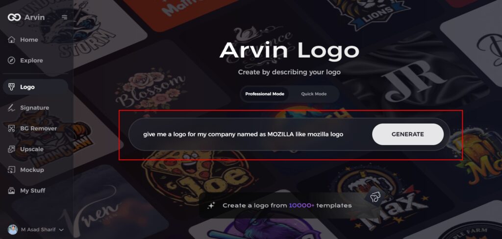
Step 2: Enter Your Business Information
Provide essential details like your business name and category. This ensures the AI generates logos tailored to your brand identity.
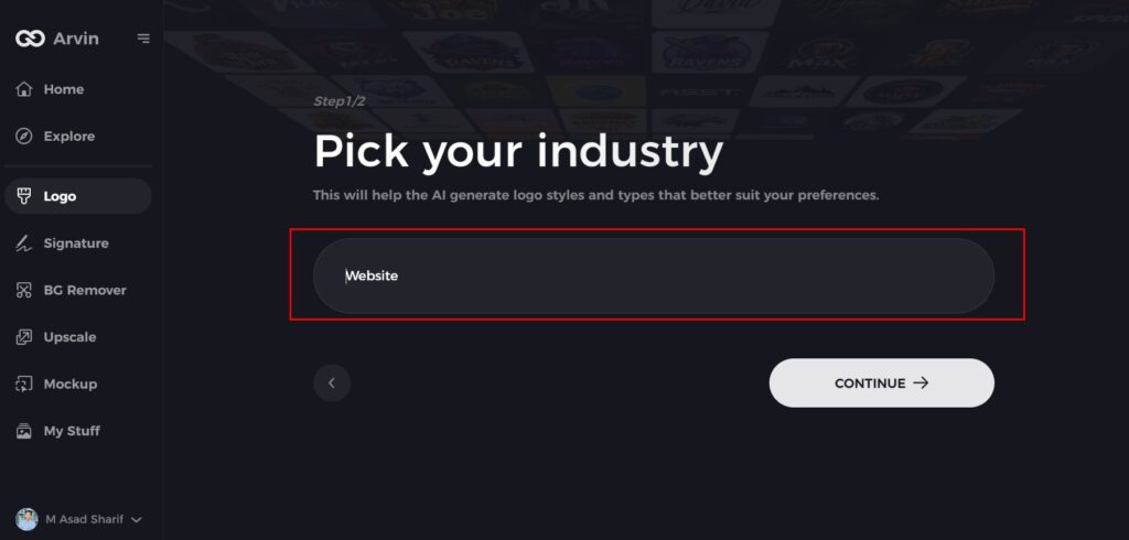
Step 3: Choose Your Industry
Select your industry from the available options. This helps the AI refine logo styles to match your sector’s specific needs.
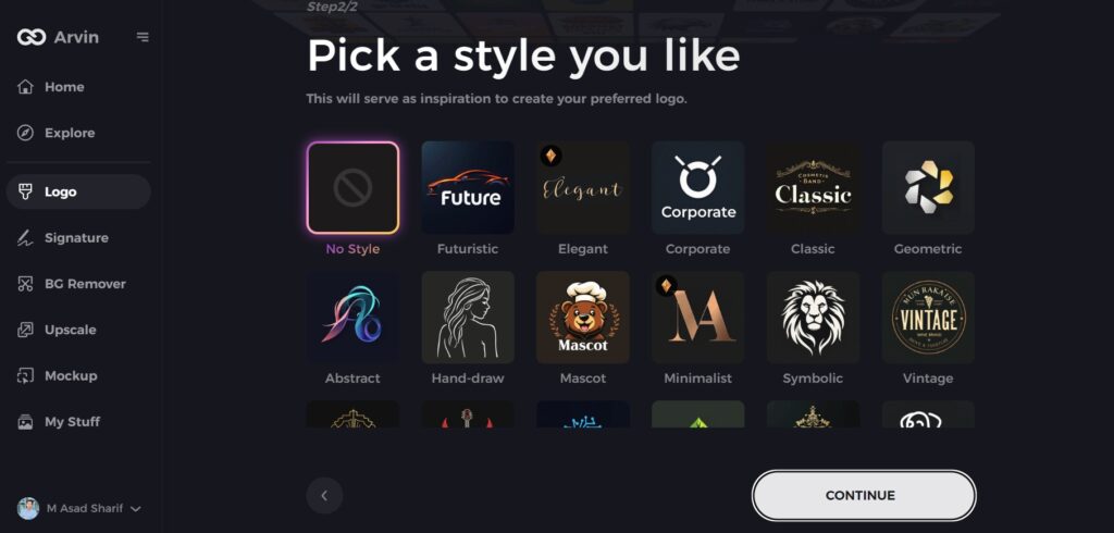
Step 4: Select a Design Style
Explore the list of design styles and pick one that resonates with your brand’s personality. You can skip this step if unsure, and the AI will use its default inspiration.
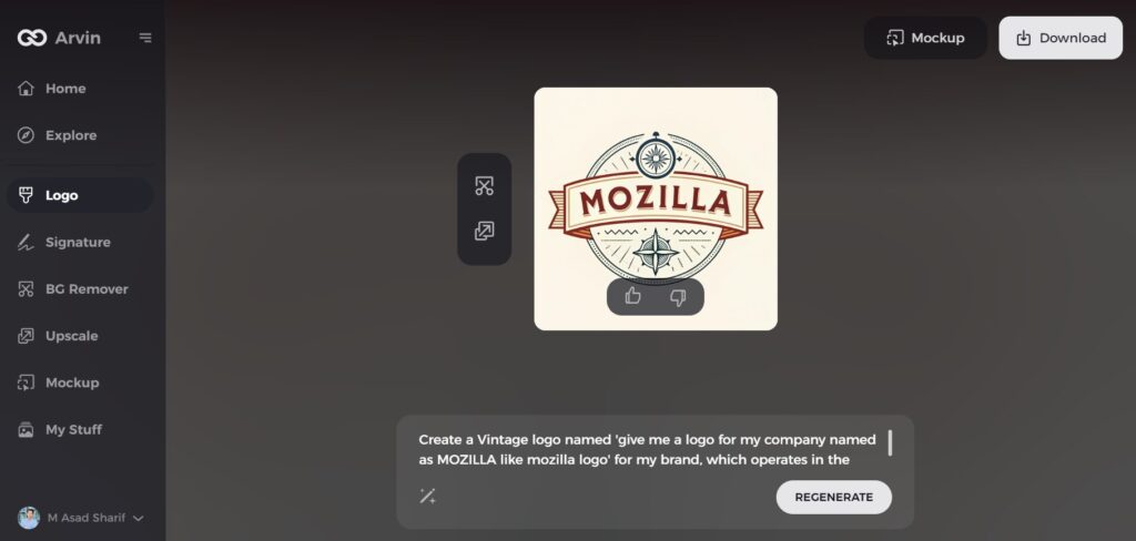
Step 5: Review Logo Ideas
Arvin AI will generate a variety of logo concepts based on your inputs. Browse through the designs and shortlist those that align with your brand image.
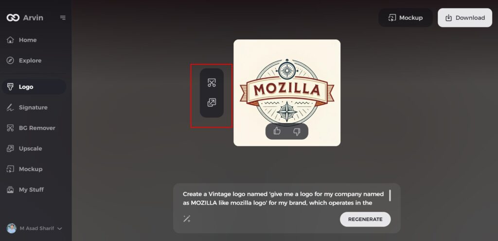
Step 6: Customize Your Logo
Make adjustments to your selected design by modifying elements like colors, fonts, icons, or layouts to match your brand vision perfectly.
Step 7: Download Your Final Logo
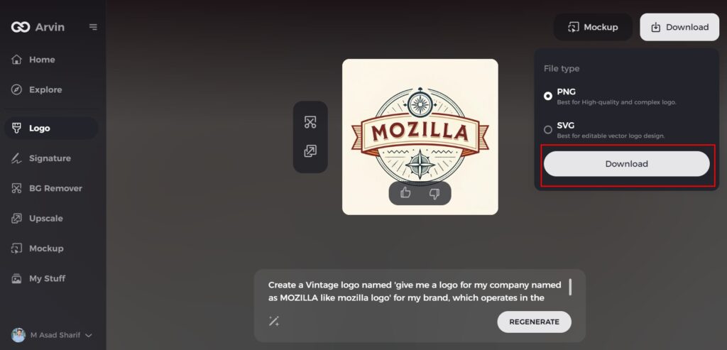
Once your design is ready, download it in formats like PNG or SVG. These versatile formats are ideal for websites, social media, and print use.
Conclusion
The whole history of Mozilla logos tells more about the life cycle of that brand in technology. The modern design logos can seen on today’s streets by playing with dinosaurs. Every aspect of the different logos represented Mozilla’s values and dreams. This current logo represents the promise of innovation, completeness, and a better web for everyone. Successful branding is critical for a company’s success, and tools such as Arvin AI can create designs that never get old. Start creating your timeless designs with Arvin AI today and take your brand to the next level!
FAQs
What is the meaning behind the Mozilla logo?
It explains innovation, open source, and Mozilla’s vision of an internet that really is for everybody.
What is the animal in the Mozilla Firefox logo?
Unfortunately, people thought that the animal on the Mozilla Firefox logo was a fox. This “firefox” is actually a red panda which is a protected species in Asia. A mistake when translating red panda from Chinese to English is how we got firefox.
Who designed the latest Mozilla logo?
That is a collaboration coming from Mozilla with their house design team partnered with an independent branding agency- Johnson Banks.
What inspired the current geometric logo?
The logo itself is a derivative of new typography and the connective nature of the web: Mozilla’s position is inclusive as well.
