Monster Logo is a logo of Monster Energy, which is an energy drink brand. The logo exemplifies the aggressive and adventurous character of the brand. Strong branding is just as important in any other industry; it helps consumers recognize your brand and stay loyal to you. Even if the logo has been transformed into a can full of energy drink, Monster Energy has gracefully managed to use this tactic, becoming one of the most recognized companies in energy drink market Monster has established a strong brand identity. Dive into the history, imagery, and influence of this energy drink.
Part 1: Monster Logo in Global Markets
Far from a purely American draw, the Monster Logo has sustained international appeal thanks to Monster Energy’s global marketing efforts. The company is active in extreme sports, music festivals and gaming culture — the brand’s logo can be seen on many fronts. No matter if it’s on your sports gear, racing cars or merchandise, the Monster Logo is a true icon of energy and excitement. Its ubiquitous presence has aided Monster Energy in retaining a strong footprint on the world stage.
Monster Logo Creates a Unique Brand Identity
In a crowded market, it’s important to have a unique brand identity, and having the Monster Logo helps with that. Most energy drink brands went with a traditional typography combined with a minimalistic logo design — but not Monster Energy. The spiny, claw-seamed “M” lends the brand an aggressive, rebellious nature. Monster Energy has been able to create a strong brand presence and customer loyalty by sticking to a consistent logo design over the years.
Monster Logo: Energy Drink Comparative Analysis
When looking at Monster Energy’s logo it is clear that they have created a very aggressive and raw design language compared to other energy drink brands such as Red Bull and Rockstar. In contrast with Red Bull’s polished, minimalist logo, Monster’s claw-mark “M” gives it a rough-and-tumble, rebellious vibe. Rockstar, by contrast, employs bold typography and a star emblem, just missing the edgy appeal of Monster’s design. That uniqueness allowed Monster to stake its own claim, luring in a demographic that craves adrenaline, excitement and being one-of-a-kind.
Part 2: The History of the Monsters logo
The story behind Monster’s logo is almost as interesting as the brand itself. Logo has never changed much, from the time of its initial design to present day. Because is this design bold and aggressive, and by exploring its origins and evolution one might see exactly for what reason has Monster Energy stuck with this identity.
Who Created the Monster Logo?
The Monster Logo designed by McLean Design, a Californian branding agency focused on packaging and visual identity. The designers wanted to create a logo that represented energy, strength, excitement and that was also striking to the consumer. The end result an icon that was a distinctive and powerful mark that resonated with Monster Energy’s brand personality. It has a high-resolution monster logo that stands out and helps the brand get noticed in the highly contested enterprise.
The design philosophy behind the Monster Logo
The design philosophy behind the Monster Logo is based on raw power, aggression, and adrenaline. The clawed “M” represents the untamed energy associated with extreme sports and high-performance lifestyles. The color is neon green, which selected for its high-visibility and life, as it pops against dark colors. Every single visual decision has been designed to satisfy the fantasy of a corporate entity. The Monster Energy target audience includes athletes, gamers, and consumers who have just come under the scrutiny of the spotlight and are looking for an edgy, electrifying brand.
Monster Logo has changed over time
While several companies choose to change their logos at the drop of a hat to stay up with new trends, Monster Energy has not altered its original logo since 2002. The monolithic selection has most likely contributed to brand consciousness. Some businesses prefer changes in an effort to stay up with consumer preferences and their creative circus. While this kind of flexibility is necessary for all operations and advertising campaigns, it also underlines the value of a solid design that should preferably be followed consistently for future logo design.
Part 3: Meaning and Symbolism Behind the Monster Logo
A logo is not just a design; it is a story. Wear that claw-shaped “M” logo and amazing color scheme of Monster for a popping image. Knowledge of the deeper symbolism and psychological effects of this design will help clarify why it resonates so strongly with consumers.
The Claw Marks on the “M”
However, the most prominent element of the Monster Logo is the claw-marked “M.” It appears as if some monster has slashed through the “M” and left its marks. This element is particularly symbolic, as claw marks evoke a sense of aggressiveness and primal strength. This element, therefore, sends a powerful message. The Claw marks tell the consumer that the monster is their energy drink and that people who drink Monster do not compromise on the adventure and energetic lifestyle they desire.
The Image of Monster Energy
A logo is meant to accurately reflect what its brand represents, and the Monster Logo does this perfectly. The vibrant, combative design was probably intended to attract extreme sports enthusiasts and gamers, who are among the more common consumer base of high-caffinated energy drinks. The furious, defiant claw marks on the “M” were probably meant to tell the consumer that the Logo was not just a Log; it represented a company willing to do whatever it takes to give them an energetic lifestyle. Therefore, the logo represents more than just a company.
The Emotional Aspect of the Monster Logo
As earlier mentioned, Logos genuinely develops an emotional aspect to the brand and its industry or product. Because consumers link the Monster logo to high-energy active experiences but because the colors used in the logo and typography used are bright and draw attention, it becomes less of a logo and more of a new cool representation of their lifestyle. This emotional link with consumers is important because when people drink Monster, they want to feel the energetic buzz that the logo portrays.
Part 4: Monster Logo Elements
Every good logo consists of its individual components carefully chosen, and the Monster logo is no exception to this rule. From the electrifying neon green colour to the aggressive typography — every aspect is connected making it iconic logo. The analysis of these components makes the influence they have on brand awareness apparent.
The Impact of Neon Green in the Monster Logo
One of the main colors of Monster Logo is neon green, and this has been selected as it creates a great psychological impact. Its vibrancy and association with energy, excitement and vitality suits an energy drinks brand perfectly. LED neon lights are excellent attention grabbers, essential in a competitive retail landscape. Made up of a neon green and black color combination, the logo pops at first glance, on a can, billboard, or promotional merchandise.
Black and White in the Logo’s Design
Black and white used in The Monster Logo adds to its bold look as well. The Black is a symbol of power, mystery, and sophistication that will also contrast the brand´s high-energy. In typography, white is used, which stands out sharply against the dark background. What if you can be a detective of a design used for an energy drink aka Monster that you think is a copy of haute couture but when you look deeper it was the contest of colors and style and being so simple yet powerful that led to the creation of this beautiful logo.
This Monster logo has unique typography
The Monster Logo Font As a key aspect to the brand, typography is a powerful element in the branding process. The broken, claw-like lettering scratches at the surface, reflecting the brand’s primal nature. This logo is regularly recognizable because this custom typography gives the emblem a unique character. Because of the raw and unrefined aesthetic of the font, it fits perfectly with Monster Energy’s brand of mischief and daring, but also attracts an audience that appreciates expression, intensity and leaning into your passions.
Part 5: The Influence of the Monster Logo in Marketing
The Monster logo is an impossible tattoo on all the coolest kids these days. Its reach goes well beyond energy drinks into sports, gaming and music. Just a glimpse at its marketing authority and brand visibility — and in a highly visible world.
Monster Logo and Its Influence on Pop Culture
The Monster Logo is not just a logo for a company, it is a pop culture symbol in the present age. From action sports and video gaming to music festivals, its outlaws and brash imagery are luring youth culture. Its logo is on merchandise, social media and even tattoos; it symbolizes energy, adrenaline and liberation. Its use in pop culture is a vehicle for increasing the association with Monster Energy’s brand image, a name in itself well known in households far beyond the energy drink market.
The Monster Logo Strengthens The Marketing
A quality logo is a solid marketing weapon and Monster Energy went a long way in using its logo to its advantage on multiple channels. The brand deploys its logo everywhere, on energy drink cans, on clothing, on race cars and in sponsorships of events. The broad exposure also builds brand recognition, strengthening the association between Monster Energy and extreme events. The Menacing Monster Logo is utilized consistently across all channels of marketing activity and potent second driver behind the brands commercial success.
The Monster Logo in Sponsorships
This positioning of the logo is essential to how Monster Energy uses marketing; its marketing strategy involves a sponsorship and promotion-heavy approach. Offering access to extreme sports events, gaming tournaments, and music festivals with the Mountain Dew logo on clear display. The Monster Logo can be seen across banners, athlete uniforms, and digital advertisements in settings full of activity. By this strategic positioning, Monster Energy is in touch with its audience while it also builds up its brand as an adrenaline-oriented lifestyle brand.
Logo Uniformity in Brand Retention
Monster Energy has been able to stay consistent with branding through its different logos, which is crucial for building trust and loyalty. It has sharpened its visual identity by keeping the same design for more than 20 years, making it easily recognizable. A brand that stays recognizable makes for a more trustworthy and loyal consumer. The Monster Logo’s employees faithful presence in the market has enabled the brand to form a memorable identity in the eyes of off-rack consumers, which consequently translates into somewhat of a sustainability aspect for the brand within the aggressive energy-drink segment.
Part 6: The Monster Logo Controversy
No major brand is without issues, and Monster Energy is certainly no exception. And the company has found itself embroiled in trademark disputes as well as conspiracy theories of consumer-driven conspiracy theory-induced subconscious numerology in its logo.
Trademark Issues and Legal Battles
Monster logo have been involved in a number of trademark cases where monster energy limited has been notorious about brand identity. Over the years, the company has filed lawsuits against businesses that used similar symbols or names, even when they had nothing to do with the energy drink industry.. While some lawsuits can come out in favor of Monster Energy, other disputes have raised questions about whether the company is too aggressive when it comes to enforcing its trademarks.
Monster Logo and Secret Theories
The Monster logo is nothing short of a rabbit hole of theories, as some consumers have tried to explore messages hidden behind the design. One popular theory is that the claw marks that create the “M” are representative of the Hebrew numeral for 666, which has been interpreted as a subliminal “satanic” reference. Some people think the claw design shows rebellion, power and high energy, which go along with the make’s identity. They have surely added to the mystique and intrigue surrounding the logo regarding the public.
Part 7: Design Your Professional Brand Logo
AI is revolutionizing logo design by providing intelligent, effective and innovative branding solutions for organizations. One of the best AI logo makers to make professional logos in minutes is Arvin AI. Instead of compounding on human-run containers requiring knowledge of graphic design, AI tools like Arvin AI utilize advanced algorithms to generate stunning logos. Overnight, the platform makes high-quality branding available for businesses of all sizes. AI focuses on more complex design elements, freeing companies from the pain of having to manually design their brand identity.
Key Features for Logo Creation
- AI-Driven Design: Creates logo concepts according to industry trends and user preferences.
- Customization Options: Users can adjust colors, fonts, symbols, and effects for a unique design.
- Create High-Quality Logo: Eliminate manual design effort and generate a professional logo in just a few minutes.
- User-Friendly Interface: With an easy-to-use platform, both novices and professionals can use it.
- Multiple design styles: From fun to professional to edgy logos.
- High-Resolution Downloads: Allows you to get crisp, scalable logos for online and print use.
Steps to Use Arvin AI for making Logo
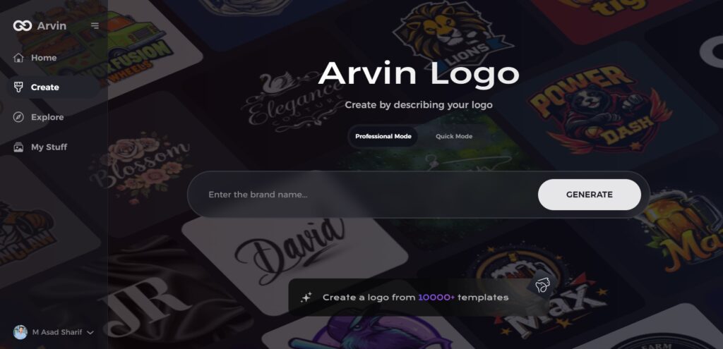
Step 1: Visit Arvin AI’s Design Page
Open your browser and go to the logo.arvin.chat site to begin creating your monogram logo.
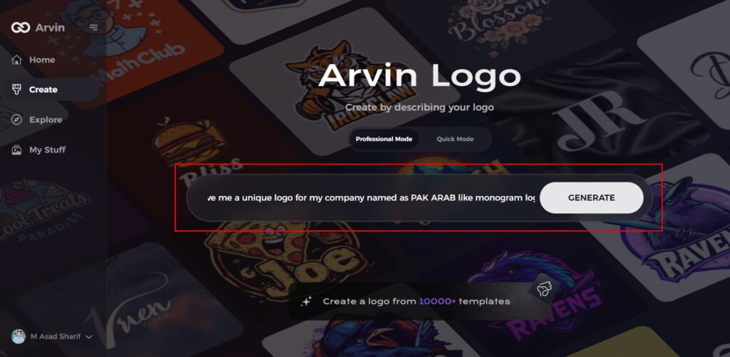
Step 2: Enter Your Business Information
Provide key details like your business name and category to help the AI generate brand-specific logo ideas.
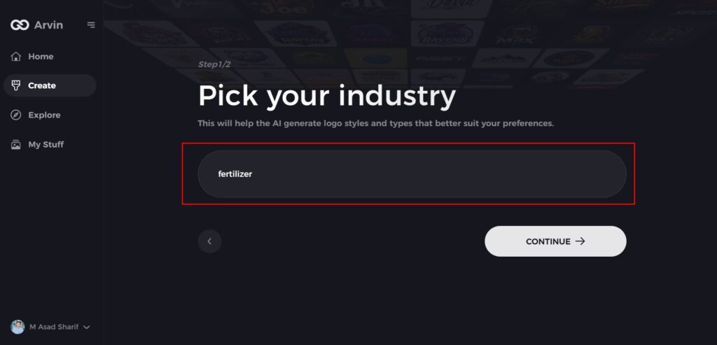
Step 3: Choose Your Industry
Select your industry from the list to help the AI refine logo styles and designs tailored to your business needs.
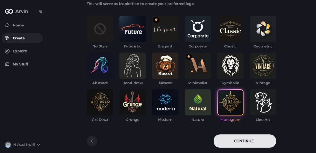
Step 4: Select a Style
Browse through available logo styles and pick one that fits your brand’s personality. You can skip this step to let the AI suggest its default inspiration.
Step 5: Explore Logo Ideas
The AI will generate multiple logo options based on your inputs. Review the designs that best represent your brand image.
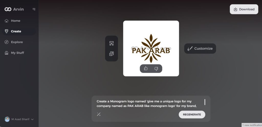
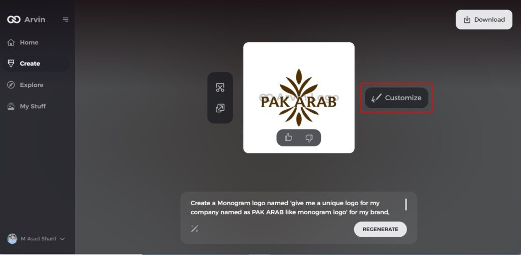
Step 6: Customize Your Logo
Make tweaks to the selected design, adjusting colors, fonts, icons, and layouts to match your brand’s unique style.
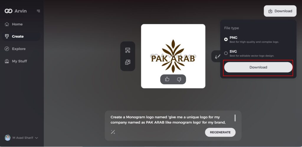
Step 7: Download Your Logo
Once satisfied, download your finalized logo in PNG or SVG format for easy use across websites, social media, and print.
Conclusion
The three claw marks inside the hexagon shape have become known as the premium and worldwide identity of Monster Energy, representing strength, excitement and an edgy attitude. The strategic line up of this prefect design with marketing has formed Monster Energy has graduated out to an industry leader. Those that seek to create a strong identity can learn something from Monster Energy in creating consistent branding, bold choices in design, and the readiness to be different in a crowded marketplace. Start designing with Arvin AI today and build a brand identity as powerful as Monster Energy’s!
FAQs About the Monster Logo
Is this a Monster logo font? If so, what font is used in the Monster logo?
The Monster Logo works off of a custom font that has been stylized to seem like claws scratching at it, making it sharp and visceral, to mirror the popularity of the product it offers for energy and vitality.
What about the color of Monster logo green?
Neon green usually associated with energy, power, and vitality, and goes hand in hand with the brand identity. The black and green complements each other with high contrast, making the logo more visible on store shelves, and enhancing Monster Energy’s fierce reputation.
Who designed the Monster logo?
McLean Design, a brand and packaging design company, created the logo. They helped make the Monster logo iconic in the energy drink market.
Can I get similar logo using Arvin AI?
Yes! Arvin AI provides AI-powered tools to create logos with bold designs similar to the Monster logo. Users can create a professional and eye-catching logo without difficulty as it offers customizable features and instantaneous design recommendations.
