A logo is the most significant part of branding, providing visual expression to company values, personality, and missions. A well-designed logo would create such an impact that how consumers view a brand changes because of it. It is essentially the central element in the effectiveness of logo design, using shapes, which have deep psychological effects and elicit certain types of emotions from the target audience.
This article explores the impact of logo shapes on brand identity, shedding light on their psychological implications. Additionally, we’ll discuss how advanced tools like Arvin AI are revolutionizing logo design, helping businesses create distinctive logos with ease.
Part 1: The Importance of Logo Shapes
Logo shapes are more than just design elements; they are powerful tools in shaping the public perception and brand identity. A right shape can convey specific values and evoke certain emotions to shape perception into a lasting impression, while the wrong shape may confuse or disengage customers.
Impact on Brand Perception
The shape of a logo can greatly affect how a brand is perceived. Rounded shapes make most users feel friendliness and ease-of-accessibility, as well as softness, which is why many health or food brands choose circular logos. Sharp, angular logo shapes have a meaning of strength, stability, and professionalism, and therefore, many brands in finance or technology tend to use them to show reliability and innovation.
The Psychology of Different Shapes
Various shapes evoke different psychological impacts.
- Circles: A circle symbolises unity, infinity, and completeness. Its curves are aesthetically pleasing and foster feelings of community and stability.
- Squares and Rectangles: Stability, structure, and reliability are behind the symbolic imagery display by squares and rectangles. Brands often use the former within more traditional or corporate realms, like IBM or Microsoft.
- Triangles: Represent power, balance, and dynamic energy. Triangular logo shapes are more align with innovation and forward movement, hence an ideal representation for brand names such as Adidas or Google.
- Organic Shapes: Organic or free-form logo shapes are less solid and symbolize creativity, nature, and fluidity. Such logo shapes are associate with ‘green’ brands or those in the creative industry, including examples such as the Twitter or Shell logos.
Case Studies of Famous Logos
Nike’s swoosh, for example, is a basically geometrical logo that carries the message of movement, speed, and athleticism-facts matched by the brand’s identity. The case with Apple’s logo also holds: it being simple and clean communicates innovation, simplicity, and sophistication. As such, both of them use shapes that are simple but highly effective in carrying across their respective brand messages. The Coca-Cola logo, on the other hand, is constructing with flowing script and reaches toward organic logo shapes, thereby capturing a sense of warmth and approachability.
How Shapes Convey Messages About the Brand
Message ideologies and brands through creative shape selection. For example, a rounded-edge logo will most of the time be perceive as friendly and trustworthy, while angular logos tend to look more professional and authoritative. A dynamic triangle in a logo can imply initiative, innovative, and on-the-move thinking, while organic logo shapes are more reflective of liberation and creativity.
Section 2: The Role of Geometry in Logo Design
When making logos, the use of geometric and organic shapes often creates a point of difference that helps delineate and hence define an image and appeal of a brand.
The Difference between Geometric and Organic Shapes in Logos
Geometric shapes are those that are regular and precise—circles, squares, and triangles fall into this category. They are defining by straight lines and symmetrical patterns, lending a sense of order and structure to designs. Organic logo shapes however are irregular and curvaceous, evoking spontaneity and creativity
Why Geometric Shapes Are Popular in Logos
Geometric shapes are preferred largely in logo designs due to their innate balance, symmetry, and simplicity. These are pleasing shapes that are timeless and versatile. Logos based on geometric shapes tend to appear clean, linear, and easy to reproduce in other formats, making them extremely effective across a variety of media and materials.
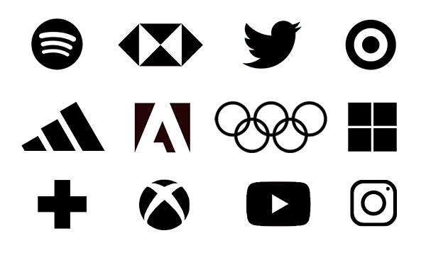
- Symmetry and Balance: Geometric logo shapes often embody harmony, which helps make logos aesthetically pleasing. A balanced logo is easier to recognize and is more likely to leave a lasting impression.
- Clean, Simple, and Timeless Appeal: Geometric logos are often strip down to their most essential elements, creating designs that are both minimalistic and easily recognizable.
Examples of Geometric Logos
Some of the most iconic logos are based on geometric shapes:
- Adidas: The three stripes in the Adidas logo are a geometric expression of stability, consistency, and simplicity. Their parallel, flat nature makes for visual balance, while the triangular form hints at movement and progress.
- Volkswagen: A great example of geometrical design is the Volkswagen logo, combining circles and lines in an old-school style. Clean lines, symmetry, and dependable form all express a sense of professionalism, since the brand has its origins in cars that have been solid, dependable over time.
Organic Shapes and Their Association with Fluidity, Nature, and Creativity
Organic shapes are fluid and free-form as opposed to the rigidity of geometric shapes. They are commonly use by brands that want to associate their brand connections to nature, creativity or human emotions.
- Association with Fluidity: Organic shapes tend to take after natural shapes such as leaves, water, or the human body. These shapes feel more natural and comfortable to the eye.
- Creativity and Innovation: The organic shape symbolizes freedom, individuality, and creativity. It is perfect for brands in arts, technology, or any other environmental-related business. Fluidity itself symbolizes and represents adaptability and innovation for audiences who appreciate the extraordinary.
Part 3: Psychological Impact of Different Shapes
When designing a logo, the choice of shape plays a crucial role in shaping how the audience perceives the brand. Let’s explore the psychological impact of some common shapes used in branding.
Circles and Ovals
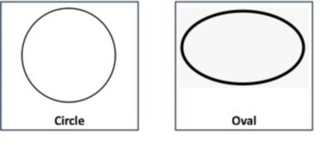
Curves are arguably the most overwhelmingly positive logo shapes symbolizing circles and ovals are unity, harmony and wholeness. Staring at today’s circle, Starbucks is one of the most vivid examples of how round shape has developed into the symbol of comfort, warmth, and locals-based values inside the coffee and tea shop. And here another great example is the round shroom logo of Pepsi which makes you feeling the energy, being a part of something continual and global.
Squares and Rectangles
Squares and rectangles are effectively associated with stability, reliability and professionalism. Such forms render an impression of organization and stability, so the viewer receives an understanding of safety and Orientation. For example, a logo of Microsoft contains four colored squares and one of its images demonstrates the capability of variably colored squares, which symbolically communicates about its diversified products and at the same structured look. It is also trusted. A logo of IBM gives a representation of professionalism and excellence of technology in its execution.
Triangles
Triangles as I have learned represent the notions of direction, energy and innovation. Slope lines and sharp emphasized lines indicate the motion and moving ahead, pursuit of progress and evolution. Nowadays, a lot of creative brands use triangles in their logos to mean performance, strength and innovation. For instance, one, two, and three stripes aligned horizontally to another that makes a triangle for Adidas represents performance, strength and creativity. The Google Drive logo has triangles, which is supposed to mean there is order, categorization, and the continuous circle of technology with storage in the cloud.
Organic Shapes
Natural curves or a kind of deviations and preclusion of symmetry closely recollect nature, creativity and dynamism. Such shapes appear significantly more organic and organic than classical geometric ones due to this; they perform the link to creativity, freedom, and organizovannostion. The brands falling under the environment linked or creative sector appear to have bigger preference for using an organic form to their logo, out of admiration and respect for the environment or creativity.
Part 4: How to Choose the Right Shape for Your Brand
When selecting the ideal shape for your logo, it’s essential to consider several factors, including your industry, brand values, and target audience. The right shape should align with your brand’s identity, message, and the emotional response you want to evoke in your customers.
Factors to Consider
- Industry: The shape you choose should reflect the nature of your business. For example, tech and corporate logos tend to favor squares and rectangles for their association with professionalism and reliability, while eco-friendly or nature-driven brands often choose organic shapes that symbolize growth and environmental consciousness.
- Brand Values: If your brand believes in community and inclusiveness, a circle or oval would be a good fit because circles and ovals are associated with unity and harmony. If your brand emphasizes innovation and progress, the triangle might be able to convey that.
- Target Audience: Consider the psychological effects on your targeted audience. If you are targeting a younger, more dynamic generation, you can opt for striking, angular shapes like triangles.
Example Logos
- Tech vs. Eco-friendly Brands: A brand like Microsoft would adopt squares and rectangles, showing professionalism and stability. On the other hand, an eco-friendly brand like Whole Foods employs organic logo shapes that depict nature and sustainability.
- Luxury vs. Approachable Brands: For example, the clean lines and geometric design of Rolex fit very well with a luxury brand because it is very sophisticated and timeless. On the other hand, a company like Target uses a circle in its logo for a more approachable and friendly appearance that invites a wide range of people.
Part 5: Modern Trends in Logo Shapes
In fact, logo design has evolved over time with changing consumer preferences, technological advancement, and so forth.
Minimalism:
The trend toward minimalistic design continues to dominate, with brands choosing clean and simple logos. Minimalism focuses on essentials only-removing frivolous details that make logos appear clear, concise, and recognizable. Simplest shapes, circles, squares, and lines are now more popular as they easily communicate the value of a brand without being confused. Brands such as Apple, Nike, and Google are among the best minimalist logos that have become great icons through their simple designs.
3D Logos:
With advancements in design tools and digital technologies, 3D logos are gaining popularity. These logos feature depth and dimension, creating an immersive experience for viewers. Often incorporating shadows, gradients, and textures, 3D logos add a sense of realism and movement, making them visually engaging. While this style is often used by tech companies or those in the gaming industry, its dynamic nature appeals to brands looking to convey innovation and modernity.
Abstract Designs:
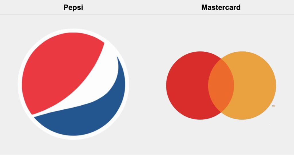
The abstract logo shapes are also in great demand. Such logos are based on non-representational elements such that the designers focus on producing an original, unique and memorable image capable of evoking an emotion or idea. In abstract, more creativity and freedom is allowed, providing a brand with the possibility of creating something absolutely unique. Pepsi and MasterCard logos have been extremely successful examples of abstract shapes that meet the requirement of distinction and timelessness.
How Modern Design Trends Influence Logo Shapes
Modern design trends drive the shape of logos by pushing the boundaries of new techniques and the adaptation of a digital age. Brands cannot afford to keep the same old traditional logo forms; instead, they must move towards designs that best represent innovation and individuality. Bold geometric shapes, clean lines, and subtle gradients contribute toward the aesthetic of today’s modern designs, which is well within the expectation of consumers who want clarity, simplicity, and depth.
Part 6: How Arvin AI Simplifies the Logo Design Process
Arvin logo maker is an innovative, artificial intelligence-powered logo design tool that leverages advanced algorithms to help businesses create stunning, professional logos quickly and efficiently. Whether you’re an entrepreneur, a startup, or an established company looking to refresh your brand, Arvin AI streamlines the logo creation process, offering a fast and user-friendly experience. Arvin AI considers industry specifics, brand values, and design preferences as it comes up with logos that might resonate well with the intended audience while saving time and effort that would otherwise go into traditional design processes.
Key Features of Arvin AI
- AI-driven Suggestions: The most powerful feature of Arvin AI is its AI-enabled suggestion engine. It generally generates options for logos based on data analysis of thousands of logos in various industries.
- Easy Customization Options: Once Arvin AI has generated logo suggestions, users gain easy access to loads of customization options. You can tweak your colors, fonts, layouts, or even graphic elements to make the logo totally yours.
- Scalability and Vector File Support: Arvin AI would ensure that your logo is scalable-you would look amazing in any size.
- Logo Optimization for Web and Print Use: Arvin AI optimizes logos for both web and print media, ensuring that your logo looks great on websites, social media profiles, product packaging, and marketing materials.
- User-friendly Interface and Fast Processing Times: Arvin AI’s interface is designed to be simple and intuitive, requiring no prior design experience.
How to Use Arvin AI for Logo Creation
Step 1: Sign Up: Sign up on Arvin AI, filling in your details about your brand (name, industry, values).
Step 2: Select Preferences: Choose your desired logo style, shape, and color preferences.
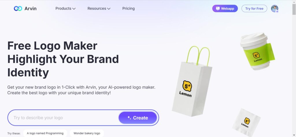
Step 3: Generate Suggestions: Let Arvin AI generate multiple logo options based on your inputs.
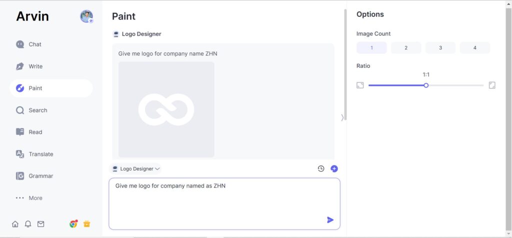
Step 4: Customize Your Logo: Adjust fonts, colors, and layout to refine your logo design.
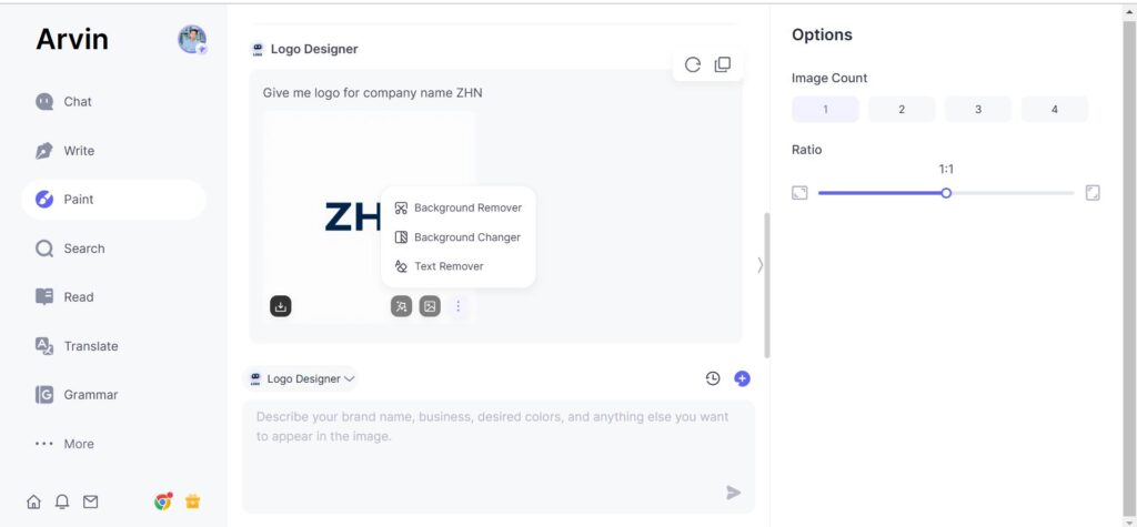
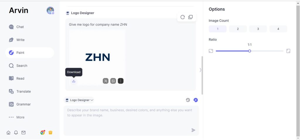
Step 5: Download Your Logo: Once satisfied, download high-quality files in various formats (PNG, SVG, etc.) for use.
Part 7: Common Mistakes to Avoid When Designing Logos
The mistake done in the logos is over-complication, placing too many elements or intricate details. A logo should be simple and instantly recognizable. Too many shapes, colors, or textures would easily confuse or even prevent anyone from memorizing the logo. A messy logo may not reproduce well when placed in small sizes or on any medium. Strive for simplicity and clarity while keeping in focus the core message and aesthetic of the brand.
Neglecting Scalability and Simplicity:
A good logotype needs to work on business cards as well as billboards, on social media profiles as well as websites. The danger here is the lack of scalability. What works beautifully in big format fails in small format? Something drawn beautifully in a large format becomes unrecognizable when scaled down. A clean design succeeds in small formats as it does in larger ones.
Choosing Shapes That Don’t Align with the Brand’s Values:
Shapes are very emotive and may mean different things in a message. For instance, the circular shape entails togetherness, completion and all-inclusiveness, whereas sharp angles may be about strength or even newness. Selecting the wrong shapes for your brand’s identity can confuse the audience or can send out the wrong message.
Failing to Test the Logo in Different Formats:
A logo should be flexible enough to work well on different media setups, ranging from the digital screen to print. Failure to test the logo presentation on different setups and backgrounds can lead to adverse results. The logo must look as strong in black and white as it does when colored. It should also look legible both on dark and light backgrounds.
Part 8: Best Practices for Logo Design
Simplicity:
Sometimes the best logos tips are the simplest ones: clean and straightforward designs stand out in memory and attract less bad print. Do not oversubscribe any unnecessary detail, keeping only the essential elements that should reflect the brand’s personality. A simple logo is easy to remember and flexible; it can be successfully used for various purposes. Remember, less can often be more in logo design.
Versatility:
A logo must be adaptable to a variety of mediums and formats. Whether it’s used on a website, business card, merchandise, or a billboard, the logo needs to look good and maintain its integrity across all applications. Versatile logos should work in full color, black and white, and any other variations required by the brand.
Consistency:
A consistent logo will, therefore help reiterate a brand’s identity while creating trust with its target audience. An effective logo should be consistent with the overall visual identity of the brand, including typography, colors, and style. Consistency across all branding materials, from packaging to advertisements, creates a unified and professional look.
Timelessness:
While trends may come and go, the best logos endure. A timeless design transcends trends and remains relevant over the years. When designing a logo, avoid overly trendy elements that may quickly become outdated. Instead, focus on creating something that feels classic and will continue to resonate with the audience for years to come.
Conclusion
The selection of shapes for the logo can definitely define a brand’s identity and values with effectiveness. Simple yet scalable and adaptable logos are very effective in making a proper and lasting visual identity. Arvin AI is easy to use for the design of professional, meaningful logo shapes that fulfill all your standards of selection. The intuitive tools offered enable creative exploration while being functional and aligned with the brand message. Try Arvin AI today so that your logo will be made to set your brand apart, towards timelessness.
FAQs
1. Why is simplicity important in logo design?
Simplicity ensures a logo shapes can easily be recognized and remembered. A simple logo is also effective at all sizes and formats. It will not perplex the viewer’s mind and fail to effectively communicate the core message of the brand.
2. How do I test my logo for scalability?
Test it for scalability: shrink your logo down to favicon size, stretch it out to the size of a billboard graphic. Make sure that at all sizes, it is clear, readable, and attractive. It should also be tested in as many formats as possible, from print to digital.
3. What are some examples of classic logos?
Logos such as the Nike swoosh, Apple’s apple, and Coca-Cola script remain fresh for decades. These logo shapes stress simplicity, malleability, and consistency with their brand’s core values, facilitating their ability to stand the test of design trend shifts.
4. What does Arvin AI do in terms of logo design?
Arvin AI simplifies the logo design process by offering intuitive tools and pre-designed templates. It ensures logo shapes are professional, scalable, and aligned with your brand’s identity, making the design process accessible to everyone, regardless of experience.
