
Have you ever come across a logo redesign that made you do a double-take? Or one that left you wondering, “Why did they change it? I liked the old one better.” Logo redesigns are tricky to get right and even harder to perfect. A great logo is meant to be timeless, yet brands often find themselves reworking their designs to stay relevant.

A logo redesign is a strategic move that reflects a brand’s evolution, market positioning, and adaptability in a changing world. Companies don’t just change their logos on a whim; they do so to keep up with shifting consumer expectations, evolving design trends, and advancements in technology.
Think about it: some of the most iconic brands, from Apple to Starbucks, have refined their logos over the years. Not because their old designs were bad, but because a refreshed look helps maintain modernity and brand recognition. Apple’s transition from a rainbow-colored apple to a sleek monochrome silhouette symbolized the company’s shift toward minimalism and cutting-edge innovation.
Similarly, Starbucks removed the text from its logo, allowing its siren emblem to stand alone.
Your brand’s identity is one of its most valuable assets, don’t let an outdated logo hold you back. Whether you’re rebranding, modernizing, or adapting to new audiences, Arvin AI’s Logo Designer can help you create a fresh, impactful logo that aligns with your business’s evolution. Try it today and bring your vision to life!
What Is a Logo Redesign?
A logo redesign is a strategic process that involves altering a brand’s existing logo to better align with its evolving identity, market trends, and consumer perceptions. This process can range from subtle modifications, such as adjusting colors or typography, to comprehensive overhauls that introduce entirely new design elements.

Research in consumer psychology underscores the significance of logo design in shaping brand perception. For instance, a study published in Psychological Science found that the shape of a logo can profoundly influence consumer judgments and behaviors. Specifically, circular logos tend to evoke perceptions of softness and warmth, while angular designs convey durability and strength. These associations can significantly impact consumer attitudes toward a brand.
Moreover, the degree of change in a logo redesign can elicit varying responses based on consumer brand commitment.
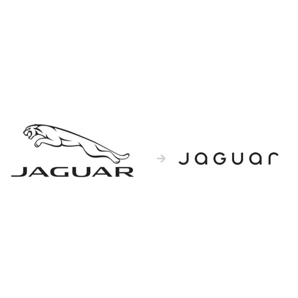
Research indicates that consumers with strong brand loyalty may react negatively to drastic logo changes, perceiving them as a departure from the brand’s core identity (just like the Jaguar Logo Redesign). Conversely, minor updates that modernize the logo while retaining its recognizable elements are often better received by loyal customers.
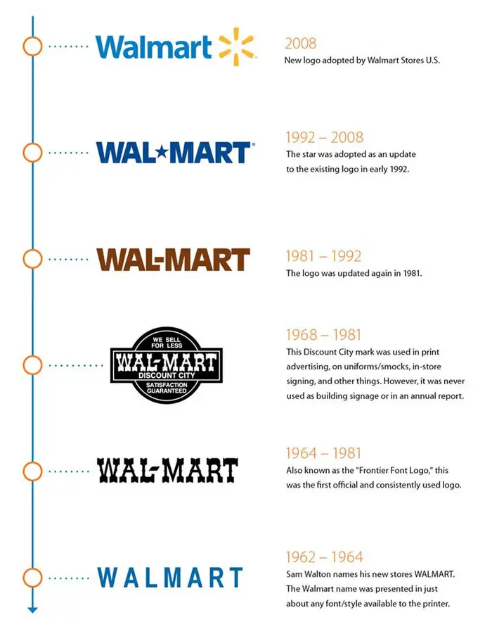
In practice, companies like Walmart have undertaken logo redesigns to reflect modernization efforts and digital advancements. Walmart’s recent logo refresh involved subtle changes to the font and color palette, aiming to bring more life and energy to the brand. However, the redesign received mixed reactions from consumers, highlighting the challenges brands face in balancing innovation with familiarity.
When Should You Do a Logo Redesign?
A logo redesign should be undertaken when a brand experiences significant changes that necessitate a visual update to maintain relevance and consumer trust.
A logo is not just a design element but a cognitive shortcut that influences consumer perceptions, brand recall, and emotional attachment (Henderson & Cote, Journal of Marketing Research). Therefore, altering it requires strategic timing to ensure a smooth transition.
First impressions matter more than ever in today’s competitive landscape. If your logo fails to communicate your brand’s identity, values, or professionalism, it’s time for a change. With Arvin AI, you can create a rebranded logo that not only looks visually stunning but also strengthens your brand’s market presence.
1. When Your Brand Identity Evolves
Companies evolve, and so do their missions, values, and target demographics. A logo that once represented a startup might not reflect its transformation into a global corporation.
For instance, Instagram’s 2016 logo redesign replaced its skeuomorphic camera icon with a minimalist, gradient-based design. This shift aligned with the app’s transition from a photo-sharing platform to a multimedia social networking powerhouse.
2. When Consumer Perceptions Shift
A logo can become outdated not only due to changing design trends but also due to evolving consumer expectations. Studies in consumer behavior indicate that people associate modern, streamlined logos with innovation and efficiency (Muzellec & Lambkin, Journal of Business Research).
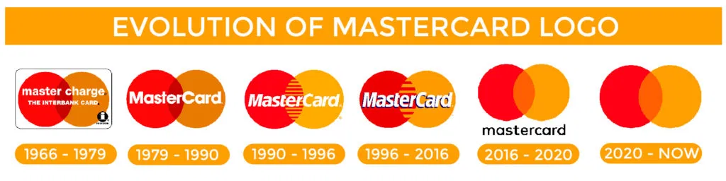
This explains why Mastercard’s 2016 logo redesign removed the wordmark entirely, relying instead on its recognizable overlapping circles. The shift reflected a growing trend toward simplified, digital-first branding.
3. When Competitors Are Gaining Market Share
If competitors with more contemporary branding are appealing to your audience, a logo redesign may be necessary to differentiate yourself.
Pepsi’s frequent logo updates contrast with Coca-Cola’s minimal logo changes, showcasing different strategies.
Pepsi continually adapts to current trends, while Coca-Cola leverages nostalgia and consistency. If your industry is highly competitive and your logo feels dated, a redesign can signal innovation and a willingness to evolve.
4. When Your Logo Doesn’t Translate Well Digitally
With the rise of mobile apps, social media, and responsive web design, logos need to function effectively across various platforms. Research in user experience (UX) design suggests that highly detailed logos perform poorly in digital environments, especially when scaled down (Norman, The Design of Everyday Things).
eBay’s 2012 logo redesign, which simplified its typography while maintaining its color identity, ensured greater adaptability across screens.
5. When You’re Expanding or Rebranding
If your company has merged, introduced new product lines, or shifted its core business model, a logo redesign can help unify the brand.
Dunkin’ Donuts dropping “Donuts” from its logo in 2019 was a prime example. It reflected the chain’s move beyond breakfast pastries into all-day beverages and snacks.
6. When Your Logo is Overly Complex or Dated
Logos that rely on intricate details, gradients, or elaborate typography often feel cluttered by today’s design standards. Minimalist design principles, supported by research in cognitive load theory, suggest that simpler logos improve brand recognition and memorability (Reber, Schwarz, & Winkielman, Psychological Science).
This explains why Animal Planet’s logo redesign removed the complicated designs and stuck with a sleek jumping elephant.
A strong brand starts with a strong logo. If your current design no longer reflects your company’s growth or resonates with your target audience, a well-planned redesign is the solution. Take the guesswork out of the process. Let Arvin AI help you create a logo that enhances brand trust and recognition.
7. When Your Logo Has Negative Associations
If your brand has faced public backlash or undergone a reputation shift, a logo redesign can be part of a larger effort to rebuild trust.
Uber’s 2018 redesign followed a period of controversies, aiming for a friendlier, more accessible identity through a simpler word mark.
How to Redesign an Existing Logo?
Step 1: Identify the Need for a Redesign
| Reason | Explanation | Example |
| Market Expansion | A company entering a new demographic or international market may need a logo that resonates globally. | WWF (World Wide Fund for Nature) redesigned its logo for international recognition. |
| Brand Modernization | If a logo looks outdated in digital spaces, it risks making the company seem obsolete. | Instagram refreshed its gradient color scheme to modernize its digital presence. |
| Mergers and Acquisition | When two brands unite, a redesigned logo must represent their combined identity. | Disney and Pixar adapted branding to reflect their merged identities under Disney. |
| Crisis Management | Some brands rebrand to distance themselves from past controversies. | Uber redesigned its logo to reposition itself and move away from negative press. |
Step 2: Analyze the Current Logo’s Strengths and Weaknesses
A successful redesign retains the core visual DNA that makes a brand recognizable while addressing its shortcomings. Consider:

- Simplicity vs. Complexity: Overly intricate designs don’t scale well in digital applications.
- Color Psychology & Trends: Are the colors still relevant, or do they feel outdated?
- Typography Readability: Serif fonts may work for tradition-focused brands, while sans-serif suggests modernity.
- Scalability: Logos should remain clear and legible from mobile icons to billboards.
Step 3: Research Market Trends and Competitor Strategies
Staying informed on industry-specific logo trends ensures the redesign is both relevant and differentiated. This involves:

- Competitor Analysis: Understanding what works for industry leaders can reveal effective design cues.
- Audience Feedback: Customer surveys and A/B testing help gauge preferences.
- Cultural and Digital Relevance: A redesign should adapt to modern usage—think social media avatars, app icons, and website headers.
A study in the Journal of Consumer Research (Bottomley & Doyle, 2006) found that customers unconsciously associate different shapes and colors with specific industries. For example, curved logos tend to evoke feelings of warmth and friendliness, while angular designs convey strength and stability.
Step 4: Preserve Key Brand Elements While Innovating
A full rebrand isn’t always necessary—sometimes, a refresh is enough.

- Keeping Core Colors or Motifs: Familiar colors help maintain recognition.
- Adjusting Font Styles for Readability: Modernizing typography without losing brand personality.
- Refining Iconography: Symbols can be simplified while retaining their original essence.
Take NPR (National Public Radio) as an example: their redesign retained the familiar three-letter structure while updating the typography for better digital visibility.
From major corporations to small businesses, brands across industries are revamping their logos to keep up with digital trends, consumer psychology, and industry standards. Don’t let your brand get left behind. Arvin AI’s Logo Designer can help you refine, refresh, or completely reimagine your brand identity with precision and ease.
Step 5: Sketch & Prototype Logo Variations
The brainstorming phase should involve:

- Thumbnail Sketching: Rapid ideation of possible redesigns.
- Digital Wireframing: Testing different compositions in software like Adobe Illustrator or Figma.
- Monochrome Testing: A logo should be effective in black-and-white before adding color.
Neuroscientific research (Reber, Schwarz, & Winkielman, 2004) highlights processing fluency, which suggests that simple, recognizable designs are perceived as more trustworthy and attractive.
Step 6: Select a Color Palette & Typeface
Color plays a significant psychological role in branding. A study in the Journal of Business Research (Labrecque & Milne, 2012) confirms that consumers strongly associate colors with emotions:

- Blue = Trust and professionalism (often used by finance and tech brands)
- Green = Growth and sustainability (popular among organic and agricultural businesses)
- Orange/Red = Energy and passion (frequent in food and entertainment)
Typography also influences brand perception. Serif fonts imply heritage and sophistication, while sans-serif fonts signal modernity and efficiency. For example, when a well-known news publication redesigned its logo, it retained its serif typography but adjusted spacing and weight for improved legibility.
Step 7: Ensure Scalability & Digital Adaptability
In an era dominated by digital branding, a logo must be:

- Responsive & Adaptive: Work in various formats (e.g., website headers, app icons, merchandise).
- Legible at Small Sizes: Avoid excessive detail that disappears in mobile applications.
- Versatile in Different Color Schemes: The logo should be effective in full color, monochrome, and grayscale.
A report from MIT Sloan Management Review highlights how brands that design for digital-first experiences see better engagement and retention.
Things to Take Note of When Doing a Logo Redesign
1. Maintain Brand Recognition While Evolving
One of the biggest challenges in redesigning a logo is striking the right balance between modernization and brand heritage. Research in consumer psychology suggests that visual consistency reinforces trust and brand recall. A study published in the Journal of Brand Management found that brands with familiar visual elements retained stronger customer loyalty even after a logo update. To avoid confusing long-time customers, brands like Visa and Warner Bros. retained signature elements—such as typography styles or color palettes—while refining their logos for a sleeker, more modern appeal.
2. Align the Redesign with Brand Strategy
A logo isn’t just a design—it’s a symbol of brand identity. Before making drastic changes, businesses should assess whether the redesign aligns with their company’s mission, values, and long-term vision. For instance, when Burberry reworked its logo, it opted for a minimalist sans-serif typeface to reflect a shift toward contemporary luxury and digital-first branding. Companies undergoing mergers, expansions, or shifts in market positioning must ensure that their new logo reflects these changes rather than just following design trends.
3. Understand Consumer Perception and Market Trends
A logo redesign should be data-driven, not impulsive. Conducting brand perception analysis through surveys, focus groups, or A/B testing helps businesses gauge consumer sentiment before finalizing changes. Studies in neuromarketing show that people react emotionally to visual identity changes, which can either strengthen or weaken brand affinity.
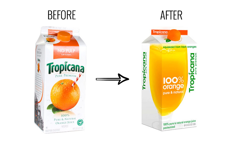
For example, Tropicana’s infamous 2009 rebrand, which stripped away its recognizable orange and straw imagery, led to a 20% drop in sales within two months, proving how a poorly executed redesign can disconnect a brand from its audience.
4. Optimize for Digital and Multi-Platform Use
With the dominance of mobile-first branding, logos must now be adaptable across diverse platforms. A well-designed logo should maintain clarity at various sizes and resolutions, from app icons to billboards. This principle is what led Instagram and Airbnb to transition to flat, simplified logos that scale seamlessly across digital interfaces. As social media and app interfaces continue to evolve, designing with responsive adaptability in mind is crucial.
5. Consider Color Psychology and Typography Changes Carefully
Color and typography are not just aesthetic choices; they influence consumer behavior and brand perception. Research in color psychology suggests that different hues evoke distinct emotions—blue conveys trust, green represents sustainability, and red stimulates appetite and urgency. A redesign that drastically alters these elements can unintentionally shift how a brand is perceived. When Animal Planet updated its logo, it moved away from its iconic green elephant to a sleeker, text-based design, but the change was met with criticism for losing its visual connection to wildlife.
Similarly, typography choices impact brand tone. Serif fonts often exude heritage and tradition, while sans-serif fonts feel modern and approachable. Brands like Google and Nokia opted for geometric, sans-serif wordmarks in their redesigns to align with digital-age aesthetics.
How to Launch Your New Logo Redesign
Test the Redesigned Logo
User testing helps gauge reactions before finalizing the redesign. Methods include:
- A/B Testing: Compare old and new logos with different audience segments.
- Focus Groups & Surveys: Collect qualitative feedback on visual impact.
- Heatmaps & Eye Tracking: Evaluate where viewers focus when looking at the new design.
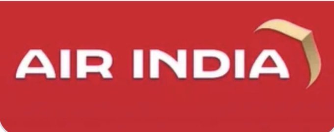
A well-known case study that occurred in 2023 involves a major global airline, Air India that subtly refreshed its logo, only to face backlash from loyal customers who felt alienated. Testing beforehand could have mitigated this issue.
Finalize and Create Brand Guidelines
Once the redesign is confirmed, develop comprehensive brand guidelines that dictate:
- Logo Usage Rules: Where and how the logo should appear.
- Color Codes & Typography Specifications: Ensuring consistent branding.
- Alternate Layouts & Backgrounds: Defining how the logo appears in various environments.
Launch and Market the New Logo
A logo redesign should be accompanied by a strong rollout strategy:
- Teasers & Behind-the-Scenes Content: Build anticipation.
- Email & Social Media Announcements: Educate audiences on the change.
- Branded Merchandise & Packaging Updates: Ensure consistency across all touchpoints.
Psychological principles of familiarity bias suggest that gradual exposure to a new logo increases consumer acceptance. A well-planned transition period helps people accept your new logo, rather than outright rejection.
Best Logo Redesigns
Based on discussions from r/graphic_design and other design-related subreddits, here are some of the most praised logo redesigns according to Reddit users.
1. San Francisco Symphony (SF Symphony)
One of the most well-received redesigns mentioned in Reddit threads is the SF Symphony rebrand by COLLINS. The transformation introduced a dynamic, flexible identity system rather than a static logo. The new design embraces custom typography and motion graphics, making it adaptable across digital and physical media.
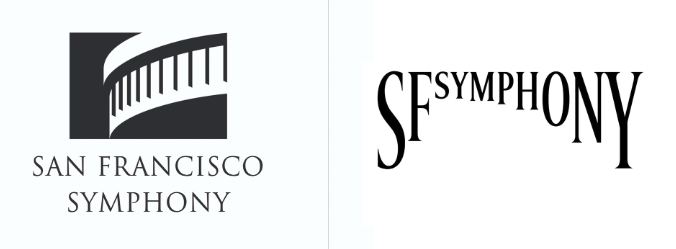
Users praised this redesign for being innovative and interactive, particularly appreciating the animated aspect of the identity, which aligns perfectly with the symphony’s artistic essence.
2. Burger King
In contrast to many brands that pursue a minimalist approach, Burger King’s 2021 logo redesign brought back a retro-inspired look, reminiscent of its 1970s branding. The update ditched the glossy, 3D design in favor of a flat, warm-toned aesthetic, making it feel nostalgic yet fresh.
3. Warner Bros.
Warner Bros. flattened and modernized its iconic shield logo, making it sleeker and more versatile for digital applications. The redesign removed the three-dimensional gold gradient in favor of a simplified, flat blue and white design.
5. Fisher-Price
Fisher-Price refined its logo while keeping its playful energy intact. The update removed unnecessary embellishments and introduced a cleaner, bouncier typeface, which feels more child-friendly and modern.
Logo Redesign AI
Redesigning a logo can be a complex process that requires a balance between creativity, strategy, and technical execution. Leveraging AI can make the process more efficient and precise. Arvin AI offers an advanced AI Logo Designer that streamlines logo redesign, ensuring high-quality results with minimal effort.
Final Words
A logo redesign is a strategic move that aligns a brand with evolving consumer expectations, market trends, and technological advancements.
However, a poorly executed redesign can alienate existing customers and weaken brand recognition. That’s why careful planning, user testing, and strategic implementation are key to success. By leveraging AI-powered design tools like Arvin AI Logo Designer, businesses can streamline the redesign process, ensuring a modern, scalable, and effective brand identity.
FAQ
A logo redesign is the process of updating or modifying an existing logo to better reflect a brand’s identity, adapt to modern trends, or improve functionality across digital and physical platforms.
A logo redesign focuses on updating the visual identity of a brand, such as changing the typography, colors, or layout. A rebrand, on the other hand, is a broader transformation that may involve altering the brand’s mission, messaging, and overall strategy, in addition to its logo.
The cost of a logo redesign depends on factors like complexity, designer experience, and brand needs. While $500 may be too much for a basic update, professional logo redesigns by experienced designers or agencies can range from $1,000 to $50,000+, depending on the scope of work. AI-powered tools like Arvin AI Logo Designer offer cost-effective alternatives for businesses looking to redesign their logo efficiently.
