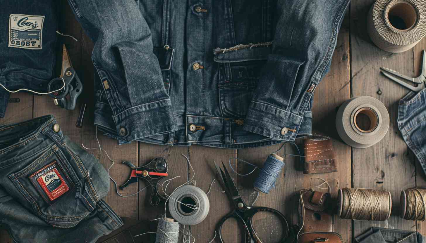
Levi’s has long been a cornerstone of fashion, evolving alongside shifting style trends from the skinny jeans era to the resurgence of mom jeans and now, the dominance of baggy silhouettes, with its iconic “levis logo”.

For a lot of us, especially Gen Z and younger Millennials, the red Batwing logo is instantly recognizable. It’s that bold, no-fuss emblem we see everywhere, from T-shirts to back pockets and even storefronts. But what’s cool is that this iconic logo is just one chapter in Levi’s long story of reinvention.
Over the years, Levi’s has gone through plenty of redesigns, each one capturing the brand’s evolution while staying true to its roots in quality craftsmanship and its undeniable cultural impact.
Levi’s logo history proves that design evolves with time. Let Arvin AI Logo Designer help you craft a logo that stands out and grows with your brand.
What Is the History of the Levi’s Logo?
The Birth of Levi Strauss & Co.
The story of Levi’s jeans starts in San Francisco during the California Gold Rush. A German immigrant, Levi Strauss, moved to the city in 1853, initially selling dry goods to miners and laborers. However, he quickly noticed a problem: workers needed tougher, more durable clothing to withstand the harsh conditions of their trades.
In 1873, Strauss partnered with Jacob Davis, a tailor from Reno, Nevada, who had developed a method to reinforce pants with rivets at stress points like pocket corners. This innovation led to the creation of the first-ever riveted blue jeans, and on May 20, 1873, the U.S. Patent No. 139,121 was granted, marking the official birth of Levi’s jeans.
These pants—initially called “waist overalls”—were constructed from sturdy denim and designed to endure heavy labor, making them an instant hit with miners, farmers, and railroad workers.
The History And Evolution of Levis Logo Meaning
Few brands carry the same weight in fashion history as Levi Strauss & Co. What began as rugged workwear for gold miners and laborers in the 19th century has evolved into a cultural staple, shaping everything from the counterculture movements of the 1960s to today’s streetwear and high fashion collaborations.
Levis Logo 1892 to 1925
By the late 19th century, Levi’s had already established itself as America’s most durable workwear brand, outfitting miners, railroad workers, and ranchers who needed clothing that could withstand harsh conditions.
The introduction of the Two Horse Pull logo in 1886 was more than just branding—it was a visual guarantee of Levi’s superior strength, illustrating two horses attempting (and failing) to rip apart a pair of jeans.
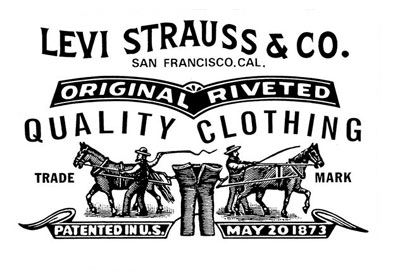
The top portion features the bold inscription “Levi Strauss & Co.” in an arched serif typeface, exuding strength and reliability. Below it, the location “San Francisco, Cal.” is presented in smaller, straightforward lettering, emphasizing the company’s roots in California.
At the core of the design is the illustration of two horses, each pulling in opposite directions, connected by a pair of jeans. The imagery dramatically demonstrates the strength and resilience of Levi’s denim, which cannot be torn apart even by powerful forces even when two men are depicted whipping the horses,.
Levi’s 501® jeans officially received their lot number in 1890, marking the birth of what would become the most iconic denim fit in history.
In the early 20th century, Levi’s refined its designs to accommodate a growing consumer base beyond laborers. Belt loops were introduced in 1922, replacing traditional suspender buttons, allowing wearers more styling flexibility. The company also began experimenting with denim washes and stitching details, setting the groundwork for denim’s transition from purely functional clothing to a fashion staple.
Levis Logo 1925 to 1929
As industrialization progressed, Levi’s recognized the need for stronger brand visibility in an increasingly competitive market. This Levi Strauss logo, introduced between 1925 and 1929, represents a distinct departure from the brand’s earlier ornate Two Horse design, embracing a modern and minimalist aesthetic.
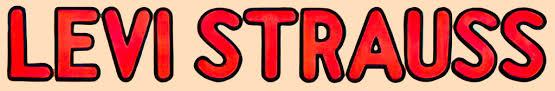
The logo features the name “Levi Strauss” in a rounded sans-serif typeface, with bold, smooth curves and playful proportions.The letters are outlined in black, providing a strong contrast that emphasizes the brand name. The design reflects a more casual and approachable tone, appealing to a broader audience beyond laborers.
The vibrant red lettering set against a light tan background creates an energetic and eye-catching visual. The red signifies confidence, energy, and visibility, while the light tan provides a neutral, grounding effect that complements the bold text.
Unlike its predecessor, which incorporated detailed imagery (like the horses), this version focuses solely on the brand name, stripping away additional elements to prioritize simplicity and modernity.
During the Roaring Twenties, Levi’s updated its jeans, improving functionality and appeal amid industrial growth and mass production.
What Was the Roaring Twenties?
The Roaring Twenties (1920s) was a period of economic prosperity, technological advancements, and cultural shifts, particularly in the U.S. and Europe.
It was an era of rapid industrial growth, urbanization, and changing social norms.
For example, jazz music flourished, and women gained more independence such as the right to vote in the U.S. in 1920. Fashion evolved toward more relaxed and expressive styles. Flappers ditched corsets for looser dresses, just as denim moved from rigid workwear to a more adaptable garment.
In 1925, Levi’s introduced belt loops on some models, transitioning away from the suspender-only design to accommodate shifting consumer preferences. Two years later, in 1927, the company debuted red selvage denim. This is a distinctive internal fabric marker that would later become highly sought after by collectors.
Despite this expansion, the 1929 Great Depression presented significant challenges for businesses nationwide. However, Levi’s maintained its reputation as a working-class staple, reinforcing its commitment to durability and affordability.
By the 1940s, denim had become an essential uniform for American laborers. Specifically during World War II, when Levi’s was classified as a necessary item for workers. Due to wartime fabric restrictions, the company was forced to simplify certain design elements. This involves removing rivets and reducing stitching on watch pockets to conserve materials.
Levis Logo 1929 to 1943
Despite the Great Depression, Levi’s jeans remained in demand due to their practicality and long lifespan. The brand also found unexpected new customers. The rise of Western films and rodeo culture in the 1930s made denim a cowboy essential. The introduction of the red Levi’s® tab in 1936 was a pivotal moment in branding, ensuring that Levi’s jeans could be instantly recognizable even from a distance.
The word “LEVI’S” is written in a geometric, extra-bold sans-serif font, characterized by strong, blocky letters with sharp angles. A distinct three-dimensional effect is created through thick black outlines. Plus, white shadows on the letters’ right sides, give the logo a sense of depth and solidity.
Below the primary wordmark is the tagline “AMERICA’S FINEST OVERALL”, written in all-caps with evenly spaced, sharp lettering. The red background commands attention, symbolizing energy, visibility, and confidence. The deep navy-blue letters contrast strikingly with the red. It reinforces the boldness and reliability of the brand, while the white accents provide a clean, polished finish.
The arrangement is symmetrical and structured, with the tagline neatly placed beneath the main logo. This deliberate alignment reflects the no-nonsense, practical values associated with Levi’s products during this era.
Levi’s logo evolution showcases the art of reinvention. Use the AI Logo Designer to design a logo that tells your story and stands the test of time.
Levis Logo 1943 to 1949
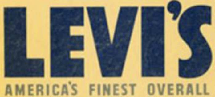
The logo features a calm, muted yellow background with deep navy-blue text. It creates a softer and more approachable tone compared to the high-contrast red and blue of the previous version. This color shift reflects a relaxed post-war vibe, moving away from the intensity of wartime branding.
The three-dimensional effects and outlines from the previous logo were removed, resulting in a cleaner and more modern design. The overall look is sleeker and less aggressive, aligning with the growing appeal of Levi’s as casual wear rather than strictly workwear.
By the mid-1940s, Levi’s jeans had begun moving beyond their utilitarian roots. With Hollywood’s Golden Age in full swing, Western stars like John Wayne regularly sported Levi’s on-screen, adding to their rugged appeal. Meanwhile, American teenagers and young adults, many of whom had grown up during wartime rationing, embraced denim as a comfortable, durable alternative to traditional slacks.
Levi’s capitalized on this newfound popularity by refining its 501® fit in 1947. They adjusted the cut for a slimmer, more tailored appearance. The company also reintroduced double-arched stitching on back pockets, reinforcing its signature design elements. By 1949, denim had begun shedding its purely blue-collar associations, making its way into casual, everyday wardrobes.
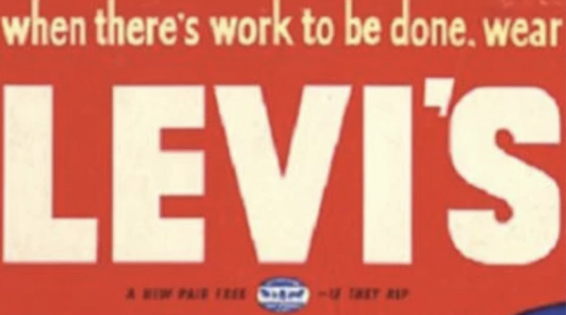
Levis Logo 1949 to 1954
The word “LEVI’S” is displayed in a bold, blocky sans-serif font, creating a sense of strength and dependability. Above the brand name, the tagline “when there’s work to be done, wear” is written in lowercase serif text. This offeres a more conversational and relatable tone.
The 1950s marked a seismic shift in denim culture, largely fueled by Hollywood and the rise of youth rebellion. Marlon Brando in The Wild One (1953) and James Dean in Rebel Without a Cause (1955) in Levis were the ultimate symbols of defiance and anti-establishment cool. Schools and establishments began banning jeans, further solidifying their forbidden appeal among teenagers.
Levi’s capitalized on this shift by expanding its Western Wear line. Introducing new fits, including the 501Z, the first zip-fly variant of the 501®, in 1954. The move was a strategic response to changing consumer preferences, particularly on the East Coast, where button-fly jeans were considered less practical.
Levis Logo 1954 to 1969
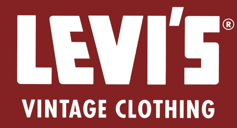
The “LEVI’S” wordmark is presented in a bold, geometric sans-serif font, with clean lines and sharp angles that exude confidence and modernity. The “Vintage Clothing” tagline beneath the main logo is written in a lighter sans-serif font, complementing the boldness of the primary wordmark while reinforcing Levi’s growing association with authentic, timeless style.
This version features sharpened, diagonal cuts in the “E” of the wordmark, giving the logo a more sleek and contemporary feel, of the 1950s and 1960s fashion trends.

As the counterculture movement took hold in the 1960s, Levi’s became a defining uniform for rock stars, artists, and activists. Hippies, anti-war protestors, and college students all embraced denim as a symbol of freedom and rebellion.
Levis Logo 1969 to 2003
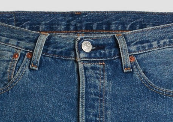
The 1969 Levi’s logo introduced the Batwing design, which has become one of the most recognizable logos in the world. Designed by Walter Landor & Associates, this logo is inspired by Levi’s signature Arcuate stitching on the back pockets of its jeans.
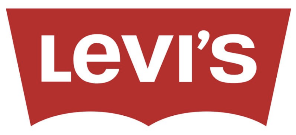
The word “Levi’s” is written in a clean, sans-serif font. This choice reinforces a sense of modernity, simplicity, and versatility, appealing to a wide range of consumers. The capital “L” and lowercase “e” create a playful yet balanced composition. This move softens the boldness of the design while maintaining a sense of authority.
By the 1970s and 1980s, Levi’s had become a household name worldwide. They started launching flared jeans, acid-wash styles, and colored denim to meet shifting fashion trends.
By the 1980s, the company launched the “501 Blues” marketing campaign, as fashion evolved in the 1990s, Levi’s adapted to the rise of grunge, hip-hop, and oversized streetwear, introducing baggy and relaxed fits to align with changing aesthetics.
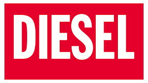
However, increased competition from emerging brands like Diesel, Tommy Hilfiger, and Gap created new market challenges. In the 2000s, the dominance of skinny jeans pushed Levi’s to reinvent itself once again, leading to the launch of the Levi’s Engineered collection and the introduction of the 510™ Skinny Fit.
Levs Logo 2003–Today
In 1971, Levi’s introduced a minor yet notable change: the switch from an all-uppercase font to a lowercase “e” in the wordmark. This decision softened the logo’s visual tone, making it appear more youthful and approachable while maintaining its timeless appeal.
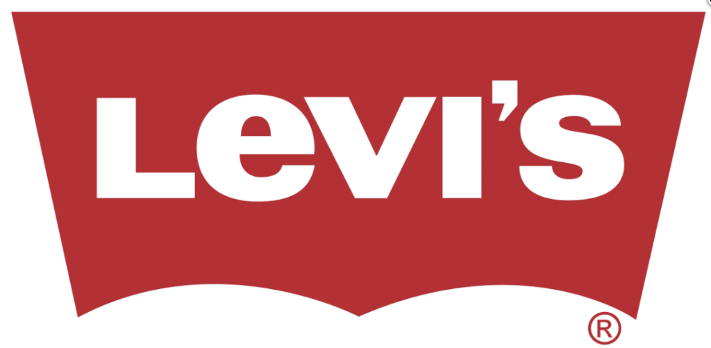
The Batwing design remained unchanged for decades, with only slight refinements made in 2003, such as a darker red hue and adjusted proportions, ensuring it stayed relevant in a modern design landscape.
Recognizing the need to modernize and reconnect with younger audiences, Levi’s underwent a significant brand reinvention in the mid-2000s, balancing its heritage with contemporary trends. The company refocused on its core styles, such as the 501®, 505®, and Trucker Jackets, while also introducing modernized fits like the 510™ Skinny and 512™ Slim Taper, catering to shifting fashion preferences. At the same time, Levi’s embraced sustainability initiatives, developing Water<Less® technology and incorporating organic cotton and recycled denim into its production process.
By the 2010s and 2020s, Levi’s experienced a massive resurgence, largely fueled by the rise of vintage fashion, social media influence, and nostalgia-driven trends. The return of 90s and early 2000s aesthetics, particularly the loose and baggy denim revival, became a key driver of Levi’s renewed popularity.
Levi’s Batwing symbolizes strength and evolution. Use the AI Logo Designer to create a logo that defines your brand’s journey.
Levi Jeans and AI
Chief Digital Officer Jason Gowans explained how Levi’s used Google Cloud-powered AI to track consumer preferences in real time, stating,
“As we introduce looser and baggier fits, we see that demand shifting towards ever more looser, ever more baggier fits.”
This insight led to marketing campaigns like “Live Loose”, further reinforcing Levi’s ability to evolve with modern style cycles.
Inspired by Levi’s Batwing logo? Start designing your brand’s next masterpiece with the Arvin AI Logo Designer and leave a lasting impression.
How to Make a Logo?
Creating a logo that stands the test of time, like Levi’s Batwing, requires a mix of brand identity, simplicity, and adaptability. Levi’s has continuously refined its logo over the decades while staying true to its roots. Here’s how you can design a logo that captures your brand’s essence:
1. Define Your Brand’s Core Identity
Levi’s started as a workwear brand but evolved into a fashion icon while keeping quality at its core. Ask yourself:
- What message should your logo convey?
- Is your brand about heritage, innovation, or bold self-expression?
2. Choose a Timeless Yet Versatile Shape
The Two Horse Pull logo represented strength, while the Batwing design symbolized modernity and global recognition. Select a logo shape that:
- Aligns with your brand’s personality.
- Stands out in different sizes and placements (T-shirts, packaging, digital screens).
3. Select Colors That Represent Your Brand
Levi’s use of red and white is strategic—it commands attention and exudes confidence. When picking colors:
- Choose bold, eye-catching shades if you want to be recognizable and iconic.
- Opt for softer, minimalist tones for a modern, high-end feel.
4. Find the Right Typography
Levi’s logo evolved from classic serif fonts to a bold, sans-serif typeface, making it modern yet familiar.
- A strong, clean font works well for mass appeal.
- A handwritten or stylized font can create a unique, artsy identity.
5. Keep It Simple Yet Memorable
Levi’s Batwing logo is proof that simplicity can be powerful. A clutter-free design ensures:
- Instant recognition.
- Versatility across platforms (social media, clothing tags, billboards).
6. Test and Refine Your Logo
Levi’s logo has undergone subtle refinements over time without losing its identity. Before finalizing your design:
- Test it in black and white to ensure clarity.
- Get feedback from different audiences.
- Consider future trends—will your logo still look fresh in a decade?
7. Bring Your Vision to Life with AI
Just like Levi’s uses data-driven insights to refine its branding, you can use AI technology to create a powerful logo.
Design your own standout logo with the Arvin AI Logo Designer and craft a brand identity that lasts.
Final Words
Levis logo evolution reflects adaptability, heritage, and cultural impact; key elements of any successful brand identity. Two Horse Pull emphasizes durability, and the Batwing logo symbolizes modernity lasting over a century. The Levis logo has maintained a strong visual presence for over a century.
A logo isn’t just a design, it’s the face of your brand, telling a story at first glance. If Levi’s history proves anything, it’s that great logos evolve but never lose their core essence. Invest in a logo that stands out, grows with trends, and remains timeless.
Start your journey today with Arvin AI Logo Designer and create a logo that captures your brand’s legacy, just like Levi’s did.
FAQ
Levi’s logo history began in 1886 with the Two Horse Pull design symbolizing strength and durability. Over time, it evolved into the iconic Batwing logo in 1969, which mirrors the arcuate stitching on Levi’s back pockets.
The cut-off “R” trademark in the Levi’s logo was a deliberate design choice to maximize space on the logo’s red tab.
The lowercase “e” introduced in 1971 gave the logo a more approachable and youthful vibe.
The “501” refers to Levi’s first official lot number for riveted denim jeans, introduced in 1890. It signifies the original and most iconic fit in the brand’s history.
Levi’s brand identity revolves around durability, authenticity, and cultural relevance.
