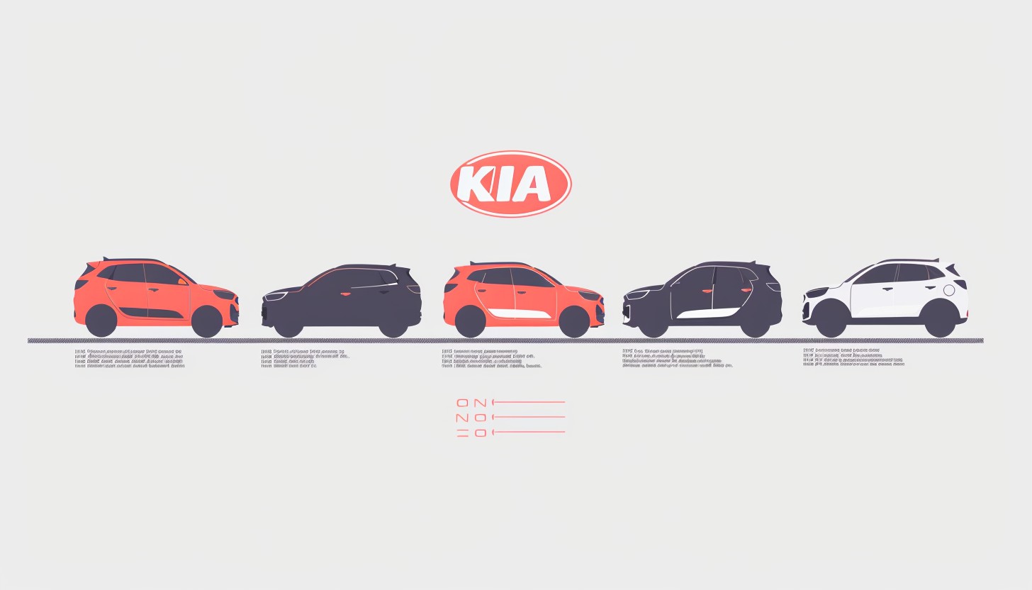
Kia Co., Ltd. is a Korean multinational automobile company, originally known as Keijo Seimitsu Industry and headquartered in Seoul, Korea. In 1973, the company announced its first integrated automotive assembly line at the Sohari plant. Kia is the second largest automobile company in Korea after Hyundai Motor, with sales exceeding 2.8 million units in 2019. Kia old logo has come a long way from its inception in Kyoto Seimitsu Kogyo to the present Kia. This time, we will briefly look at the history from 1944 to the present.
Part 1: History of KIA
By knowing the history of the Kia old logo, you can get a glimpse of the identity of the brand. It shows how Kia has adapted and grown over the years. Whether you like cars or just curious, the story of such kind of iconic logos is interesting and moving. Discover the charming history of the Kia old logo.
1944: The dawn of Kia Motor
Born in 1905, Kim Chorho founded Kia at the age of 39. Before Kia was named “Kia,” Kia was called Keijo Seimitsu Kogyo. Ho established Kia as a company specializing in the manufacture of bicycle parts and steel pipes rather than automobiles.
1952: Became Kia automobile.
In choosing the name “Kia,” Ho chose a word meaning “the rise of Asia” and a word that shortened the company name of the past. The new name reflects the brand’s plans for innovation and creativity from Asia.
1972: Kia acquires a car manufacturing license
When Kia was approved for automobile manufacturing, Kia began building a production plant. The plant was opened in 1973 and called the Sohari Factory.
1992: Kia to the United States
The founder of Kia passed away before this expansion was realized, but he would definitely have rejoiced if he saw Kia entering the world.
1998: Merging with Hyundai Motor
During the Asian financial crisis, Kia was forced to move the axis. Therefore, we agreed to a partnership agreement with Hyundai Motor Corporation. Under the agreement, Kia Automobile will invest 34% of Kia Motor, and Kia Motor will invest in 22 subsidiaries of Kia Motor.
Part 2: Meaning and history of Kia Logo
Each brand story is different. Some brands have used the same logo for decades, others have changed the logo every few years, others have never changed the logo. In the case of Kia, the logo has been updated for many years, but also has two separate logos.
1944 – 1964
The first KIA old logo was designed during the era of bicycle manufacturing. It consisted of three diamonds with gears in the center. The company name is placed inside the gear and is edged into another diamond shape. It was complex and powerful at the time. The palette of monochrome made me feel professionalism and authority.
1964 – 1986
In the 1960s, KIA’s profile changed and licensing car production began. The Kia old logo is a green circle with an oblique line facing the top right. The emblem is similar to the character Q upside down, but not. The logo, which appeared on its 20th anniversary, was actually a combination of the Korean acronym for “automotive industry” and the “O” symbolizing the wheel.
1986 – 1994
The Kia old logo that appeared in 1986 was also very meaningful. The 1980s emblem consisted of a symbolic flag, a stylized wordmark expressed in a thick lettering of custom typefaces, and three waves penetrating it. Each wave represented one of Kia’s corporate philosophies: social development, automotive excellence, and internationalization.
1994 – 2012
The new area of the Kia old logo began in 1994. The first version consisted of an ellipse placed horizontally and a wordmark inside it. The custom typeface of the word mark is simple and clear, and the only unique element of lettering is the absence of a horizontal bar in the letter “A” and the small horizontal stroke from the top of the letter to the left. Despite the simple structure of the word mark in the frame, this Kia logo had a strong meaning.
2012 – 2020
In the 2012 redesign, the Kia emblem, published in 1994, was more sophisticated, with more vivid red shades and more distinctive lines and outlines. The concept remains unchanged, with stylized word marks in the oval frame, indicating the status of the Kia brand in the international market. The 2012 KIA logo is an example of a minimalist and tongue-in-cheek design, stylish and timeless. There is no excess, but the essence of the brand can read.
2020 – Current
In the 2020 design revamp, we incorporated a youthful and futuristic style into KIA’s visual identity and maintained the brand’s uniqueness and awareness while minimizing the elements on the badge. The new logo consists of a stylized red inscription, with three letters connecting the upper “K” to “I” and the lower “I” to “A,” and looks like two Cyrillic characters “Ω Ω.”
Korean Logo
The most interesting thing about KIA’s visual identity is that the brand has two different logos for the international and Korean markets. The Kia old logo used in the brand’s home country is completely different from what we used to see in Western Kia cars. The Korean logo consists of a blue circle with a thick black outline. Inside the circle is a stylized character “K” drawn with elegant white lines, representing the brand name.
Part 3: Elements of Kia old logo
The current Kia logo aims to express passion, energy and modernity. The Kia logo has consistently centered on the company name in its history. Today’s Kia old logo makes strong and sophisticated claims in both black and red. Minimal lettering is reminiscent of creativity, strength and innovation at a glance.
Font
The typography of Kia Motor’s distinctive logo fonts is an element that determines its brand identity. Kia has been mainly using the word mark logo for many years, so the font style strongly affects the image of the entire brand. Kia old logo fonts specifically custom designed for brands rather than using existing typefaces. The font is a sophisticated sans-serif with a bold, block-like beauty in capital letters.
Color
The official logo colors of Kia is red, black and white. However, many recent Kia branding assets use a black-and-white version of the logo with no red accent. This simple style aims to express strength and refinement. Black is generally reminiscent of luxury, professionalism and elegance. By focusing on black and white, Kia’s logo exudes sophistication and authority.
Kia colors include
| Color Name | Hex | RGB | CMYK | Pantone |
| Kia Live Red | #BB162C | 187, 22, 44 | 0, 0.882, 0.764, 0.266 | N/A |
| Kia Gray | #7E8083 | 126, 128, 131 | 0.038, 0.022, 0, 0.486 | N/A |
| Black | #000000 | 0, 0, 0 | N/A | PMS BLACK 6 C |
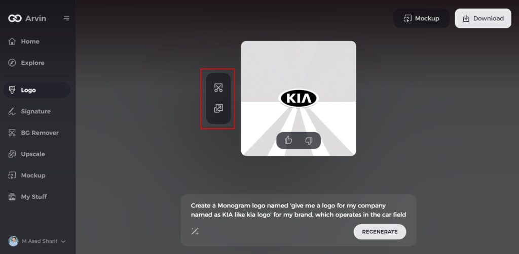
Part 4: Arvin AI: Revolutionizing Insights in Logo Design
A logo is the hallmark of a company’s identity. It communicates its value, creates impressions, and well recognized in any market. With a good design, a firm can shape a corporate reputation and etch its place in the respective industry. To companies like Kia, tools such as Arvin AI can fine-tune their branding strategies, with the logos remaining impactful and relevant. This is where Arvin AI shines as the ultimate logo design tool.
Key Features of Arvin AI
- AI-Driven Insights: Help it determine trends and design recommendations for logos.
- Prediction of Trends: Enabling brands to be ahead of the curve with emerging design trends.
- Allowance for Customization: This feature gives scope to designed logos that strictly complement the unique identity of a brand.
- Friendly Interface: Easy to use, even professionals make designing professional logos accessible to anyone.
- Immediate Feedback: Give real-time assessments and suggestions for improvement throughout the design process.
Steps to Use Arvin AI for making Logo
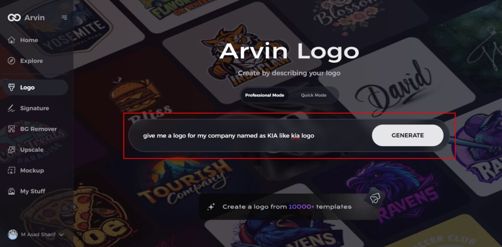
Step 1: Visit the Arvin AI Website
Open your web browser and navigate to the Arvin AI logo maker’s design page to begin your logo creation journey.
Step 2: Provide Business Information
Enter your business details, such as the name and category, to help the AI tailor designs specific to your brand identity.
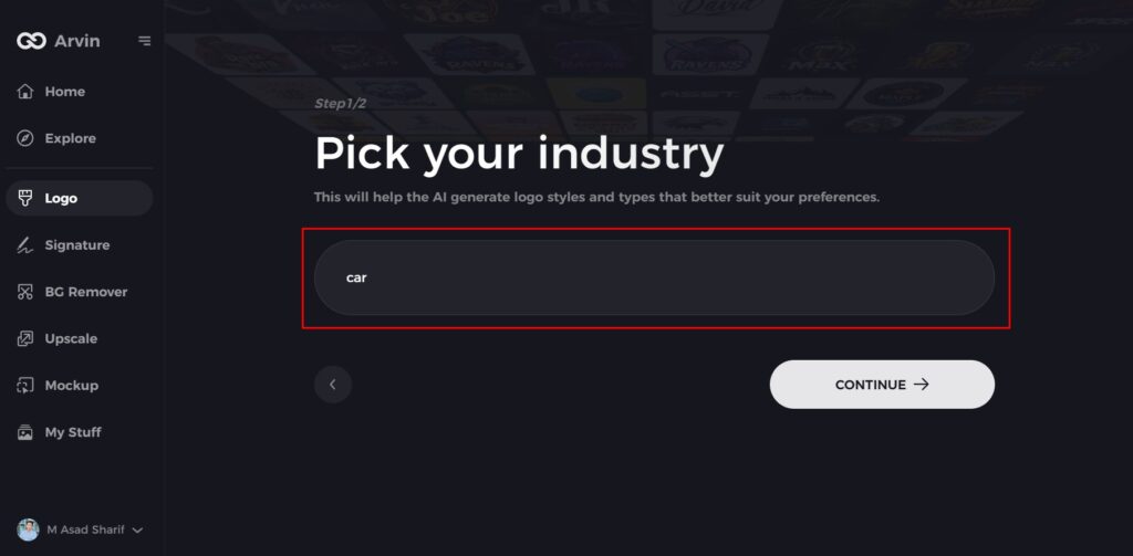
Step 3: Select Your Industry
Choose your industry from the provided list to refine the logo options. This helps the AI focus on styles relevant to your field.
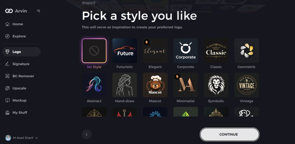
Step 4: Choose a Design Style
Browse through the style options and pick one that aligns with your brand’s vision. If you’re unsure, skip this step and let the AI generate designs based on default inspirations.
Step 5: Explore Logo Ideas
Review the AI-generated logo designs created based on your inputs. Select the ideas that resonate most with your brand image.
Step 6: Customize Your Logo
Personalize your selected design by adjusting elements like colors, fonts, icons, and layouts to perfectly capture your brand’s essence.
Step 7: Download Your Final Logo
Once satisfied with your customized logo, download it in formats like PNG or SVG. These versatile formats ensure your logo is ready for websites, social media, and print materials.
Conclusion
Kia old logo reflect the company’s history: from small to global automobile company. Every version was the manifestation of a transformation and growth of Kia-a company that was truly concerned with answering customer needs. Today’s marketplace is one extreme competition. And the new game in town happens to be this relevancy-innovative tool like Arvin AI, actually offering value insight for brands, which are interesting in evolving while keeping their values intact. The journey of Kia reminds one of the abilities to adapt in power and, most importantly, the importance of a strong logo.
FAQs
Why is Kia old logo historically important?
This old logo simply symbolizes its journey from an automobile manufacturer which was local-based to a full-fledged worldwide automobile giant because of its shift in identity as well as in vision.
What is the old logo of Kia?
The original Kia logo had three diamonds overlapped by a circular gear, inside which was a hexagon. Inside the hexagon was a rectangle with the word “KIA” spelled out in capital letters. 1964-1986: The Kia “Q” logo was implemented during this period.
How did Kia’s logo change throughout the years?
Kia changed its logo through the years based on the expansion of the company, modernization, and venturing into foreign markets, every new version is sleeker and more contemporary.
How can Arvin AI aid in logo creation and analysis?
Businesses leverage Arvin AI’s AI solutions to perform trend analysis while their logo analytics identify performance metrics and receive creative suggestions for branding improvement in visual identity development.
