
Hulu was founded in 2007 as a joint venture between NBC Universal and News Corporation. It marked the beginning of what would become one of the leading streaming platforms in the industry. As it evolved, the Hulu logo remained a central part of its branding strategy.

Over the years, Hulu has grown substantially, reaching a milestone of 50 million subscribers by December 2023. This impressive growth has solidified its place among the top streaming services, competing with industry giants like Netflix and Disney+.
As of the fourth quarter of 2022, Hulu held approximately 16% of the streaming market. It maintained a significant share despite increasing competition. Its steady expansion can be attributed to a combination of strategic content acquisitions, original programming, and a flexible subscription model that includes both ad-supported and ad-free options, catering to a diverse audience.

Hulu Logo Branding
Hulu’s branding strategy is meticulously orchestrated. It consists of typography, iconography, illustration, and dynamic design elements, all of which are anchored around the core identity represented by the Hulu logo. These elements are not just aesthetically pleasing but strategically implemented to enhance user experience. This ensures brand consistency and communicates Hulu’s narrative in the digital entertainment space.
Typography
Hulu utilizes the Graphik type family across all applications, a choice driven by the typeface’s versatility and modern appeal.
Graphik is a neo-grotesque sans-serif typeface designed by Christian Schwartz and published by Commercial Type in 2009 (Wikipedia).

The Graphik typeface is known for its clean lines and contemporary feel, which aligns perfectly with Hulu’s forward-thinking brand identity.
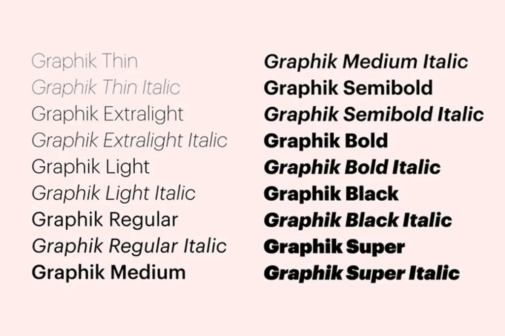
The uniform application of this typeface ensures that whether a viewer is browsing through Hulu’s platform or encountering its advertisements, the textual presentation remains seamless and distinctively “Hulu”.
Just as Hulu meticulously crafts its visual identity using elements like the Graphik typeface and its iconic green color, Arvin AI Logo Maker allows businesses to generate logos tailored to their industry, audience, and brand personality. Whether you need a sleek, modern logo for a tech startup or a bold, colorful identity for a streaming service, AI-powered tools can suggest designs based on your inputs, ensuring a cohesive and strategic brand presence.
Iconography
Iconography in Hulu’s design is crucial for intuitive navigation and storytelling.
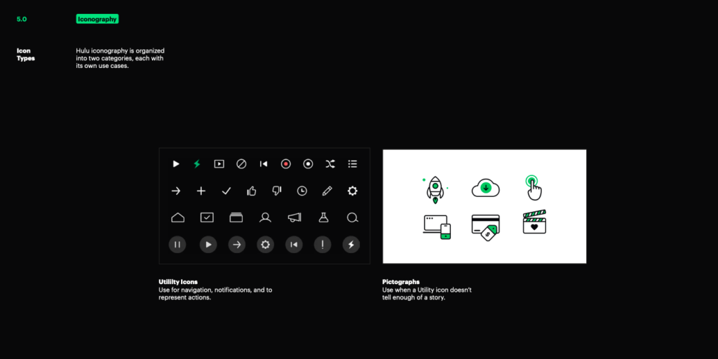
The icons are designed to contrast sharply against their backgrounds. It can facilitate user engagement by making the interface more navigable and the content more relatable.
The largest group of Hulu users are aged between 25 and 34 years. Approximately 94.25% of Hulu’s website traffic comes from the United States.
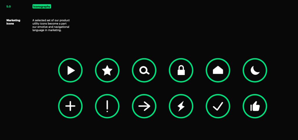
These icons follow the rounded aesthetics of the Vessel, ensuring they fit cohesively within the overall design schema.

For instance, in Hulu’s mobile app, utility icons guide users fluidly from one section to another. This enhances the overall usability of the platform and enriches the user experience.
Illustration
Hulu employs illustrations that incorporate elements of the Vessel, adding layers of character and flair to its communications.
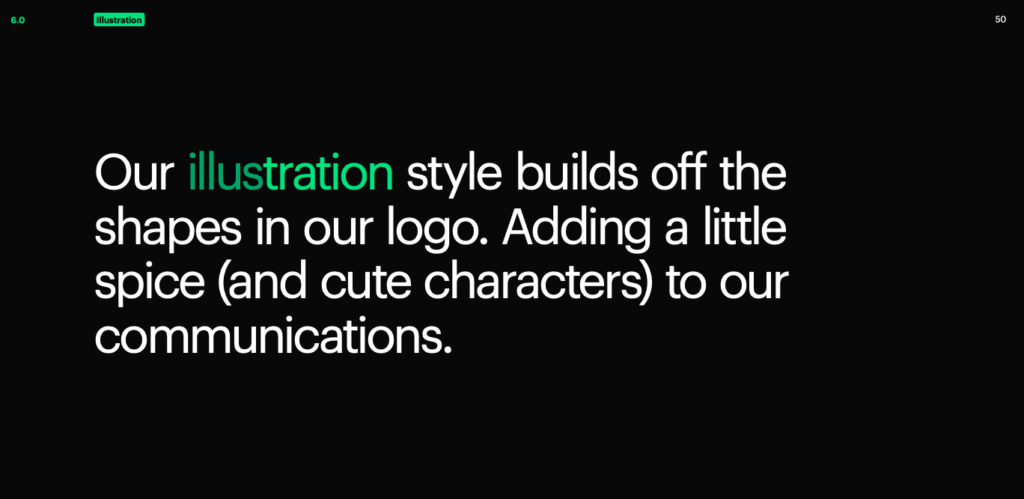
These illustrations vary from character spots. It may highlight specific characters from Hulu Originals, to hero illustrations on landing pages or thank you pages. These banners are often spotted during major releases or seasonal campaigns such as Christmas, Thanksgiving or even New Year’s.
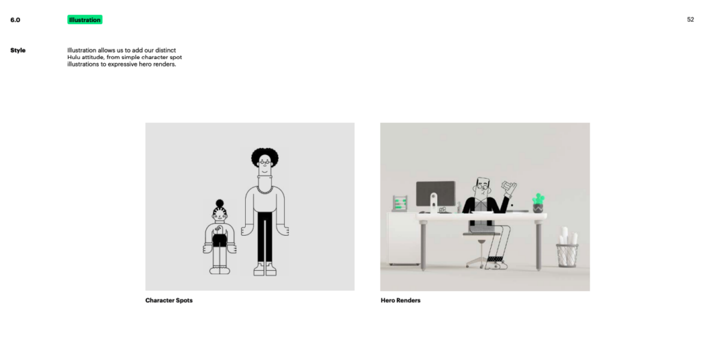
This approach not only makes the visual content more engaging but also helps in forging a stronger emotional connection with the audience, by making their presence more vivid, rather than just with words.
The Vessel

The Vessel is a unique design motif derived from the Hulu logo. It acts as a versatile frame that ties together various brand touchpoints. This element is crucial for maintaining consistency across Hulu’s digital and physical branding platforms.
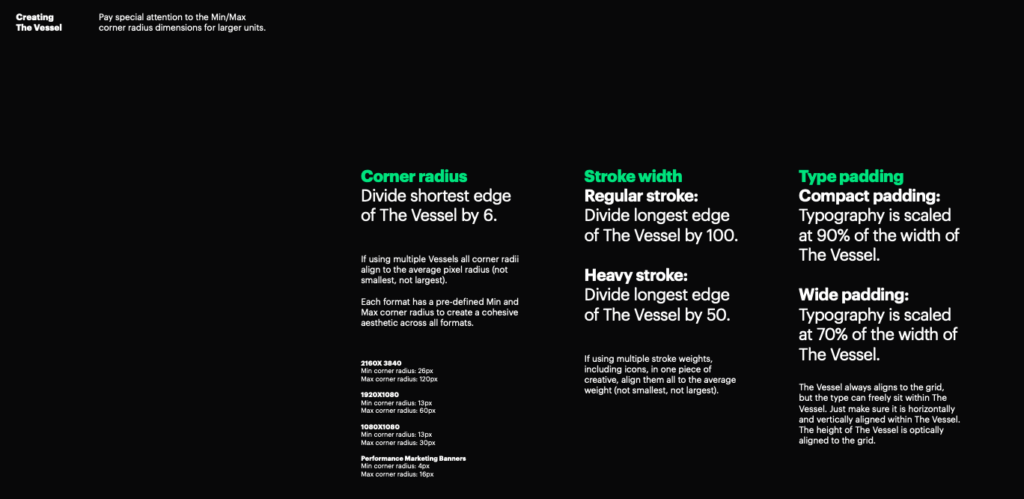
The specific guidelines for the Vessel’s stroke weight and corner radius, based on specific calculations. It ensures that it remains a consistent and integral part of the visual identity, irrespective of where it appears.

The Vessel is prominently featured in the user interface, serving as a dynamic container for content previews and interactive elements. By doing so it makes the browsing experience more engaging and visually integrated.
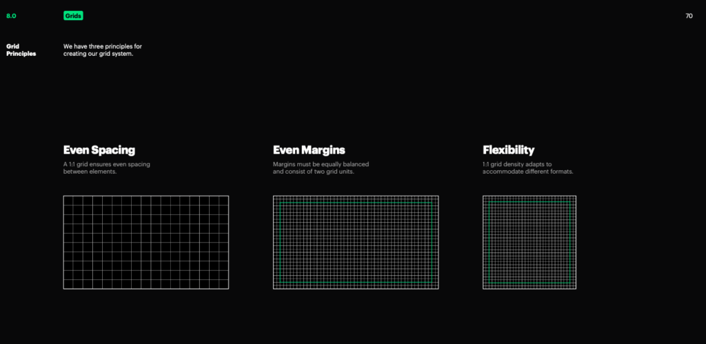
Grid System
Hulu has an adoption of a 1:1 grid system. It is based on the aspect ratio of the format. This ensures that all visual components are aligned and proportionately spaced, regardless of the platform.
Call to Action (CTA)
Hulu’s CTAs are tailored to fit the length and style of different promos while maintaining brand consistency.
These CTAs not only prompt user action but also reinforce brand recognition and viewer retention.
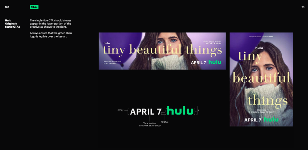
For Hulu Originals, the CTAs are designed to keep the presentation unified across various media. Promotional materials distinctly highlight the availability of new content or series continuations.
Hulu Logo History
Hulu is a prominent player in the streaming industry. They offer a dynamic platform where users can access a vast array of TV shows, movies, and exclusive Hulu Originals. Known for its user-friendly interface, Hulu differentiates itself by providing current-season episodes from major U.S. broadcast networks, often available just a day after airing.
Hulu generated $2.1 billion in ad revenue for the year ending in September 2021.
Over the years, Hulu has expanded its service to include live TV. It also has a variety of subscription options, such as Hulu + Live TV.
In 2023, Hulu’s average revenue per subscriber for SVOD (Subscription Video on Demand) was $12.17, and for SVOD + Live TV, it was $90.52.
Hulu’s logo has seen several transformations since its inception in 2007. It encapsulates the brand’s fresh and innovative approach to media streaming. This initial design used a simple, sans-serif font that was approachable and easy to recognize.
2014- Now Hulu Logo
In 2014, Hulu introduced a redesigned logo. They retained the green color but opted for a gradient to add depth and modernity to its visual identity
This design was aligned with design trends at the time, which favored dynamic and layered visual effects.
The 2017 redesign marked a significant shift towards minimalism. Hulu simplified its logo by removing the gradient and using a flat, vibrant green color.
Hulu’s logo evolution showcases how businesses must adapt their visual identity over time to stay relevant in the market. With Arvin AI Logo Maker, businesses of all sizes can create custom, high-quality logos that embody their brand’s core values.
The latest iteration of the logo in 2020 fine-tuned the shade of green to a deeper and richer hue. This adjustment hoped to convey a more mature and sophisticated brand image, especially with its growing library collection of Hulu Originals.
What Is The Hulu Logo Color Scheme?
Specifics of Hulu Green
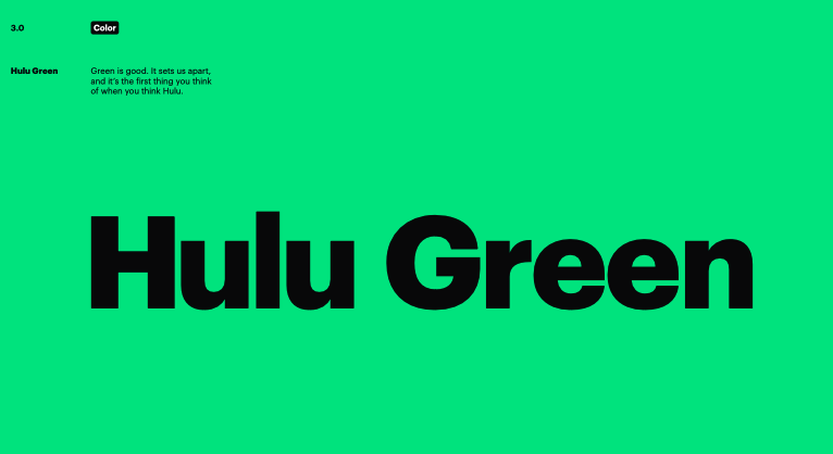
Hulu’s chosen shade of green serves as the primary color in its logo.
The exact color specifications are:
Pantone (PMS): 354 C
CMYK Color Model: 76, 0, 74, 0
RGB Color Model: 0, 215, 120
Hex Code: #00D778
This specific shade of green is selected not only for its brightness and vibrancy but also for its psychological implications. Green often represents growth, freshness, and innovation.
Utilization of Secondary Colors for Versatility
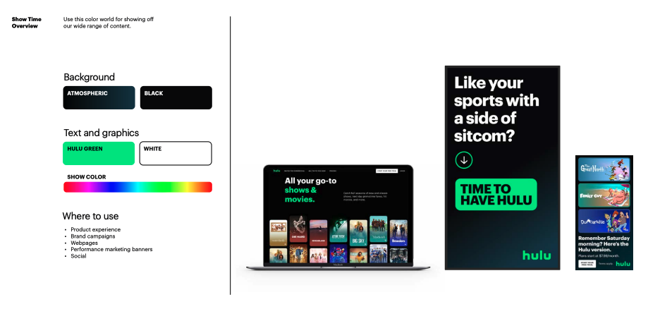
To ensure the logo’s effectiveness across various backgrounds and to maintain its visibility, Hulu incorporates black and white as secondary colors in the logo’s design:
Black: CMYK: 0, 0, 0, 100 RGB: 0, 0, 0 Hex Code: #000000
- Applied on lighter backgrounds to provide a stark contrast, ensuring the logo’s prominence.
White: CMYK: 0, 0, 0, 0 RGB: 255, 255, 255 Hex Code: #FFFFFF
- Used against darker backgrounds to ensure that the logo remains visible and striking.
Strategic Branding with Color
Hulu’s strategic use of its green logo color is a deliberate branding tool that makes the logo instantly recognizable. The bold color choice distinguishes Hulu in the competitive streaming market. Additionally, the consistent use of this specific green reinforces brand identity and aids in viewer recall, a key aspect of Hulu’s marketing strategy.
Hulu Logo Meaning
Symbolized by its vivid green color, the logo reflects Hulu’s innovative spirit and continuous growth in the streaming industry. This color not only aligns with the company’s forward-thinking approach but also freshness and renewal, constantly evolving to enhance user experience with the latest technology and content offerings.
The choice of lowercase letters in the logo emphasizes Hulu’s user-friendly and approachable nature, making the platform seem more inviting to a diverse audience.
As indicated by Hulu’s SVP of Experience, Ben Smith,
“Efforts were aimed to make the user experience more intuitive and personalized.”
Cultural Impacts
Hulu’s logo and its content often appear in various parodies and sketches, particularly on platforms like “Saturday Night Live” and in online meme culture. For instance, “Saturday Night Live” has featured skits that parody Hulu’s content strategies. These parodies, while humorous, also serve to keep Hulu relevant in public discourse, enhancing brand visibility and engagement.
Hulu Logo Font
Hulu’s logo font is meticulously designed to align with the streaming giant’s core values of accessibility, innovation, and user-friendliness. Utilizing a custom, bold, sans-serif typeface, the logo ensures the logo remains legible across various media formats from digital ads on small screens to large outdoor billboards.

The decision to use lowercase letters in the Hulu logo breaks away from the more formal or corporate connotations of uppercase letters. It speaks to Hulu’s desire to connect with viewers on a personal level, emphasizing a friendly user experience.

The geometry of the Hulu logo’s typeface, characterized by rounded edges and uniform thickness, contributes to a sense of openness and ease. These design elements are crafted to convey a welcoming and non-intimidating presence, inviting users to explore Hulu’s diverse content offerings. The simplicity of the design helps ensure that the logo is adaptable and scalable, maintaining its integrity and impact whether it’s displayed on the high-definition screen of a smart TV or the side panel of a city bus.
Hulu’s branding is designed for versatility, ensuring that the logo maintains clarity across mobile apps, smart TVs, and physical billboards. Similarly, Arvin AI Logo Maker provides logos that are scalable and optimized for multiple platforms, from social media profiles to high-resolution advertising materials.
Hulu Logo 2024
In 2024, Hulu’s logo continues to be a powerful representation of the brand’s ethos, blending modern design with user-centric functionality.
Design Features of the 2024 Hulu Logo
Color
The Hulu logo retains its vibrant green color, known for its freshness and vitality. This green, detailed as Pantone 354 C, RGB (0, 215, 120), and Hex #00D778, is not just visually striking but also symbolizes growth and creativity.
Typography
The logo features a bespoke, lowercase sans-serif font that enhances readability across various platforms and devices. The choice to use lowercase is deliberate, aiming to convey approachability and friendliness, making the brand seem more accessible to a diverse audience.
Versatility
The streamlined design of the logo ensures that it performs well in multiple applications, from app icons and web interfaces to large-scale advertisements. This versatility is crucial for maintaining brand consistency across different media channels.
Hulu’s logo evolution, from its 2007 launch with a gradient effect to its modern, minimalist aesthetic in 2020, demonstrates the importance of adapting branding while maintaining recognizability. Arvin AI Logo Maker enables businesses to iterate and refine their logos as their company grows, ensuring that the brand identity remains fresh, relevant, and adaptable without losing its essence.
Integrating Arvin AI Logo Maker into Hulu’s Branding Approach
Hulu’s branding strategy exemplifies how a strong visual identity can reinforce market positioning, enhance user engagement, and maintain consistency across various digital and physical touchpoints.
The Hulu logo, with its distinct typography, color scheme, and adaptability, is a perfect example of how strategic branding can solidify a company’s presence in a competitive industry.
For businesses or content creators looking to establish a similarly impactful brand identity, leveraging an advanced tool like Arvin AI Logo Maker can be an invaluable resource.
Future Outlook
As Hulu moves forward, the logo is likely to continue as a central element of the brand’s visual strategy, possibly adapting subtly to align with emerging design trends or new strategic directions of the company. The fundamental aspects of its design—particularly its color and typography—are expected to remain consistent, providing a stable foundation for Hulu’s branding efforts as it navigates the evolving media and entertainment landscape.
In conclusion, the 2024 Hulu logo is more than just a corporate symbol. It is a dynamic tool that supports the brand’s marketing, enhances its visibility, and fosters a deep connection with viewers, contributing significantly to Hulu’s ongoing success and recognition in the competitive streaming industry.
If you’re inspired by Hulu’s branding journey and want to build a similarly memorable, adaptive, and professional brand identity, give Arvin AI Logo Maker a try.
Create a custom, high-quality logo in minutes, designed for scalability, versatility, and brand storytelling. Start designing now and make your brand as recognizable and impactful as the industry’s leading names.
Final Words
FAQ
The Hulu logo represents the brand’s innovative and dynamic presence in the streaming industry. The logo is designed to be simple, modern, and versatile, ensuring instant recognition across digital and physical platforms.
Hulu’s primary visual symbol is its logotype—a bold, lowercase wordmark set in a custom sans-serif font. Additionally, Hulu incorporates “The Vessel,” a design element derived from the logo, which acts as a framing device in branding and interface design. This unique feature reinforces brand consistency across Hulu’s digital ecosystem.
Hulu uses green as its signature brand color because it stands out in the competitive streaming market, evoking freshness, innovation, and entertainment. The specific shade—Pantone 354 C, RGB (0, 215, 120), Hex #00D778—was carefully chosen to create strong visual recognition. Green also aligns with the platform’s continuous evolution and ability to stay ahead in the industry.
Hulu is known for its vast library of TV shows, movies, and original content, including award-winning series like The Handmaid’s Tale and Only Murders in the Building. It differentiates itself by offering next-day streaming of major network TV shows, a mix of live TV options, and an extensive on-demand catalog. Its flexible subscription plans, including ad-supported and ad-free tiers, make it a versatile choice for viewers.
Hulu is a leading streaming platform that provides on-demand access to a diverse selection of TV shows, movies, and exclusive original content. Launched in 2007 as a joint venture, it has grown into a major player in the streaming industry, offering both a subscription-based video-on-demand (SVOD) service and a live TV streaming option.
