Logo can be described as the face of your brand; it plays an important role in defining how the world perceives your business. A well-crafted logo, besides creating a sense of trust and recognition, keeps you ahead of your competitors. Professional design may seem intimidating, but with the right guidance and tools, even beginners can produce a great-looking and effective logo. Arvin AI is an intuitive design assistant that makes it all easier and lets anyone create remarkable logos. The guide will give you the how to draw a logo, step-by-step guidelines, and the tools you’ll need to get your ideas up and running.
Part 1: What Makes a Good Logo?
A good logo is so much more than just a design or a sign. It is more like a brand’s identity. Either you are launching a new business or renovating an already existing brand, understanding the major factors that work in a good logo is inevitable. In the following section, we will try to understand characteristics of a good logo, right from simplicity and versatility to relevance and uniqueness. Let’s dig into what makes a logo stand out and how it can help build a strong, recognizable brand presence.
Key Elements of a Great Logo
A good logo does more than look pretty; it’s a branding implementation that communicates your story. There are four key elements about how to draw a logo:
- Simplicity: A clean and uncluttered design ensures easy recognition and versatility. Think of the Nike swoosh—minimal yet impactful.
- Memorability: A logo should leave a lasting impression. McDonald’s logo golden arches, for example, are unforgettable due to their distinct and consistent design.
- Versatility: A good logo looks great on all platforms—business cards, billboards, websites, or even merchandise.
- Relevance: It should reflect your industry, audience, and brand values. Apple’s logo perfectly conveys innovation and sophistication.
By studying how to draw a logo, you can better understand why these principles are timeless and effective.
Understanding Your Brand Identity
Your logo is an extension of your brand identity. To create one that resonates, start by defining your:
- Target Audience: Identify who your business serves. What are their preferences and expectations?
- Brand Personality: Are you fun and quirky, or formal and professional? Your logo should embody this tone.
- Core Values and Mission: What do you stand for? Your logo should communicate these ideas at a glance.
Part 2: Tools and Materials for Drawing a Logo
Designing a logo- it’s a creative journey that just calls for the right tools to aid in bringing those ideas that populate your imagination. Be it sketching traditionally, or plunging into advanced digital platforms, the process at hand is improved with the relevant materials. So, here is a deeper dive into both traditional and digital tools for making logos.
Traditional Tools: The Foundation of Creative Exploration
The base of every creative journey was traditional tools before digital design tools became popular. With pencils, paper, paintbrushes, and sketchbooks, designers were allowed to explore their ideas and work out a basic basis for their thoughts. These tools also allowed creativity and honed technical skills that will eventually be developed in more sophisticated designs. Whereas technology is changing the face of design processes, some old-fashioned tools get a niche place in the world of creativeness for unique visualization and realization methods for vision and establishing historical grounding for the new design techniques.
Using a Pencil, Eraser, Sketchpad, and Ruler
Traditional tools are so much more helpful in getting the initial logos. A pencil is helpful to you in sketching freely with ideas, because here you can brainstorm easy shapes, lines, and proportion. Add this with an eraser that can remove markings without permanently modifying your design and you get a lot from it. Brainstorming goes well on paper, and mainly for symmetrical or structured logos.
The Benefits of Starting on Paper
Paper is one of the best media to express your creative vision. There are no distractions from the software or the technical settings, hence you can only think purely based on the concept. Quick ideation and changes can be executed with paper sketching. The rough drafts that come from those can facilitate you in bringing it to the digital tools where you can polish out finer details of your design.
Digital Tools: Precision and Professional Execution
Digital tools are unparalleled when it comes to accuracy and efficiency of proper execution in logo design. They enable the designer to express their creative vision from the very details down to the minute particulars, streamline the process, and make easy changes. All of this ensures the final product is polished enough for both digital and print formats. Therefore, be it a beginner or a professional, reliance on the right digital tools works magic in the creation of memorable and effective logos.
Adobe Illustrator, Canva, and Figma
As you go from idea to implementation, digital assets will give you the control and scale expected with a professional logo. Adobe Illustrator is a go-to favorite for its robust capabilities of vector-based designing, so how to draw a logo is crisp clear on everything from business cards to billboards. Canva is an approachable entry-point solution that provides templates to facilitate the design process. Figma is perfect for teams as it allows real-time design adjustments while receiving immediate feedback.
Part 3: Step-by-Step Guide to Drawing a Logo
Brainstorm Ideas and Research. Develop a logo as a part of developing your brand. The well-designed logos with a structured approach will provide you with the logo that gives a reflection to the heart of your brand and will still stand out in the competitive market. Here is a step by step guide to draw a logo.
Step 1: Brainstorm Ideas and Research
Start by researching competitors and taking ideas from their logos. Identify the trends and what not to replicate. Identify what clicks with your target audience and matches with your brand values. Prepare a mood board that describes the visual aspect of your cool logo brand. Incorporate colors, fonts, and themes that symbolize the emotions and message you want your logo to pass down to the audience.
Step 2: Sketch Initial Concepts
Start by making doodle pieces to outline concepts. It is not yet perfect; it is more about creativity. Be flexible and always try out different shapes, text placements, and icons suitable to your brand. Try a few layouts to see what best works for your piece.
Step 3: Refine Your Sketches
Now pick two or three of your best ideas. Kill the weaker ideas and focus on designs that are memorable and versatile. Take those; draw them up larger with more detail and precision. Make sure your designs are clear and professional yet still original.
Step 4: Digitize Your Design
Transfer your developed sketches to the design software such as Adobe Illustrator or Canva. Scan or photograph your sketches to digitize them. Using digital tools will add precision, symmetry, and effects to your design. Play with colors, gradients, and fonts while making sure everything falls in line with your brand’s mood board.
Step 5: Finalize the Logo
Test how to draw a logo in various formats to make sure it’s versatile. Scale it down to see if it’s readable in smaller sizes and convert it to gray scale to confirm that it works without color. Final adjustments can be made to balance proportions, improve scalability, and perfect alignment. Once everything is in place, your logo is ready to represent your brand.
Part 4: How to Use Arvin AI for Logo Creation
Arvin AI is a powerful tool that simplifies the logo-creation process for you to create professional logos, without requiring the skills of a graphic designer. Using AI-driven insights and easy-to-use interface, Arvin AI helps to streamline your design process, suggesting features and functionality based on your brand. If you are beginning from scratch or refining an idea, Arvin AI makes logo creation quick, intuitive, and accessible to all.
Key Features of Arvin AI
- Designing palettes with AI-based color and font style suggestions.
- Drag-and-drop with an intuitive interface for easy edits.
- The more advanced feature would be generating logos based on the description of your brand.
- Real-time preview of the logo in different contexts.
- Exporting options for different file formats and sizes.
Steps to Use Arvin AI
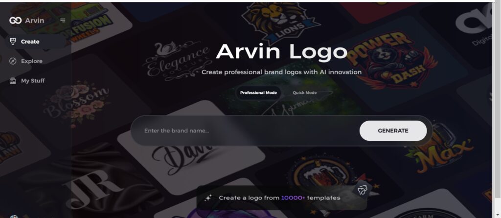
Step 1: Go to the Arvin AI Website
Open your browser and go to Arvin AI to start designing a unique, transparent company logo.
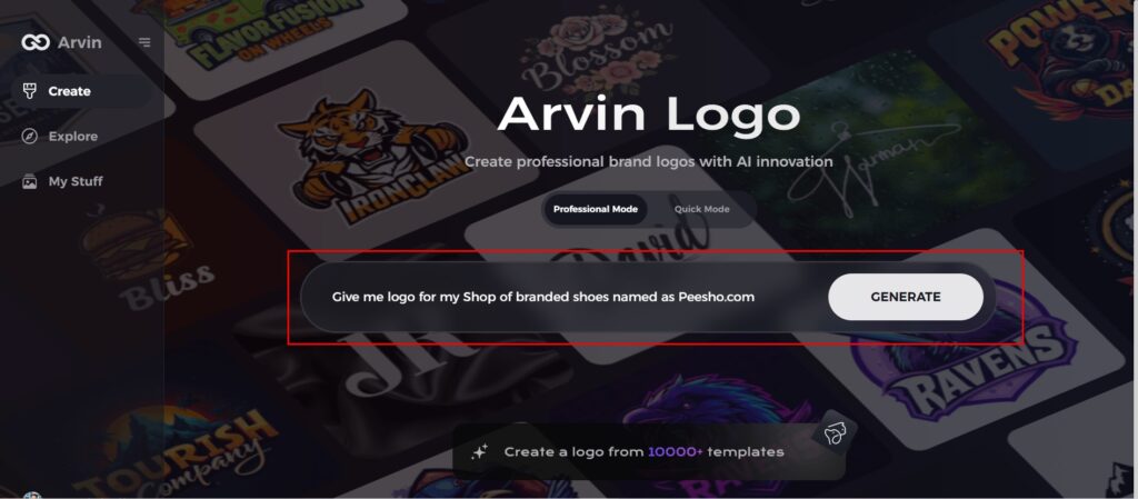
Step 2: Enter Your Company Details
Provide your company’s name and select its category. Request a transparent logo to let the AI generate designs tailored to your specific needs and business representation.
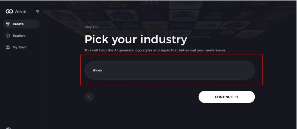
Step 3: Choose Your Industry
Select the industry that you do business in. This selects the AI to create logotypes that fit your brands values and market niche as well.
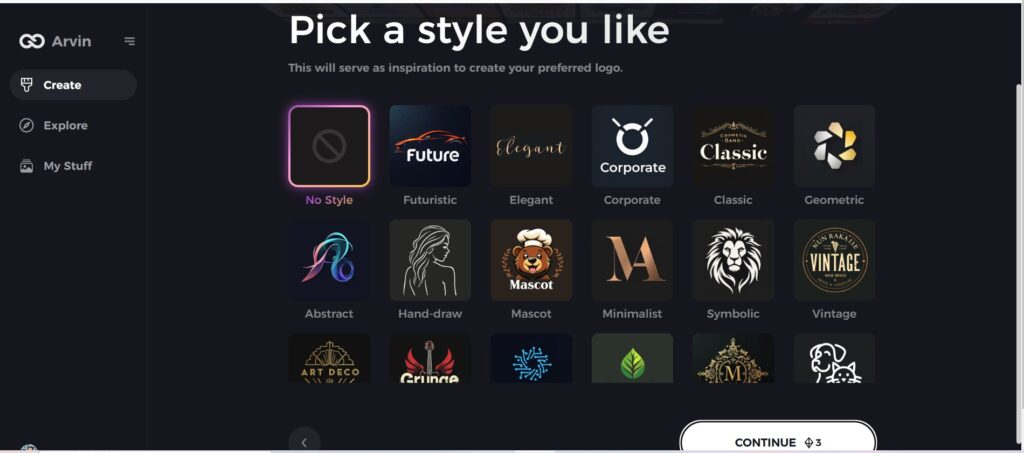
Step 4: Select a Design Theme
Select a design style that you like. You can leave it on “no style” if you haven’t decided yet. It creates some amazing designs for you without any input from you.
Step 5: View Logo Concepts
Review the logo designs created by Arvin AI. Scroll through the options to find one that resonates with your brand identity.
Step 6: Customize Your Logo
Refine the selected logo by tweaking colors, fonts, and icons to align perfectly with your brand’s personality and aesthetics.
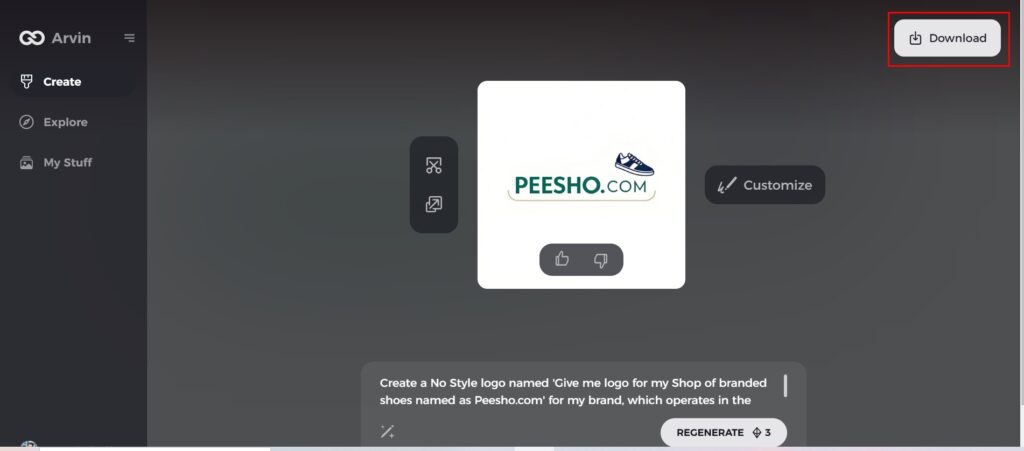
Step 7: Download Your Final Logo
Once satisfied, download your logo in versatile formats like PNG or SVG, ensuring it looks professional across websites, social media, print, and other media platforms.
Part 5: Common Mistakes to Avoid When Designing a Logo
It is quite creative and very easy to mess up on simple things that might undermine the whole impact and effectiveness of the final product. Let’s talk about common mistakes designers should avoid while creating a strong, memorable logo that works on all mediums.
Overcomplicating the Design
The Problem:
Too many design elements in one logo can often make it visually cluttered, and it gets hard to differentiate. Most the time, over designing leads to messiness, creating confusion, resulting in a lower effectiveness and tougher reproduction of that how to draw a logo.
Why It Matters:
A logo must be simple and immediately recognizable. When the logo is too complex, it loses most of its power, especially when scaled down. Just imagine an Apple or Nike or McDonald’s. It is the simplicity in which their designs are made that makes them so iconic.
How to Avoid It:
- Stick to one or two strong elements that clearly represent the brand.
- Omit extraneous information. Think about the message and what you are trying to convey with the logo.
- Check for scalability. A logo should work well on a business card and billboard. If it becomes illegible or loses its impact at smaller sizes, it is probably too detailed.
Using Too Many Colors or Fonts
The Problem:
Though colors and typography are exactly what brand identity needs in order to be unique, too many colors and fonts can dilute the message in a logo. An over-designed with mixtures of fonts and shades appears messy and unprofessional.
Why It Matters:
Too much color or font usage can dilute the impact of the logo. The look and feel is key to recognition through consistent design. A logo should be cohesive, clean, and easy to reproduce on different platforms. Too many fonts and too many colors can make your logo look disjointed and inconsistent.
How to Avoid It:
- Limit the color palette to two or three primary colors that complement each other and convey the right emotions.
- Choose one font or two contrasting ones. Too many fonts make the design fall apart.
- Think about contrast and readability. Ensure your font is legible at any size and that colors provide good contrast.
Failing to Make the Logo Versatile for Different Mediums
The Problem:
A logo that does well on paper or in one specific context will not necessarily translate well across all mediums. Whether it’s on a mobile screen, printed on merchandise, or viewed in black and white, your logo should work everywhere.
Why It Matters:
Logos can be seen today across all media websites, social media platforms, packaging, and several others. However, if your logo is not versatile then it might lose its effect or look very unprofessional when used in different settings.
How to Avoid It:
- Run your logo through a series of mediums to see how it performs across different settings.
- Scalable. Your logo has to be readable and recognizable in different dimensions, from social media icons to huge banners.
- Provide different types of logo (horizontal, vertical, black-and-white versions, among others) so that your logo can be used with flexibility.
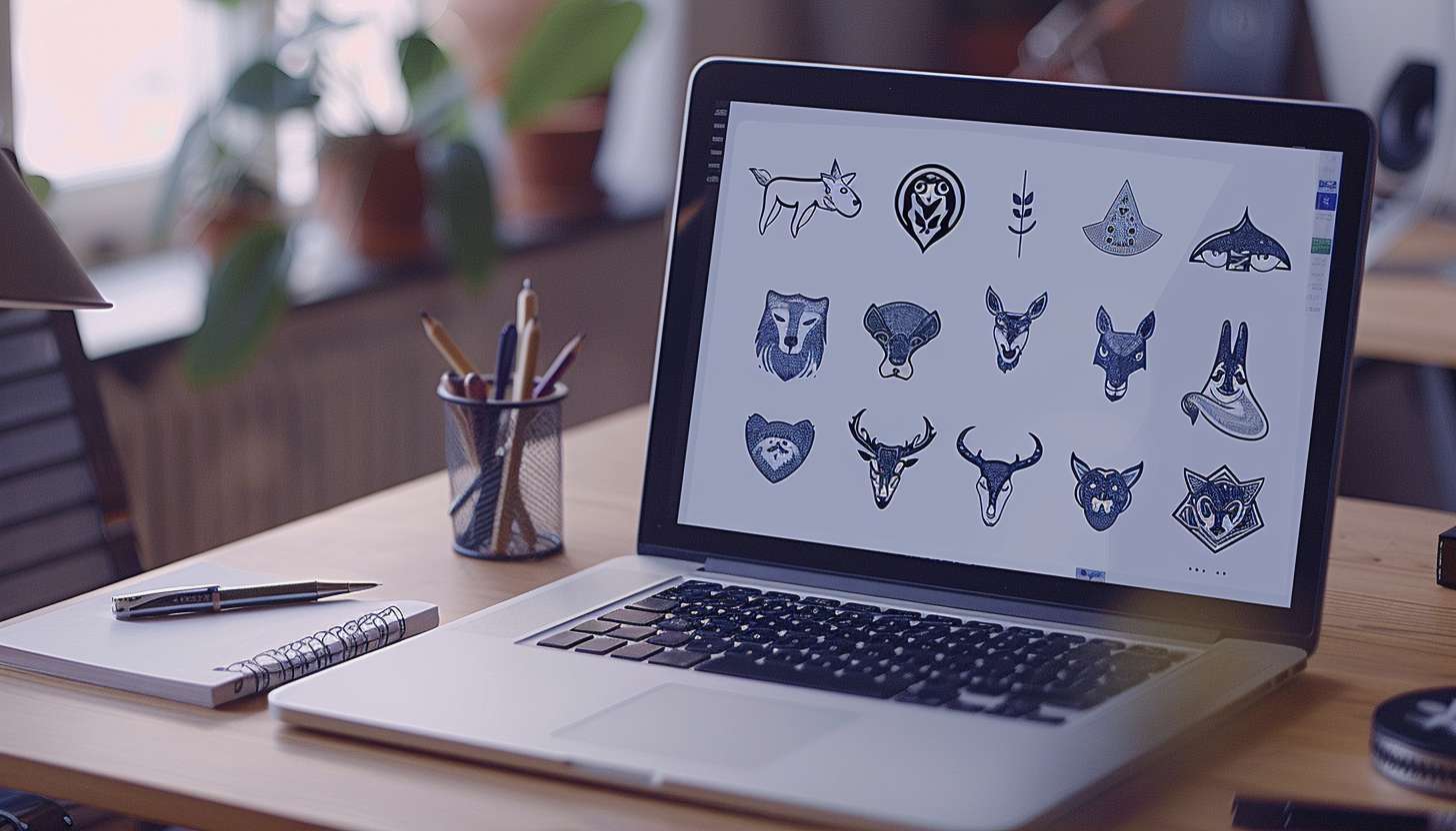
Part 6: Drawing Custom Logo Icons and Symbols
You can come up with original logo icons and symbols that define your brand. Such graphics and images can carry the message about your brand directly and memorably. In the following section, we will cover how to come up with a unique and meaningful icon and symbol that matches the identity of your brand. Let’s dive into creating custom symbols to represent your brand.
How to Design Unique Logo Icons
Designing a logo icon starts with understanding your brand’s mission, values, and target audience. This foundational knowledge helps guide the design process, ensuring how to draw a logo reflects what the brand stands for. It is important to understand how your brand is perceived and how the icon can visually communicate its essence.
Conceptualizing and Sketching Ideas
Begin with brainstorming various ideas in line with your brand identity. Sketch freely to allow for shapes, symbols, or abstract concepts to represent your brand. Keep things simple; don’t forget the design needs to scale well and be legible at all sizes.
Choosing the Right Shapes and Symbols
Choose shapes and symbols that would relate to the kind of message you want to pass along. For instance, a circle would be unity or completeness, and a square, stability or structure. That way, choose symbols that would represent something close to your brand’s core values and can speak to your target audience.
Finalizing with Digital Tools
From there, you will go to design software like Adobe Illustrator or Affinity Designer. Here is where you will refine your design, get the proportions right, and ensure that your icon is clean, polished, and scalable.
Sketching Techniques for Creating Scalable, Recognizable Icons
Start with simple geometric shapes such as circles, squares, and triangles to create the base of your icon. These are easy to work with and provide a solid base to build upon.
Utilizing Grids for Symmetry
Use grids or guides in your design software to ensure that your icon maintains symmetry and proportion. This is especially helpful when working with logos that need to be consistent across different applications.
Incorporating Negative Space
Negative space can be a great asset in how to draw a logo. Consider the empty spaces that can be in or out of your icon as elements that form depth without being too complicated with the design.
Combining Icons and Text in Logo Design
The lettering and icon should complement each other in coordination that is in accord with the style of the icon. A playful icon calls for a casual font, and a sleek modern one should be paired with a minimalist and clean typeface, so it would create balance for both.
Ensuring Balance and Readability
Balanced iconography to the text is visually stunning. The balance between the dominance of the text with respect to icon and vice-versa should neither overpower the icon’s dominance over text nor vice-versa. Maintain the proportion balance of both factors wherein the icon blends with the text to ensure impact and legibility.
Placement for Maximum Impact
It is essential that the placement of the icon in regard to the text contributes to good readability and aesthetics. Some other arrangements would include having the icon on top of the text, underneath, or besides the text. This is the purpose: to be able to arrive at a structure where the logo would be read clearly and impact people.
Conclusion
Creating a logo involves many steps, starting with getting to know your brand, coming up with ideas, making sketches, and finally settling on colors and fonts to put everything together before perfecting it into the most representative image of your brand. Arvin AI simplifies all this for new designers and veterans alike through its intuitive tools and personalization. Whether you are just starting or looking to elevate your designs, Arvin AI makes it easy to create a professional logo in no time. Unlock your creativity and come up with a how to draw a logo that best represents your brand’s identity and value.
FAQs about How to Draw a Logo
What is the best way to start drawing a logo?
Start with thinking, research on your brand identity, and rough drafts for creating ideas that reflect and connect with the brand values you would like.
Do I need professional tools to design a logo?
No, you can start with very simple tools such as a pencil and paper or free digital tools. To display more complex items, it’s suggested to use Arvin AI for the best how to draw a logo.
Can I use Arvin AI even if I don’t have design experience?
True. Arvin AI is very accessible with user-friendly customizing possibilities; thus perfect for those seeking a professional logo irrespective of experience background.
How long is the time cycle in designing my logo?
It will depend on your experience and the tools you use. With Arvin AI, you can design a logo in under an hour because of its efficient and intuitive features.