Football fans wear the pride of their team quite literally—whether it’s the crest on their chest as part of their favorite team’s kit or the chants echoing through stadiums during iconic moments. These logos aren’t just decorations for the pitch; they are symbols of identity, pride, and history that resonate deeply with fans around the world. Take Liverpool FC, for example. Their Liver Bird crest, accompanied by the anthem “You’ll Never Walk Alone,” isn’t just a logo—it’s a rallying cry, a reminder of resilience, and a connection to a community of millions.
The crest doesn’t just support a club; they express their cultural pride every time they wear the jersey. These logos are so much more than designs—they’re part of the shared identity of players and fans, a visual representation of tradition, glory, and unwavering loyalty.
In this guide, we’ll explore some of the most famous football logos and delve into how Arvin AI can help you design a professional logo for free.
Football Logos and Names
Real Madrid CF
The Real Madrid Club de Fútbol crest is one of the most recognizable and revered football logos in the world, and every detail within it tells a story of prestige, tradition, and success. At the very top sits an intricately designed crown, a symbol of the club’s royal status, which was officially granted by King Alfonso XIII in 1920.
Moving inward, the monogram at the heart of the crest intertwines the letters “M,” “C,” and “F,” representing Madrid Club de Fútbol. Cutting diagonally through this monogram is a striking blue stripe, an element that adds both contrast and a sense of movement to the design. While it may appear simple, this stripe has been a consistent feature since the early 20th century.
Meanwhile, the subtle yet powerful color scheme of white, blue, gold, and red adds layers of meaning. White, the primary color, conveys elegance and purity, while blue stands for loyalty and stability. The touches of gold and red in the crown emphasize passion, energy and their royal roots.
FC Barcelona
The FC Barcelona crest is a perfect fusion of history, identity, and pride, with every element woven together to represent the club’s storied legacy and deep connection to Catalonia. Its shield-shaped design immediately evokes tradition, while the vibrant colors and intricate details tell a story that spans centuries.
At the top left, the red cross on a white background symbolizes Saint George, the patron saint of Catalonia, tying the club to the region’s cultural and historical roots. Next to it, the red and yellow stripes represent the Senyera, the official flag of Catalonia, further emphasizing FC Barcelona’s role as a symbol of Catalan pride and independence.
Speaking of color contrasts, check out how you can use contrast in design to stand out!
Below this, the bold black letters “FCB” act as the unifying centerpiece of the logo, directly identifying the club. Underneath, the bottom half of the crest features blue and garnet stripes, the club’s iconic team colors, which are known globally as “blaugrana.” These colors are not just a stylistic choice but a defining aspect of the club’s visual identity, instantly recognizable to football fans around the world.
FC Bayern Munich
At the core of the crest lies the blue and white diamond pattern, which is derived from the flag of Bavaria. This pattern is a direct homage to the club’s roots in the Bavarian region of Germany, symbolizing its close ties to local culture and its identity as a team.
Surrounding the diamonds, a vibrant red ring frames the logo, featuring the club’s full name, “FC Bayern München,” in bold, white uppercase letters. The red, white, and blue color scheme is striking and reflects both the energy of the team and the traditional Bavarian colors. Red, the dominant color, represents passion, strength, and the fiery determination that FC Bayern brings to every match, while the white and blue reinforce a sense of pride in the club’s origins.
The simplicity of the design is part of its charm. It avoids unnecessary complexity, ensuring that the focus remains on the core elements: the diamonds and the name.
Juventus FC
The Juventus FC logo is a striking departure from traditional football crests, embracing minimalism and modernity. This bold redesign, introduced in 2017, captures the essence of Juventus with a sleek, contemporary style that stands out in the world of football.
At its core, the logo features a stylized “J” that serves as both a representation of the club’s name and a powerful symbol of its heritage. The clean, geometric lines of the “J” create a dynamic, forward-thinking look, and the double lines of the “J” also subtly resemble a shield, hinting at the classic design of older football crests while presenting it in a reimagined form.
Above the “J,” the word “JUVENTUS” is displayed in bold, uppercase typography with clean, sans-serif font.
The choice of black and white as the sole colors of the logo reflects the club’s nickname, “La Vecchia Signora” (The Old Lady), and its iconic striped kits that have been synonymous with Juventus since 1903.
Paris Saint-Germain FC
At the center of the logo is the Eiffel Tower, a universally recognized symbol of Paris. Its inclusion reflects the club’s deep connection to the city and its representation as not just a football team but a cultural ambassador for Paris on the global stage.
Beneath the Eiffel Tower lies a fleur-de-lis, a traditional symbol of French royalty and a nod to the club’s historical ties to the suburb of Saint-Germain-en-Laye, where PSG was originally established.
The outer ring of the crest features the club’s name, “PARIS SAINT-GERMAIN,” written in bold white uppercase letters. The typography is clean and modern, giving the logo a contemporary feel while maintaining its timeless elegance. The use of white complements the red and blue, creating a striking contrast that highlights the design’s main elements.
Football Logos Premier League
Arsenal FC
At the heart of the logo is the cannon. It is a nod to the club’s origins in the Woolwich Arsenal, an armament factory in southeast London where it was founded in 1886. This military-inspired symbol ties the club to its heritage and reflects strength. And these are qualities Arsenal fans and players alike take pride in. The gold-drawn cannon radiates prestige and tradition, while its forward-facing direction embodies Arsenal’s drive for progress and ambition.
Above the cannon, the word “Arsenal” is prominently displayed in bold, clean typography. The entire design is enclosed within a shield-shaped crest, a classic structure often associated with legacy and defense. The shield is split into two tones. Red, Arsenal’s signature color, and a blue trim adds a touch of contrast. Giving the logo a modern and polished look while maintaining balance.
Chelsea FC
At the center of the emblem is the blue lion rampant, holding a ceremonial staff. The lion is a heraldic symbol of power and courage.
Its a direct reference to the coat of arms of the Cadogan family, who have strong ties to the Chelsea area.
Surrounding the lion are four red symbols: two football images and two Tudor roses. The footballs are a simple nod to the sport itself, anchoring the crest to its identity as a football club. The Tudor roses is a historical emblem of England. It ties the club to its national heritage, highlighting Chelsea’s role as a prominent English team.
Encircling the central elements is, “CHELSEA FOOTBALL CLUB,” written in bold, white uppercase letters on a deep blue background. The contrast between blue, white, and gold adds depth and elegance to the logo.
Liverpool FC
At the heart of the crest is the Liver Bird, a mythical creature that has become synonymous with Liverpool. The Liver Bird is placed centrally on the shield, emphasizing its significance as the focal point of the club’s identity.
The banner across the top, with the words “You’ll Never Walk Alone,” is more than just a motto. It’s an anthem that unites fans worldwide. Taken from Gerry and the Pacemakers, this phrase represents solidarity, and the unwavering support of Liverpool fans, no matter the circumstances.
Flanking the shield on either side are two eternal flames, which honor the victims of the Hillsborough disaster in 1989. These flames are a poignant reminder as the club’s commitment to remember those lost and support their families.
At the bottom of the crest, the “EST. 1892” inscription marks the founding year of Liverpool Football Club.
The design is framed by a decorative arch, giving the crest an almost regal appearance.The combination of red, green, and white in the color scheme further enhances the logo’s aesthetic.
Manchester United FC
At the heart of the logo lies a shield, split into two halves. The upper half features a golden ship in full sail. It refects Manchester’s rich industrial past and its connection to the Manchester Ship Canal.
The lower half of the shield features the iconic red devil, holding a trident. This figure is a nod to the club’s nickname, “The Red Devils,”. This was inspired by the club’s association with Salford rugby and adopted in the 1960s. The devil represents the intimidating presence on the football field. The trident emphasizes power, authority, and dominance.
Flanking the shield are two golden footballs, which highlight the club’s core identity as a football team.
The shield is surrounded by a red banner, emblazoned with the club’s name, “MANCHESTER UNITED,” in bold uppercase letters. The typography is clear and authoritative, ensuring that the club’s name is unmistakable.
Tottenham Hotspur FC
At the center of the logo is the cockerel (rooster) standing proudly atop a football. This element is deeply tied to the club’s history and name. The cockerel, or “Hotspur,” is a reference to Sir Harry Hotspur, a 14th-century knight known for his fighting spirit and association with spurs on his boots. This connection to bravery and resilience is a hallmark of the club’s identity. The bird’s upright stance and confident posture symbolize pride, courage, and determination, values that Tottenham aims to embody both on and off the pitch.
The football beneath the cockerel is a nod to the club’s core essence—football. The vintage design of the ball is a subtle homage to the club’s long history, dating back to its founding in 1882. Together, the cockerel and football create a timeless representation of the club’s focus and origins.
Below the central design, the club’s name, “TOTTENHAM HOTSPUR,” appears in a clean and modern font. The choice of a monochromatic navy blue color palette adds to the logo’s sleek and modern appearance, while also maintaining the traditional club colors. This simplicity ensures versatility across various applications, from kits to merchandise, while allowing the design to remain striking and memorable.
Manchester City FC
At the top of the crest is a golden ship, symbolizing Manchester’s industrial past and its link to the Manchester Ship Canal, which played a vital role in the city’s history as a trade and industrial hub. Below the ship lies a red rose, a historic emblem of Lancashire, the county to which Manchester traditionally belonged.
The shield features light blue and white diagonal stripes dividing it into two sections, paying homage to the club’s iconic sky-blue kits that serve as a cornerstone of Manchester City’s identity.
On either side of the crest are the numbers “18” and “94,” representing the club’s founding year.
The sky blue ties directly to the club’s kits, the gold exudes excellence and success, and the red adds a contrasting touch that enhances the crest’s aesthetic. As a symbol, it reflects Manchester City’s rise as a powerhouse in English and international football, resonating with fans locally and around the world.
Everton FC
At the center of the crest is the Prince Rupert’s Tower, a historic structure located in Everton, Liverpool. This small Georgian lock-up, built in 1787, once served as a holding place for petty criminals and drunks.
Flanking the tower are two laurel wreaths, which are classic symbols of victory and success. Beneath the shield is the Latin motto “Nil Satis Nisi Optimum,” meaning “Nothing but the best is good enough.”
The deep blue background in their crest is synonymous with Everton. It reflects the club’s identity as “The Toffees” and their iconic blue kits. The inclusion of “1878” marks the year Everton was established, highlighting its status as one of the oldest and most historic football clubs in England. It pays homage to over a century of footballing tradition.
Football Logo Maker
Arvin AI – Your Creative Assistant
Arvin AI is an intuitive design platform that can help you craft a football logo in minutes. Its AI-powered suggestions guide you through the design process with ease. It offers templates and color combinations tailored to your team’s identity. Plus, with its easy customization tools, you can tweak every detail to make your logo uniquely yours.

Key Features:
- Tailored logo designs using AI insights.
- Pre-built templates specific to sports teams, including football.
- Instant export options for social media, merchandise, or kits.
Football Logo Design Free
What’s better than professional-quality logos? Logos that don’t break the bank! Arvin AI offers free design tools, ensuring anyone can create a standout logo without worrying about costs.
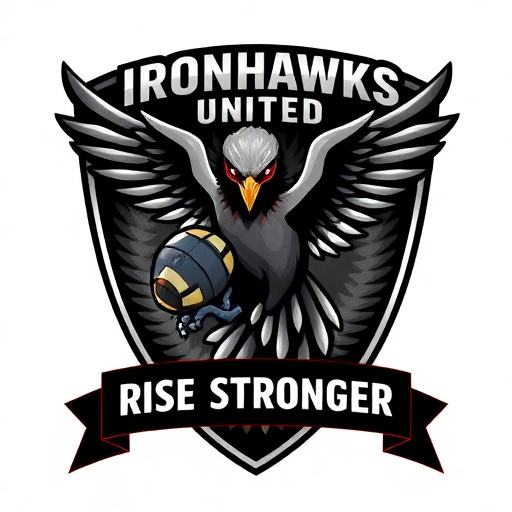
Here’s a stunning example of a logo created using Arvin AI’s Logo Maker!
Team Name:
IronHawks United
Brand Story:
Ironhawks United is a football team forged on the pillars of strength, precision, and boundless ambition. Established in 2023, the team represents a blend of urban grit and untamed nature—where the “Iron” symbolizes resilience and industrial strength, and the “Hawk” represents sharp focus, speed, and tactical superiority. Based in the bustling city of Greyhaven, the Ironhawks aim to dominate the field with their relentless spirit and a fanbase as loyal as the hawk’s sharp gaze.
Team Colors:
- Steel Gray: Represents industrial strength and unbreakable resolve.
- Deep Crimson: Symbolizes passion, energy, and the blood-pumping excitement of the game.
- Jet Black: A touch of elegance and intimidation, reflecting their tactical dominance.
Team Motto:
“With Focus We Soar, With Strength We Strike.”
Final Words
Football logos are powerful symbols that connect clubs to their fans and communities. If you’re inspired to create your own team logo, tools like Arvin AI Logo Maker make it simple, creative, and completely free.

Whether you’re starting a new football club or rebranding an old logo, Arvin AI ensures your logo stands out while reflecting the essence of your team. Explore the power of creativity and design a logo that tells your story today!
FAQ
This is subjective and varies based on personal preferences. Some fans love the simplicity of FC Barcelona’s crest for its classic shield design, while others admire Liverpool FC’s logo for its incorporation of the liver bird and the motto “You’ll Never Walk Alone.” Ultimately, the “best” logo depends on the emotional connection fans feel.
Among NFL logos, the Dallas Cowboys’ iconic star is often praised for its simplicity and recognition, while Oakland Raiders (now Las Vegas Raiders) has a bold, rugged look that many fans find cool and edgy.
In professional football, Sheffield FC, the world’s oldest football club (founded in 1857), boasts one of the earliest logos. However, modern Premier League clubs like Aston Villa and Nottingham Forest also have historic logos dating back to the 19th century.
Football badges, often referred to as logos or crests, are symbolic emblems representing a club’s identity. They often include elements tied to the club’s history, location, or nickname, such as animals, landmarks, or cultural symbols.


