Logos are the heart of branding, especially in the fast-food industry. They are more than just images, they represent a brand’s identity, values, and promise. A great logo can attract customers, build loyalty, and even become a cultural icon. Think about how instantly recognizable the McDonald’s golden curves or the KFC Colonel’s face. These logos have shaped the way we think about fast food. In this article, we will explore some of the most famous fast food logos.
Part 1: The Evolution of Fast Food Logos
Fast food logos have come a long way from their humble beginnings as basic identifiers. Over the years, they have transformed into being the potent symbols of brand identity representing the shifts in design trends, consumer psychology, and marketing strategy. This chapter explains how the logos of such companies developed from simple designs into icons around the globe.
Origins of Fast Food Branding
Fast food logos began as simple identifiers. In the early days, these logos were designed to be upfront and easy to recognize from a distance. McDonald’s first logo featured the name in a simple, bold font. Here the interesting info about Apple Logos evolution. It wasn’t until the 1960s that the iconic golden arches were introduced, inspired by the design of the restaurant buildings.
Transition to Modern Logo Design
As the fast-food industry grew, so did the sophistication of its branding. Companies began incorporating typography, color psychology, and minimalist trends into their logos. Fonts were chosen to convey specific emotions or messages. For instance, Burger King’s bold and rounded font gives a friendly, approachable feel.
Part 2: Characteristics of Effective Fast Food Logos
Creating a memorable and impactful fast food logos requires careful consideration of various design elements. Below are some key characteristics that make fast food logos stand out in a competitive market:
- Color Psychology: Colors play a significant role in making fast food logos effective. Red, yellow, and white dominate the industry because they create a specific emotional response.
- Memorability and Simplicity: A simple logo is easier to remember. When customers can instantly recognize a logo, it strengthens brand recall.
- Typography and Symbolism: The choice of font and symbols can make or break a logo. Fonts need to align with the brand’s tone, and symbols add depth and meaning
- Versatility Across Media: Effective logos maintain their clarity and impact across various platforms and materials. Whether displayed on packaging or digital screens.
- Appropriate Proportions: The balance between text and imagery in a logo is critical. Overcrowded designs can beat viewers, while an unbalanced composition may seem incomplete.
- Cultural Relevance: Fast food logos often tap into cultural symbols or themes to connect with their audience.
Part 3: Tips for Designing a Unique Fast Food Logo
Designing a logo for a fast-food brand is both an art and a science. A good logo can capture attention and convey your brand’s identity and make a lasting impression on the customer. By focusing on creativity you can create a logo that stands out in a competitive market.
- Align with Brand Values: Your logo should reflect your brand’s story and mission. A family-focused restaurant could include warm colors and friendly.
- Ensure Versatility: A great logo works across all platforms and materials. Whether it is on a menu, a sign, or a digital ad, the logo should maintain its clarity and impact.
- Focus on Timelessness: While it can be tempting to follow current design trends, creating a timeless logo ensures long-term recognition.
- Incorporate Subtle Storytelling: Add elements that subtly tell your brand’s story or highlight its uniqueness. A story-driven design helps customers feel a deeper connection to the brand.
- Use Contrasting Colors: Ensure that your logo’s colors have enough contrast to stand out. Contrasting colors not only make the logo visually appealing but also ensure clarity.
Part 4: 10 Famous Fast Food Logos and Their Stories
We reveal the exciting stories behind 10 of the world’s most popular fast food logos in this section. Starting from the golden arches of McDonald’s to the face of Colonel Sanders, each logo has a story unique to its values, identity, and cultural impact. These logos are not just symbols; they make their respective brands unforgettable.
McDonald’s
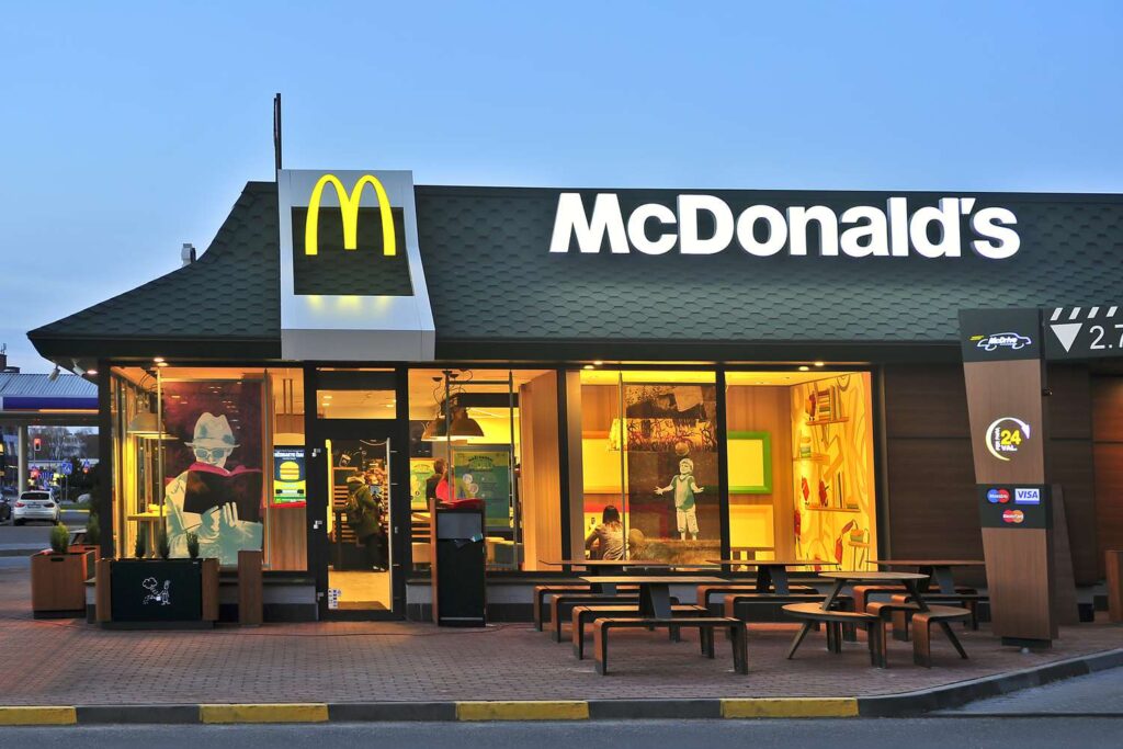
The golden arches are one of the most recognizable symbols in the world. Originally inspired by the architecture of the restaurant buildings, the logo evolved into a global icon. Its combination of simplicity and bold color choices makes it timeless.
Burger King
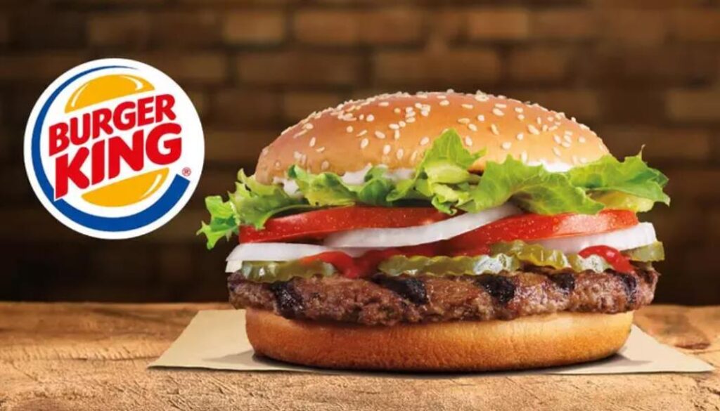
Burger King‘s logo journey shows how designs have shifted from complexity to simplicity. The latest retro-inspired update emphasizes boldness and clarity, while it reinforces the brand’s focus on quality and tradition.
Starbucks
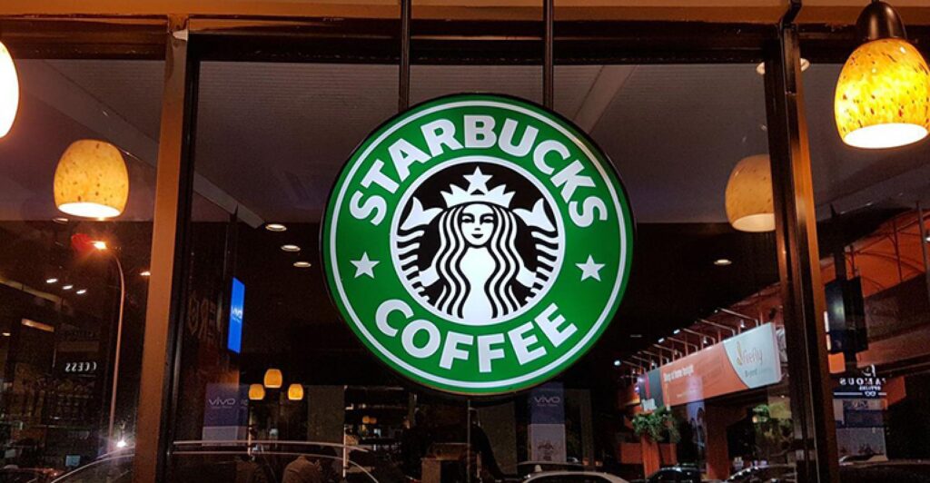
Starbucks started with a detailed mermaid illustration that reflected its roots in Seattle’s maritime culture. Over time, the design became more simple, creating a modern icon that is both recognizable and versatile.
Domino’s Pizza
Domino’s logo cleverly incorporates a domino symbol, highlighting its name. The Red white and blue add colours as scheme addition toward creating good memorability and trust dullness due to which making it out of the line design under the industry class.
KFC
The face of Colonel Sanders is synonymous with KFC. This logo creates an emotional connection by highlighting the brand’s founder, reinforcing authenticity and tradition. Colonel Sanders, with his iconic white suit and glasses, symbolizes the roots of the company.
Subway
Subway’s clean and fresh design reflects its focus on healthy and customizable options. The arrows in the letters “S” and “Y” symbolize movement and choice, aligning with the brand’s dynamic nature.
Dunkin’
Dunkin’s shift from “Dunkin’ Donuts” to simply “Dunkin’” marked a careful effort to extend its appeal beyond just coffee and donuts. The rebranding reflects a more modern, streamlined approach, aligning with the growing trend of quick-service.
Taco Bell
The Taco Bell logo is a stylized representation of the fun and energetic vibe of the brand, with a bell icon that is both a focal point visually and a play on the name of the brand. The logo often features bold, vibrant colors, typically purple.
Pizza Hut
Pizza Hut, a global leader in the pizza industry, has built a powerful brand identity that resonates with consumers around the world. The iconic “hut” logo, with its simple yet striking red roof design, is immediately recognizable and evokes a sense of warmth, comfort, and tradition.

Chick-fil-A
Chick-fil-A’s logo cleverly integrates a chicken motif into its typography. This design is both playful and effective, aligning perfectly with the brand’s focus on chicken-based products. The logo features are bold, red font that stands out while incorporating a subtle chicken plan within the hand.
Part 5: How Entrepreneurs Can Create Standout Logos with Arvin AI?
One of the main essentials of an entrepreneur who aims to create a brand is the uniqueness of the logo. Arvin AI makes this very simple by providing intuitive tools and innovative features for those design novices and pros. With Arvin AI you can access thousands of design templates personalized for your industry. Personalize colors, fonts, and icons to fit your brand’s vision.
Key Features of Arvin AI
- User-Friendly Interface: Arvin AI provides a seamless design experience for beginners and professionals alike.
- AI-Powered Customization: The platform allows users to customize colors, typography, and symbols with ease.
- Thousands of Pre-Built Templates: Entrepreneurs can draw inspiration from a vast library of templates tailored to different industries.
- High-Quality Downloads: The platform ensures logos are available in high-resolution formats, suitable for all branding needs.
- Real-Time Preview: With Arvin AI, users can see live previews of their logo as they make changes.
- Logo Variations: The platform provides the option to generate multiple logo variations, giving managers a range of design choices to pick from them.
Steps to Use Arvin AI for making Logo
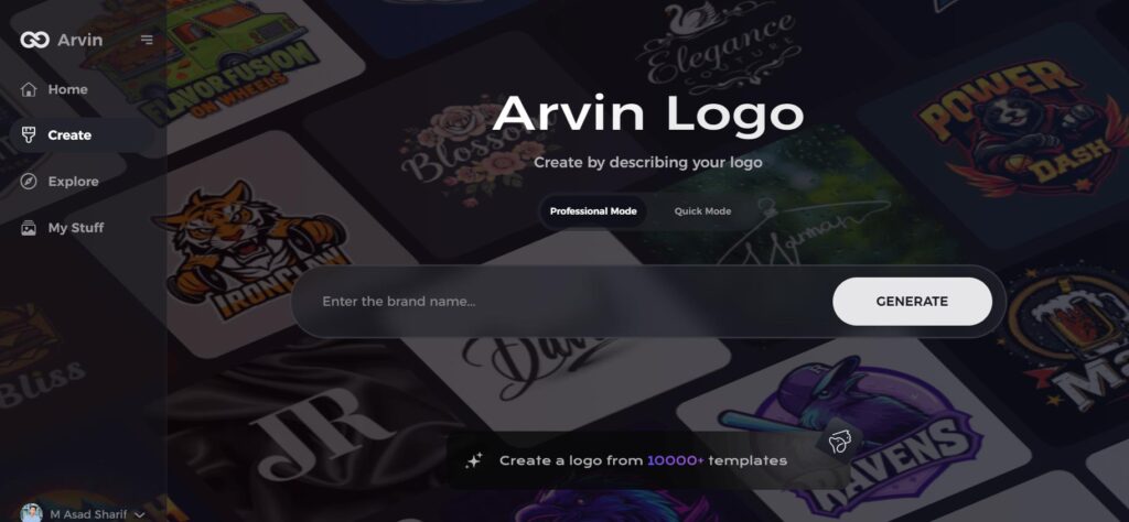
Step 1: Visit the Arvin AI Website
Begin by navigating to the logo creation page at Arvin Loga Maker, where you can start designing your unique fast food logo.
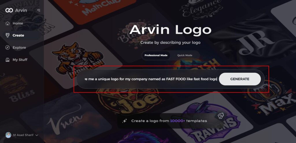
Step 2: Provide Business Details
Enter essential information about your fast food business, including its name and category. This helps the AI tailor logo designs specific to your brand’s identity.
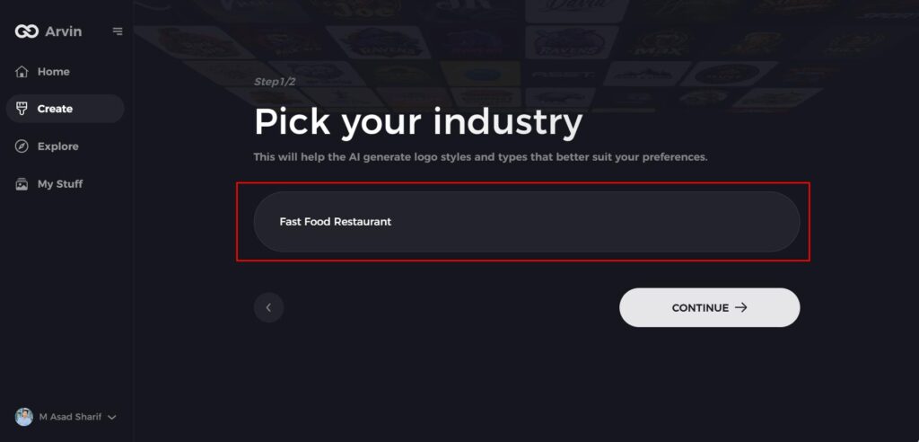
Step 3: Select Your Industry
Choose the fast food industry or another relevant category from the list. This will help the AI refine logo styles and design suggestions based on your industry.
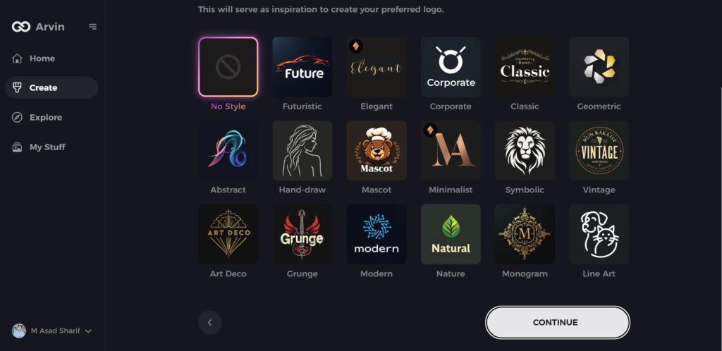
Step 4: Choose a Design Style
Browse through the available design styles and select one that aligns with your brand’s vibe. If none stand out, you can skip this step and let the AI suggest a style.
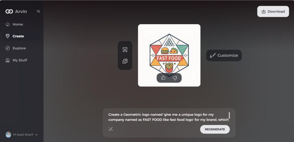
Step 5: Review Logo Ideas
The AI will generate multiple logo options based on your inputs. Evaluate the designs that resonate with your brand’s image and message.
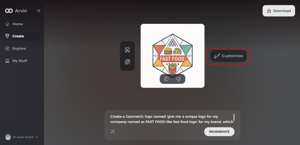
Step 6: Customize Your Logo
Personalize your selected logo by adjusting colors, fonts, icons, and layouts to match your fast food brand’s visual identity and style.
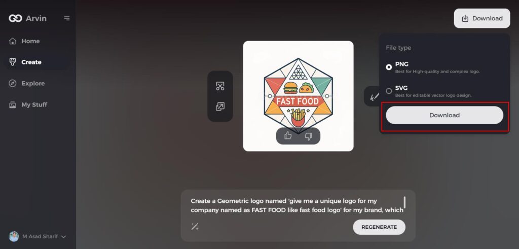
Step 7: Download Your Logo
Once satisfied with your logo design, download it in high-quality formats like PNG or SVG for seamless use across websites, social media, and marketing materials.
Conclusion
Fast food logos are much more than simple images; they are powerful branding tools. With this understanding of the history, design evolution, and the key features, the businesses will come up with the logos that resonate with the audience and are sustainable for the long term. Whether you are inspired by the golden curves of McDonald’s or the simplicity of Subway, there is a lot to learn from iconic designs. Remember the tool like Arvin AI can help you design a logo that aligns with your brand’s values and vision.
FAQs
What makes a fast food logo effective?
An effective fast food logo uses bold colors, simple designs, and recognizable symbols to make it memorable and appealing to customers.
Why do fast food chains use red and yellow in their logos?
Since it can stimulate appetite and the emotions of excitement and happiness, red and yellow should be used for fast food branding.
How can Arvin AI help in designing a logo?
Arvin AI offers a user-friendly platform with AI-driven customization, pre-built templates, and high-quality downloads to design professional logos effortlessly.

