Speaking of iconic branding, Domino Pizza’s logo design stands out as a symbol of innovation and taste, calling empathy of pizza lovers around the world. It is not just an emblem but a part of the visual history that has evolved with the times. As graphic designers, we know the importance of effective logos. The Domino Pizza logo is a textbook example of how creativity and design principles can be combined to build a brand identity. In this article, we will introduce a fun journey that traces the history and evolution of this famous logo Dominos logo.
Part 1: Meaning and History of Dominos Logo
Since Dominic Pizza changed its name to Domino Pizza in 1965, Domino Pizza’s visual identity always depicted. For the first few years it was a red and white composition, but in the 1970s it began using blue, and this traditional logo colors scheme became the main chain sign.
1960 – 1965
The birth of Domino Pizza’s logo design can be traced back to the early 1960s, when the creative flash and iconic fast food logos industry grew rapidly. In this era, the logo was originally announced under the name “DomiNick’s,” reflecting the original brand name before being rebranded to Domino’s. From 1960 to 1965, Domino Pizza’s logo design was simple but bold. It is characterized by a palette of monochrome, and the design itself was spoken without using flashy colors.
1965 – 1969
Between 1965 and 1969, Domino Pizza logo design underwent major changes. As the brand grew and evolved, its visual identity changed. The change of the logo was not just a change, but an expression of the brand’s progress and ambition. In 1965, Domino changed its name to Domino’s and set the stage for the need for a new logo. This change provided a design opportunity that resonated with the company’s new direction.
1969 – 1975
From the late 1960s to the early 1970s, experiments and innovations repeated in various fields, and Domino Pizza’s logo design was no exception. In the 1969 design change, the brand introduced a refreshing and exciting new color, bright blue. This shade was not just a shade, but a symbol of new energy and bold progress. The blue letters, designed in the ultra-thick sans-serif typeface, stood out dramatically against the red and white domino emblem.
1975 – 1996
Domino Pizza logo design underwent major changes in 1975. In this era, a brighter and more calm shade of blue introduced in place of the bold shades of the past. The new blue was consistent with the Domino brand’s focus on quality and innovation, giving the brand a fresh and refreshing impression. The logo design of Domino Pizza at this stage was not just a color update. The new composition is a unique square, the left side of which replaces by an easy-to-recognize red and white domino.
1996 – 2012
The evolution of the Domino Pizza logo design continued to reflect the changing times and the growth of the brand. In this era, the emblem tilted to the right, changed into a shape, and breathed a new breath. This innovative change was not just an aesthetic sensation, but a commitment to help Domino move forward and align with modern design trends. The contours of all elements were skillfully recreated and modern.
2012 – Present
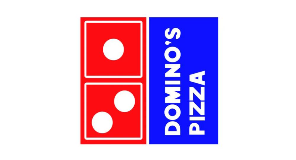
In 2012, Domino Pizza logo design marked a major milestone. This design change included a bold choice, but maintained the brand’s connection to its historical past. The new logo placed a light blue “Domino’s” wordmark on the right of the red and blue rectangular emblem. The emblem itself was divided into two, with two white dots on the blue part and one white on the red part.
Part 2: Design Elements of Dominos Logo
Domino’s logo combines several design elements, such as squares, dots, colors, fonts, and rectangles in the most creative way, making them more distinctive. The three dots represent the first three stores Tom acquired.
Domino’s Logo Font
The logo fonts used for the Domino’s logo is customized by designer Hannes von Dohren, but it can be guessed what font is based on or at least similar. Today’s fonts are like Pluto Sans Heavy fonts found in any application. The common point of Domino’s various fonts is that they must always be bold.
Domino logo color
The pizza chain begins with white, then red and blue, and now red, white and blue are the official logo colors of the brand. These colors are more conspicuous and eye-catching than pizza companies. There are various reasons why these three colors were chosen. To stand out, to convey trust and loyalty (by using the same color as the American flag), to be associated with products sold by Domino (by symbolizing the red as a pizza sauce).
Domino Logo
In addition to the wordmark used for many years, the pizza shop also used a symbol of a domino. The numbers drawn in the domino have meaning. Each dot symbolizes Domino’s first store. However, after the expansion of three stores, Domino did not increase. However, the domino chain grew so rapidly that only three points were drawn on the domino.
Part 3: Evolution of Dominos logo design
Domino Pizza logo history is a fascinating narrative, of the way powerful brands have reinvented their visual lexicons in tune with shifting times, tastes, and technologies. From humble start to world acclaim today, Domino’s logo imposes its mark upon design. Five general parameters narrating the course of evolution of the logo are discussed here, and graphics design notes are added for graphics designers and brand observers alike.
Consistent color palette
One of the key factors in the evolution of Domino Pizza logo design is the consistent use of red and blue. The color varies, but the core color symbolizes the brand’s energetic and reliable image does not change. From the intense red introduced in 1965 to the calm blue adopted in 1975, the use of these colors has created a recognizable and unified visual language.
Adapting to modern trends
Throughout its history, Dominos logo has shown a keen ability to adapt to modern design principles. Whether it is the transition to a rhombus in 1996 or a sophisticated rectangular emblem in 2012, the logo has always reflected the current trend without losing its core identity. This ability to evolve indicates an understanding of both the market and the flow of visual times.
Maintaining brand traditions
Despite changes and adaptations, the Domino Pizza logo design maintains an important element that connects its origins. For example, three white dots are tributes to the original three stores. With such thoughtful preservation, the brand’s legacy remains an important part of its visual appeal.
Balance between simplicity and complexity
Domino’s logo has changed from complex to minimalist. The 2012 redesign demonstrates the power of being simple, using basic geometric shapes and colors to create a modern, clean look. However, the symbolism and complexity behind these choices demonstrate a rich understanding of design principles and branding.
Match brand value
The change in Domino’s logo reflects the company’s core values of innovation, quality and customer connections. Each change in the design highlights these attributes, allowing the visual identity to be on the extension of the brand’s mission and vision. The evolution of Domino Pizza logo design is an effective branding master class. It is a story of innovation, continuity, adaptability and thoughtfulness.
Part 4: Philosophy and meaning Behind Dominos logo design
Domino Pizza’s logo design occupies a unique space in the field of iconic branding that tells stories beyond just aesthetics. This philosophy aligns perfectly with the brand history along with product excellence and corporate values. Designers who want to guide their design work make meaning discovery their primary focus.
Symbols of Three Dots
The three dots in the logo are not merely design choices, but symbolize the original three stores Domino founded. This symbolic feature reminds us of the modest beginning and growth of the brand and fosters a connection between the company’s tradition and its current position as a global company.
Diagonal orientation
The diagonal orientation of the emblem introduced in the 2012 design change signifies dynamism and momentum of progress. Domino visually conveys the message that he is always moving forward.
Use of red and blue
The red and blue color palette, consistent throughout the brand’s history, contains important meanings. Red is often reminiscent of passion, energy and hangery, and blue symbolizes trust and trust. By combining these colors, we express the fusion of brand quality, dedication to customer satisfaction, innovation and reliability.
Evolution that reflects brand growth
The constant evolution of Domino’s logo reflects the company’s growth and expansion. The brand transition from its early status as a small pizza dealer to become an international franchise is mirrored through its complete design transformation from monochrome banners to globally recognized emblems. Each redesign is a visual chapter of this growth story.
Emphasize simplicity
Domino gradually shifted to a simple design, aligned with the brand’s philosophy of providing modern design trends and products that are easy to understand and high quality. The minimalism of redesign in 2012 means that the brand focuses on what is truly important: high quality materials, best taste and customer satisfaction.
Part 5: What to learn from Domino Pizza logo design
There are countless examples of creativity and innovation in the world of branding, but there are some that stand out. Domino Pizza’s logo design is one of the symbols of designer and consumer empathy. Not only colors, shapes and fonts, but also storytelling, adaptation and connection are important. This section delves into five lessons that graphic designers can learn from the evolution of Domino Pizza logo design.
The power of storytelling
Domino’s logo is not just an artwork, it is a story told through visual clues. From the three points representing the original store to the choice of colors that convey brand value, each element spins a story. The successful logo tells us that it should be a visual storyteller that condenses the brand’s history, values and aspirations.
Adapt without losing identity
The logo design of Domino Pizza has changed in accordance with the design trend during its evolution. But I never lost that core identity. The lesson here is that adapting to new styles and trends is essential, but maintaining a connection with brand traditions is equally important. Find a balance between innovation and tradition.
Simplicity says things
The recent shift to simple design makes the logo more versatile and modern. This reminds us that simplicity often leads to clarity and cognition. Clean and easy-to-understand design is important in the age of information excess. The careful selection of red and blue in the history of Domino’s logo indicates an understanding of color psychology. These colors are not randomly chosen, but are used to evoke certain emotions and perceptions.
Design in line with brand value
The Domino Pizza logo design matches the core values of the brand in every aspect. The choice of design reflects the brand’s promise and personality, from the dynamism drawn on the diagonal to the trust implied by the blue shades.
Part 6: Popularity of dominos logo
Domino’s popularity was chosen by itself. The company has an organized marketing system that uses signboards, TVs, magazines, sports and talent shows to increase brand and sales. They also actively utilize Twitter, Facebook, Instagram, YouTube and Celebrity to increase brand awareness.
Domino’s Strategic Sponsorship Approach
British Gott Talent is one of the most watched shows in the world. Domino uses that viewership to approach more people. Domino also sponsored the French Football Division Two League and League Two. The four-year sponsorship deal marked Domino’s brand promotion.
Your Logo, Your Silent Marketer
As an entrepreneur, you have to be serious about logo design. It is an ambassador who does silent marketing for you. When you are ready to request a logo design, please leave it to LogoMyWay, the industry’s number one creative agency. LogoMyWay prioritizes your logo design. Choose from three of our professional logo designers, famous logo contests and interactive logo maker interfaces.
Part 7: How Arvin AI Can Help You Understand Logo Evolution
Logo designs are more than just visual markers; they are the building blocks of a brand’s identity. A great design lets a company to communicate its values, build recognition, and evoke emotions in its potential consumer. Arvin AI is one of the most advanced logo design and analysis platforms. It explores logo design trends and provides actionable insights to businesses and designers to create logos that really resonate.
Key Features of Arvin AI
- Logo Evolution Analysis: Understand the development of logos through time and why they evolve this way.
- Compare Tools: Compare different iterations of a logo and understand what’s behind a specific design decision
- Customization Insights: Receive industry-specific recommendations that will make your logo speak to your target audience.
- AI-Powered Suggestions: Suggest current best logos based on what is popular currently and over history.
Steps to Use Arvin AI for making Logo
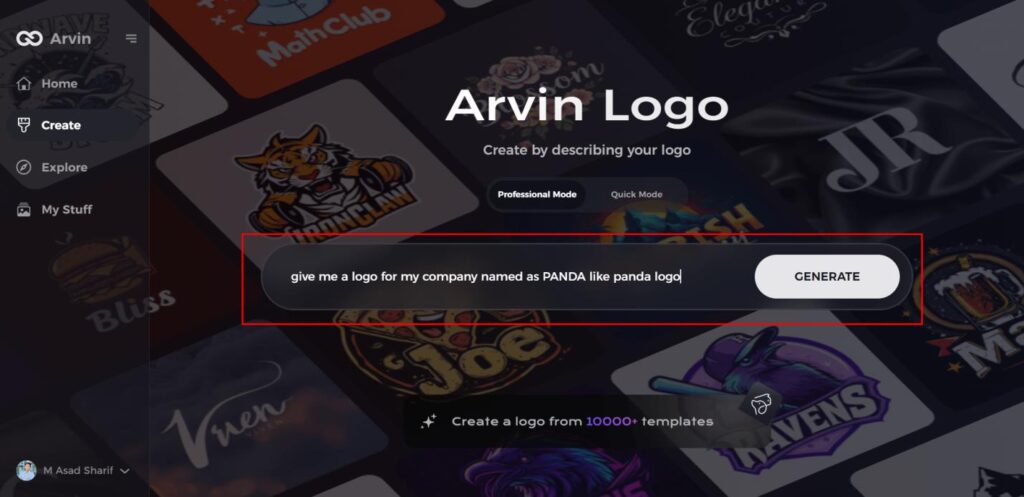
Step 1: Visit the Panda Logo Design Page
Open your browser and navigate to the Panda Logo design page on Arvin AI to begin creating your unique panda logo.
Step 2: Enter Your Business Details
Provide essential information about your business, including the name and category. This helps the AI generate logo concepts that align with your brand.
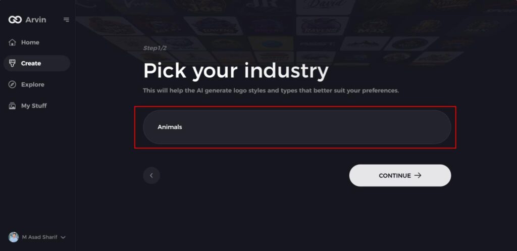
Step 3: Select Your Industry
Choose your industry from the list provided. This step helps narrow down logo style options, allowing the AI to tailor designs specifically for your sector.
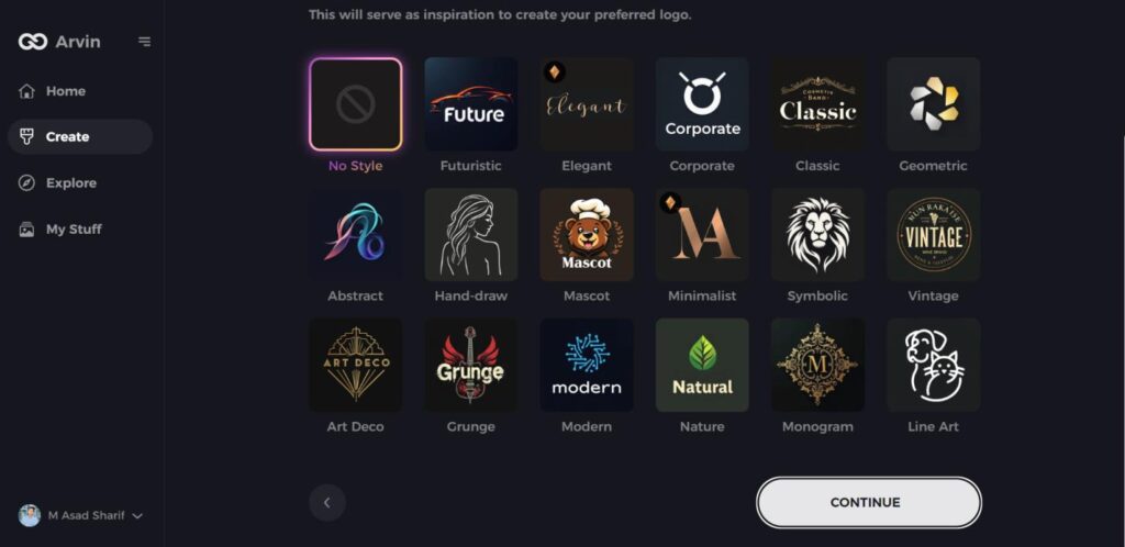
Step 4: Choose Your Preferred Style
Browse through the available styles and pick one that reflects your brand’s image. If none appeal to you, simply skip this step and let the AI suggest a design based on its default inspiration.
Step 5: Review Logo Ideas
The AI will generate several panda-themed logo options based on the details you provided. Take your time to explore the designs that resonate with your brand’s message.
Step 6: Customize Your Logo
Personalize your selected design by adjusting elements like colors, fonts, icons, and layout to match your brand’s aesthetic.
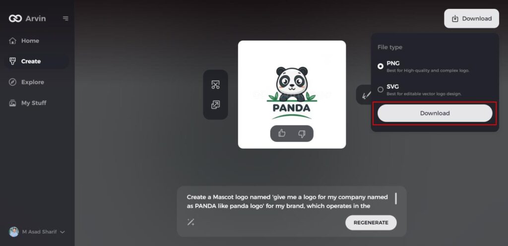
Step 7: Download Your Logo
Once you’re happy with your custom panda logo, download it in formats such as PNG or SVG. These formats ensure your logo works seamlessly across websites, social media, and printed materials.
Conclusion
In the world of delicious branding, Dominos logo design provides a feast of inspiration and insight for graphic designers. From humble beginnings to modern forms, the perfect blend of storyline, adaptability, simplicity and harmony with core values. It is a piece of design wisdom that reinforces the idea that all lines, curves and colors have meaning. Tools such as Arvin AI are irreplaceable because they create logos that speak for mission and creativity, which eventually open the gates to iconic and timeless designs.
FAQs
What is the meaning behind the Domino’s Pizza logo?
The three dots signify the first three stores, and the red and blue signify passion, trust, and quality.
How has the Dominos logo evolved over the years?
Since 1965, the logo has moved from black and white to a red, white, and blue design, and with a significant 2012 redesign losing “Pizza” for a longer brand name.
What colors are used in the Dominos logo, and what do they represent?
Red represents hunger and craving, and blue represents reliability and trust, both supporting Domino’s powerful brand image.
Why did Domino’s change its logo in 2012?
The refresh eliminated the word “Pizza” to represent on-brand expansion, simplifying the appearance but keeping the recognizable domino icon.
