The Demon Slayer logo is a strong representation of one of the most popular anime logo and manga series. Kimetsu no Yaiba, which was written by Koyoharu Gotouge, started as a manga in 2016 and turned into an anime in 2019. The bold lettering and bold colors make it immediately recognizable. Blending traditional Japanese designs with modern design, the logo represents the series’ intense battle scenes and fantasy worlds. This piece delves into its history, design, evolution, and influence on the anime’s branding.
Part 1: Meaning and History of the Demon Slayer Logo
The Demon Slayer logo has not changed since the very beginning, which is an unusual design approach for an anime project. Such consistency speaks to the strength of the original design and cultural relevance. Debuting with the manga, the logo perfectly captures the essence of the series. Demon Slayer logo has become international and instantly recognized to be in connection with the action-packed battles and emotional depth that captures the audience.
Origin of the Demon Slayer Franchise
This Demon Slayer franchise is based on Japanese legends, historical traditions, and samurai culture. It follows Tanjiro Kamado, a boy who has dedicated his life to avenging his family from demons and curing his sister. The logo embodies this mashup of old and new with strong strokes and a lively layout. The pronounced circular emblem around the text forms a brushstroke or red flame shape, which can represent battle strength and the protagonist’s indomitable spirit. This design connects to the series’ themes of resilience and justice.
Cultural Influence Behind the Logo
Inspired from Japanese culture, the logo is strongly based on traditional calligraphy and artistic styles of Japan. The design features a brushstroke circle inspired by traditional Japanese inking processes, giving it a classic and modern twist. This is modern anime style with letters carved with traditional Japanese style. It represents the action and intensity in the series with the wild shape and jagged edges of the text.
PART 2: The Demon Slayer Logo meaning
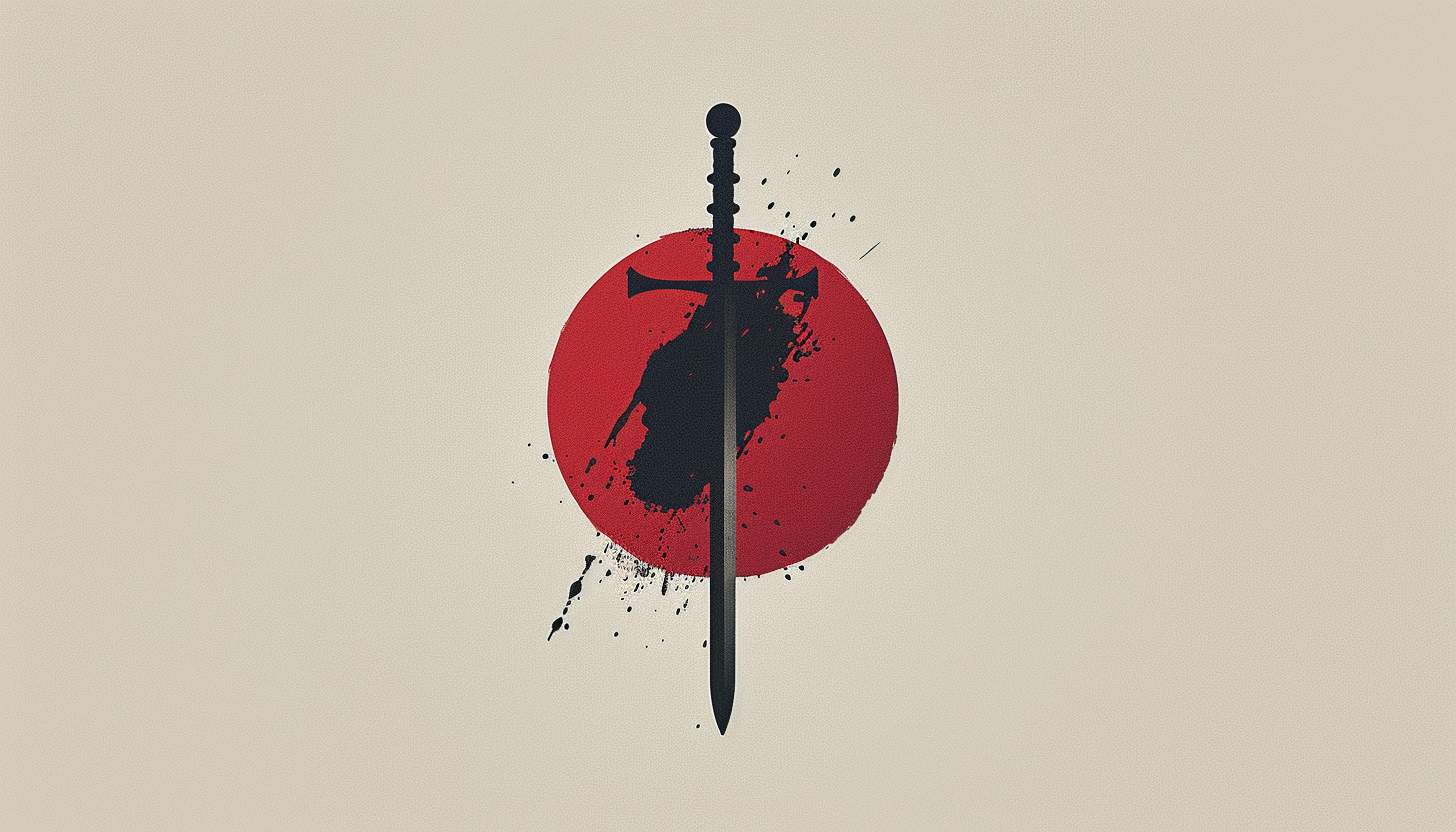
The Demon Slayer logo is an emblem. This is a stylized inscription, bold and looking almost like kanji (Japanese writing), inscribed and combined with a circular emblem in red and black, as that relates to the various battles, and supernatural beauty, that is present in the story. This is minimalistic logo yet impactful, staying true to what the anime is known for; its explosive action and rich plot. The circular shape adds a dynamic feeling to the logo; it resembles a fire or a brushstroke — motifs used in Japanese traditional art.
Marketing and Branding of Demon Slayer
Demon Slayer logo is one of the vital elements of the franchise’s branding. While this emblem will show up not only in manga covers but also in anime posters, goods, and video games since the anime started airing. The iconic status of the logo assisted in making it one of the most grossing anime shows ever. One of the most identifiable images of the brand, fans instantly associate with great story telling, brilliant battles, and mind blowing animations, hence why it appears on virtually every marketing campaign.
Demon Slayer Logo Symbolizes the Anime’s Themes
The anime’s central themes are embodied in the Demon Slayer logo. The bold, dramatic font suggests intensity and movement, reflecting the high-stakes battles and emotional weight of story. The dark versus light color scheme in this final scene also has thematic significance, as it symbolizes the constant battle between good and evil throughout the series. The logo embodies the spirit and vibe of Demon Slayer: Kimetsu no Yaiba, and as such is an integral part of the franchise’s identity.
Part 3: The History of the Demon Slayer Logo
Since its first publication in 2016, the Demon Slayer logo has not changed. Despite various adaptations, its bold design and cultural elements have remained constant and ensured strong branding across anime, movies, and merchandise all over the GLobe.
The Origin of the Demon Slayer Logo (2016 – 2020)
When the manga was first serialized in Weekly Shonen Jump in 2016, it was quite a different logo. The logo stood out, with its bold black typography and red circular brushstroke. Demon Slayer’s logo has not varied from the OUTLINE SHIDEN going all the way back to OURAN, unlike other anime franchises, which serves to reinforce loyalty from the fans while they wait for more. Its consistency across the manga, anime and films have made it an iconic status in the anime industry.
Consistency of the Logo
The Demon Slayer logo stayed the same during its anime and movie adaptations. Both the 2019 anime adaptation and 2020 Mugen Train movie used the same logo design, aiding with its brand identity. That consistency helped forge a strong visual link between the manga, anime, and merchandise. Many franchise alters its logo but Demon Slayer never update its design and strengthen their brand.
Part 4: Demon Slayer Logo Font and Typography
Demon Slayer logo type is designed with custom fantasy style font that brings a very different and dramatic feel. Typography is important in branding, enabling it to stand out while reflecting the anime’s intensity and supernatural aspects.
The Unique Fantasy-Inspired Font
The bespoke font mixes fantasy design with traditional Japanese calligraphy. All the text looks like someone carefully wrote it out in thick, uneven strokes, lending an ink-brushed aesthetic that hammers home the historical and supernatural elements of the series. This unique font makes Demon Slayer truly stand out from the anime crowd, being an immediately recognizable and hugely powerful logo.
The Impact of Typography on Branding
The font used in the logo of Demon Slayer anime is a key factor in the formation of the anime’s brand identity. Its jagged, powerful strokes represent the high-octane content of the show. The font helps maintain the logo’s legibility, allowing fans to quickly associate it with the anime’s action, emotional weight, and historical elements.
Part 5: Color Palette and Symbolism of the Demon Slayer Logo
The Demon Slayer logo features a black, red, and white color scheme, which gives it a strong and eye-catching appearance. The stark contrasting colors ensure the logo pops, maintaining visibility through media formats from anime posters to merchandise. This rich palette boosts the intensity and dramatic appeal of the logo.
The Cultural Significance of the Colors
The color of the Demon Slayer logo has strong cultural meaning in Japanese tradition. Red is symbolic of blood, passion, and determination, while black signifies mystery, power, and supernatural forces. The show also uses its palette of colours to serve its themes, like the use of white as a backdrop to represent purity and contrast in the war of good vs evil in the show. These color amplify the storytelling power of the logo.
Color Strengthen the Logo’s Impact
The dark typography is pair with a background enhancement with white and fire red that contrasts. This deliberate use of color not only reinforces the anime’s branding strategy but also facilitates recognition of the logo or mark in a crowded global market.
Part 6: Design a Demon Slayer Logo
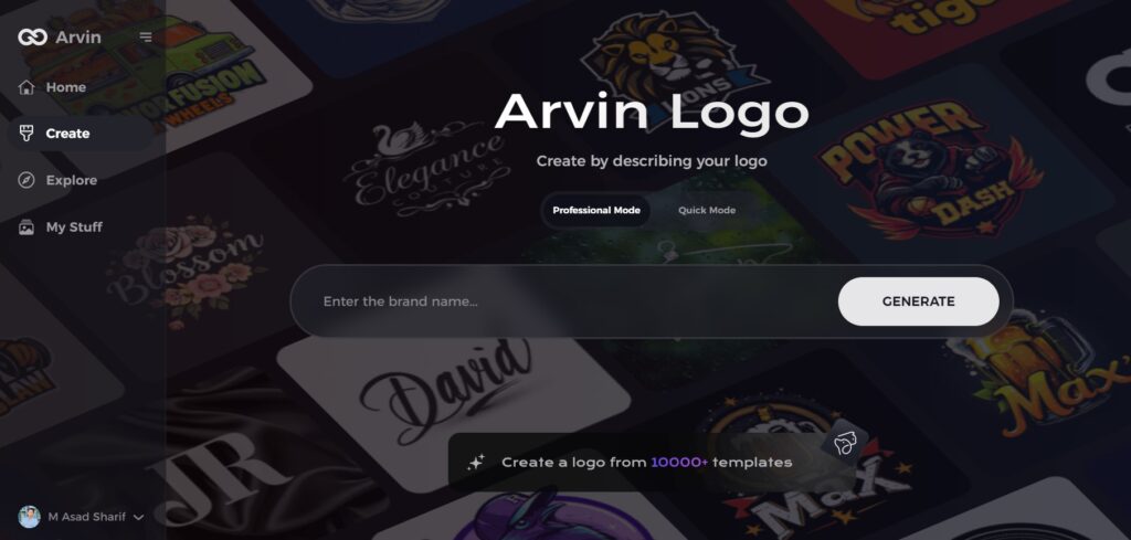
Arvin AI, an AI logo maker for anime logos, make it as simple as clicking a button to generate a logo similar to your favorite Demon Slayer character. This tool enables a user to create their own designs in the style of anime logos with its intelligence. Arvin AI Make High Quality Logos: Whether you are fan artist, content creator, business owner, Arvin AI helps you easily design high quality logos.
Key Features Of Arvin Ai
- AI-Driven Font Selection: AI-powered font suggestions with anime-esque aesthetic to guarantee authentic and stylish appearance.
- Smart Color Palette Suggestions: Suggests anime theme-inspired color combinations for a visually stunning design.
- High-Resolution Exports: SVG & PNG formats allow crisp, scalable, print-ready logos.
- One-click Editing Tools: Option to customize and modify logos as per your need by creating/editing shapes, colors, and effects.
- Anime-Inspired Design Elements: Includes brushstroke effects, Japanese-style typography, and fantasy-themed visuals.
Steps to Use Arvin AI for making Logo
Step 1: Visit the Arvin AI Website
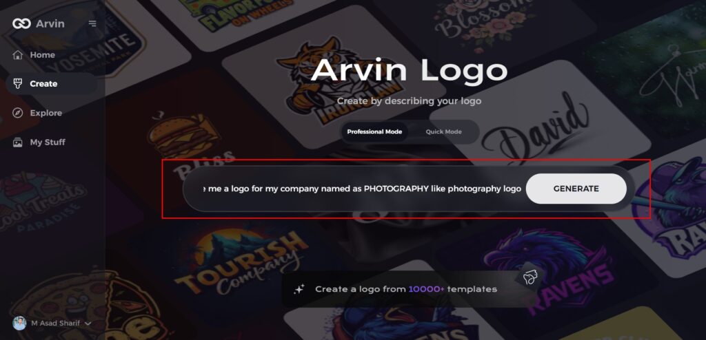
Open your web browser and navigate to the design page on Arvin AI. This is where you can begin crafting your photography logo.
Step 2: Provide Your Business Details
Enter essential information about your photography business, including the name and category. This step ensures that the AI tailors designs specifically for your brand.
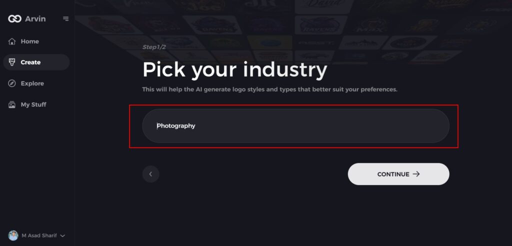
Step 3: Choose Your Industry
Select “Photography” or a related industry from the options available. This helps the AI focus on logo styles and elements best suited to your field.
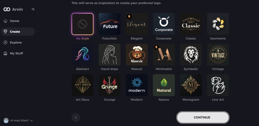
Step 4: Select a Style
Explore the list of design styles offered and pick one that aligns with your brand’s aesthetic. If you’re unsure, you can skip this step and let the AI generate ideas using its default inspiration.
Step 5: Explore Logo Ideas
Review the unique photography logo designs generated by the AI. These ideas are based on the details and preferences you’ve provided.
Step 6: Customize Your Logo
Fine-tune your chosen design by adjusting elements like colors, fonts, icons, and layouts. This personalization ensures your logo truly reflects your photography brand’s identity.
Step 7: Download Your Final Logo
Once satisfied with the design, download your logo in formats like PNG or SVG. These formats are ideal for websites, social media, and print materials, ensuring versatility for your branding needs.
Conclusion
The Demon Slayer logo is a classic part of the anime’s personality with solid typography, contrasting color, and distinctive brushstroke texture. It is a key part of anime culture, standing out with its bold and striking design. Also, If you want to create a custom Anime-style, I would suggest Arvin AI. We offer AI-driven font selection, automatic color suggestions, easy editing features — all in the same app that allows you to design a professional-quality logo with ease. So back to our anime logo adventure with Arvin AI.
FAQs
What is the meaning behind the Demon Slayer logo?
The Demon Slayer logo reflects the dark, dramatic nature of the anime with its dramatic typography and Japanese culture-inspired color scheme.
Can I download the Demon Slayer logo in PNG or SVG format?
Yes, you can find high-resolution PNG and SVG formats on official anime merchandise sites and fan resources.
What font is used in the Demon Slayer logo?
The logo uses a specially designed font similar to Garden Song Regular with special stylistic variations.
How can I make a similar logo like Demon Slayer?
You can use Arvin AI’s logo maker to design an anime-style logo with AI-powered font selection, color customization, and high-quality exports.