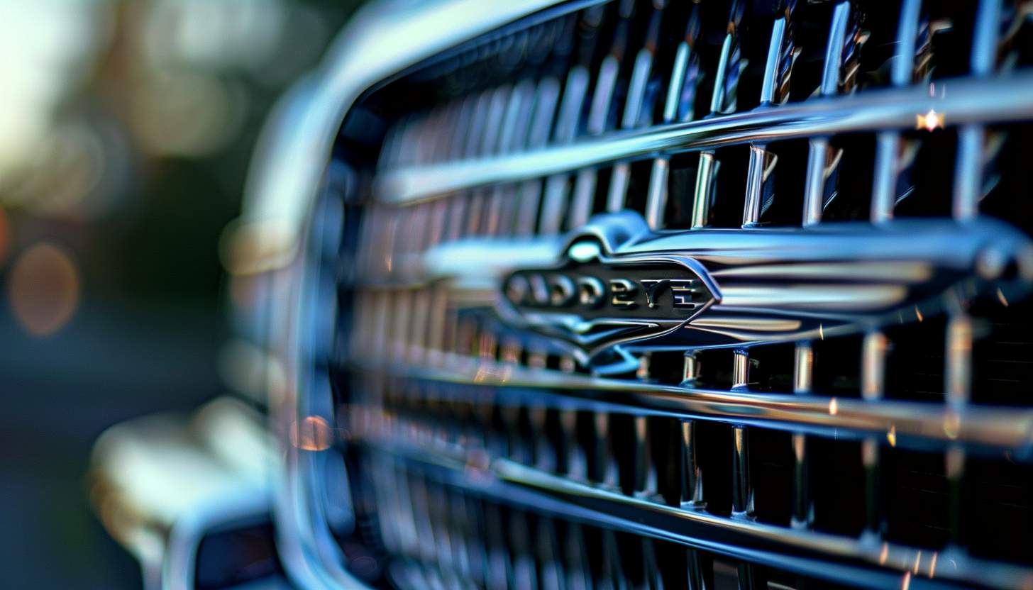
This makes Chrysler logo one of the oldest well-known automobile manufacturers, and today it stands strong since its origination in 1925. Its logo had undergone so many changes through these years in accord with the firm’s progressions and trendy advancements. As much as this would be true of any car’s logo, to the company’s identity, its recognition makes its logo significant; every variant speaks for the concept Chrysler is proposing- be it luxury, innovative, fast-paced, or energetic. This will make one understand the evolution of how the brand managed to stay current over time.
Part 1: Evolution of the Chrysler Logo over the Decades
The Chrysler logo has changed shapes and styles throughout the years due to the development of the company and designs during each period. Let’s trace how Chrysler is one of the emblem logos which evolved over the decades and what it denoted about the company during each design.
1924 – 1928
In the mid-1920s, the badge used by Chrysler was elegant and refined. It was in the form of a seal, almost like a wax stamp, with gold details. The logo also had diagonal banners that carried the brand name, giving it a sophisticated look.
1928 – 1930
The original Chrysler logo designed by Oliver Clark, inspired by Roman mythology. A wax seal illustration containing two wing symbols represented speed as the central feature of the logo design. The Chrysler brand received its quality distinction through this special seal.
1930 – 1936
In 1930, Chrysler changed the logo by removing the wings that constituted the old logo. The company then decided to have a simple seal. The rebranded logo aimed to depict luxury alongside quality making it elegance through refinement.
1936 – 1950
In 1936, the company updated the logo once again by adding a new wing to both sides of the seal. The wings of the logo are bold and powerful, giving an impression of energy and speed. The wings of the logo are silver with black stripes, so it gives an impression of speed and modernization.
1950 – 1951
One of the big changes made by Chrysler in its logo was in the 1950s, when the company changed its previous logo with a bold new one. This indicated by the lion placed on a black shield covered with gold, symbolizing strength, power, and royalty.
1951 – 1955
The bird functioned as the company’s speed and progress symbol because the company dedicated itself to future-led innovation. Engineers created the bird design to move replicating actual flight motion.
1955 – 1962
In the 1955 design change, a very modern and minimal Chrysler badge introduced, overlapping two indentations horizontally: a long, sharp black indentation and a short, wide red indentation. This interesting geometric logo used for seven years.
1962 – 1980
In 1962, the badge was changed again. It was a symbolic blue pentaster, consisting of five triangles, with a white pentagonal star with thin, sharp rays in the center. Underneath the pentastar was a black capital letter and a heavy geometric sans-serif typeface was used.
1980 – 1990
In the 1980s, Chrysler used a character-based logo. Composed of all capitalized modern wordmarks, it features futuristic confident lines and rounded characters. The name plate “R” is both open, adding personality to the brand’s visual identity.
1990 – 1993
Chrysler reinstated the winged seal to its logo in 1990, a feature that had originally been part of the brand in earlier designs. However, the seal was made to look new this time around. The shape was made more oval in appearance, thus looking smoother and more modern.
1993 – 1995
In 1993, Chrysler went back to its original logo design in observance of the brand’s heritage and legacy. The iconic seal was reinstated, depicting a stalwart brand for quality character for so long.
1995 – 1998
In 1995, the shape of the logo was returned to the circle. The round frame became thicker, and the bright gold surface became shinier than the previous version. The other elements remained almost intact, only slightly refined and enhanced.
1998 – 2000
In a 1998 design change, a round black and golden Chrysler emblem was placed between two elongated, sharp wings of silver similar to the 1990 badge. The sophisticated and brighter emblem was placed under the upper-case logotype of the surplus and became a stylized geometric typeface with heavy capital letters.
2000 – 2008
In the 2000s, Chrysler began using the pentaster emblem for visual identity. The emblem was placed on the left side of the wordmark and changed to a traditional typeface with a thicker line.
2008 – 2009
In 2008, the pentaster was shifted in Chrysler’s logo and is now moved more forward on the logo; the pentaster was also increased in size and given more significance to the star symbol. These modifications were carried out as an effort to reinforce a stronger presence with a more modern look that was still not divorced from history and values.
2009 – 2023
The 2009 Chrysler logo is a chic and elegant interpretation of the wing emblem. The seal is gone and the word mark is drawn on the blue line instead. Three-dimensional wings have a smoother and plump line, giving a balanced and sophisticated impression.
2023 – Present
In 2023, Chrysler announced a new logo with the 2009 emblem in a contemporary fashion. The new concept is built with a minimalist approach, with iconic wings drawn with black flat lines, with no banner in the center.
Part 2: Chrysler Logo Design Elements & Changes
The Chrysler logo has undergone many changes to fit the company’s style, vision, and market trends. Let’s break down the key elements of the Chrysler logo and how they have changed over time.
Typography and Font Evolution
The logo fonts, used in the Chrysler logo, has changed according to modern styles and branding needs. The early days had it with strong classic letters, which made it feel both strong and elegant. Throughout, Chrysler transitioned to more stylish and classy fonts to give the brand a more sophisticated look and feel.
Color Palette Shifts
Brand perception strongly depends on color applications which Chrysler uses to align its brand persona. The first logos used gold and blue tones, which reflected trust, prestige, and excellence. With time, Chrysler has experimented with silver and black tones, giving the brand a very high-end, futuristic look.
Part 3: Meaning and Symbolism behind the Chrysler Logo
The Chrysler logo is not only a symbol; it stands for the brand’s history, values, and visions for the future. By analyzing its design elements and comparing it to competitor logos, we can understand how Chrysler positions itself in the automotive world.
Breakdown of Key Design Elements
The Chrysler logo has featured several design elements that highlight its brand identity.
- Wings: The contemporary Chrysler logo has smooth silver wings that signify speed, freedom, and innovation. It gives the brand a premium, futuristic feel and appeals to performance-conscious and style-driven drivers.
- Colors: Over time, the primary logo colors used in Chrysler’s logo have varied. The modern silver and blue tones signify class, reliability, and trust. In the old days, it was gold and blue, adding a touch of prestige and excellence.
- Shapes: Chrysler has changed shapes over time, from a circular seal to streamlined wings. The transformation of a more old-fashioned badge into a more contemporary, aerodynamic form mirrors Chrysler’s change from a traditional American brand to an international player.
Logo Embodies Chrysler’s Values and Identity
Growing from values and identity priorities the Chrysler leadership team developed a logo as the visual representation of their business philosophy. It represents:
- Luxury and Innovation: Sleek design with metallic colors that speak to Chrysler as a premium brand of modern design and technology.
- American Heritage: Deeply rooted in the U.S. auto industry, Chrysler’s logo represents its legacy but has adapted to modern times.
- Trust and Quality: The polished, professional elements used in the logo speak to customers’ trust that Chrysler vehicles crafted with care and precision.
Comparisons with Competitor Logos
The Chrysler logo has been modified to stand out in a manner that differentiates it from the other logos but not in a manner that cheapens it.
- Cadillac: The emblem for Cadillac has a rich detail of crest design and multiple colors that signify prestige and heritage. Chrysler, however, uses the more modern and sleek winged emblem that appeals to smooth movement.
- Ford: Ford has never changed its iconic blue oval shape with white letters. Chrysler’s emblem has really evolved over the years, trying to fit as many premium standards as possible into the design.
- Chevrolet: The Chevrolet bowtie is one strong, bold shape, power, and reliability. Chrysler’s winged logo leans more towards elegance and luxury rather than rugged strength.
Part 4: How Arvin AI Helps in Logo Creation
Arvin AI simplifies the making of logos by being quick and easy. You can generate one-of-a-kind logos through this platform which provides customizable design templates as well as design tools. Logo creator tools offer pick able features such as colors along with fonts and symbols designed to match your brand image. Based on your preferences, Arvin AI gives you designs, saving you so much time and effort. Using Arvin AI is one way to achieve a professional-looking logo without being a designer.
Key Features of Arvin AI
There are following key features of Arvin AI:
- AI-powered suggestions: Generates unique logo ideas based on your brand details
- Easy customization: Adjust colors, fonts, and layouts to match your style
- High-resolution downloads: Get logos suitable for both print and digital use
- User-friendly interface: Simple tools for quick and easy editing
- Industry-specific templates: Offers designs tailored to different business types
- Fast logo creation: Generates professional logos in just a few clicks
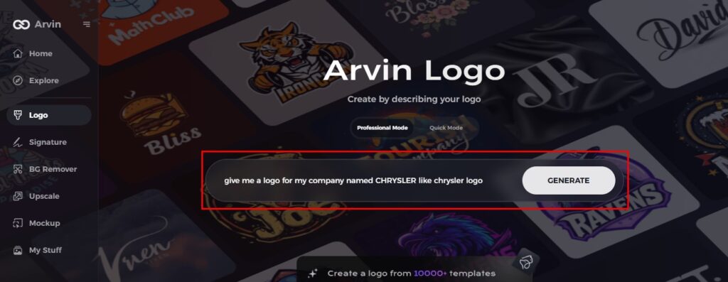
Steps to Use Arvin AI to Design a Custom Logo
Step 1: Sign Up and Log In
Go to the Arvin AI logo maker website, sign up, and log in to get access to the logo design feature.
Step 2: Enter Your Brand Details and Preferences
Input your brand name, slogan, and industry. Input your design preferences, including the style of font, colors, and themes that define your brand.
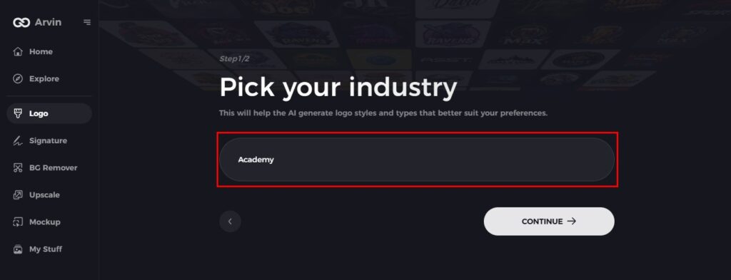
Step 3: Choose Your Industry
Pick the type of your business or your industry to ensure that Arvin AI creates style and designs in your logo best fit for a company.
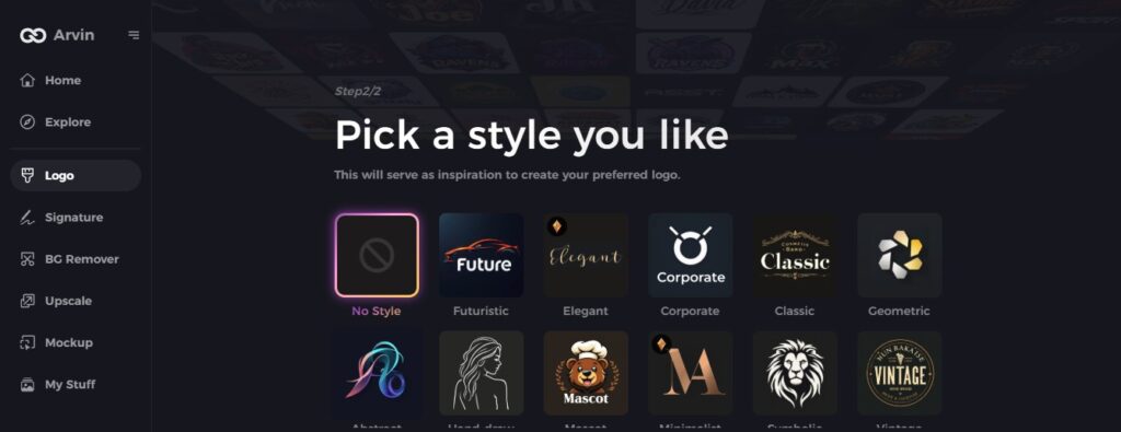
Step 4: Choose a Style
Select style of your own liking. In fact, a personal choice gives a boost toward creation of logos of your envisioned concept.
Step 5: Personify Your Logo
Once Arvin AI creates your logo, you can further customize it. You can adjust elements such as font style, layout, and symbol positioning to create a logo that fits your brand perfectly. Try different variations until you are satisfied with the result.
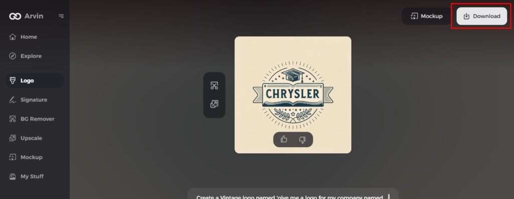
Step 6: Save and Download Your Logo
Preview your final logo design and save it in a high-resolution format, suitable for both print and digital use.
Conclusion
The Chrysler logo has evolved with time, symbolizing the growth and vision of the brand. In the automotive industry, a good logo is very important as it creates identity and trust. Like Chrysler’s logo, every business needs a unique logo to differentiate itself. Arvin AI is the best tool for logo creation, and making a professional logo is now easy. Its AI- powered features provide businesses with outstanding eye-catching logo creations that stand tall to capture their brand on the marketplace.
FAQs
What is the meaning of the Chrysler logo?
As the Chrysler logo combines features which represent both elegance and speed with technical innovation it effectively communicates luxury elements.
Why did Chrysler change its logo so many times?
Chrysler changed its logo to update itself with modern designs and also with the change in the company.
Which of the Chrysler logo versions is most iconic?
The winged version is the most popular, indicating speed and luxury.
Can I make a similar logo using Arvin AI?
Yes, you can create logos inspired by Arvin AI and based on the sleek, stylish branding of Chrysler.
