With such an importance on fresh, high-quality ingredients, Chipotle, the successful fast-casual restaurant brand, has taken a household presence. A company’s logo is instrumental in building brand identity and representing visually the business culture and sense of purpose the company holds on to. Changing logos are as common as company evolutions have been over time at Chipotle and with that reflects its journey forward in relevance. The Chipotle logo history, deeper meaning, and redesign in engaging its customers yet keeping the spirit is an article that is a close-up look.
What is Chipotle?
Chipotle is the name of the American fast food restaurant chain, which was founded in 1993 and currently operates some 3,000 outlets in the United States, Canada, the United Kingdom, Germany, and France. The company specializes in Mexican food.
Part 1: History of Chipotle: How did it begin?
Chipotle serves Mexican cuisine but is a rooted American. It was founded in 1993 by Steve Els, the son of a pharmacist born in Indianapolis. He studied art history at the University of Colorado. And always dreamed of becoming a chef at a fine restaurant. He entered the Culinary Institute of America in 1990 and his dream came true. In 1993, he started Chipotle to test his abilities, but he did not think it would become famous so quickly. Els served as CEO until 2020.

Part 2: The Chipotle logo evolution through the years
With the times, the logo design of Chipotle has evolved to express the chili pepper, which is the origin of its name. At its first appearance, the brand had a completely different badge on its sleeve.
1993 to 2009: Vintage beauty
The first Chipotle logo was written with no visual elements and represented Chipotle for 16 years. This logo established the name of the restaurant chain in the consumer’s mind. In the absence of social media, it was important to remember. The word mark was simply written in a papyrus-like black font, with the subtext “Mexican Grill.” Even in this playful font, the logo looked professional and almost copied the style adopted by high-end restaurants.
2009: Bold colors, enter
The Chipotle logo was the first and only major renewal in 2009. Chipotle adopted concentric circle as logo. A distinctive feature of the logo is the illustration of the peppers placed in the inner circle. White pepper placed in a red field. There is a thin white edge running around. The outer circle is black and thick, placing the brand name and subtext on the upper and lower curves.
2009 to today: Modernity at its finest
2009 was a year of transformation for the brand. The Chipotle logo renewed, and the shape of the decoration changed to red. There were some refined changes to the logo, but they were still recognizable to customers. The outer circle became thicker, the letters grew larger, and the central pepper became a new design.
Chipotle showed the tiger more funky and placed it in a brown field. The brand made the logo rectangular and placed the pepper in a rounded brown square. The word mark of Chipotle placed on a red rounded rectangle. It was written in white and gave the designer flexibility.
Chipotle logo color
The Chipotle logo employs multiple colors to portray the brand. The most crucial color used in the logo is red. Red symbolizes passion, energy, and love; these were aspects that the brand wanted to show through the logo. It is also termed as the color of increasing appetite of the consumer.

The brown color incorporated in the design is also the color that makes the brand stand out. The brown color represents the earth, and pepper is painted in the brown color, so it probably expresses the freshness that pepper has just sprung from the earth. Brown also stimulates appetite and represents health and nature, so it’s a perfect choice for fast food chains.
Part 3: The First Redesign (2001)
The first major redesign of the Chipotle logo occurred in 2001. It is one important step in the development of the brand. Here’s a detailed look at each aspect of this change as follows:
The Reasons for the First Redesign
By 2001, Chipotle was booming and gaining more popularity. The old logo, although practical, didn’t capture the essence of the brand’s purpose or mission. Chipotle wanted a logo that could be able to convey the message of fresh, high-quality food better and reach out to a wider audience.
Major Changes Made in the New Logo Introduced in 2001
The new logo was round in shape with bold red and brown tones, which made it more modern and eye-catching. A chili pepper added as the central icon, symbolizing the vibrant flavors of Chipotle’s menu. The text was clearer and more professional, which helped establish trust and recognition among customers.
How the New Design Reflected the Brand’s Growth and Shift in Identity
The new design indicated Chipotle was growing from small, casual restaurants to becoming one of the major stars in the fast-casual dining industry. The chili pepper icon connected right to the Mexican-inspired cuisine behind the brand while the polished finish reflected quality commitment.
Part 4: The Role of Minimalism in Chipotle’s Brand Strategy
It is true that Chipotle’s brand went through changes, and the company decided to go for minimalism in its logo and it perfectly fits into an overall trend in the business world. Let’s dive into the details:
The Growing Trend of Minimalism in Logo Design
One thing that has characterized the design of logos over time is simplicity. Companies have adopted this simplicity approach in their logotypes to create clean, modern, and memorable symbols. This practice eradicates all extra details and focuses on what a brand needs for identification.
How Chipotle’s Logo Comply with this Theme
Chipotle’s logo embraces this slight theme by being one of simple designs, smooth outlines, and alignment. It would be so conspicuous to any casual observer of being round and how the pepper seems to carry quite a bit in terms of illustrating the company brand personality.
Effectiveness of Simple Logo in Brand Recall and Customer Engagement
A simple logo is easier to remember, which in turn helps to recall the brand. Customers will easily recognize Chipotle’s logo on a storefront, menu, or social media. The minimalistic design gives the brand a modern and accessible feel, further increasing customer interaction. Focusing on simplicity helps Chipotle communicate its values effectively and consistently.
Part 5: Public Perception and Reception of the Chipotle Logo over Time
Chipotle has updated their logo many times since the foundation of the restaurant, and different customers and industries responded differently. Now, let’s explore people’s responses, and how they influence Chipotle’s branding approach.
Customer and Industry Response to the Changes Made
Nobody was silent when Chipotle did an update with the logo, as customers and industry experts always find something to discuss. The updates contained many since they express the growth of the brand and quality focus. Like 2001, in which the chili pepper matched this modern look was highly praised since it expressed Chipotle’s Mexican-inspired food.
How these perceptions influenced Chipotle’s branding strategy?
This meant that the customer and industry feedback played an important role in helping Chipotle to establish the perfect brand identify. Positive responses made the company more aware that they were headed in the right direction and criticism informed the company what their fans cared about.
Part 6: How Arvin AI Enhances Logo Design Analysis
Arvin AI is a powerful tool, it is designed to make a logo analysis efficient for students and people interested in the topic. This drives businesses to gain insight on mechanism through which logos spread the brand message especially through colors, shapes and fonts. Companies can see how their logos compare to their competitors and make sure they are on similarity with the latest trends and expectations of the customers through Arvin AI. Through detailed comments and using tactics, Arvin AI helps brands create unique logos and makes them work very well within the context of the company’s identity with the help of engaging the audience.
Key Features of Arvin AI for Logo Design Analysis
There are following key features of Arvin AI:
- Color Analysis: Arvin AI checks how well your logo colors match the brand’s message. It helps choose colors that attract the right emotions from customers.
- Font Recognition: The tool identifies fonts used in your logo to ensure they fit your brand’s tone. It suggests font changes to make the logo clearer and more professional.
- Brand Identity Alignment: Arvin AI reviews if your logo matches your brand values and mission. It provides suggestions to make sure your logo clearly represents your business.
- Competitive Comparison: It compares your logo with competitors to see how unique it is. The tool helps improve your logo to stand out in the market.
- Simplicity Evaluation: Arvin AI checks if your logo is simple and easy to recognize. It recommends changes to make the design clearer and more memorable.
- Actionable Feedback: Arvin AI gives easy-to-understand suggestions to improve your logo. You get clear steps to make your logo more effective and engaging.
Steps to Use Arvin AI for Logo Design
Step 1: Create an Account and Log In
Visit Arvin AI website, create an account, and log in to access the logo design feature.
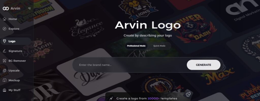
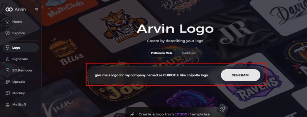
Step 2: Input Your Brand Information and Preferences
Enter your brand’s name, slogan, and industry. Specify any design preferences, such as font style or image themes, based on your brand’s identity.
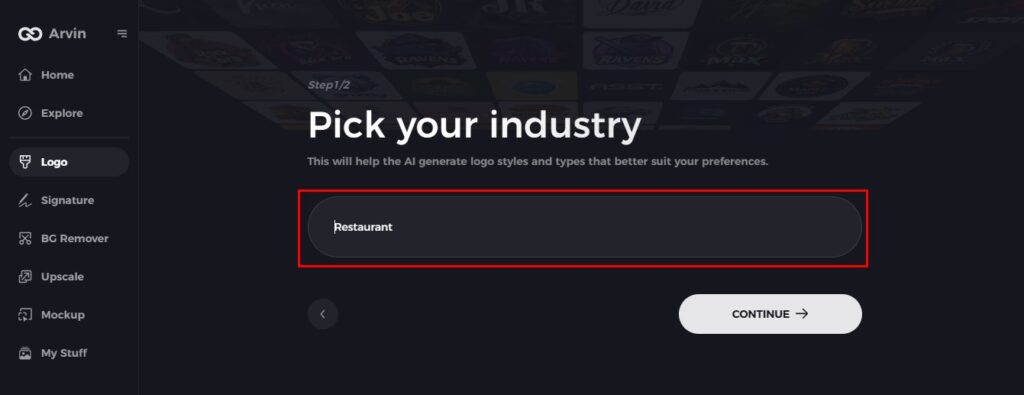
Step 3: Choose Your Industry
Select the industry that your brand belongs to. This will guide the AI to create logo styles according to your niche.
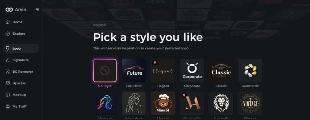
Step 4: Select a Design Style
Choose a design style that fits the vision of your brand. This will guide the AI in the creation of logos that resonate well with your desired look and feel.
Step 5: Personalize Your Design
Once you get logo ideas using Arvin AI, use its tools to change any font style, layout, and symbol placement based on your needs. You can try different designs until the right one comes along.

Step 6: Save and Download Your Logo
Preview the final design and save it in high resolution. You can use it for both digital and print applications, just like Chipotle’s logo for all branding needs.

Conclusion
The logos have changed over the years to represent change that Chipotle brand has undergone through for a new look. At its best, it has been traditional and new at the same time, preserving interest while retaining history. Interestingly, a good logo is one of the most essential pillars of a strong brand and its visions and purposes. This is what happened with Chipotle: changes that were done in the logo evidently demonstrate how powerful good logos could be to the brand. Therefore, tools such as Arvin AI are very ideal for doing analysis and optimizations on the logos to suit the identity and objective of your brand.
FAQs
Why did Chipotle redesign its logo multiple times?
Chipotle changed its logo multiple times to meet the market requirements and show its growth. Each alteration was done keeping in mind how to make it more modern without losing the core identity of the brand.
What does the pepper symbol in the Chipotle logo represent?
The pepper on the logo means that Chipotle’s food is spicy, or as the company puts it, bold and flavor-packed. Its brand major on new food, Mexican style, and the logo confirms this strategy.
How has the Chipotle logo evolved to reflect the brand’s values?
Chipotle has managed to change each logo with time according to the changing values of the brand, including quality, freshness, and simple wholesome food.
Can Arvin AI be used to create or analyze logos for other brands?
Yes, Arvin AI is versatile and can use to analyze and improve logos for any brand, no matter the industry.

