Burger King is one of the leading names in fast-food chains across the globe, offering flame-grilled burgers to people. Beneath this identity stands its emblematic logo that does not only embody the vision and mission of the company but also symbolize how it keeps abreast of changing trends and requirements. The logo has also had a developmental process from the birth of this product and every change was perhaps premised ‘On the Changing Dynamics of this Firm’. This article presents how and when the logo was changed, in the light of both design and the symbolism involved as key factors that have placed Burger King Logo firmly on the map of `the fast-food giants.
Part 1: The Early Days – Burger King’s First Logo
The Birth of Burger King
In 1954, James McLamore and David Edgerton founded Burger King to shake up the fast food industry with cheaply priced burgers of high quality. Its first logo was crucial to the brand’s expression and positioning in the market. Early on, Burger King focused on simplicity and recognition, as the company needed to compete in a burgeoning market. The logo encapsulated the company’s mission to provide great-tasting food quickly, establishing Burger King as an accessible yet high-quality choice for customers.

Description of the First Logo
The first logo was simple yet memorable. It was bold, easily recognizable, and enclosed “Burger King” in a banner or crown shape. The bold font was clear, evoking strength and trustworthiness. The use of red and yellow in the logo symbolized warmth, appetite appeal, and energy. The crown-like shape reinforced the concept of “king,” positioning the brand as a leader in the fast-food industry.
Significance of the First Logo
The first logo symbolized the core vision of Burger King: the efficient provision of nice, fast-prepare meals to consumers in the quickest possible manners. The usage of red and yellow colors came in a vividly catchy yet frequently associated with issues like food, appetite, therefore attracting consumers of this brand highly. Simplicity and obviousness in expression ensured that they brought about efficiency as well as high qualities that are more accessible to all the customers while segregating the brand over an extremely thick market.
Part 2: The 1990s Redesign – A More Modern Look
Overview of the 1990s Redesign
As Burger King entered the 1990s, it was quite evident that this fast-food business was changing so fast. With new entrants in the fast-food market, competition was now increasing, while consumer preferences became more contemporary and vibrant brands. To stay contemporary and attract more diverse, youthful consumers, Burger King launched its logo redesign program to reflect these shifting dynamics.
Analysis of Changes in the Logo
The Burger King logo was redesigned in the 1990s with a number of new changes to make it more modern and dynamic. The color scheme became much vibrancy while having a richer, bolder contrast between red and yellow. The redrawn font became more angular and streamlined while showing a more energetic and youthful vibe.
Why the Logo Was Redesigned
This came out of competition and need to be relevant in a more saturated marketplace for fast food. With the change in consumer preference, Burger King felt the urgency to keep in tandem with the cultural foresights and expectations regarding the brand image. Thus, it is under this reason that the new logo came about responding to the growing trend seen through the 1990s toward more contemporary and bold branding across all industries.
Impact on Brand Identity
The new logo repositioned Burger King as the modern and innovative brand in the fast foods for new-generation consumers. It updated the company image without losing its uniqueness. The simplification of the logo with energetic and bold styles helped strengthen the identity of Burger King as a leader among fast-food chains.
Part 3: 2000s to 2010s – Staying Relevant with Minor Tweaks
It is at this time that Burger King was implementing subtle means of small but radical changes that helped them modernize without compromising its core value identity. With time, and most that the consumers find preferable over other things, the organization has been paying attention to making small alteration keeping it modern but not at the expense of its core values.
Analysis of Minor Logo Tweaks during the Early 2000s and 2010s
Burger King upgraded its logo in a series of minor improvements between the early 2000s and 2010. While there wasn’t the kind of overhaul one would expect, minor changes were incorporated to polish the brand personality.
Color Refinement
The colors used in the Burger King logo were red, yellow, and blue. Though it remained red, yellow, and blue, but its use was far more refined. The tints were toned a bit for bright appeal towards the modern customers and giving it a much fresher and much more dynamic appearance without going very far from the original.
Font Modernization
The other major update was the font. The typeface was altered to make it look more modern and clean, thus more readable and versatile enough for use on a variety of digital platforms and advertising media. This subtle tweak ensured that the logo remained as versatile as it was in a world that was fast becoming digital, where brand logos needed to function across screens of all sizes.
How Burger King Adapted to Changing Design Trends Without Losing Its Core Identity
The company did not alter its logo much during the trend of minimalist designs in the early years of the 21st century; rather, it just fine-tuned it. The improvements set the brand in continuity with the prevailing design trend during the time: more sleek, and more simplified visual elements, but preserving other iconic elements such as the dual-bun shape and bold colors that consumers immediately recognized.
Impact of This Period’s Logo on Burger King’s Marketing Campaigns and Consumer Perception
The minor changes in the logo made in the 2000s and 2010s were a great aid in fueling Burger King’s marketing, especially when digital advertising really gained momentum. The more modern design of the logo brought the brand into the youth as well as those who were digitally adept, but still the iconic aspects evoked the nostalgia of the fans for a long time. With that, it was possible to reach more diverse audiences without neglecting its traditional loyal clients by maintaining an equilibrating balance of novelty and old heritage.
Part 4: 2021 – A Bold New Logo
The 2021 Burger King logo redesign marked a bold and exciting shift by bringing back the retro aesthetic and introducing a fresh, modern take. This new logo combined nostalgia with a streamlined approach, signaling a new chapter for the company while honoring its roots.
Introduction of the 2021 Redesign
Burger King also decided to go big and in 2021 the company decided to refresh their logo and went back to some of the roots but making it look more like a future technology. Thus, the new interface was not just the new look-and-feel but rather the brand proposal that goes hand-in-hand with the new generation of customers, as well as a way of reassured people regarding its concern with the past.
Why the Company Chose to Bring Back a Retro Look
The decision to bring back a retro look was informed by Burger King’s aimed at targeting the feelings of memories that many people hold with the Company. Taking a logo in its simplest form that referred back to its origins, Burger King pre-saged every one with memories of the fast-food craze.
Analysis of the New Design Elements and How They Reflect the Brand’s Commitment to Its History and Future
New design elements and what they say about the brand’s commitment to history and future
2021 redesign was more streamlined and flat. The new design was less cluttered with details, instead bolder shapes and clearer fonts. The new minimalist rounded logo design allows greater versatility for its employment into any digital or printed media. It ensures Burger King does not get left behind in this increasingly visual, screen-dominated world. The retro themes are still revered with modern touches. While keeping that diluted bun look, a nod not only to the company’s past but also to its vision for the future.
Significance of Using a More Streamlined and Bold Approach in This Redesign
The 2021 logo is more minimalist and bolder, with fewer frills and a more direct visual effect. This bold design follows contemporary trends in design, where minimalism is considered more sophisticated. The modern look appeals not only to older customers who remember the brand’s legacy but also to younger customers who find simplicity and clarity necessary in branding.
The Emotional Connection to Nostalgia and Burger King’s Focus on Its Heritage
The 2021 redesign demonstrates Burger King’s focus on heritage and brand identity, embracing the power of nostalgia. The company looked back to its iconic designs from the past to ensure that its logo remained emotionally resonant with long-time fans. The new logo is a bridge between the past and the future, effectively balancing the need for modernity with a strong sense of tradition.
Part 5: What the Burger King Logo Represents
Logo means a lot; in fact, a logo design forms the complete image of your brand. At Burger King, this logo gives immense meaning while talking about some significant values. Their mission statements along with relations of the product and the user would define it pretty much. Part of the burger king’s new logo was its elements: it was trying to deliver the look how the actual values of a brand were merged.
Deep Dive into the Symbolism Behind the New Logo
Burger King Logos have been changed over the years, and their latest version is simpler yet impactful. Here is what the new logo symbolizes:
Color Palette
The logo’s colors: yellow, red, and brown, carefully picked for their warmth and associations with hunger and comfort, communicate energy, happiness, red arouses excitement and desire. While brown speaks about natural, uncompromised product: flame-broiled Burgers of Burger King.
Font and Typography
The new font is bold, simple, and clear. The curvy, friendly letter forms create a feeling of warmth. While the simplicity of the font aligns with what Burger King Logo wants to achieve in terms of food accessibility. The new font also transcends what is speedily casual dining that Burger King Logo intended to offer.
Streamlined Design
This minimalistic logo is more identifiable and versatile because it cuts across both the physical sign and the digital platform. This is reflected in the brand commitment to quality food without the extraneous frills, symbolizing no-nonsense fast food, simple, and genuine comfort food.
The Visual Representation of Burger King’s Commitment to Simplicity, Quality, and Comfort Food
The concept used to execute the Burger King brand values lies within the simple thinking technique. They strive to serve simple, tasty and quality foods and hence the comfort foods are neatly served without any fuss. A good logo would foster patronage and create a brand image. The new Burger King Logo is an easily recognizable figure that consumers first considers equal to high quality and reliability. The longer it takes to happen the more this logo will make the client trust it and remind them of the brand’s promise and this is something that no other super weapon is as effective in keeping the customers.
Part 6: Arvin AI and Its Impact on Branding
Arvin AI is changing the branding industry by offering the branding power of artificial intelligence in logo design for generating the best logos that represent business visions. This advanced technology shall help corporations find beautiful and befitting logos for the corporations’ brand images. With Arvin’s intelligent design approach and advanced features, companies can design memorable logos by intelligently assist. In this section the author shall expound on the most manifest characteristics and how development is accomplished in order to bring about a radical change in the branding process.
Key Features of Arvin AI
- AI-Powered Logo Design: Arvin AI uses advanced algorithms to create unique, customizable logos that align with a brand’s ethos.
- User-Friendly Interface: The platform provides an easy design process even for non-designers to create professional logos within a short period of time.
- Countless Customization Options: A user can fine-tune colors, fonts, and icons to represent their brand completely.
- Real-time Feedback: The Arvin AI gives instant feedback on design selections, which refines and perfects the logos developed.
- Scalable and Versatile: It is scalable with high-quality printing, suitable for diverse applications from digital to print media.
Steps to Create a Logo Using Arvin AI: Inspired by the Evolution of the Burger King Logo
The transformation of the Burger King logo reflects a balance between heritage and innovation. Similarly, Arvin AI empowers users to create logos that resonate with their brand’s identity while embracing modern trends. Here’s how you can craft your logo with Arvin AI:
Step 1: Access Arvin AI’s Logo Design Platform
Navigate to the Arvin logo page using your browser. Like Burger King revisited its design roots, you’re just a few clicks away from reimagining your brand identity.
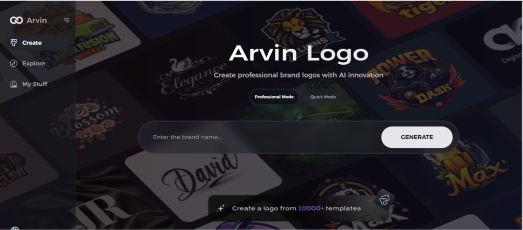
Step 2: Provide Your Business Details
Input essential information, such as your business name and category. Just as Burger King tailored its logo to align with its core values, your inputs will guide the AI in creating designs that reflect your brand’s essence.
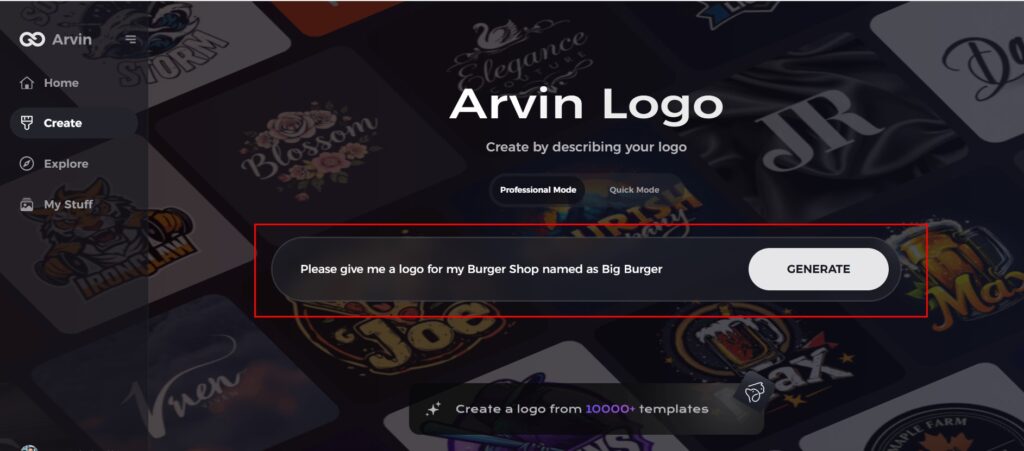
Step 3: Select Your Industry
Choose an industry that matches your business. This step ensures that the logo styles are optimized for your niche, much like how Burger King’s updates honored its fast-food heritage.
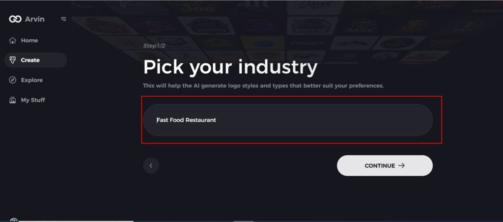
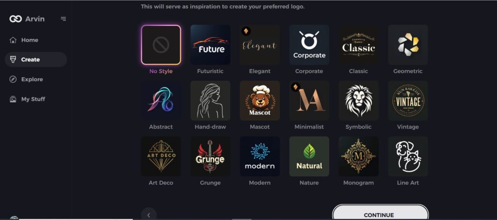
Step 4: Define Your Style
Browse through the style options and pick one that complements your vision. If undecided, you can skip this step, allowing the AI to draw from its default inspirations, just as Burger King did by blending retro charm with modern aesthetics.
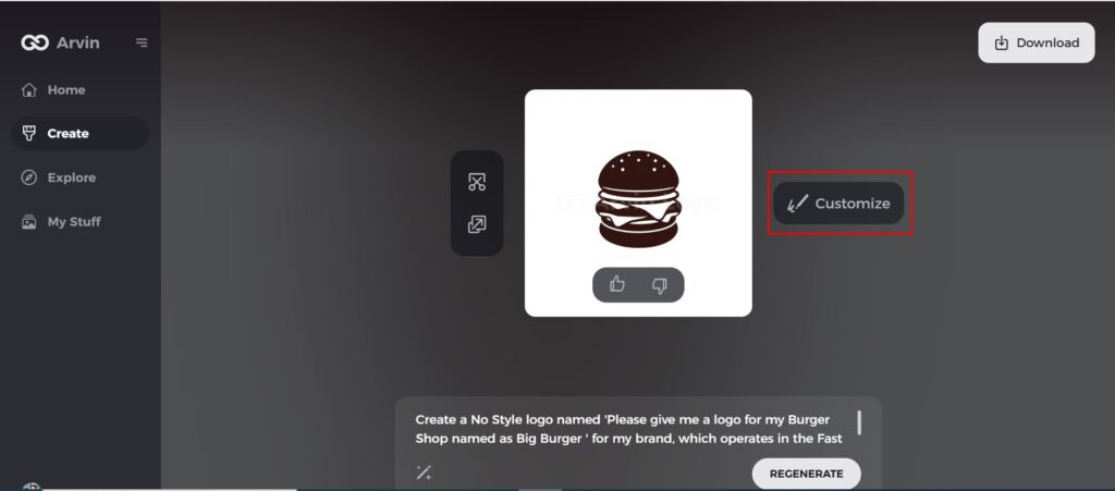
Step 5: Customize Your Logo
Refine your chosen design by adjusting elements like colors, fonts, icons, and layouts. Personalize the logo to echo your brand’s unique style, akin to Burger King’s commitment to standing out while staying true to its legacy.
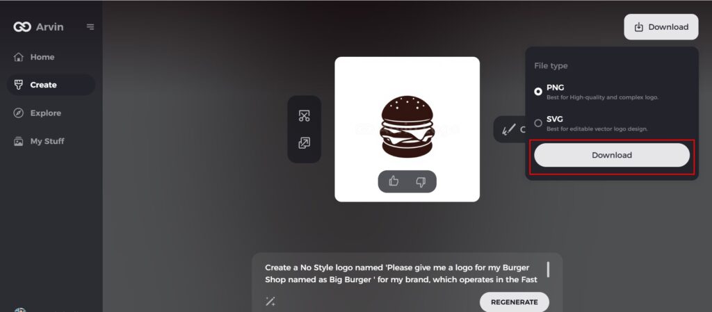
Step 6: Finalize and Download
Once you’ve perfected your logo, download it in versatile formats such as PNG or SVG. These formats, like Burger King’s consistent branding, ensure seamless integration across digital and print platforms.
Part 7: Future Trends in Logo Design
As branding continues to evolve, logos continue to be one of the most important parts of a company’s identity. The evolution of the Burger King logo is a good example of the broader trends that will shape the future of logo design.
How the Evolution of Burger King’s Logo is Part of Larger Trends in Design
The Burger King logo had undergone several revamps over the years, mimicking the different design preferences of yesteryear. Its recent redesign, coming from a vintage-inspired style, is in harmony with the trends of brands reverting to the good old times. As simple and authentic simplicity becomes the essence of modern designs. The Burger King logo is an outstanding example of the way design caters to mainstream trends like nostalgic marketing.
Predictions for Future Trends in Logo Design
The ever-changing dynamics between customers’ requirements and the rate at which technology develops leave no scope for the logicians. Therefore, given below are the top predictions and trends which the logo of future times may acquire:
Simplified Logos
The trend towards simplicity in logos has been on the rise in recent years and is expected to continue. Companies prefer cleaner, more minimalist designs that are easy to recognize and reproduce in various mediums. The new redesign of the Burger King logo with bold, clean lines and flat design represents this trend perfectly.
Digital-First Designs
The increasing need for online presence among brands calls for more critical digital-first designs. Logos need to cut across all possible digital platforms, ranging from social media profiles to mobile apps. A digital-first logo should be scalable, readable at smaller sizes, and color adaptable for screen types.
The Growing Role of AI in Logo Creation and Branding
Artificial intelligence utilize to enable businesses obtain rapid, specific and even analytics-based design from a short period of time. Brands could therefore create a logo that had a better association with their customer segment. It spends less time and money through gadgets like Arvin AI. In the near future, there will be more significance of AI in appealing and distinctive logos that matter most.
The Role of Logos in Creating Lasting Brand Identities in the Future
Logos are the basis of a brand’s identity and loyalty of customers. When a brand is looking for future-proof identities, logos have to be fluid enough to meet the present demands. And this eventual technological changes in the future. With a great logo, a company can remain consistent with the image it creates. While evolving over time, staying relevant and reaching out to their audience for as long as possible.
Conclusion
The first design for the Burger King Logos and the evolution has undergone to this minimalist adaptation shows how branding can change with the times. This redesign reminds people how to balance nostalgia along with innovation. It represents something larger than just some visual mark. A symbol is full of the story, values and connecting a brand with audience. Arvin AI provides tools to create a customized logo. It’s perfect for fast-food chains as well as creating branding elements for any business. The AI features allow you to generate unique logos tailored to the specific needs and vision of your brand.
FAQs About The Burger King Logo
What does the new Burger King logo mean?
The new logo symbolizes the Burger King Logo Heritage to some extent. It mixes up retro with some contemporary who is in some way, still symbolic to the simple outlook of the brand of being as good as it is. Such an old-and-new combination helps everyone recall a long history of delicious dishes while maintaining relevance in design.
Why did Burger King change its logo in 2021?
The redesign aimed to make the brand nostalgic, respecting its history and modernizing the design for a new, minimalist look. This linked Burger King Logo to its audience on an emotional level by allowing them to reminisce about the classic branding with more contemporary visual elements.
How does the Burger King logo help in brand recognition?
The strong, old-school style would only add to the identity of Burger King. But make the brand more memorable and recognizable across different marketing platforms. Using familiar and fresh visual elements for the logo ensures that Burger King stays at the forefront of people’s minds. Which improve visibility and engagement for the brand.
Can I create a fast-food brand’s logo with Arvin AI?
Yes, Arvin AI provides tools to create a customized logo. So, it’s perfect for fast-food chains as well as creating branding elements for any business. The AI features allow you to generate unique logos tailored to the specific needs and vision of your brand.


