Did you know that the default typeface for Andriod is Roberto? Typography plays a crucial role in shaping a brand’s visual identity and user experience. With over 1,796 free Google font families available on Google Fonts, selecting the right typeface and best Google fonts can enhance readability, improve aesthetics, and establish a brand’s personality.

In this guide, we’ve compiled the best Google Fonts for different use cases, from highly readable web fonts to sophisticated logo typography. We’ll also answer common questions about Google Fonts, helping you find the perfect typeface for your next project.
Pair the best Google fonts with a custom-designed logo. Use the best Google Fonts and let Arvin AI craft a professional, high-impact logo for your brand.
Best Google Fonts for Websites
When selecting a font for a website, readability, versatility, and loading speed are key factors. Here are some of the top Google Fonts for web design:
Lato
Lato is a modern and highly versatile sans-serif font, striking a balance between professionalism and warmth. Designed by Łukasz Dziedzic in 2010, its name means “summer” in Polish, reflecting its light, airy feel.
Originally created for a corporate client, Lato gained widespread adoption after being released for public use. Its clean structure and subtle curves make it most of the most popular Google fonts for corporate branding, technology startups, and business websites. Major brands and platforms, including Mozilla and Merriam-Webster, use Lato for its excellent readability and neutral aesthetic.
Open Sans
Created by Steve Matteson and commissioned by Google, this sans-serif font was specifically designed for clarity at small sizes.
It has a neutral yet friendly appearance, making it ideal for corporate websites, mobile apps, and government portals. Google itself integrates Open Sans across various platforms, including Google Docs and Google Ads, while organizations like Mozilla and WordPress also favor it for its versatility and accessibility.
Merriweather
Merriweather is a classic serif font crafted for long-form content readability, making it a staple for news articles, e-books, and academic websites. Its high x-height and slightly condensed letterforms ensure maximum legibility even on small screens.
Developed by Sorkin Type Co., Merriweather has become a popular choice for editorial content, with platforms like Medium and The Washington Post utilizing similar serif fonts for an elegant reading experience. It pairs well with modern sans-serif fonts, creating a sophisticated yet readable typographic hierarchy.
Inter
Inter is a highly optimized sans-serif font tailored for user interfaces. Designed by Rasmus Andersson, it features variable font weights, refined kerning, and enhanced readability on digital screens. Tech-forward brands like Notion, Figma, and Vercel rely on Inter for their design systems, ensuring clean typography across web and mobile applications.
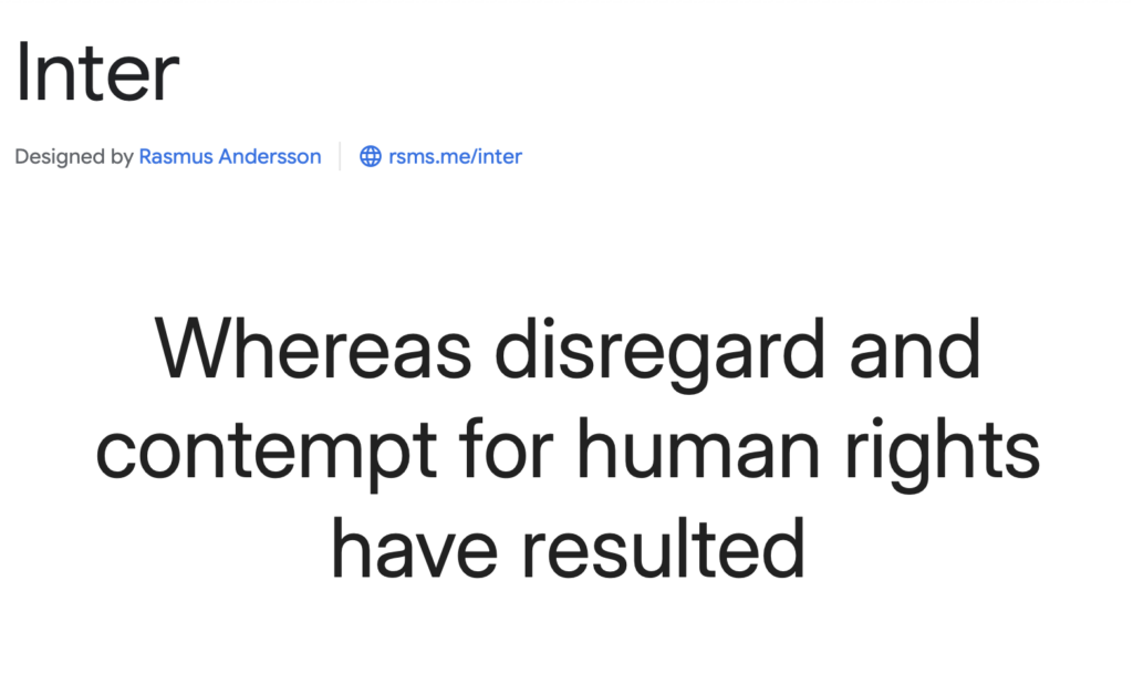
Unlike traditional sans-serif fonts, Inter was specifically engineered for small text sizes and high-resolution displays, making it an excellent choice for software dashboards, UI elements, and accessibility-focused designs.
Work Sans
Work Sans is a humanist sans-serif that blends functionality with character. Originally designed by Wei Huang, it was inspired by early grotesque typefaces but adapted for modern digital use.
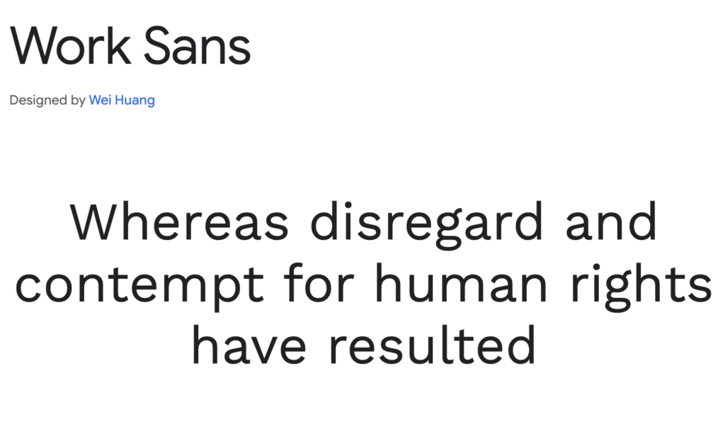
The font has become particularly popular for startup branding, UI/UX design, and mobile applications, thanks to its balance of geometric precision and subtle warmth. Work Sans’ adaptability makes it a go-to font for fintech platforms, e-commerce sites, and personal portfolios, offering both professionalism and a welcoming aesthetic.
Hind Madurai
Hind is an elegant, highly legible sans-serif font designed for web typography. It was developed by Indian Type Foundry, initially created to support Indian scripts like Devanagari. However, its clean letterforms and open structure quickly made it a global favorite.
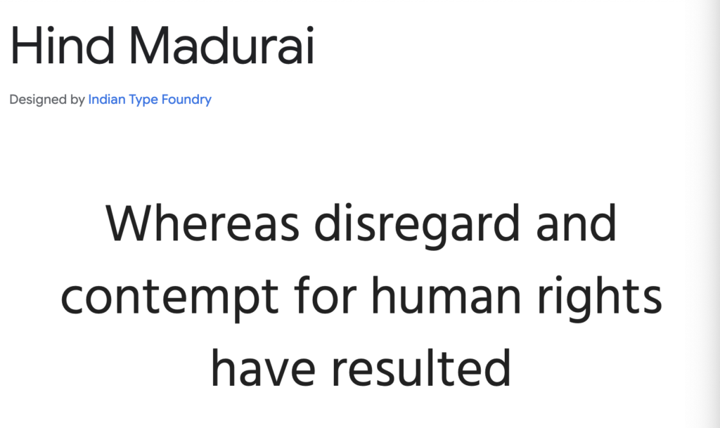
Government portals, academic websites, and online learning platforms commonly use Hind due to its excellent readability across different languages and screen sizes. Its subtle yet distinctive design makes it a great alternative to more commonly used sans-serif fonts like Open Sans and Lato.
Manrope
Manrope is a geometric sans-serif font that embodies precision and modernity. With rounded letterforms and open counters, it provides a clean, futuristic aesthetic without feeling too sterile.
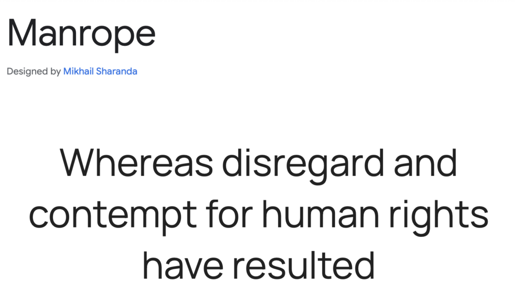
It’s an excellent fit for tech startups, SaaS (Software-as-a-Service) companies, and digital dashboards, where clarity and efficiency are paramount. Brands prioritizing a minimalist yet high-tech look often choose Manrope for web and mobile interfaces.
Karla
Karla is a friendly, slightly quirky sans-serif with rounded edges and a structured layout. Its organic letterforms make it feel approachable, making it perfect for branding, packaging, and creative design projects.
Many independent brands, artisan businesses, and lifestyle websites opt for Karla to give their typography a personal yet professional touch. Its combination of readability and personality makes it a popular alternative to more corporate-looking sans-serifs.
Nunito Sans
Nunito Sans is a well-balanced, modern sans-serif designed for user interfaces. With its smooth curves and even spacing, it provides a polished, contemporary look that works well for financial technology (fintech) apps, educational platforms, and health-related websites.
Originally developed as a rounded version of Nunito, this font has gained traction for its friendly yet professional aesthetic. Many digital platforms choose Nunito Sans for UI elements, data dashboards, and mobile-friendly typography.
DM Sans
DM Sans is a minimalist, elegant sans-serif optimized for small text sizes. It’s clean and contemporary, often seen in high-end fashion websites, editorial design, and corporate branding.
Unlike heavier sans-serifs, DM Sans maintains an airy and sophisticated feel, making it ideal for luxury branding, modern web design, and creative portfolios. With its balanced proportions and open letterforms, it’s an excellent choice for refined, high-end digital experiences.
Best Google Fonts for Logos
Choosing the right font for a logo is crucial as it reflects brand identity. Here are some of the best Google Fonts for logo design:
Archivo Black
Archivo Black is a heavyweight sans-serif designed for making a strong visual impact. Its thick letterforms and bold structure make it an ideal choice for headlines, posters, and large-scale branding projects. Originally designed for print typography, Archivo Black has been adapted for digital use, maintaining high readability on both screens and paper.
Due to its commanding presence, it is frequently used in sports branding, political campaigns, and dynamic advertising materials where an authoritative and powerful look is needed.
Playfair Display
Playfair Display is a high-contrast serif that embodies elegance and sophistication. Inspired by 18th-century transitional typefaces, it reflects the refinement of old-style printing techniques while maintaining a modern aesthetic. The font’s dramatic strokes and fluid curves make it a favorite for luxury brands, high-end editorial design, and upscale fashion websites.
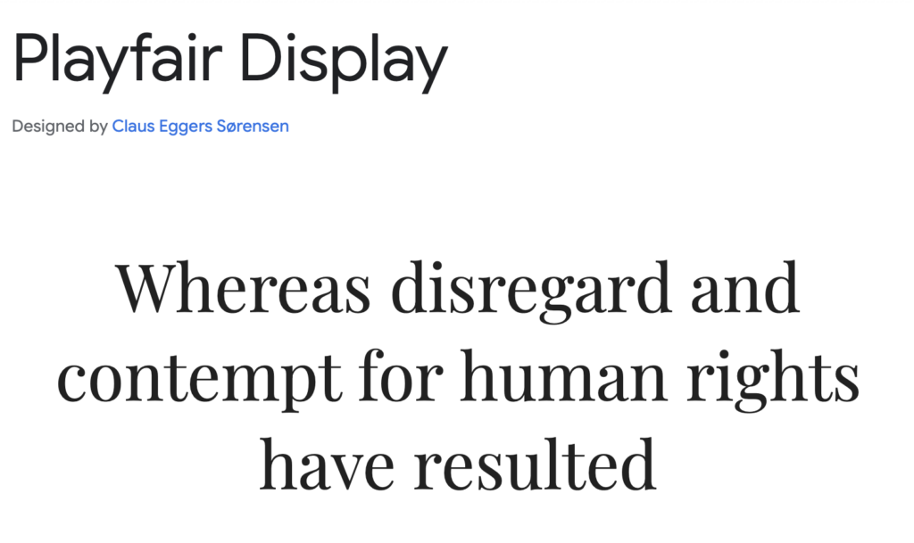
You’ll often see Playfair Display in beauty brands, wedding invitations, and luxury product packaging, where its classic yet stylish look enhances a brand’s visual appeal.
Raleway
This font is often used in web design, digital presentations, and corporate identities where a clean, stylish, and highly legible typeface is essential.
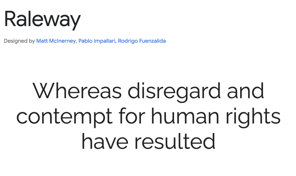
Raleway is a sleek, modern sans-serif with a refined and minimalist aesthetic. Originally designed as a single-weight typeface, it was later expanded into a full family, providing designers with versatile weight options. Its thin, elongated letterforms and geometric style make it a top choice for tech startups, creative portfolios, and contemporary branding.
Bebas Neue
Bebas Neue is a condensed sans-serif that commands attention with its tall, uniform letterforms and strong presence.
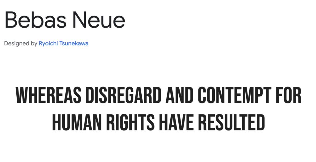
Often referred to as the “Helvetica of the free fonts,” it has become a go-to typeface for branding, posters, and high-energy marketing materials. Its structure makes it ideal for sports branding, beverage packaging, and streetwear logos, where a bold, urban look is needed. Bebas Neue is frequently used in YouTube thumbnails, film posters, and digital campaigns to create striking, eye-catching typography.
Abril Fatface
Abril Fatface is a high-contrast display serif that combines bold strokes with elegant curves, creating a dramatic and stylish look.
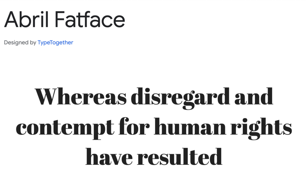
Inspired by vintage advertising fonts, it brings a touch of classic sophistication to modern designs. Frequently used in fashion branding, boutique signage, and high-end magazine covers, Abril Fatface pairs beautifully with minimalist sans-serifs to create a luxurious, editorial-style aesthetic. It’s often seen in beauty campaigns, high-end product packaging, and luxury event invitations.
Anton
Anton is a modern, high-impact sans-serif designed to grab attention.
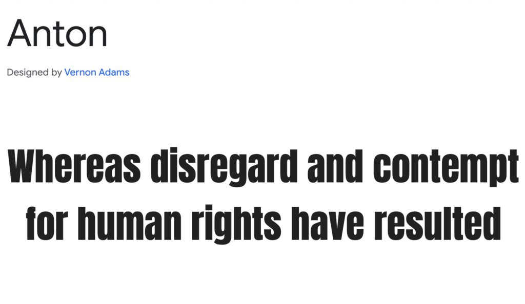
Originally inspired by traditional newspaper headlines, Anton has been optimized for digital and web use, featuring strong, condensed letterforms with excellent legibility. It’s a popular choice for tech brands, media companies, and entertainment platforms, where its commanding style ensures messages are delivered with authority. Anton is frequently seen in movie posters, fitness branding, and digital advertisements that require a powerful and dynamic presence.
Make your typography work for you. Whether you need a tech-forward logo, a timeless serif brand mark, or a fun handwritten logo, Arvin AI adapts to your needs.
Quicksand
Quicksand is a rounded sans-serif that feels modern, friendly, and approachable. It was designed with geometric principles, making it both highly legible and visually appealing.
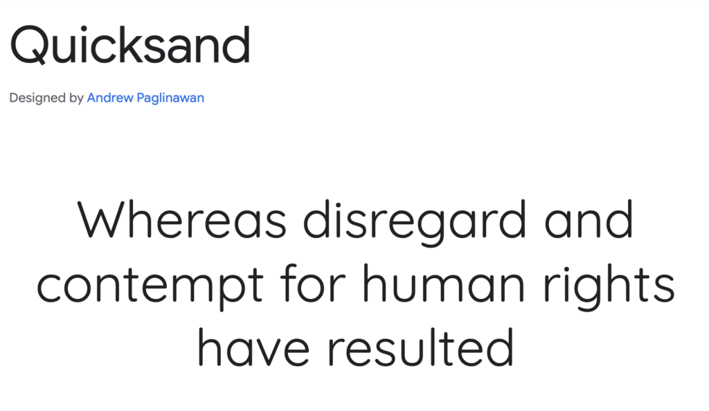
This typeface is a favorite for startups, lifestyle brands, and creative agencies looking for a contemporary and inviting aesthetic. Its soft edges give off a sense of warmth, making it a great choice for wellness brands, fintech applications, and e-commerce websites that want to establish a user-friendly, trustworthy identity.
Arvo
Its clean lines and slightly condensed form make it an excellent choice for logos, posters, and impactful branding.
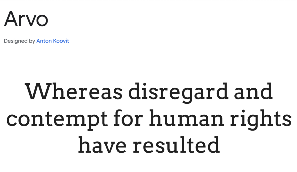
Originally designed for screen readability, Arvo is frequently used in technology brands, corporate presentations, and architectural firms where a modern yet strong visual identity is required. Its sharp edges and even spacing make it a standout choice for brands that want a mix of tradition and modernity.
Julius Sans One
Julius Sans One is an elegant, all-caps sans-serif with a unique, refined appearance.
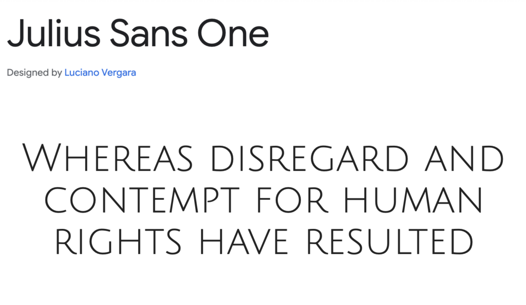
Its delicate letterforms and subtle geometric details give it an air of sophistication, making it perfect for high-end fashion, jewelry brands, and boutique identities. This typeface is commonly seen in luxury product packaging, perfume labels, and minimalist branding. Its thin, stylish design makes it an excellent choice for brands looking to project exclusivity and refined taste.
Unica One
This font is a futuristic sans-serif that blends modern minimalism with a retro touch.
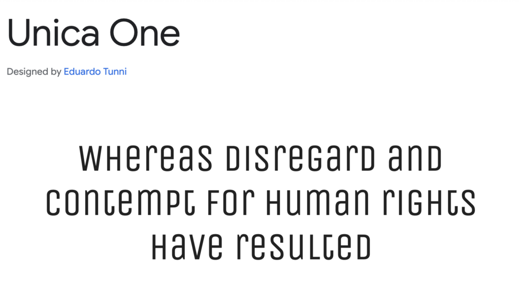
Its monolinear design and slightly condensed structure make it stand out in digital branding, tech startups, and entertainment logos. The font has a unique personality that feels both contemporary and nostalgic, making it great for video game branding, AI-driven platforms, and forward-thinking companies.
Best Google Fonts for Luxury Brands
Luxury brands tend to require a different level of subtlety, and usually use their font to express how they feel or the values they want to impart on their audience or potential clients. Here is a list of font that, when used in tandem with a right branding, can give off a luxury feel.
Tenor Sans
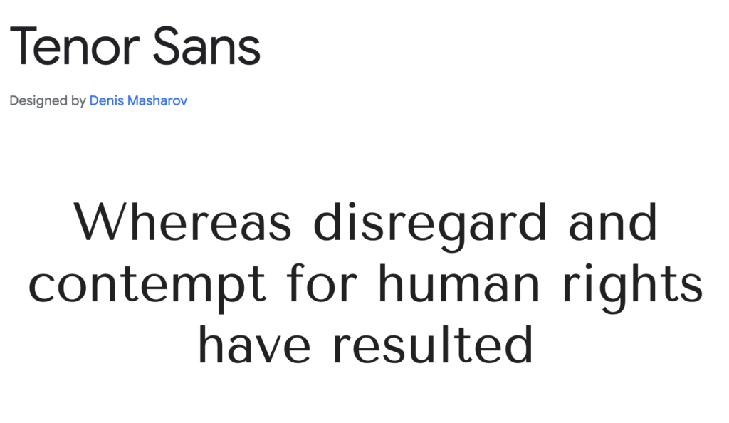
Tenor Sans is a modern serif that complements high-end aesthetics. Its sleek, elongated letterforms make it an excellent choice for upscale brands, premium lifestyle websites, and elegant editorial design.
Cormorant Garamond
Cormorant Garamond is an elegant and refined serif font inspired by classic Garamond typefaces.
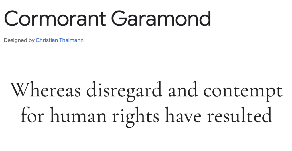
It’s a favorite for luxury fashion, high-end beauty products, and premium print materials due to its sophisticated and timeless feel.
Libre Baskerville
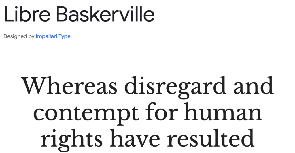
Libre Baskerville is a sophisticated serif that conveys trust and class. With its traditional design and excellent readability, it’s a staple in law firms, luxury hospitality branding, and high-end e-commerce.
Cinzel
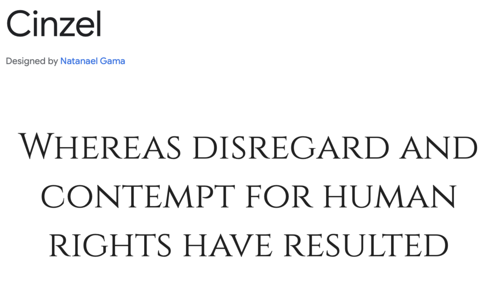
Cinzel is inspired by classical Roman inscriptions, making it a perfect choice for luxury aesthetics, premium branding, and upscale product packaging. Its sharp serifs and strong presence make it ideal for wine labels, jewelry brands, and fashion houses.
Spectral
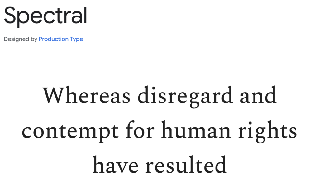
Spectral is a stylish serif with a modern edge, blending classic elegance with contemporary design. Often used in corporate branding, premium magazines, and elegant web design, it has a refined and authoritative feel.
Lora
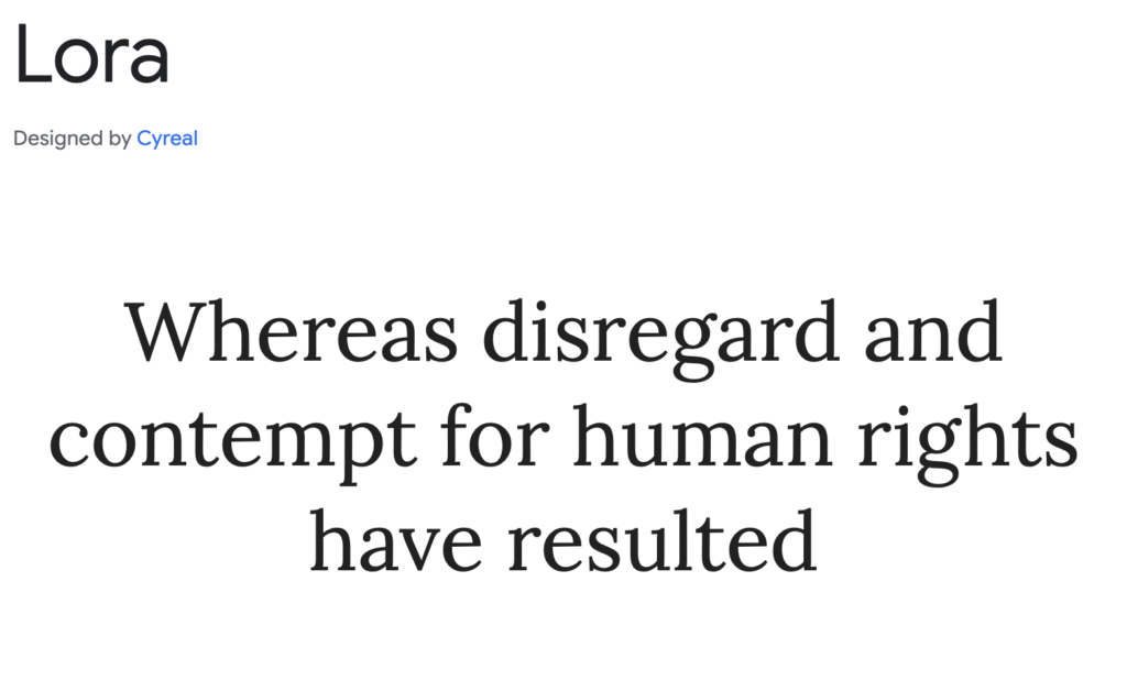
Lora is a well-balanced serif with a touch of artistic flair. Designed for digital readability, it’s often found in premium lifestyle blogs, boutique branding, and high-end editorial design.
Gentium Book Basic
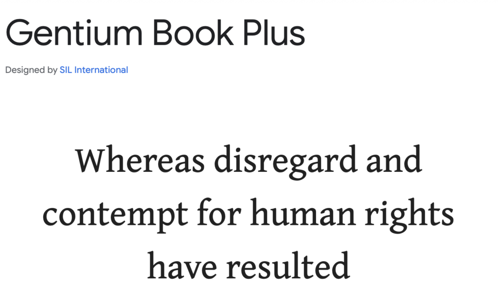
Gentium Book Basic is a book-style serif font with a prestigious, old-world charm. It’s widely used in classic literature publications, luxury hotel branding, and exclusive membership club materials.
Best Google Fonts for Headings & Titles
Oswald
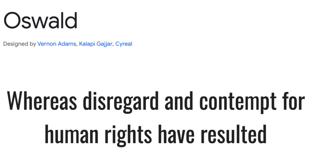
Oswald is a strong, condensed sans-serif designed to make an impact. Its bold, tall letterforms give it a commanding presence, making it a great choice for headlines, banners, and branding that requires a confident tone. Originally inspired by the classic gothic sans-serifs used in early 20th-century print ads, Oswald has been carefully adapted for digital use, ensuring excellent legibility on screens. Its sharp edges and tight spacing make it perfect for posters, sports-related branding, and editorial headlines.
Teko
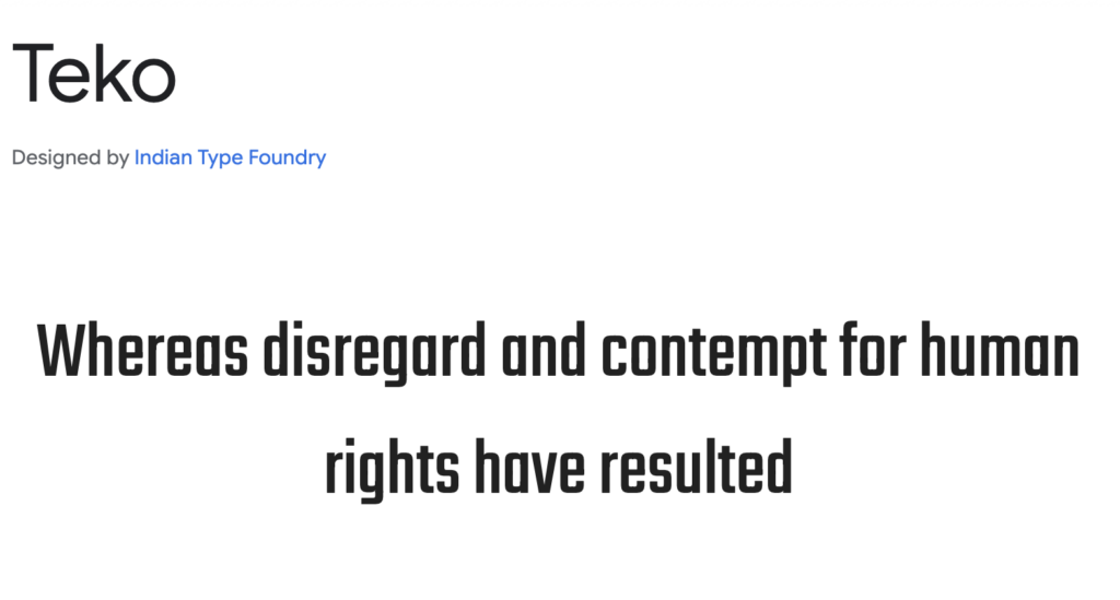
Teko is a structured, modern sans-serif font designed specifically for titles, UI designs, and digital displays. It features a high x-height and slightly squared letterforms, giving it a sleek, technical feel. Developed primarily for use in Hindi and Latin scripts, Teko ensures readability in both large and small text. Its design makes it particularly well-suited for tech startups, esports graphics, and urban branding.
Lobster
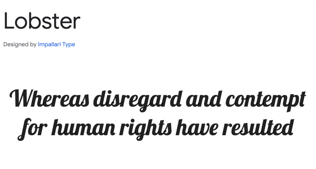
Lobster is one of the most recognizable script fonts on the web, thanks to its elegant yet playful cursive style. It features well-balanced letter connections and an attractive, flowing structure, making it perfect for branding, signage, and vintage-themed designs. Unlike many script fonts that require manual kerning adjustments, Lobster comes with pre-programmed ligatures, ensuring smooth and natural letter connections. This makes it especially useful for logos, restaurant branding, and personalized merchandise.
Josefin Sans
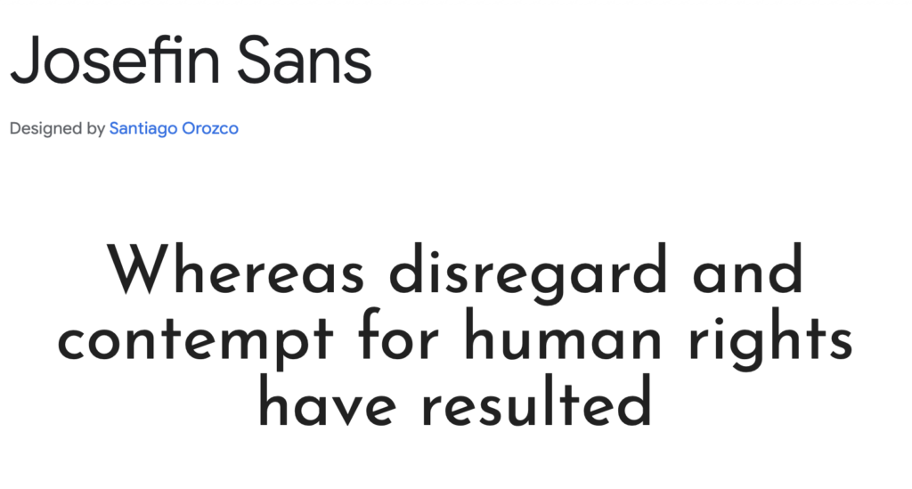
Josefin Sans is a geometric sans-serif with a distinct vintage flair. Inspired by Scandinavian typography from the 1920s and 1930s, it brings a sense of elegance and minimalism to any project. The font has a tall, narrow design with stylish curves and sharp edges, making it perfect for fashion branding, magazine headlines, and modern portfolio websites. With multiple weights available, it offers versatility, working well both as a display font and for subtler text elements.
Rock Salt
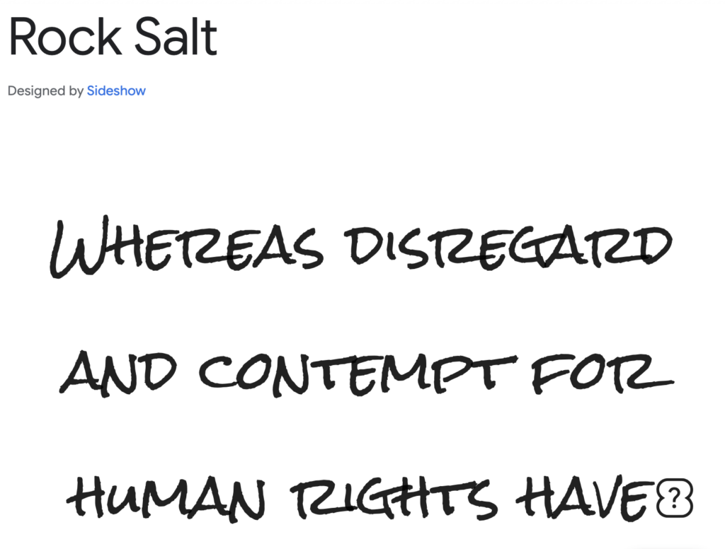
Rock Salt is a bold, hand-drawn brush-style font that feels expressive and dynamic. It mimics the look of inked handwriting, giving it a raw and artistic feel. Unlike traditional brush scripts, Rock Salt maintains a casual, edgy look, making it a great choice for street art designs, band posters, graffiti-style branding, and informal social media graphics. Its slightly uneven strokes add an element of authenticity, making it perfect for projects that require a more personal or handcrafted touch.
Yanone Kaffeesatz
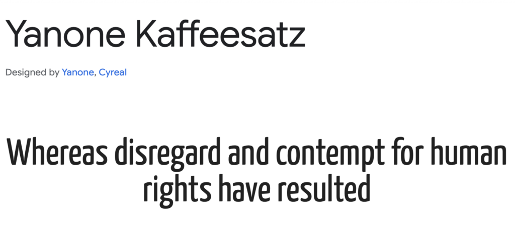
Yanone Kaffeesatz is a modern, condensed sans-serif with an elegant and contemporary look. Originally designed as a coffee shop-inspired font, its name literally translates to “coffee grounds” in German. It has a slightly rounded structure, giving it a softer feel compared to other condensed fonts. This makes it ideal for menu designs, modern branding, and minimalist UI elements. Despite its narrow proportions, the font maintains high readability, making it a versatile choice for digital and print applications.
Pacifico
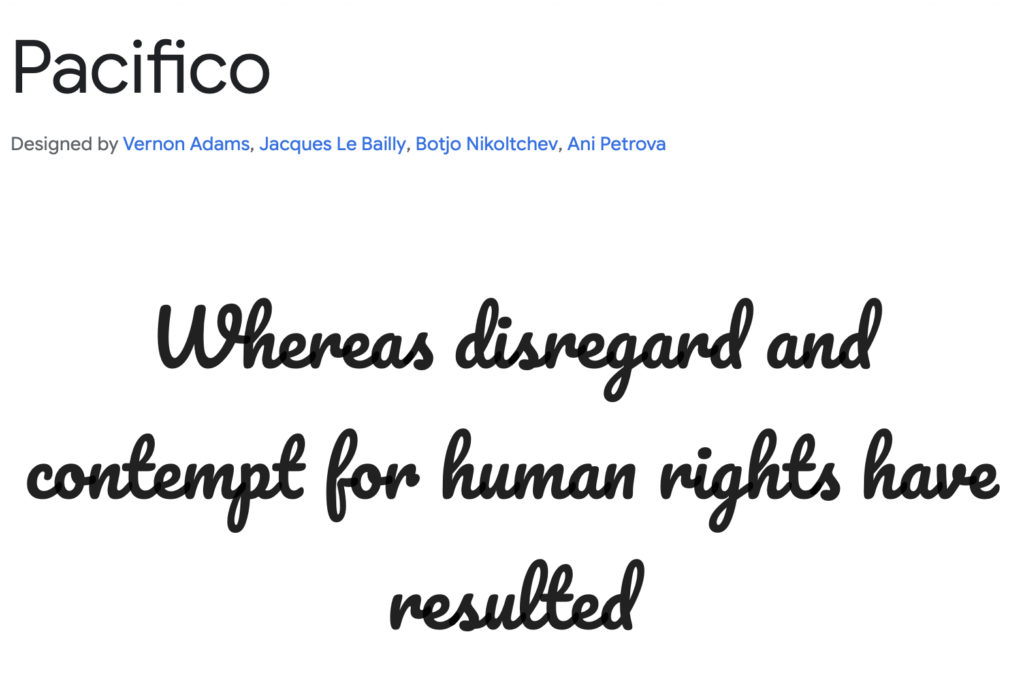
Pacifico is a casual script font with a laid-back, retro feel. Its smooth, rounded strokes give it a friendly and inviting aesthetic, making it perfect for lifestyle brands, personal blogs, and playful advertising. Inspired by 1950s American surf culture, Pacifico carries a nostalgic charm while remaining fresh and modern. Its bold, flowing letterforms make it ideal for titles that need to stand out in an informal yet stylish way.
Fredoka
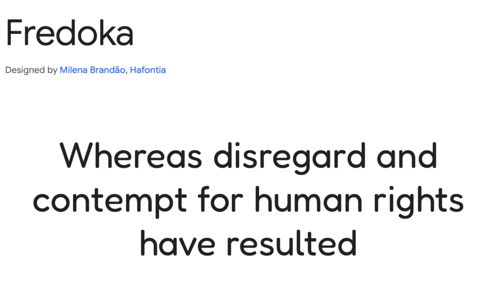
Fredoka is a fun, rounded sans-serif designed for maximum visual impact. It has thick, bubbly letterforms, giving it a warm and approachable feel. This makes it an excellent choice for children’s books, toy packaging, and friendly brand identities. The font’s large letter spacing and soft curves also make it particularly effective for UI elements and social media graphics where readability and personality are equally important.
Expletus Sans
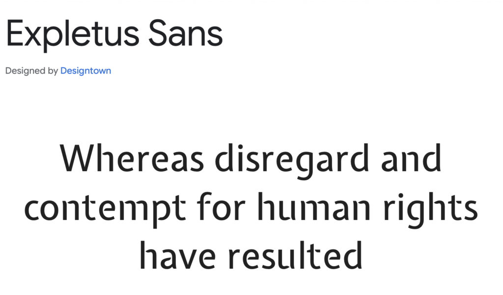
Expletus Sans is a futuristic display font with unique letterforms and sharp angles. Its geometric structure makes it stand out, making it a great choice for tech branding, science fiction themes, and cutting-edge startup designs. The font has a slightly experimental aesthetic, with tall ascenders and distinctive diagonal cuts that add a sense of motion and energy. It works well for bold headlines and digital interfaces that require a sleek and modern touch.
Fugaz One
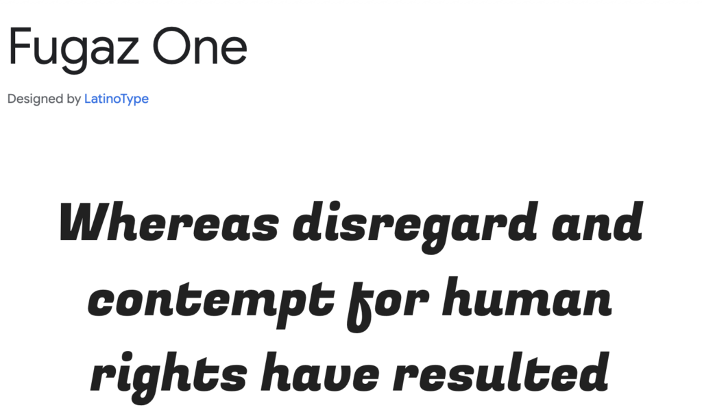
Fugaz One is a dynamic sans-serif with a strong, energetic style. Its slightly slanted letters and exaggerated shapes create a sense of movement, making it ideal for sports branding, high-energy advertisements, and action-packed designs. The font has a distinctive geometric structure with sharp edges, giving it a powerful and confident look. Whether used in posters, event promotions, or digital banners, Fugaz One delivers an eye-catching and modern presence.
Best Google Fonts for Body Text
Source Sans 3
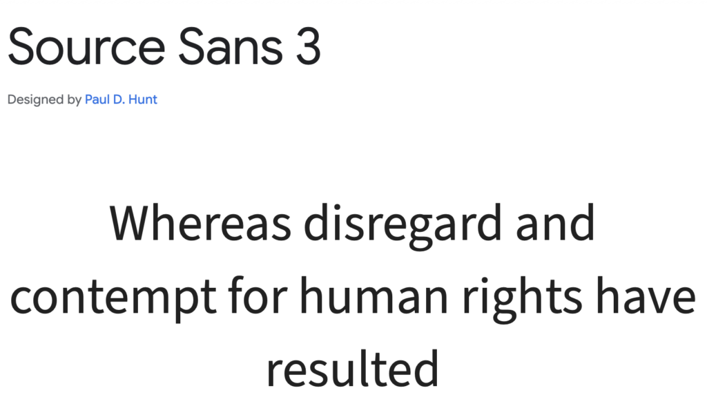
Source Sans 3 is a warm, readable serif font designed for body content and extended reading. Developed by Adobe as part of the Source family, this font was crafted with humanist proportions and soft curves, making it highly legible and comfortable on the eyes. It pairs well with Source Sans Pro for a balanced typographic system, often seen in editorial layouts, digital publications, and professional reports. Its friendly yet structured design makes it a popular choice for corporate websites, academic research papers, and long-form articles.
PT Serif
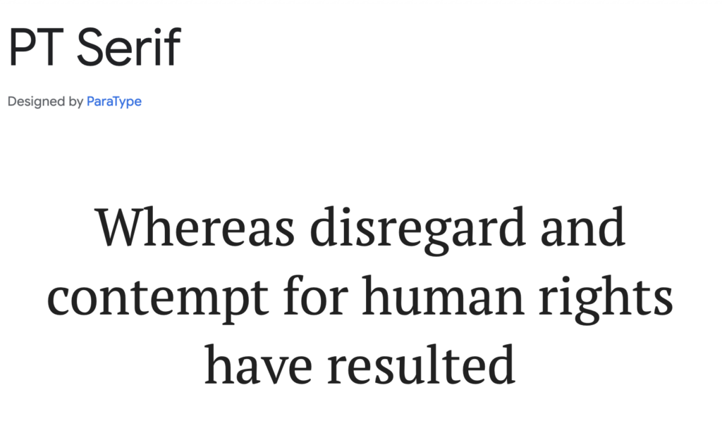
PT Serif is a classical serif font designed for long-form reading and literary content. Created by the Paratype Foundry, it was originally developed to improve readability across both digital and print formats. With wide letter spacing and refined contrast, PT Serif excels in news articles, printed books, and research papers, providing a traditional yet modern reading experience. It’s often used alongside PT Sans, forming a versatile typography duo suitable for newspapers, academic publishing, and knowledge-sharing platforms.
Fira Sans
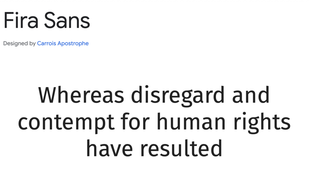
Fira Sans is a highly legible sans-serif typeface, originally designed by Erik Spiekermann for Mozilla’s Firefox OS. Created with digital in mind, Fira Sans features open letterforms, consistent spacing, and excellent readability at all sizes. Its clean, structured appearance makes it an ideal font for user interfaces, mobile applications, and accessibility-friendly web designs. Many modern tech companies and software developers favor Fira Sans for its clarity and adaptability, ensuring smooth text flow across multiple screen resolutions.
Crimson Text
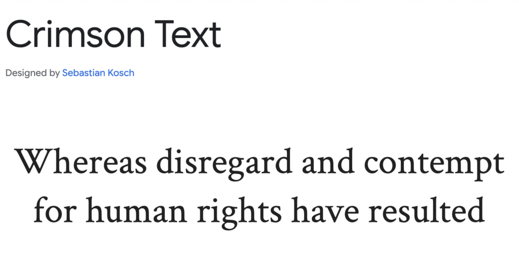
Crimson Text is a sophisticated, old-style serif font optimized for comfortable reading in print and digital formats. Inspired by classic Garamond-style typefaces, it carries an elegant yet understated character, making it perfect for novels, academic essays, and historical articles. With subtle curves, refined stroke contrast, and a timeless aesthetic, Crimson Text is a favorite among publishing houses, literature websites, and e-book platforms that prioritize a classic yet contemporary look.
Rubik

Rubik is a rounded sans-serif font designed for extended reading and UI/UX design. Its subtle rounded corners soften the typography, making it visually friendly and easy on the eyes. Developed by Google and Hubert & Fischer, Rubik is commonly used in tech product interfaces, educational platforms, and creative branding. Its versatility allows it to function well in both headlines and body text, making it a strong choice for modern web design, mobile applications, and interactive learning platforms.
Best Google Fonts for Minimalist & Modern Designs
Questrial
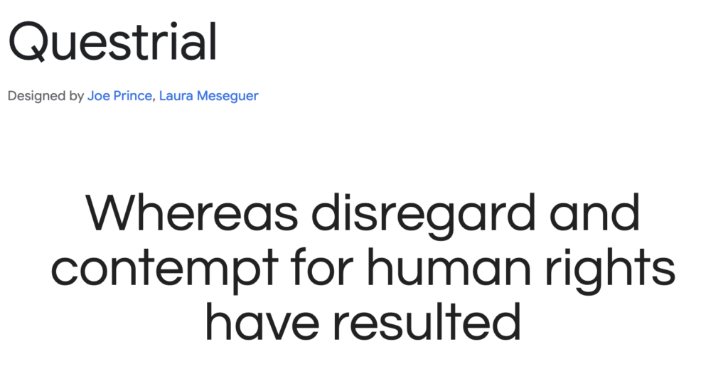
Questrial is a simple yet stylish sans-serif that blends modern minimalism with classic typography principles. Its open letterforms and uniform stroke width create a clean, highly legible look, making it ideal for web design, branding, and long-form digital content. Questrial’s versatility allows it to work seamlessly in both headlines and body text, making it a popular choice for lifestyle blogs, sleek portfolio websites, and modern corporate presentations.
Barlow
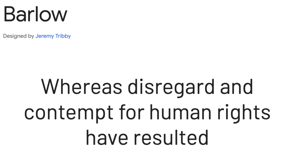
Barlow is a minimal yet strong sans-serif, inspired by California’s highway signage. Designed by Jeremy Tribby, it has slightly rounded corners and a contemporary geometric style, making it highly readable while maintaining a strong presence. Barlow is frequently used in branding, navigation interfaces, and tech startups that require a modern, clean aesthetic. Its neutral yet confident look makes it ideal for digital dashboards, fintech applications, and professional business websites.
Mukta
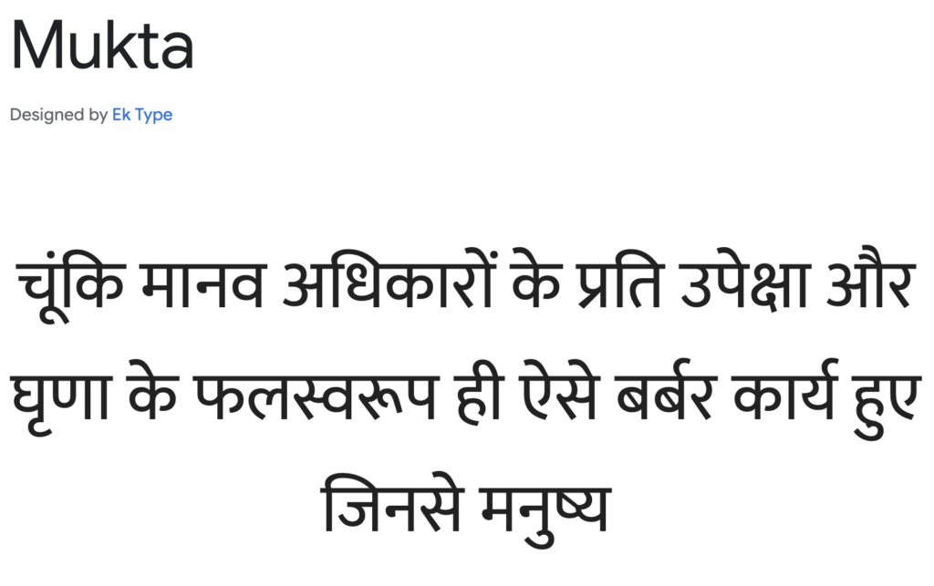
Mukta is a subtle, modern sans-serif font family that was originally designed to support Indian scripts like Devanagari, Gurmukhi, and Tamil. Its smooth, well-spaced letterforms make it a great choice for multilingual projects, inclusive design, and international branding. Mukta’s soft curves and balanced weight distribution give it a friendly yet professional feel, making it suitable for educational platforms, NGO websites, and e-learning content.
Arimo
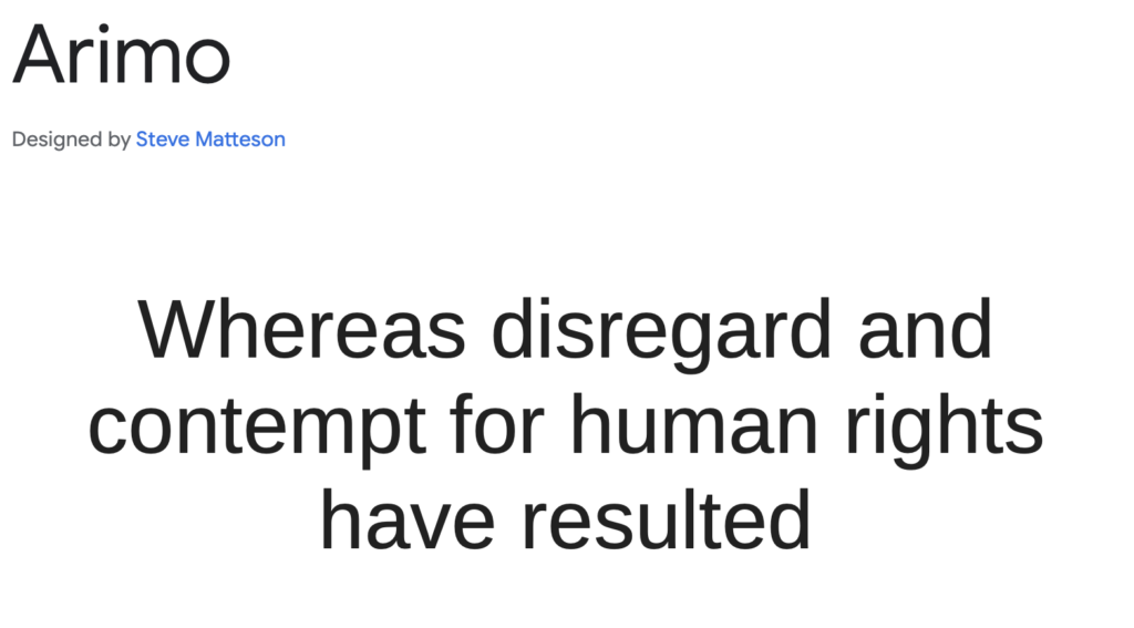
Arimo is a no-nonsense sans-serif designed for digital readability. Created by Steve Matteson, Arimo was developed as a metrics-compatible alternative to Arial, offering improved clarity and spacing for digital screens. It excels in corporate environments, software interfaces, and accessibility-focused typography, where clear, distraction-free text is essential. Arimo is often used in documentation, technical writing, and productivity applications, where precision and consistency matter.
Tenali Ramakrishna
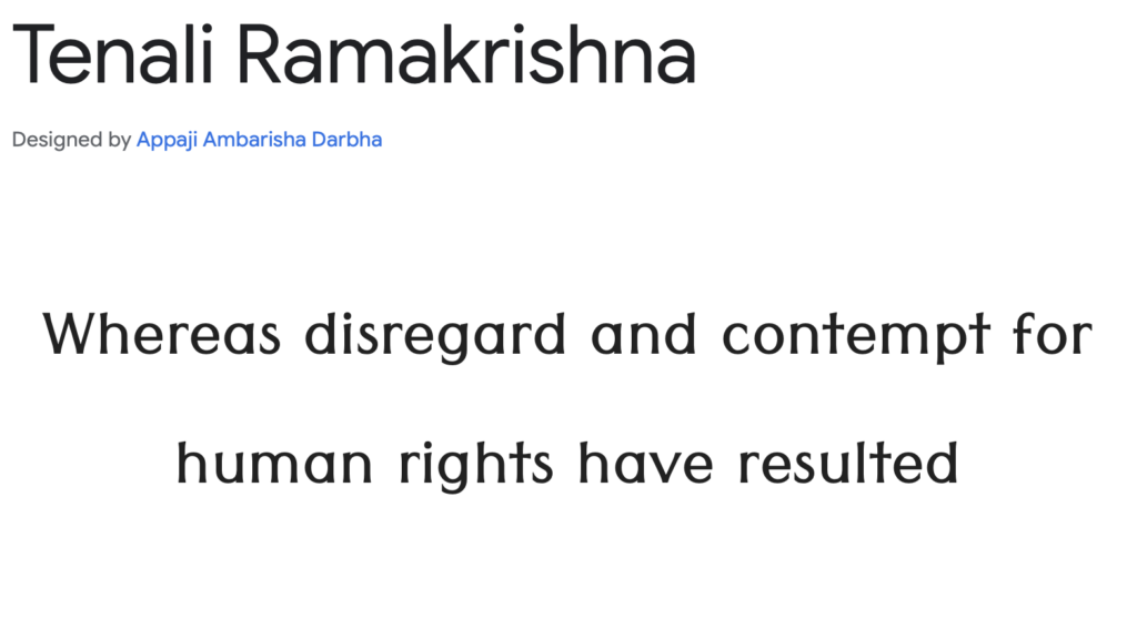
Tenali Ramakrishna is a smooth sans-serif with balanced proportions, originally designed to support Telugu script typography. Its open curves and slightly elongated letterforms give it a refined, elegant feel, making it an excellent choice for branding, print publications, and bilingual typography projects. It offers a distinct character while maintaining high readability, making it a great alternative to more generic sans-serifs in multilingual UI design and creative editorial layouts.
Best Google Fonts for Handwritten & Script Styles
Indie Flower
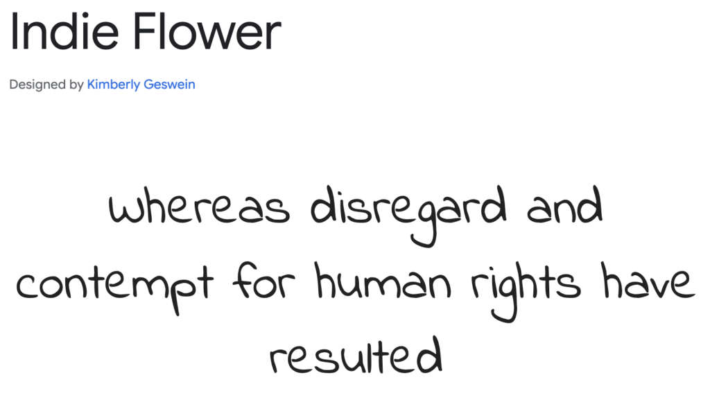
Indie Flower is a fun, natural handwriting font that mimics a casual, free-flowing pen style. Its playful and slightly irregular letterforms give it an authentic, personal feel, making it a great choice for diary-style blogs, greeting cards, scrapbooking, and children’s books. Unlike more structured script fonts, Indie Flower embraces an imperfect, doodle-like charm, often used in classroom materials, journaling apps, and creative branding where a warm, informal aesthetic is desired.
Kalam
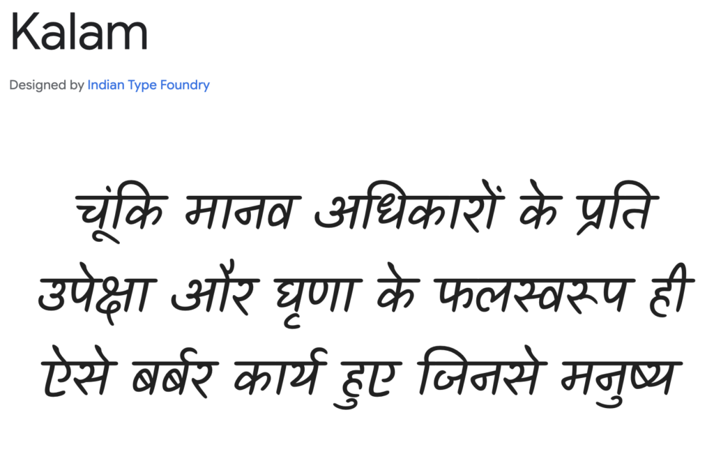
Kalam is a brush-style font with authentic strokes, designed to feel fluid and dynamic. It has a slightly slanted structure, mimicking the movement of a traditional paintbrush, making it an excellent option for handwritten notes, artistic branding, and culturally expressive designs. Originally developed to support Indian scripts, Kalam is highly versatile and works well for storytelling, digital illustrations, and café menus that require a lively yet legible handwritten feel.
Merienda
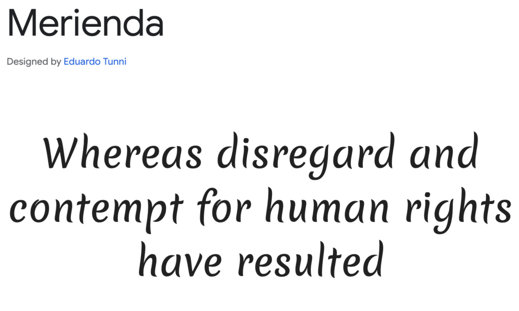
Merienda is a soft, friendly script font with a smooth, rounded flow. Its name means “afternoon snack” in Spanish, and its relaxed, slightly playful curves reflect that cozy, inviting feeling. Merienda’s well-balanced strokes and even spacingmake it a great option for branding, food packaging, lifestyle blogs, and handmade product labels. It carries a casual elegance, working well in both playful and semi-formal settings, where a touch of warmth is needed.
Just Another Hand
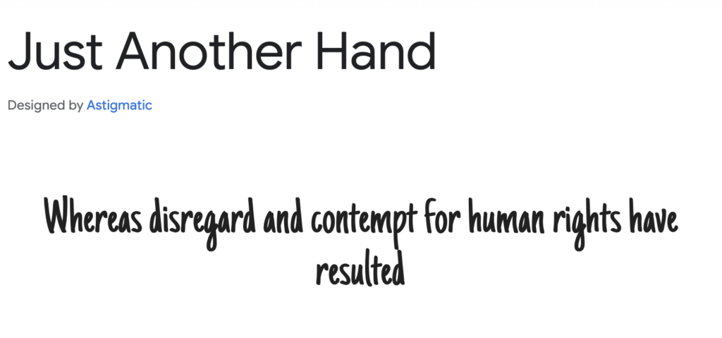
Just Another Hand is a casual, informal handwritten font that feels personal and natural, almost like quickly jotting down notes with a fine-tip marker. Its narrow, slightly condensed letterforms make it stand out among traditional script fonts, giving it a more compact and unique personality. It’s commonly used for DIY projects, invitation cards, comic-style typography, and creative social media graphics, where an approachable, handwritten touch adds a personal connection.
Parisienne
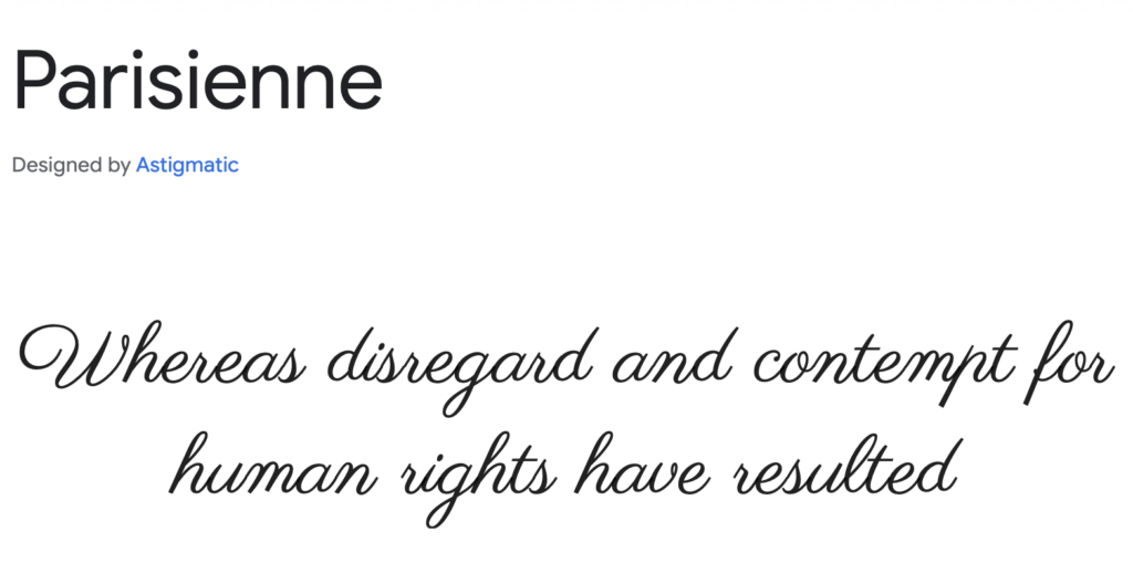
Parisienne is a romantic and elegant cursive font that exudes sophistication. Its delicate loops, flowing connections, and refined structure make it ideal for wedding invitations, luxury branding, high-end fashion labels, and vintage-style designs. Parisienne has a timeless quality, reminiscent of classic French calligraphy, making it a favorite for elegant restaurant menus, perfume packaging, and sentimental greeting cards. Whether used for a romantic script or a stylish headline, it adds a touch of class and charm.
Best Google Fonts for Coding
Source Code Pro
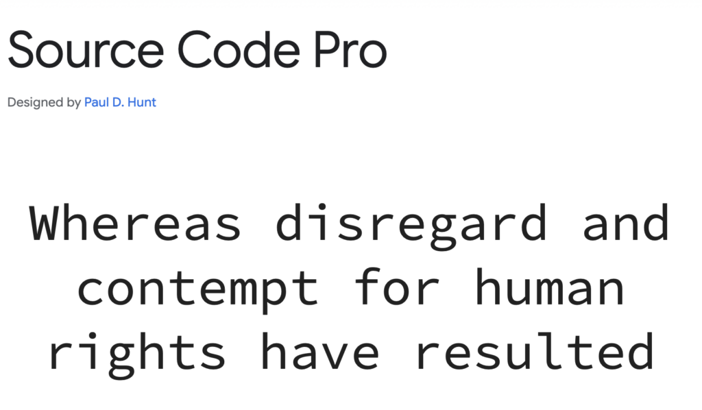
Source Code Pro is a professional, well-optimized monospace font designed by Adobe. It provides excellent readability and clear differentiation between similar characters, such as zero (0) and the letter O. This makes it a top choice for software development, command-line interfaces, and debugging tools. Many developers prefer Source Code Pro for its even spacing and high legibility, ensuring clean and efficient coding environments.
Inconsolata
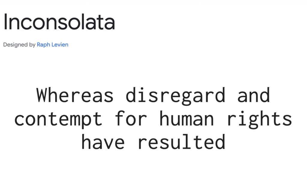
Inconsolata is a modern, monospaced font with a sleek, contemporary aesthetic. Originally designed by Raph Levien, it offers a more humanist feel compared to traditional monospace fonts. Unlike rigid monospaced fonts, Inconsolata maintains smooth curves and well-balanced letter spacing, making it perfect for coding, terminal applications, and documentation writing. Its refined design also makes it a great alternative to system-default coding fonts like Courier.
Fira Code
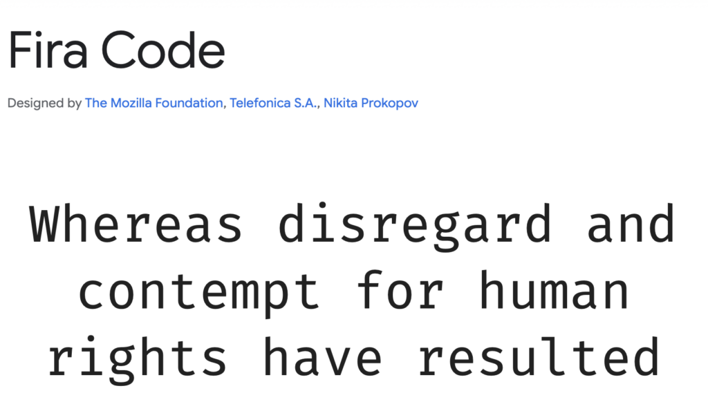
Fira Code is a monospace font designed specifically for programmers, featuring ligatures for common coding symbols. This means it transforms character combinations like !=, =>, and === into visually distinct glyphs, improving code readability and reducing eye strain. Developers using Visual Studio Code, JetBrains IDEs, and Sublime Textoften favor Fira Code because its ligatures streamline complex syntax, making code easier to scan.
Anonymous Pro
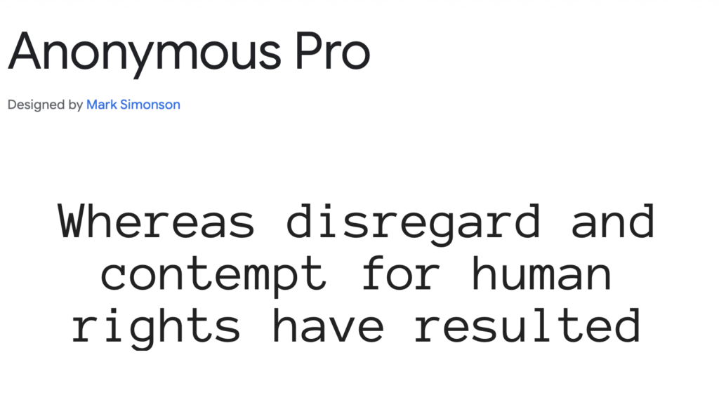
Anonymous Pro is a sleek and easy-to-read monospace font originally designed for coding and terminal use. It features clear character distinctions (e.g., lowercase “L” and number “1”), reducing errors in programming. Its slightly condensed width makes it a great choice for compact UI designs, side-by-side code viewing, and terminal displays. Many developers who prefer a retro-inspired look without sacrificing clarity turn to Anonymous Pro.
JetBrains Mono
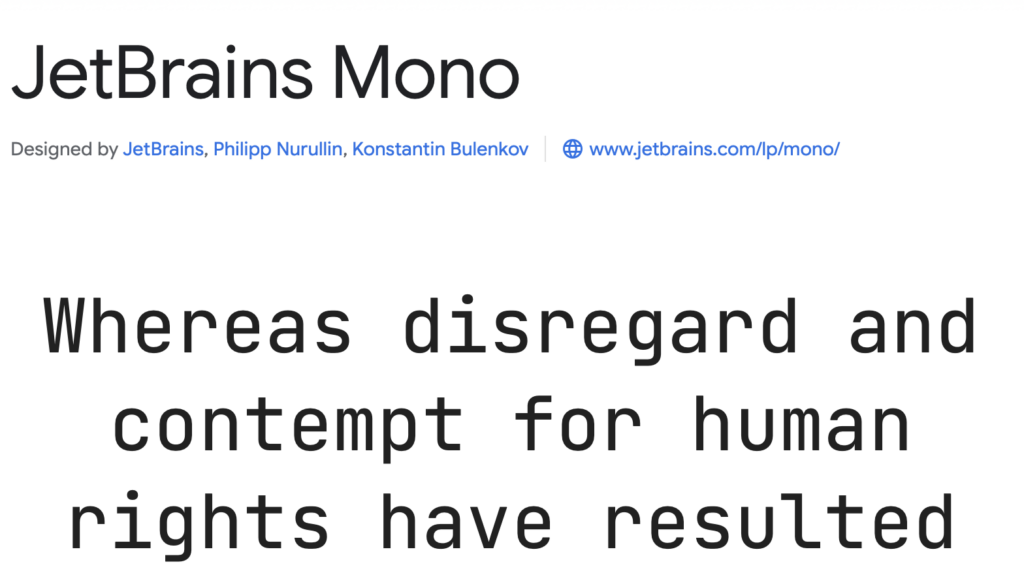
JetBrains Mono was specifically designed for developers by JetBrains, the company behind popular IDEs like IntelliJ IDEA, PyCharm, and WebStorm. It features increased line height, softened curves, and coding ligatures, optimizing code readability for long development sessions. JetBrains Mono is often recommended for dark mode IDE themes, where its balanced contrast prevents visual fatigue.
IBM Plex Mono
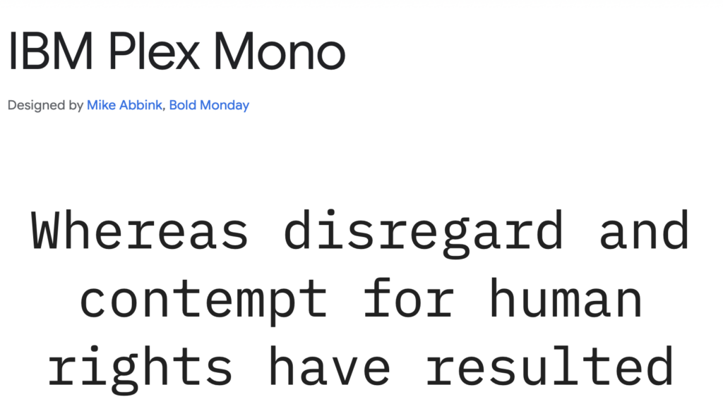
IBM Plex Mono is a functional, high-legibility monospace font designed by IBM. It strikes a balance between technical precision and humanist curves, making it ideal for coding, system logs, and terminal-based applications. Unlike generic monospace fonts, IBM Plex Mono includes subtle design nuances that make it more visually appealing while maintaining strict monospacing. It’s often seen in data dashboards, software documentation, and developer tools.
Courier Prime
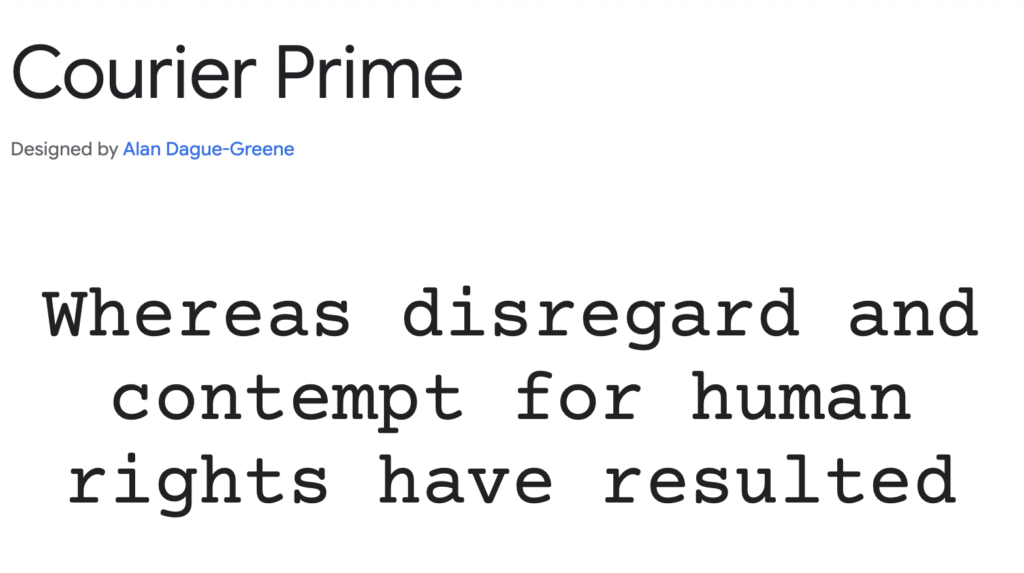
Courier Prime is a refined take on the classic Courier font, offering improved weight distribution and readability. Designed for screen and print, it’s frequently used in screenwriting, academic research, and system logs. While not as modern as some coding fonts, Courier Prime remains a reliable choice for developers who appreciate the retro typewriter aesthetic without the visual inconsistencies of older monospace fonts.
Ubuntu Mono
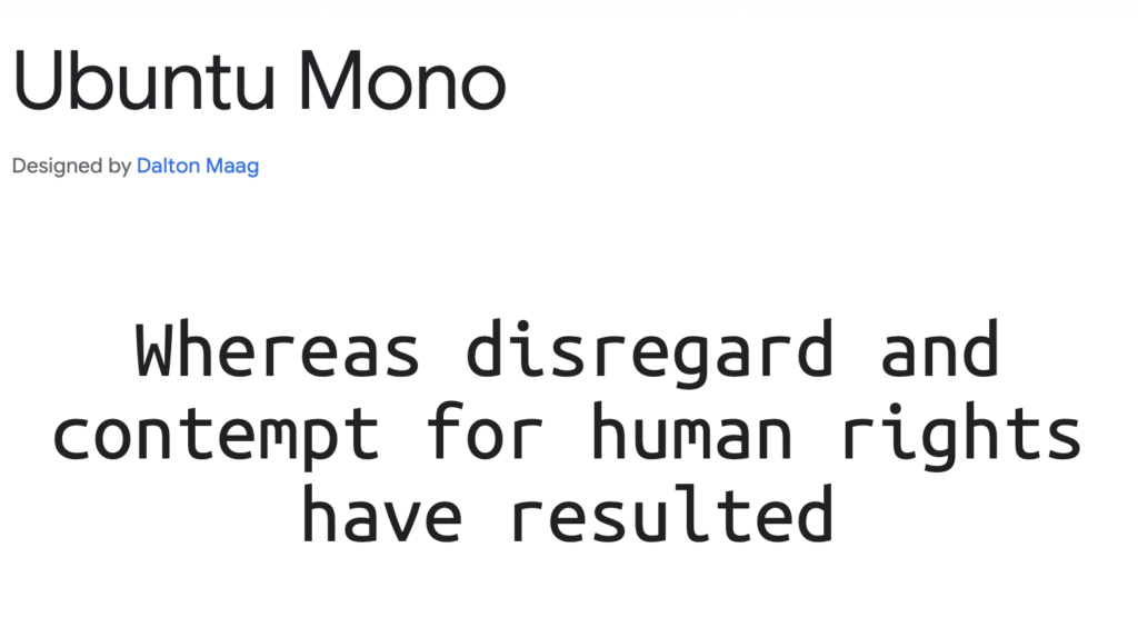
Ubuntu Mono is a stylish, highly readable monospace font developed as part of the Ubuntu Font Family. It has soft curves and an open structure, making it an excellent choice for terminal applications, Linux-based environments, and system monitors. Unlike many rigid monospace fonts, Ubuntu Mono incorporates a bit of personality while maintaining clean readability. It’s a favorite among developers who want a more refined look for their command-line interfaces.
PT Mono
PT Mono is a clean, minimalist monospace font designed for technical and financial content. Unlike traditional programming fonts, PT Mono was crafted with data tables and spreadsheet applications in mind. Its sharp character clarity makes it a great choice for web development, data visualization, and structured coding environments. If you need a monospace font that maintains readability across both UI components and raw code, PT Mono is an excellent option.
Overpass Mono
Overpass Mono is a structured, modern monospace font designed for high readability in digital environments. Inspired by the Highway Gothic font, it has a clean, slightly condensed letterform that ensures efficient space utilization in coding environments. Its design makes it ideal for software terminals, command-line applications, and developer-focused websites. With its contemporary look and optimized spacing, Overpass Mono is a great alternative to default system monospaced fonts.
Final Words
With an extensive collection of free and high-quality fonts, Google Fonts is an essential resource for web designers, developers, and branding professionals.
When choosing a font, consider factors like legibility, versatility, and design intent. Some fonts work best for body text, while others shine in headlines or logos. Additionally, pairing contrasting fonts—such as a serif for headings and a sans-serif for body text—can create a harmonious visual hierarchy.
However, picking the best Google fonts is just one part of designing a compelling visual identity—your logo is equally important. If you’re looking to create a unique, professional logo that perfectly complements your chosen typography, Arvin AI’s Logo Designer can help you bring your vision to life.
FAQ
The best Google Font depends on its intended use. If you’re looking for a highly versatile and readable font, Open Sans and Lato are excellent choices for websites. For a luxury brand, fonts like Playfair Display and Cormorant Garamond exude elegance. If you need a monospace font for coding, JetBrains Mono and Fira Code are industry favorites.
Aesthetic appeal is subjective, but some of the most visually pleasing fonts include:
For modern minimalism: Raleway, Questrial, and Barlow
For elegance and sophistication: Cinzel, Spectral, and Parisienne
For contemporary branding: Nunito Sans, Manrope, and Inter
Many designers consider Playfair Display, Crimson Text, and Lora to be some of the most beautiful fonts available in Google Docs, thanks to their elegant letterforms and refined contrast. For a sleek and modern look, Rubik and Work Sans are excellent alternatives.
Luxury brands require sophisticated, high-contrast, and timeless fonts.
Playfair Display – Perfect for fashion, jewelry, and upscale brands
Cormorant Garamond – A refined serif ideal for editorial and premium branding
Cinzel – Inspired by classic Roman inscriptions, great for high-end packaging
Spectral – A stylish serif with a modern luxury feel
