In the realm of music, the band not only attracts the audience with its melody, but also leaves an impressive impression through its visual identity, the band logo. The band logo is not just a mark, but represents the essence, posture and genre of the musical journey that awaits the listener. This comprehensive article explores the world of band logos, from the symbolic design of legendary metal bands to the unreadable but intriguing logos of black metal groups.
Part 1: History of Band Logos
Band logos have a very rich history in reflecting the growth of music and art. Logos, early on, were simple and straight forward: a band’s name in some form of simple font. But with the development of the music industry, the creativity behind the logo also evolved.
Iconic Beginnings
The “Tongue and Lips” by the Rolling Stones, designed in 1970, is one of the most iconic logos ever. It fittingly portrayed the defiant and dare to be boldness of the group. Even The Beatles’ “Drop-T” logo ultimately became an eternal picture of innovation that the group possessed.
Artistic Evolution
Pictorial logos got more artistic and sophisticated over the years. The 1980s witnessed much more intricate designs that arose with heavy metal and punk rock. Sharp, edgy fonts of Metallica and Iron Maiden symbolized their hard-hitting music. The cultural and social changes over the years had their reflection in logo design.
Part 2: Elements of Excellent Band Logos
A super band logo is an art as well as a science. It is that logo which has been created by combining aesthetics with functionality, thereby incorporating the essence of the band along with clarity and recognition. A great logo has to appeal to the fans as well as test the times. Here are the elements defining a great band logo:
Typography
The font will make or break a logo. Typography should suit the style and genre of the band. For instance, sharp, angular fonts for Metallica reflect their heavy metal sound, while clean, classic lettering for The Beatles fits their timeless appeal. A good font choice gives the personality of the band and sets the tone for their music.
Colors and Symbols
Colors and symbols are very strong tools in logo design. Each color has a different emotion associated with it: red for energy and passion, blue for calmness, and black for mystery and strength. Symbols can also add depth. For example, Queen’s logo features astrological symbols representing each band member, which gives it a personal touch.
Shape and Simplicity
The best logos are usually simple, and easily identifiable. A clear design ensures the logo looks great on all the platforms, from album covers to merchandise. The best example of a logo is “Tongue and Lips” of the Rolling Stones, bold, memorable, and instantly recognizable.
- Metallica: Their sharp edges and bold design reflect the aggressive and powerful music. This logo is an excellent match for the heavy metal genre.
- The Beatles: The “Drop-T” logo is simple yet elegant, which reflects the universality and innovation of the band.
- Queen: Their intricate logo, designed by Freddie Mercury, combines regal elements with personal touches, making it unique and grand.
Part 3: Evolution of the band logo
For decades, the band’s logo has evolved with the shift of music genre and culture. Explore the evolution of the band logo while focusing on specific symbolic times. Every band logo is known for its vitalness and simplicity.
70s rock band logo psychedelic and artistic
In the 1970s, the rock band incorporated the psychedelic art movement and their logo reflected its influence. The band’s logo, such as Pink Floyd and Red Zeppelin, featured complex designs, vivid colors and artistic elements reflecting the experimental and trippy nature of the time.
80s rock band logo bold and glamorous
The 1980s saw the rise of glam rock and hair metal, and the logo featured a bold and flashy design. Bands such as Kiss and Van Halen expressed the essence of the extravagance of rock’n’ roll of this era with a logo that exudes a glamour and cyatrical atmosphere.
90s band logo: grunge and simplicity
The 1990s led to a shift to grunge music, and their logo symbolized the overthrow of the 80’s. Bands like Nirvana and Pearl Jam adopted a more minimalistic and vivid approach, reflecting the authenticity and rebellious spirit of the grunge movement.
Part 4: Tips for Band Logo
Tips you can do is to find the first inspiration for the type of concepts and styles you want to base your logo design. This can be done by looking at examples of other music band logos. Famous bands such as Metallica, Arctic Monkeys and 1975 have very distinctive logos that are easy to understand not only by fans but also by the general public.
Determine the characteristics of the band
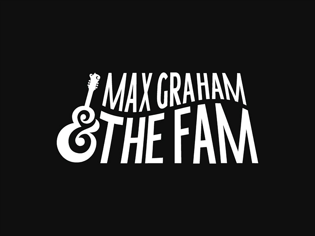
Unlike normal business and organizations, the band must have a stronger charisma and persona in order to gain more fans. The more authentic and distinctive the identity of the band, the more people will be interested in it. This is one thing you need to keep in mind in the process of designing your logo.
Choose the right design style and concept
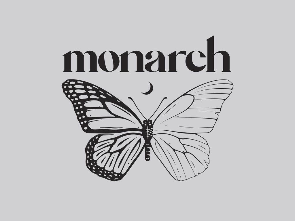
In the logo design world, there are various concepts, themes and styles based on logo design. There should be a style that suits everyone. Therefore, you need to determine which styles and concepts match your band’s music. If your band is a classic band that produces a variety of music in the blues genre, it is generally preferred to use a little retro and classic design concept.
Sketch Ideas
Once you have specifically determined the elements, values, and identity you want to display in your band’s logo design, you will immediately sketch out the various display ideas that come into your mind. This sketch stage is very important, so you can spend quite a long time here. Sketches should be relaxed and relaxed so that all potential ideas can be properly examined.
Test various design methods
Don’t get me wrong. This does not mean that you must receive formal education or master the principles of art. But to make a good logo, you need to know the basic principles of design. Having a basic understanding of how colors work, how shapes harmonize, and many other principles is a reference for creating professional band logo designs
Part 5: Role of Band Logos in Merchandise and Branding
Band logos are very important in merchandise and branding. They are on the front of t-shirts, hats, posters, and album covers, becoming icons that fans proudly wear and display. The visibility of the logo helps to market the band and gives fans a sense of belonging and identity. In the history of logos, some have been able to become part of the bands.
Metal band logo
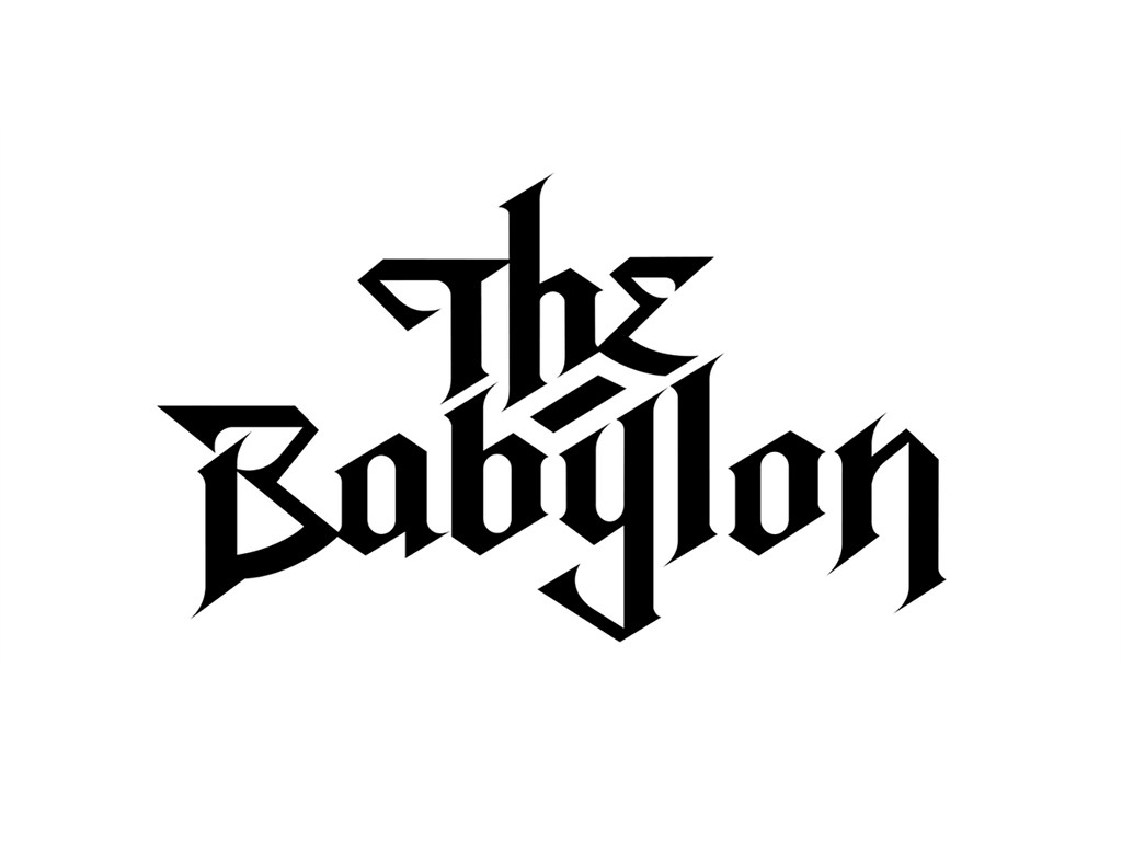
A metal band logo usually gives a fiery and aggressive feel, with sharp cutting, angular art forms, and dark brooding colors. They mainly use gothic or distorted fonts to show a feeling of rebellion and raw energy, and imagery styles like skulls, flames, or abstract shapes can complement this style. The overall design reflects the bold and heavy nature of metal music.

Pop band logo
The logos of pop bands are full of vibrancy and modern appeal. Clean, sleek typography combined with bright and energetic colors makes it a looker. Often these logos contain playfulness, dynamic elements such as swooshes, gradients, or abstract icons. It has been designed in such a way that it captures the fun and upbeat nature of pop music, emphasizing approachability.
Retro Rock Band Logo
A retro rock band logo combines nostalgia with bold personality. It may use vintage-style fonts, earthy or warm colors, and iconic imagery like guitars, vinyl records, or amplifiers. These logos often have a slightly distressed or textured look, giving them an authentic, old-school vibe that resonates with fans of classic rock.
Jazz Band Logo
These are elegant and classy logos of a jazz band just like the genre. Fluid lines and smooth curves define the visual theme with accompaniments such as a saxophone or a piano. Neutral tones, gold, or deep blues give it this classy look. Over all, the design speaks to creativity and artistry that has lasted through time.
Punk Band Logo
Punk band logos are unapologetic and bold: rough, aggressive fonts and chaotic layouts often embody the anti-establishment ethos of the genre. Black, white, or high-contrast colors dominate, sometimes with safety pins, anarchy symbols, or a texture of torn paper. These kind of designs are the mirror of raw energy and defiance of punk music.

How Arvin AI Can Help Design Your Perfect Band Logo
Band logos are considered very challenging to design, mainly when trying to include a band’s unique identity and style. Arvin AI has managed to make it easier with the advanced design tools that marry creativity with efficiency. With its intuitive features, Arvin AI allows musicians to craft logos that don’t just look professional but will also connect well with the musician’s brand. Arvin AI comes up with one-of-a-kind logo designs reflecting your band’s identity.
Key Features
- Customizable Templates: Browse through a diverse variety of templates, color palettes, and typography variations.
- Real-time Suggestions: The system makes available instant suggestions with the incorporation of edits, which allows users to produce a really good-looking logo.
- Integrated Branding Options: Beyond logos, Arvin AI helps create a cohesive brand identity by offering designs for merchandise, album covers, and promotional materials.
- Collaborative Tools: Share designs with bandmates or collaborators in real time, ensuring everyone’s vision aligns.
- Symbol and Color: The AI provides insights into the psychology of colors and symbols, helping you make informed decisions to create a logo that leaves a lasting impression.
Steps to Use Arvin AI for making Logo
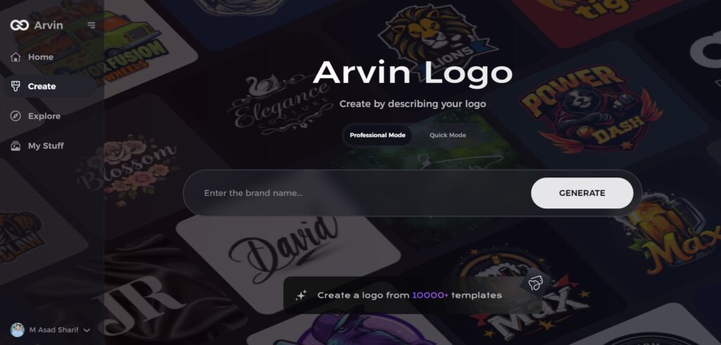
Step 1: Visit the Arvin AI Website
Open your web browser and navigate to the design page at Arvin Logo Maker to begin the process of creating your band’s logo.
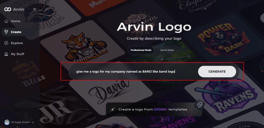
Step 2: Fill Out Your Band Information
Enter essential details such as your band’s name and music genre. This information helps the AI generate logo designs that align with your band’s identity and style.
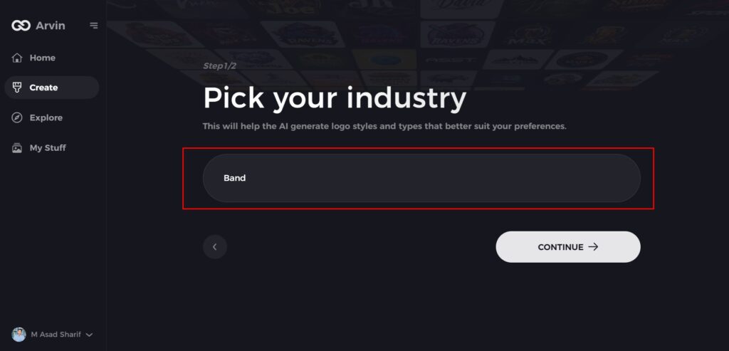
Step 3: Choose Your Genre
Select a genre from the list provided. This helps the AI refine the logo styles and designs based on your band’s specific genre and aesthetic.
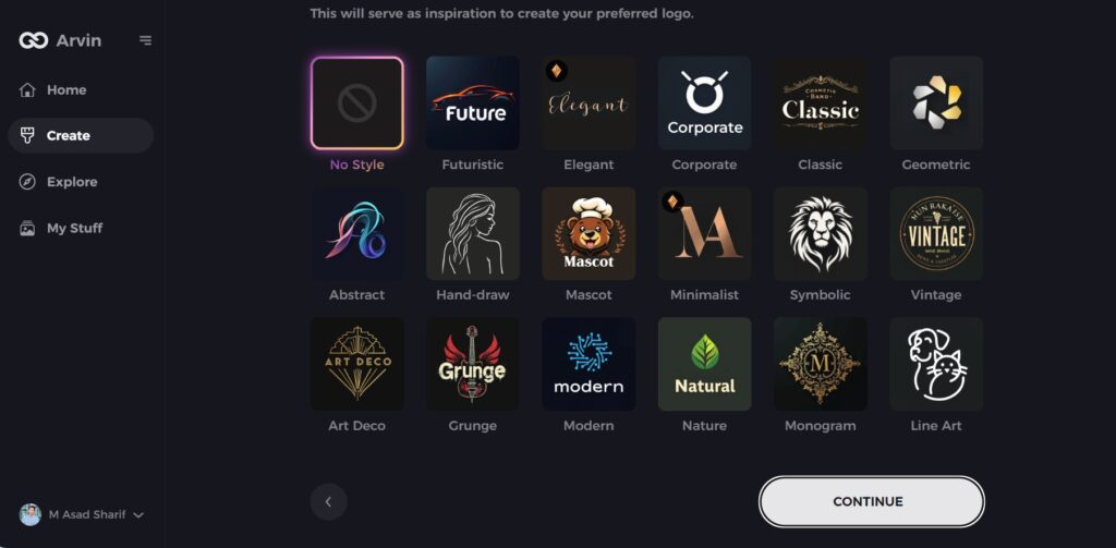
Step 4: Pick the Design Style
Browse through the available styles and choose one that best represents your band’s image. If you’re unsure, you can skip this step, and the AI will generate designs based on default inspiration.
Step 5: Review Logo Ideas
The AI will generate a variety of logo concepts based on the information you’ve provided. Review the ideas and select the ones that best capture your band’s spirit.
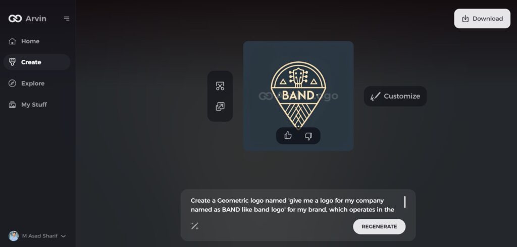
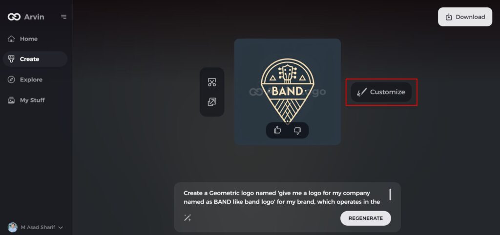
Step 6: Personalize Your Logo
Refine the selected design by making adjustments to elements such as colors, fonts, icons, and layout to match your band’s unique style.
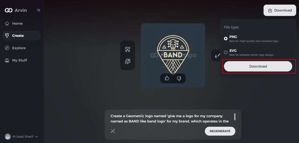
Step 7: Download Your Logo
Once you’re satisfied with your logo, download it in formats like PNG or SVG. These formats ensure compatibility for use across websites, social media platforms, and print materials.
Conclusion
Band logos are a great way to develop a band’s identity and legacy. They instantly bond with fans, increase sales of merchandise, and create instant identification anywhere in the world. A memorable logo is an investment for any band’s future. Using anything from Arvin AI, musicians can bring their creative vision to life effortlessly. Whether it is simple or intricate, a well-designed logo sticks in fans’ minds as well as lasts through the ages.
FAQs
Why are band logos essential for marketing?
Band logos prove to be very important to get recognition, increase merchandise sales and more importantly connect with your audience.
What makes a band logo timeless?
A timeless band logo may incorporate simplicity, unique typography or even meaningful symbolism that is easily recognized across any medium.
How do I know if my band logos are effective?
A good logo is memorable, recognizable, and has an emotional impact. It must also be flexible to fit in different sizes and formats.
Can I use Arvin AI for designing my band logo even though I am not experienced?
Absolutely. The interface of Arvin AI and customizable templates make it easy for anyone, with or without experience, to design a professional band logo.

