
Telecommunications company AT&T is a global business and Industry leader in mobile network, broadband internet, and digital entertainment service. The company was founded in 1885 and has grown to serve millions of customers in more than 200 countries. AT&T is one of the largest U.S. wireless providers, with top competitors including Verizon and T-Mobile. The AT&T logo design portrays the strong heritage, technology, and global presence while depicting reliability and innovation.
Part 1: History and Evolution of the AT&T Logo
The AT&T logo has changed over the years as the company has transformed itself from a local telephone provider to a global telecommunications giant. This section will explore the visual metamorphosis that took place during this evolution.
The AT&T Logo Origin (1885)
The first logo of the American Telephone & Telegraph Company (AT&T), designed back in 1885. When the company was just a baby in the telecommunication industry. The bell image represented the signifier, the product itself, which was telephone communication. The bell is a core part of AT&T’s identity, representing its commitment to long-distance telephone service and establishing the baseline for the company logo.
1885 – 1900: The Bell System logo
Throughout this time, the bell icon enclosed within a triple square border, helping the reader recognize it as a unique visual identifier. The wordmark, in this case, “Long Distance Telephone” was also used and emphasized through the bell image. A direct link to what the company actually did. It written in all the praise of AT&T’s leadership in long-distance communication and early telephony technology in the late 19th century.
1900 – 1921: Circular frame and extension
In the beginning of the century, the square frame that surrounded the bell was changed to a circular shape, making the logo look more dynamic and modern. The logo also featured the words “Bell System“ with “Local,” signifying the company’s growing national scope. These were among AT&T’s growing array of services, as the company expanded its horizons and shifted its focus more toward local and regional communications across the United States.
1921 – 1939: A Streamlined Logo
In 1921, AT&T was simplified further, building on its clean and modern redesign by dropping the “Bell System” inscription. Over this time, the company adjusted its typeface to make it bolder and more recognizable. The new overall look was contemporary, suggestive of the company’s increasing power. Its wish to present itself as an influential, establishment name appealing to the wider public.
1939-1960: The Strong and Bold Logo
From 1939—1960 AT&T Logo evolved with Bold, Heavy Type-Specimen and Updated Design Elements. These changes intended to represent power and prestige and AT&T was still a dominant player in the US telephone market. During this time, the new design was more to focus on confidence as well as stability. Which suited the new direction the company was going, and the company began to be seen as the telecom company leader.
1960 – 1964: Simplistic Look in the Logo
In the early 1960s, AT&T adopted a minimalist logo, stripping away the extra stuff around the bell image. That enabled the central bell symbol to shine more brightly. This design simplification indicated a trend of modernism in which brands began to simplify and design in a way that allowed for clarity and efficiency. The streamlined logo reflected AT&T’s growing emphasis on innovation and evolving within a transforming telecommunications environment.
1964 — 1966: The Blue and White Colour Palette
In 1964, it was given a bold blue and white design, which was a stark contrast to its original, black-and-white style. The addition of the new blue frame round the bell gave it a more distinctive visual identity, while the simplified design of the bell still felt very familiar. It was a conscious decision, to embrace a blue and white color palette as a reflection of trust, stability, and innovation — all important values for AT&T as they began to offer a wider range of services.
1966 – 1969: Abbreviation of the name and compact circular frame
AT&T abbreviated its name from “American Telephone & Telegraph” into “AT&T” in 1966, which was incorporated into the logo’s design. While the unusual circular frame was taken as solid and attached to bold “AT&T” letters. This new design simplified the logo while maximizing recognition. The clean, bold look presented the company as modern and established the groundwork for planned branding changes in the future.
1969 – 1983: Saul Bass and the Colorful Globe
The latest redesign came in 1969, overseen by legendary designer Saul Bass, and represented a radical evolution — the spherical globe logo instigated a new look in the company’s visual identity. Its globe design, adorned with five bold blue stripes and four white stripes, represented AT&T’s growing global reach and its new commitment to explore computing and telecommunications. The new logo was a departure from the bell image as AT&T evolved into a more global and technology-oriented company.
1983 – 2001: The “Death Star” Globe and Global Identity
The “Death Star” globe logo was adopted in 1983, as with the Star Wars spacecraft. This signature design signaled AT&T’s growth and market entry abroad, highlighting the company’s expanded globally. Its globe with horizontal stripes represented the connections and vast array of services the company made available around the world, helping solidify AT&T’s position as a dominant telecommunications provider internationally.
2001 – 2005
The globe design slightly updated from 2001 to 2005 to reduce the number of stripes, giving it a more minimalist and modern look. The color palette was also dulled to provide a more modern and upscale look to the logo. The reforms more or less captured the brand image that the company was transforming into, which had morphed to a leaner design, focused on simplicity and originality juxtaposing the global image.
2005 – 2015
After the merger of AT&T and SBC in 2005, the logo redesigned, signaling a new direction for the company. A new logo created with 3D globe and white and blue lines, representing growth, development and technological progress. This layout anticipated the firm’s international services and innovation-oriented strategy, which heralded a new era for AT&T after its acquisition by SBC.
2015 - Today: The New Flat and simplified logo
In 2015, AT&T launched a simplified, flat iteration of its logo that reflected the changes to modern branding. The design resulted in the same blue and white color scheme, but more simplified lettering, and no 3D elements. This new logo signified AT&T’s emphasis on trust, modernity, and innovation, preserving the iconic logo but evolving it into a more minimalist form to suit the requirements of the digital age.
Part 2: AT&T Logo Symbolism
The AT&T emblem has deep meaning expressing the personage of a global telecommunications titan. Each aspect of the logo communicates its growth, values, and ambitions. The globe signifies the firm’s global presence, the blue and white colors express trust and innovation, while the typography emphasize their strength and professionalism. Now–let’s get into these design elements and see what they bring to the strong message the logo conveys.
The globe as a representation of global reach
Responding to the globe in AT&T’s logo is the company’s extensive connection to the people and places in our world. The globe symbol combined with a perfect shape underscores AT&T’s dedication to providing communication services in the various countries. Which makes it an icon of worldwide connectivity. The design evolution corresponds to the development of the company from a local service provider to an International leader in the telecommunication industry. It always highlighting its international reach and technological competence.
Meaning Of The Colors In AT&T Logo
The AT&T logo has evolved from a monochrome design to a blue-and-white scheme with deeper meaning. The blue stands for trust, stability, and stability, characteristics AT&T tries to exemplify in its long-term relationships with customers. White symbolizes transparency while also evoking clarity and efficient service. AT & T Logo Blue and White — The blue and white combination not just gives a professional appearance but also close inspired AT&T presents a visionary and innovative leader in global communications.
Typography and Design Choices
AT&T’s typeface has adapted through the ages to reflect how the company has grown and modernized. The company initially used italicized traditional serif fonts that instilled a sense of reliability and trust. But this big, geometric sans-serif typeface represents a more modern, progressive and corporate brand. The clear lines of the new typefaces stress AT&T’s place in the technology-pulsed universe of communications. A position that conveys strength, modernity and efficiency in business. This font change reflects AT&T’s evolution over time.
Part 3: AT&T’s Logo Impact and Legacy
The AT&T logo represents trust, reliability, and leadership in technology for its customers. And like AT&T itself, the meaning of the logo has become more complex, evolving as the company has grown and extended its global reach Now, let us see how the logo evolved AT&T’s Brand identity, played certain key business milestones and so set global branding trends that most companies are still following today, including ones in tech and telecom.
Building Brand Identity
The AT&T logotype is pivotal in establishing and maintaining the company’s identity. Over the years, the logo has become synonymous with reliability, quality, and technology leadership. With an evolving industry AT&T branded itself and its services, and the logo changed to reflect the global reach and mindset of the companies new direction. AT&T has adapted itself as a telecommunications pioneer making an important appearance on multiple platforms and the given logo, is all about consistency. Its simplicity and effectiveness have solidified it as a symbol of the company’s commitment to excellence.
How AT&T’s Logo Contributed to the Company’s Success
The AT&T logo has followed the company for the most part when it comes to major corporate developments as mergers and acquisitions — including a direct competition with Bell (AT&T purchased the original Bell in 1949) and even expansion to the global market. The adaptability of the logo enabled it to outlast those stages and stay more relevant during those significant changes, with a solid overall presence for the AT&T brand, across markets and platforms while solidifying its dominance in global telecommunications.
Global Branding Trends Influenced By
The AT&T logo had a long-lasting impact on trends in branding for both telecommunications and tech companies. Other multinational companies with a virtual or physical global reach have used a globe as a central design motif; they’re trying to mimic the message there. In addition, AT&T’s modern typography and blue-and-white color scheme established high standards for branding in the technology space. The logo influence is trifactorial, not limited to AT&T alone; it helps create an outlook regarding the company, as well as its corporate identity for a smoother global world.
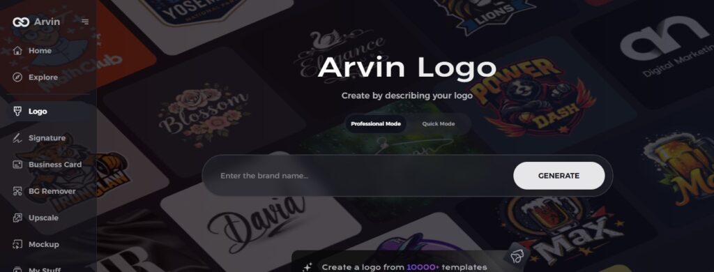
Part 4: Design A Professional Brand Logo
With the rise of advanced AI tools. Such as Arvin AI, it’s easier than ever to create a unique and professional logo in today’s digital world. Arvin AI is an intelligent and powerful logo design maker that empowers businesses and entrepreneurs design logos that signified their identity in hours rather than days. Well, we will see how Arvin AI will help you like a great tool to create a unique logos and more easy than any other logo setup.
Key Features Of Arvin Ai
- Customizable Templates: Select from a variety of industry-specific templates that can be easily tailored to meet your brand’s requirements.
- Lossless Compression: The design platform is incredibly intuitive, meaning that no prior design experience is needed, and anyone can produce a world-class logo.
- Options to Choose Font Style Color and Layout: On this tool you can choose your all of font style color and layout.
- Fast and Efficient: Arvin AI creates quality logos within less time, making the logo creation process faster and easier.
- Professional-looking Results: Despite limited input, Arvin AI generates polished and professional logos that are suitable for companies of all sizes.
Steps to Use Arvin AI for making Logo
Step 1: Create an account and log in on Arvin AI
Visit the website of Arvin logo maker, open an account, and log in for the logo design feature.
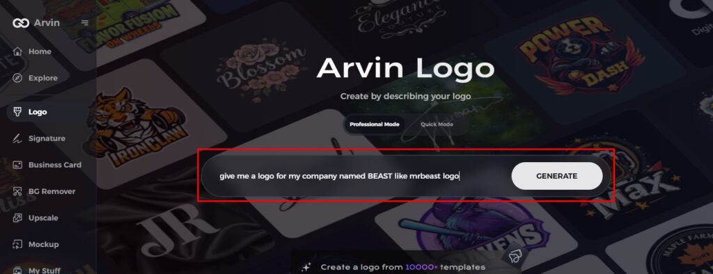
Step 2: Input your brand information and preferences
Input your brand name, slogan, and industry. Specify all your design preferences, which may include font styles or images themes.
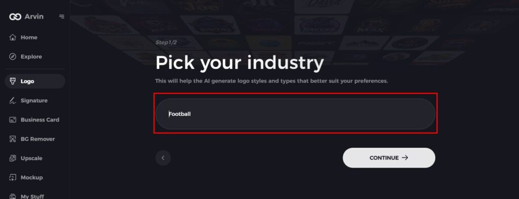
Step 3: Pick your industry
Now select your industry related to your niche. This will help the AI generate logo styles and types that better suit your preferences.
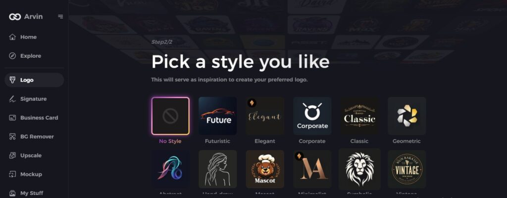
Step 4: Select Style
Now select a style which you would like and continue. This will serve as inspiration to create your preferred logo.
Step 5: Design Personalize through the tools of Arvin AI
After Arvin AI gives create your logo, you can customize those logos with the tools that have elements such as font style, layout, and the positioning of symbols. Experiment on different designs until you like what you see.
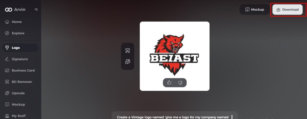
Step 6: Save and download the final logo
Preview the finished logo and save it in a high-resolution format for both print and digital uses.
Conclusion
With these flexible versions of their logo for different markets, AT&T has managed to convey their corporate image as a global leader and able to meet the challenges of the future. As AT&T continues to lead the telecommunications industry, its logo remains a timeless symbol of trust and progress. Are you ready to make your own iconic logo? Try Arvin AI today! Its user-friendly interface and customizable templates make it easy to create a stunning logo that truly represents your brand instantly.
Frequently Asked Questions (FAQs)
What is the meaning of the AT&T logo?
The AT&T logo represents the global presence and leadership of the company in telecommunication as the globe is indicative of its global presence.
Who designed the AT&T logo?
The original logo, featuring the bell, was created in 1885 by the American Telephone & Telegraph Company.
How has the AT&T logo changed over the years?
The AT&T logo changed from a straightforward bell to a stylized modern globe, demonstrating the company’s evolution into an international communications powerhouse.
Can I create a logo similar to AT&T’s using Arvin AI?
Yes, Arvin AI allows you to design logos with similar elements to the AT&T logo, using its intuitive features to customize and create professional logos.
