
The American Airlines logo is, in fact, one of the prominent aspects of its branding that has changed over the decades, like the rest of its brand identity and product, while still delivering sense of quality and patriotism. Logos don’t necessarily need to be flashy, but a well-designed and strategically implemented logo is key to recognition. American Airlines has done an excellent job of keeping its design up to date with the current trends.
Part 1: History and Evolution of American Airlines Logo
Over the years, the American Airlines logo has undergone several changes, each reflecting the airline’s evolution and modernization. American Airlines has been all about branding since it was founded in 1930. As trends in aviation and branding have evolved, so too has the logo. But through these alterations, it has always maintained features that represent American pride and resilience. Now let’s take a look at the key design evolutions throughout the American Airlines logo.
The Birth of American Airlines
The early 20th century was a time when airlines required solid branding in order to gain credibility in the developing aviation industry. American Airlines was established in 1930, and it adopted its first official logo in 1934. A well-designed logo fostered recognition and a feeling of dependability among the travelers. American Airlines, right from the start, played up the patriotic imagery. Something much more than just a logo, evoking the might and history of the United States.
1934-1945
Introduced in 1934, American Airlines’ first logo was a bold and patriotic design. It featured a white eagle with its wings raised, representing freedom and power. It included an eagle with two prominent capital ‘A’s standing for “American Airlines” placed in a red circular background. The red, white and blue color palette reinforced the airline’s national identity. This livery made a strong visual statement that ensured American Airlines would be easily identifiable in a booming air transport sector.
1945-1962
By 1945, American Airlines wanted a cleaner, more modern logo. The new design streamlined the eagle, shown now in solid blue, and with no red background. This sleek and simplistic method not only matched with the changing patterns of branding but also increased visibility in varying formats. The sleek appearance of the logo was representative of the airline’s focus on efficiency and modernization. From the 90s on, air travel was growing steadily, and a modernized visual identity allowed American Airlines to keep a powerful identity.
1962-1967
The logo went through a round in 1962, where American Airlines revived the round red background again, along with a simplified elements from its original logo. It gave the eagle a sleeker, more structured look, and made the letters “AA” prominent. Its logo balanced tradition with modern aesthetics, retaining the patriotism symbolized by the airline’s name while taking it in a direction more palatable to modern branding. This logo became an integral part of the American Airlines’ identity as the airline started developing its global presence.
1967-2013
A new logo was introduced in 1967 by iconic designer Massimo Vignelli and would also go on to become one of the most recognized airline logos in the history of air travel. The design included the company name in a sans-serif font, the two capital “A”s aligned next to one another. Between them was a stylized eagle figure, subtly embedded rather than separated. The color scheme of red, white, and blue persisted, while the logo turned towards a minimalist and sophisticated philosophy.
2013-Present
The most significant change in American Airlines history occurred in 2013 when it unveiled an entirely new logo. Developed by FutureBrand, the new logo unveiled the “Flight Symbol”: a sleek, contemporary, eagle’s head morphing into an energetic wing. The Heralded red, white, and blue hues with which Americans were familiar now faded into a gradient style reminiscent of American movement and invention. This more recent wordmark sported a much cleaner, more modern font, in line with contemporary branding and signifying American Airlines place on the world stage.
Part 2: Why the American Airlines Logo is So Good
The American Airlines Logo, thanks to its patriotic colors, its sharp look and covert meanings. The logo achieves a fine balance between minimalism and brand familiarity. Earning itself a place among the more effective designs in a highly saturated market.
The Use of Patriotic Colors
A bold red, white and blue color palette is one of the most immediate and striking thing about American Airlines logo design. These colors directly imply the United States flag, which further solidifies the airline’s very strong national identity. The use of these colors not only resonates with Americans travelers. But also helps creates a sense of authority, trust, and dependability in the airline industry. Many global Airline brands rely on their respective national colors to highlight their origins. American Airlines has successfully done this with the help of a striking brand.
The Modern and Sleek Design
American Airlines adopted its present logo, the Flight Symbol, in 2013, replacing a classic eagle emblem. The sleek and minimalist logo, designed by FutureBrand. Whereas prior airline logos were highly detailed, this new version chooses an elegant simplicity while still exhibiting knitted corporate fibers. With its clean and sophisticated appearance it is versatile enough for work on the digital as well as the physical space, allowing it to keep its relevance in a fast acting world.
The Hidden Symbolism
Hidden messages are often hidden in great logos. The Flight Symbol of the American Airlines logo used by the company today artistically becomes an eagle’s head, a reference to the airline’s traditional logo. This clever little design element gives American Airlines a nod to its heritage, while also moving towards a modern look. It also symbolizes freedom, strength, and aviation, underscoring the airline’s mission to deliver seamless travel experiences.
Part 3: The Impact of the American Airlines Logo on Branding
A well-designed logo contributes significantly toward an airline’s popularity and customer loyalty. The logo you see on our planes, in our uniforms, on our website and in our app is one of the most powerful symbols that provides marketers with the opportunity to reinforce American’s position as a leading global airline
The Role of the Logo in Shaping American Airlines’ Global Reputation
The logo of an airline conveys so much more—its legacy, innovations and its reliability, and thus a well-designed logo becomes a part of a brand’s global reach. By maintaining a strong but stable brand image, the airline has positioned itself among the world’s top carriers. It is not only a representation of its belief in offering only top-class service but makes sure that traveling customers strongly recognize and trust American Airlines as one of the leading names in the aviation sector.
Logo in Marketing and Advertising Campaigns
Like all major airlines, American Airlines uses its logo as an effective branding device in its marketing and advertising campaigns. From billboards and online advertisements to social media campaigns and television commercials, the logo is everywhere and serves to consolidate the messaging. Used strategically across platforms it adds to the brand recall by allowing customer to directly link it with trust, efficiency and world class service which enhances the reach and influence for the entire airline in the market.
Logo on Aircraft, uniforms and Digital Platform
The American Airlines logo is featured on aircraft tail, pilot and crew uniforms, airport signage, boarding passes and digital interfaces. This extensive use makes for consistent branding and global recognition. Unlike the old design which was successful in attracting urban customers, but didn’t reveal much about them, this looks modern, clean and elegant, making it easily implementable in both physical and digital spaces ensuring that the airline looks the same whether you see it in airport and at the booking wheel.
Strong Logo Build Customer Trust and Loyalty
The reason a strong logo matters is because they can affect consumer beliefs and loyalty. The American Airlines logo embodies professionalism, trustworthiness and excellence—three essential qualities in the airline industry. A strong brand identity gives reassurance to the passengers, which helps in getting the passengers to fly with you every time together. This emotional connection creates long-term customer relationships resulting in loyalty, and ultimately, helps to reinforce American Airlines’ reputation as a trusted global carrier.
Part 4: The Future of the American Airlines Logo
Branding trends are constantly changing, and American Airlines may choose to evolve its logo again in the future. Any updates in this regard will probably remain fairly true to their strong identity and traditional elements, while adopting more digital advancements and data-driven minimalism along the way.
Will American Airlines Get a New Logo?
Although the logo has evolved three times throughout history, the American Airlines logo kept its basic structure and adapted to modern trends. The current logo will always look the same way because it has a long history, but this may not be the last update either. Should a redesign take place, expect it to be a slight improvement at best, not a complete overhaul. Keeping the Flight Symbol and making small adjustments helps the brand position itself as relevant without forfeiting its history.
Future Trends That Will Shape Airline Logos
They should continue to be more simplified over the next years and work as much in a digital context as a physical one, even so many companies are leaning bigger and bigger to bold kolor logos. Animated and interactive logos may also come in trend for your digital marketing and app interfaces. Similarly, the rise of AI-generated design will lead to more streamlined, data-driven design systems that harness AI to generate consumer-conscious systems and patterns that fulfill consumer wants and industry buzz.
Digital Branding in Aviation
Previously, the airline brand always needed to be visible on the aircraft and on printed materials. With this in mind, logos now have to be formatted for websites, mobile apps and social gains. American Airlines is in the early stages of this shift, ensuring that its logo is effective no matter the digital touchpoint. Branding in the future will create designs that adapt to various screen sizes and formats of marketing.
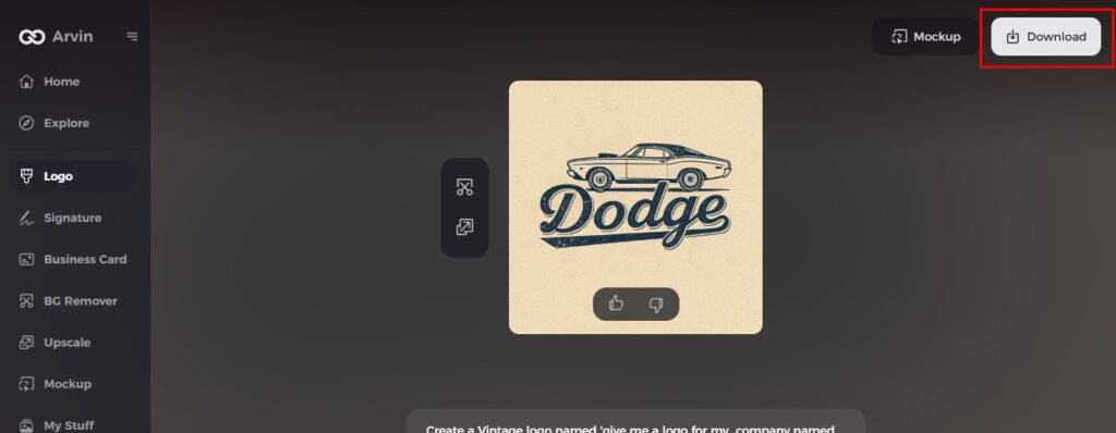
Part 5: Designing An Airline Logo using Arvin AI
Arvin AI — AI logo design solution for your businessBrand identity is the most important aspect a business needs when establishing itself in the market. No matter if you need a logo for an airline, travel agency, or aviation startup, Arvin AI takes the work out of the design process by crafting logos with professionalism, high quality and customization to your brand’s idea. Using customizable templates, industry-specific design suggestions, and advanced AI tools, you can design a visually appealing and meaningful logo within minutes.
Key Features Of Arvin Ai
- AI-Powered Logo Ideas: Receive intelligent logo suggestions based on your industry and brand personality.
- Customizable Templates: You can use pre-designed templates and edit them as per your need to get a professional look.
- Optimizing the Color Palette: AI picks the best combination of colors for a recognizable and strong brand.
- Scalability for All Use Cases: Logos can scale perfectly on airplane fuselages, websites, uniforms, and marketing collateral.
- High-Quality Vector Formats: Download your logo is sharp vector formats for scalable branding.
Steps to Use Arvin AI for making Logo
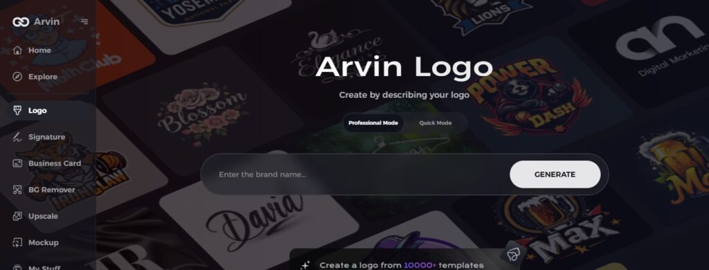
Step 1: Create an account and log in on Arvin AI
Visit the website of Arvin logo maker, open an account, and log in for the logo design feature.
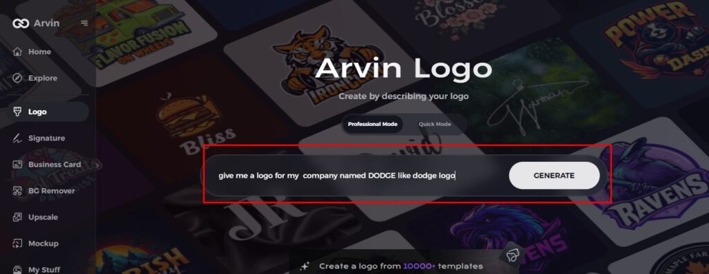
Step 2: Input your brand information and preferences
Input your brand name, slogan, and industry. Specify all your design preferences, which may include font styles or images themes.
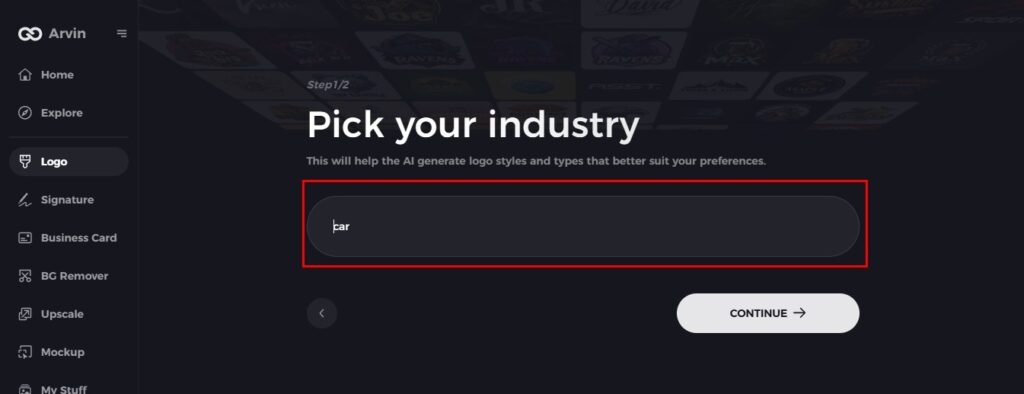
Step 3: Pick your industry
Now select your industry related to your niche. This will help the AI generate logo styles and types that better suit your preferences.
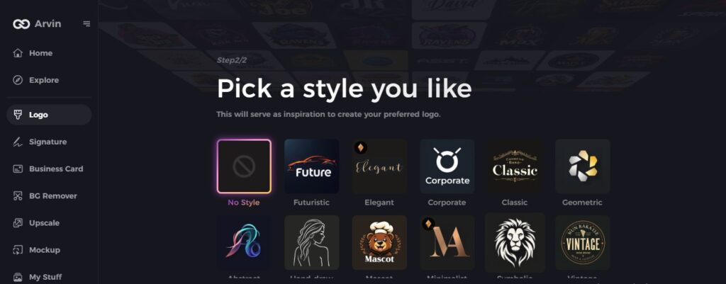
Step 4: Select Style
Now select a style which you would like and continue. This will serve as inspiration to create your preferred logo.
Step 5: Design Personalize through the tools of Arvin AI
After Arvin AI gives create your logo, you can customize those logos with the tools that have elements such as font style, layout, and the positioning of symbols. Experiment on different designs until you like what you see.
Step 6: Save and download the final logo
Preview the finished logo and save it in a high-resolution format for both print and digital uses.
Conclusion
American Airlines logo is an emblem of trust, perfection, and innovation. Its history, from the past to modern Flight Symbol, its brand has retained a strong visual identity. Every Business needs a good logo, and with Arvin AI you can create your professional logo in seconds, say goodbye to expensive logos, and create a quality logo yourself. Try your hands on Arvin AI to design a one-of-a-kind logo for your airline or business and saturate your brand with the creativity of AI.
FAQs
What is the meaning behind the American Airlines logo?
The American Airlines logo signifies the airline’s identity with a contemporary design that includes the eagle, the emblem of America, and a stylish flight-inspired appearance.
Why did American Airlines change its logo in 2013?
The rework was part of a comprehensive brand overhaul to revamp the airline’s image and make it more attractive in the internet age.
Who designed the original American Airlines logo?
The first logo was designed by Goodrich Murphy, an employee of American Airlines, in 1934.
Can I create an airline logo using AI?
Yes! With Arvin AI, you can design a professional airline logo with AI-powered customization, templates, and high-quality formats.
