Amazon, started in 1994 by Jeff Bezos, has become one of the most known and successful companies in the world. It offers an enormous online marketplace for all from books and electronics to cloud computing services. In today’s numerical stage, branding plays a crucial role in shaping how a company is perceived by the public, and a company’s logo is often the first point of contact between the brand and its customers. In particular, the Amazon logo has changed several times over the years, reflecting the growth of the company. This article will cover the history, meaning, evolution, and brand identity behind Amazon’s logo.
Part 1: The History of the Amazon Logo
Many transformations of the Amazon logo reflect growth in the company and vision that have come with time. From early designs to a more recognized smiley arrow, the logo tells the story of how Amazon transformed from being an online bookstore to the international giant that it is today. Here is how this brand identity has been employed to convey a message to customers and in so doing a manifestation of the mission. Through its understanding, there is a clearer concept on why the iconic logo came into place for Amazon. Moreover you can learn here how to make a logo in photoshop: A Comprehensive Tutorial.
The early days of Amazon and its original logo
When Amazon first launched in 1994, it was not the worldwide e-commerce platform as today. It started as an online bookstore with a simple yet memorable logo that would become iconic over time. The first Amazon logo was a basic design that featured the company’s name in a stylized font. It was a simple wordmark that didn’t include any extra symbols or intricate graphics.
The Story Behind Amazon’s First Logo
The logo that the company developed originally represented its early vision, where one could look for books and other goods easily and conveniently. Simple and clean was the exact feel of the logo just like the simple business model Amazon like to establish at the time. It symbolized what the brand promised the customer, namely simplicity and convenience when shopping online.
The transition from the original logo to the current one
As Amazon’s products grew and the business started to expand into virtually every sector, the original logo had to be upgraded so that it could mirror its business. In the year 2000, a new logo was adopted that was much more energetic and modern, which determined the future of the brand.

Part 2: The Meaning Behind the Amazon Logo
Amazon logo is more than just a design; it reflects the company’s core values and mission. The arrow pointing from “A” to “Z” symbolizes the wide range of products, and the friendly smile-like appearance reflects simplicity and customer satisfaction. Each element was placed to represent Amazon as easy and varies You must learn about the Logo Shapes and Impact on Brand Identity: Design Trends and Tips. Having understanding of the meaning behind this logo can give insight on its journey and focus of perfection.
Symbolism of the arrow and its meaning
The most familiar feature of the current Amazon logo is the curved arrow that gives from the letter “A” to the letter “Z.” This is simple, yet powerful symbol transfers multiple meanings.
- Smile: The arrow forms a smile, suggesting that Amazon is committed to bringing happiness and satisfaction to its customers.
- A to Z: The arrow also points from “A” to “Z,” representing the wide variety of products Amazon offers, from A to Z, giving customers access to nearly anything they could need.
- Delivery: The arrow can also represent delivery, which is core to the 5C of Amazon.
Amazon logo reflection
The arrow in Amazon’s logo perfectly line up with the company’s customer-first idea. Rotated around providing a vast assortment, swift delivery, and excellent customers care, Amazon’s business model is what makes it outstanding; Smile that suggests about making customers happy, shows by offering their demand, A to Z of arrow indicates that the Company maintains everything the customer might ask for.
The color scheme and its psychological impact
Amazon’s use of black and orange in its logo also has significance. Black takes on skill, difficulty, and consistency-a message Amazon wants to give its customers. Orange for the arrow is a color that provokes feelings of warmth, energy, and enthusiasm, all reinforcing that commitment by Amazon to giving customers the best experience.
Part 3: The Evolution of the Amazon Logo
Through the years, it has been evident that changes have been observed on Amazon’s logo and how it changed through time, caused by the development and vision of this company. These changes reflected the journey Amazon had endured from being only an online bookshop to being the world’s biggest marketplace. Such a transformation is how a brand’s values and ambitions are symbolized by its design.
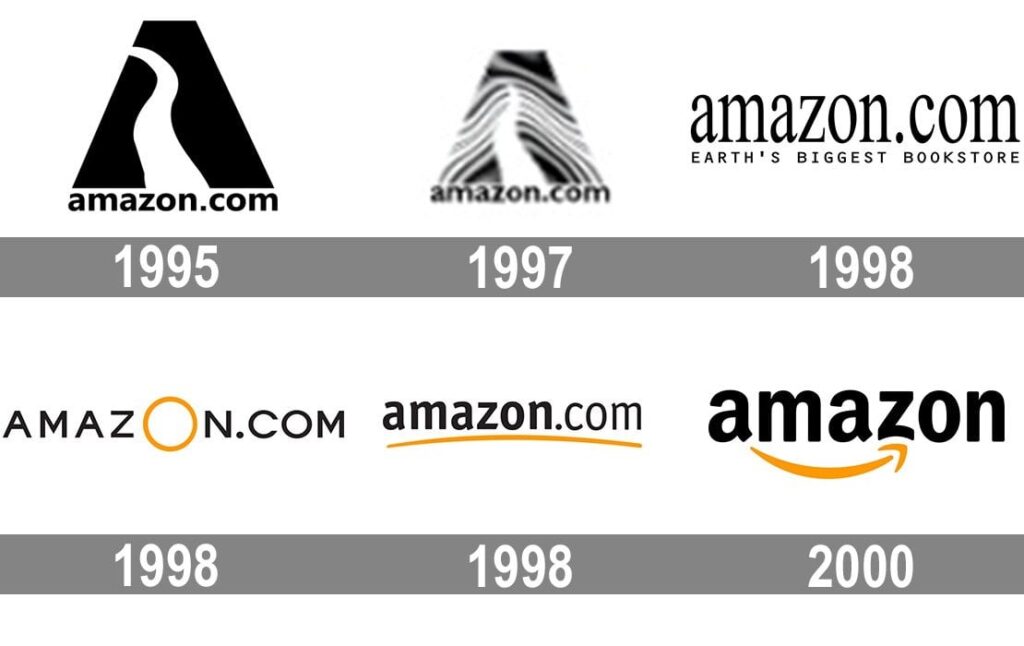
Timeline of logo changes: From 1994 to the present
Amazon’s logo has evolved in several stages since its inception. Here’s a quick look at its key changes:
- 1994-1997: The original logo was a simple wordmark with the company’s name written in a basic font.
- 1997-2000: A slightly updated version of the logo was introduced, featuring a more modern font and a sharper design.
- 2000-Present: The most significant change came in 2000, with the addition of the now-iconic smile and arrow.
Design adjustments over the years and their reasons.
The design changes in Amazon’s logo reflect its growth as a company. The initial wordmark was sufficient for Amazon’s humble beginnings, but as the company extend its product offerings and compete the worldwide, a more outstanding and active logo the need. The arrow was added to indicate Amazon’s wide range of products and its commitment to customer satisfaction. Over the years, the design has been refined to keep it clean, modern, and simple — elements that align with Amazon’s overall brand identity. As addition you can read here about how to make your circle logo design stand out.
How the logo reflects Amazon’s growth and diversification.
Through such changes, the logo portrays Amazon’s evolution from the time it started as an online bookstore to becoming an international leader in e-commerce, technology, and even entertainment. The smile that the company has added onto, together with the A to Z arrow, represents the direction and growth of the ever-increasing business.
Part 4: The Amazon Logo and Its Brand Identity
The Amazon logo can be described as significantly more than a design; this identifies the shape a part of the company’s brands. It has changed with the years, adapting to reflect the growth and mission of Amazon. From the iconic smile to the arrow pointing from A to Z, every symbol tells the story of customer satisfaction and a wide variety of products available. It has words like innovation, reliability, bringing convenience to people’s lives across the globe and in the process of shopping.
The logo itself is most important when it comes to creating the brand of Amazon.. Simple, familiar, and useful in helping the customers to relate to. The logo is everywhere — from the website to packaging to Amazon’s physical stores. Because of this, it helps Amazon re-establish their key points of reliable, fast and satisfying service.
Logo connection with Amazon’s customer
The Amazon logo is created to target vast groups of customers worldwide. The arrow symbolizes a warm and customer-friendly approach. And the A to Z message resonates with the customer’s desire for convenience and choice. With Amazon reaching further into international markets, this logo remained to be the constant presence in showing that the company exists across the globe and offers satisfaction to every customer from everywhere.
The importance of simplicity
Let me first make several comments about the Amazon logo, and one of the first things that stands out is how uncomplicated the logo really is. In a world full of complex logos and marking messages, Amazon’s logo stands out because it is up-front and easy to remember. It makes it easy to associate with it.
Part 5: How the Amazon Logo Reflects Innovation
It is; therefore, more than just a logo; the Amazon logo has been a symbol of innovation and fulfilling the need for clients. The iconic arrow from A to Z, signifying all sorts of products, up to its modern sleek appearance, the logo embodies the forward-thinking attitude of Amazon towards shopping. It is true that it depicts its end favors towards enhancing the shopping experience as easy, efficient, and affordable to every consumer and this in one way contributes to creating a niche for a firm in the digital market.
The impact of Amazon’s logo on digital marketing
A strong logo is crucial for any business to thrive in the online space. One of the most recognized logos in the world is Amazon’s logo, and it has significantly contributed to the company’s success in digital marketing and e-commerce. The logo is very important because it immediately lets customers know what they are buying, whether through an app on their smartphone, a laptop screen, or an Amazon package delivered to their doorstep.
Part 6: Arvin AI: Make your Brand Logo Like Amazon
Today’s businesses require smart tools to stand apart and grow. Arvin AI provides companies with an easy, efficient way of making professionally designed logos without necessarily owning design skills. The said platform helps businesses save some time and money through handy tools for logo creation and branding. Companies can, hence, use Arvin AI to design logos within the quickest possible time and convey identity. Whether you are a startup or an established business, Arvin AI makes branding easier and more accessible, helping you succeed in a competitive market.
Key Features
Easy Logo Creation: AI-powered tools create unique logos to match your brand.
No Design Skills Needed: A simple platform anyone can use, no experience required.
Time-Saving Automation: Speeds up the logo-making process for quick results.
Customizable Designs: Adjust colors, fonts, and layouts to fit your style.
High-Quality Results: Ensures professional designs for a polished look.
Affordable Branding: A budget-friendly solution for creating standout logos.
How to Make a Logo Using Arvin AI
Step 1: Go to the Website of Arvin AI
Open your browser and proceed to Arvin Logo Maker to start creating a personalized, transparent logo for your business.
Step 2: Input Your Business Information
Enter your business name, and select its category. Then, select the “transparent” logo option to allow Arvin AI to create customized designs based on your company’s identity.
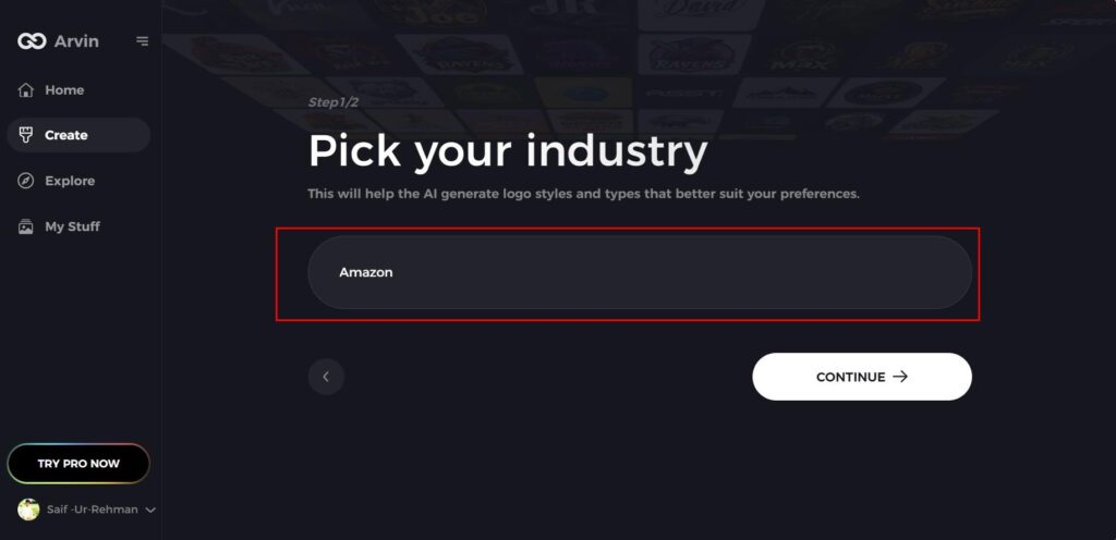
Step 3: Select Your Industry
Pick the industry your business operates in. This helps the AI create logos that reflect your brand’s values and align with your market niche.
Step 4: Pick a Design Style
Choose a design style that appeals to you. If you’re unsure, leave it as “no style,” and the AI will create unique designs without specific input.

Step 5: Browse Logo Options
Review the logo concepts generated by Arvin AI. Scroll through the suggestions to find one that matches your brand identity.
Step 6: Customize Your Selected Logo
Make adjustments to the chosen logo by changing colors, fonts, or icons to align it with your brand’s personality and vision.
Step 7: Download Your Final Design
Download your logo in PNG or SVG when satisfied. The formats assure that your logo is well display on both digital and print media.

Conclusion
The Amazon logo has evolved to reflect the company’s growth and technological advancements, with its simple yet meaningful design symbolizing a wide range of products from A to Z and a positive customer experience. Its simplicity and recognizability have played a key role in Amazon’s success in digital marketing and e-commerce, fostering trust and brand recognition globally. Arvin AI offers businesses an intuitive platform to create professional, customizable logos, with automated workflows to save time and effort. This highlights the importance of branding and how logos play a crucial role in shaping a company’s identity and connecting with consumers.
FAQs
What is the meaning of the arrow in the Amazon logo?
The arrow in the Amazon logo connects the letter “A” to the letter “Z,” symbolizing that Amazon offers a wide range of products from A to Z.
Why did Amazon change its logo?
Amazon has made small changes to its logo over time to reflect its evolving brand and business. The logo’s design became more updated and modern.
How important is the Amazon logo to its brand image?
The Amazon logo is a key part of the company’s brand image. It is quickly familiar and represents the company’s commitment to offering a wide variety of products.
What does the simplicity of the Amazon logo symbolize?
The simplicity of the Amazon logo symbolizes efficiency, clarity, and accessibility. It reflects the company’s focus on providing a seamless shopping.
Read More
50 Cool Logos And Free Cool Logo Maker for Your Brand
Purple Logos: The Perfect Choice for Unique Branding
Logo Shapes and Impact on Brand Identity: Design Trends and Tips
