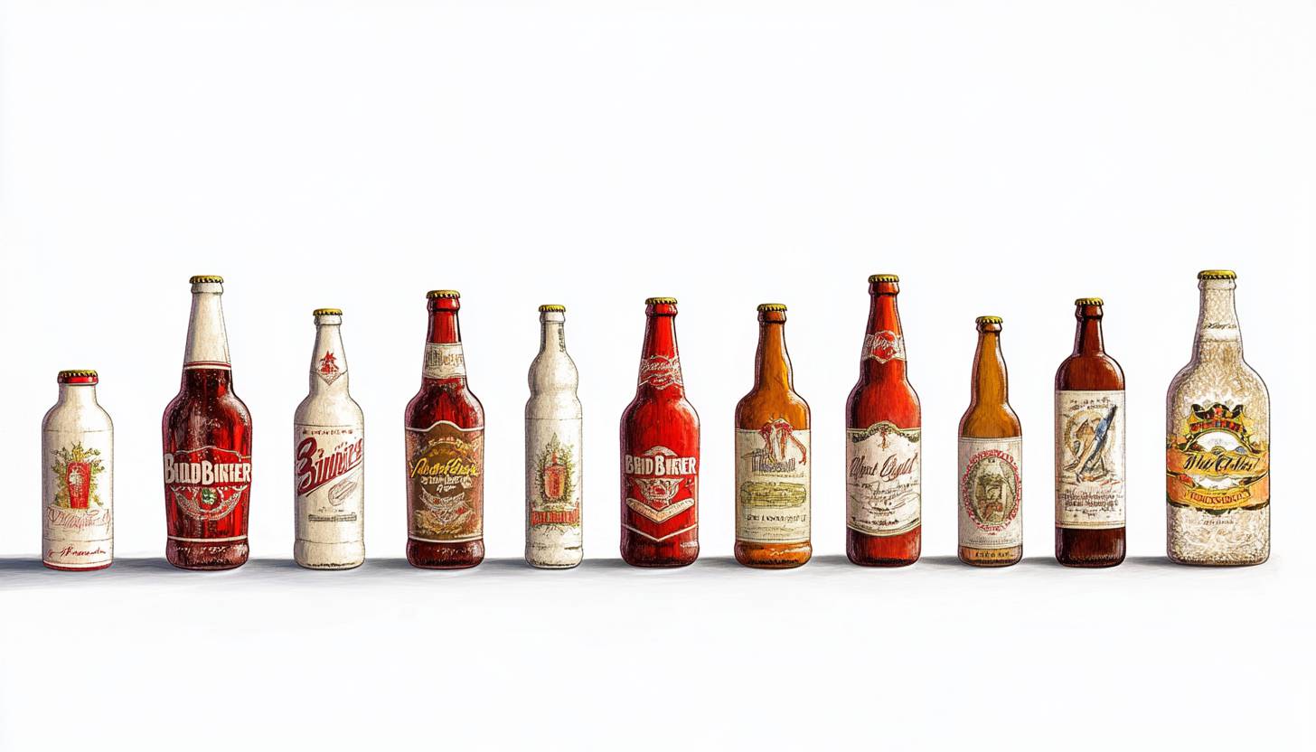
Budweiser is an American brand of lager beer, currently manufactured by AB Inbeb. The lager beer was first released in 1876, and became a major success throughout the United States. The famous beer spreads across all nations now and remains a top global brand in alcohol products. The Budweiser logo, first made in 1876, has changed about 15 times. Based on red and white, this logo began with a more elegant.
Part 1: Meaning and History of Budweiser Logo
The Budweiser logo, known as the King of Beer, has been redesigned many times in the brand’s history. Its bright tones and minimal sharp shapes look neat and modern in any background. The first three versions of this famous beer logo were very gorgeous, based on the seal and crest, adding many letters. In 1952, however, he began to design more minimalist and bolder to satisfy the tastes and overall progress of the young audience.
1876 – 1910
The first Budweiser logo consisted of a rectangular badge written in writing, with the letter “Budweiser Lager Beer” at the top and the largest size. The decorative red crest was on a rectangle with two wide ribbons. As this is one of the cute logos for your brand, that enhance your visual identity.
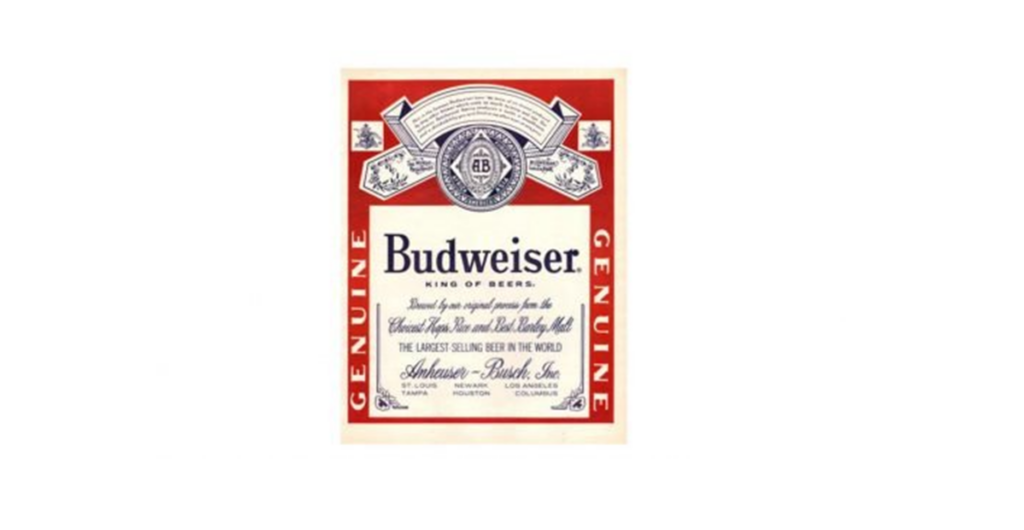
1910 – 1945
The 1910 label had the same concept, but the label was colored (the first example of using red) and written in English. A white space is now in the red card. On the red outer layer was Anheiser’s symbol mark, and on both sides was the letter “Genuine.”
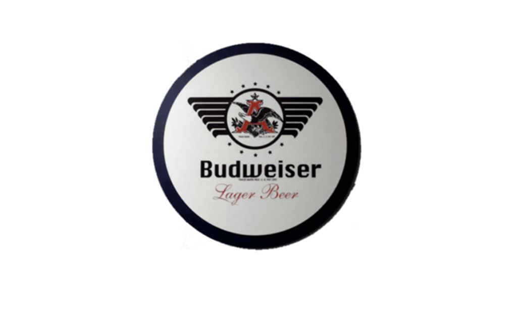
1936 – 1947
This round logo adds a modern twist to the classic Budweiser brand. In the center, the name of the proud Budweiser is depicted in sophisticated bold. On top of it, the wings reminiscent of flying birds are stylishly painted, creating a free and vast atmosphere that symbolizes Budweiser’s vast reach and long tradition. The color palette of the logo is based on white and has a sophisticated dark outline and contrast.
1945 – 1987
In 1945, the outline of the label became more sophisticated and the rectangle became vertical. The inscription came to be written in a modest serif logo fonts, with additional lettering in a thin, delicate script using curves and vignettes.
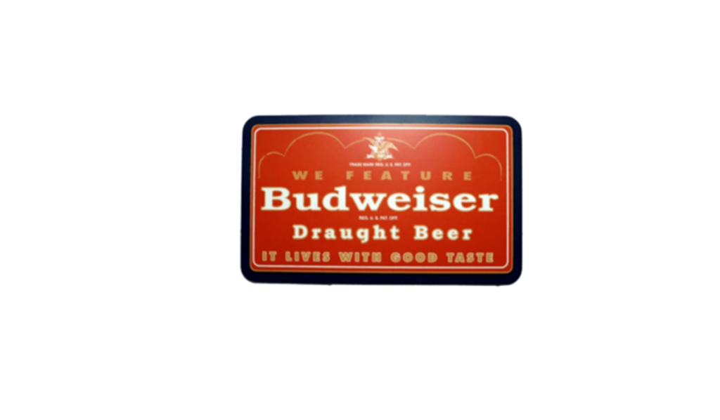
1947 – 1948
This rectangular logo is beckoned in a warm, burning shade of red and orange. At the top of the logo is a large “We Feature” character, suggesting monopoly. The bold Budweiser logo placed in the center represents confidence and self-assertion. The letter “Draught Beer” below highlights a fresh, on-tap quality beer.
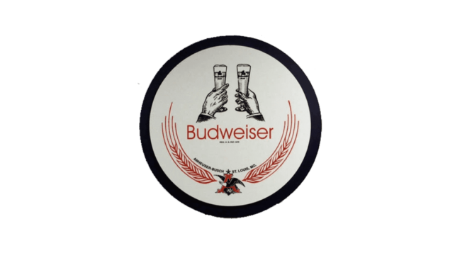
1948 – 1952
This exciting design, mostly rounded, captures a special moment shared by everyone: a toast. Two intricately sketched hands in vintage art style ring two glasses of Budweiser Beer, symbolizing celebration, camaraderie and sharing memories. The red laurel crown surrounding the central design, reminiscent of victory and achievement, positions Budweiser as the king of the moment of celebration.
1952 – 1955
The 1952 design change brought modern minimalism to beer’s visual identity. A white bold wordmark placed in an abstract geometric figure of red with a thick black outline. Anheiser Bush’s seal, drawn with a thin white line, placed on a wordmark, and the catchphrase “King of Beers” written in capital letters was placed under the main inscription.
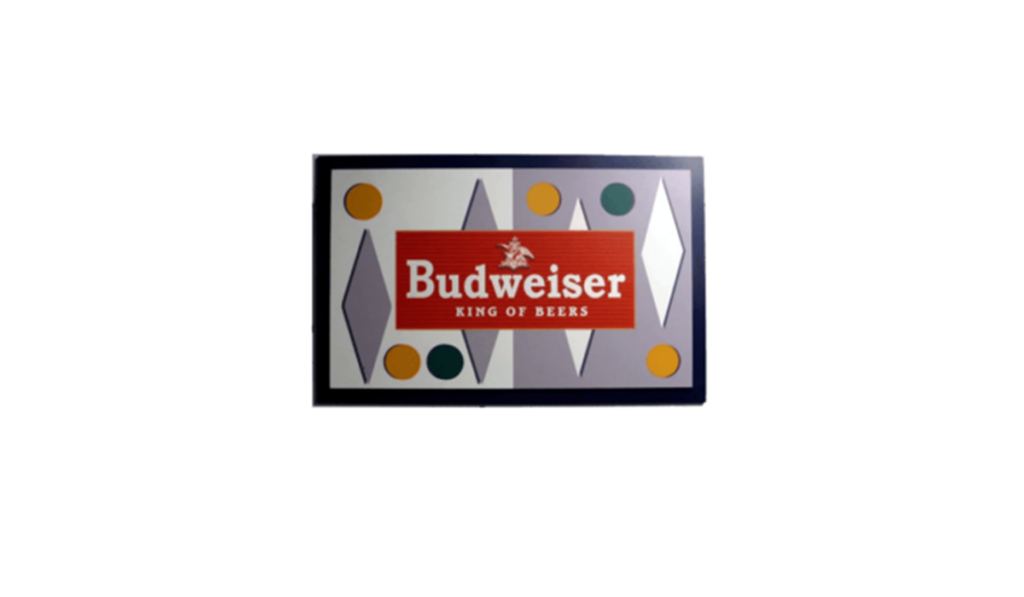
1955 – 1957
“Budweiser” is written in red bold and the logo contains the subtitle of “King of Beers.” The entire design is enclosed in a silver rectangular frame, and the background is abstract with blue geometric shapes of different shades and dots of various colors such as yellow, green, and dark blue.
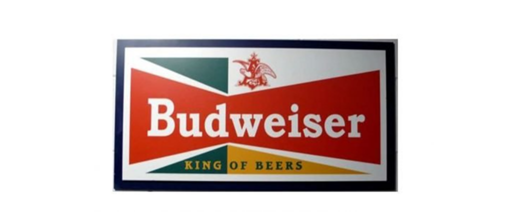
1957 – 1961
The iconic red bow tie first appeared in 1957. It placed in a white rectangle with yellow and green triangles. Although the word mark remained white, it became larger than the previous version, and the Anheiser Bush symbol drawn in red and placed in the white part of the logo.
1961 – 1963
In 1961, they decided to remove the triangle and Anheiser symbols. The bow tie remained, but the shape of a blue and brown vertical ellipse began to surround it. Of course, the frame lengthened vertically to accommodate new elements.

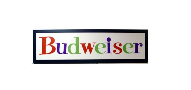
1963 – 1968
For the five years from 1963, no graphics used and a single inscription used. Rice husk characters written in bold lines, and three logo colors are used: red, purple and green. This logo is unique, friendly and invites creativity and welcome.
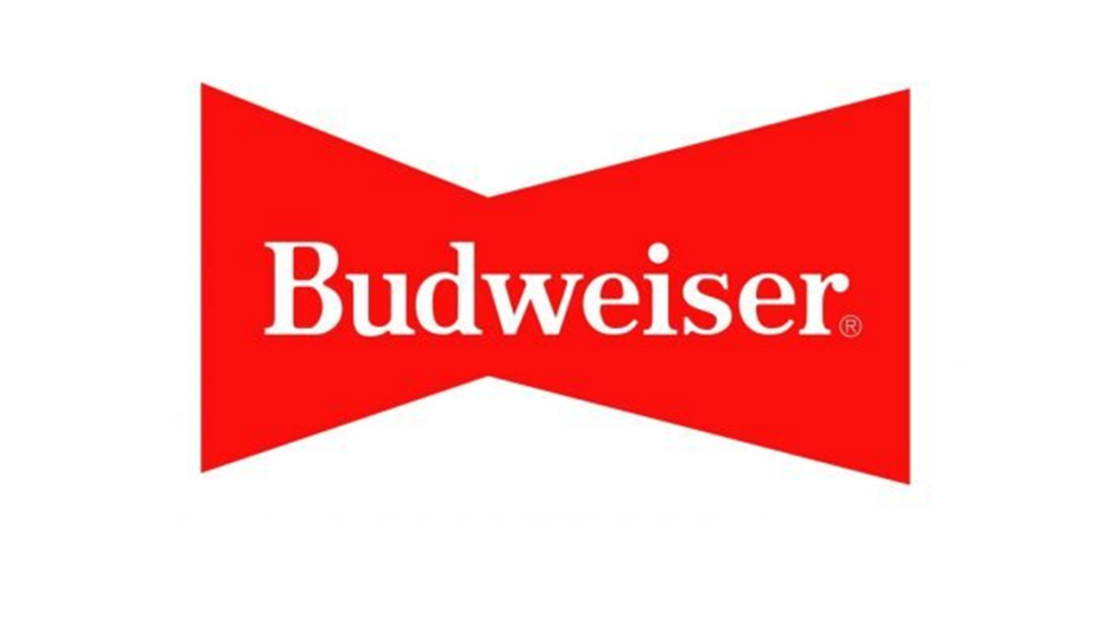
1968 – 1987
The bow tie revived in 1968 and used for 20 years. It was a refreshing minimal logo with a simple white word mark on red ground. Nothing else, no frames, no outlines, no additional characters.
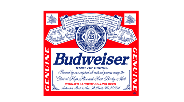
1987 – 1999
“Budweiser” and the logo written in blue bold in the center. Above and below the brand name, the coat of arms of the crown, hops leaves, and shields are intricately designed. The surroundings of the logo are fringed by a blue-ribbon design, and there are references to the beer brewing process and phrases that explain the beer “this is the famous Budweiser beer.” At the bottom is the catchphrase “WORLD’S LARGEST SELLING BEER”.
1987 – 1994
In 1987, the bow tie was refined and had a thin black shadow. The left part is much smaller than the right part. The inscription also contains a thin black shadow, the serif character is italic, reflecting progress and elegance.

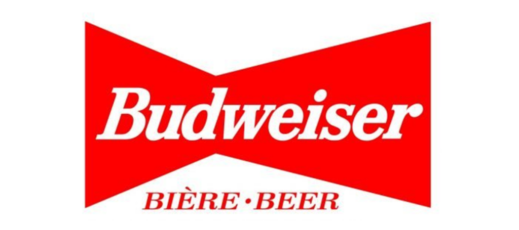
1994 – 1999
In 1994, he returned to his normal perspective. This time I changed the character. The character of the name became large and tilted slightly to the right. At the bottom of the main piece, the letters “Biere” and “Beer” are all in red capital letters, separated by points. In the background, he wanted to sell more beers in Canada, and he probably put the same words in French and English.
1996 – 1999
A completely new emblem designed in 1996, but only used for three years. Black outline to red rectangle. The logo resembled an aviation badge. The white character was a serif typeface with a rounded, ultra-thick italic tip of the letter “R.” This attempt ended briefly and returned to the iconic bow tie in 1999.
1997 – 1999
This impressive logo captures the essence of modern design with its minimalist yet effective configuration. The geometric shape and symmetry harmonized to show balance and stability. The well-chosen color palette creates professionalism and confidence. The logo is simple, so it is scalable and suitable for various platforms from business cards to signage.
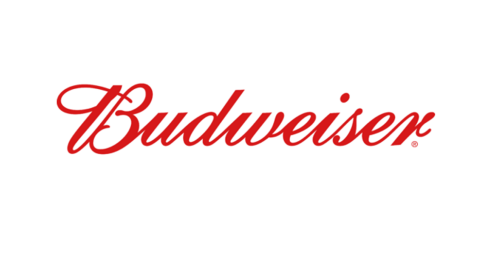
1999 – Today
This logo, based on a passionate red, is effortlessly spelled “Budweiser” in an elegant and flowing style. Each character blends seamlessly with the next character, creating a sense of unity and continuity. The impressive writing font is reminiscent of a bygone era and makes you feel tradition and heritage.
1999 – 2010
This complex logo, colored by tradition and legend, tells of Budweiser’s illustrious past. On the background of the bright red, from the eagle symbol of the logo to the brilliant motif, the complex details symbolizing strength, freedom and American pride are expressed. At the center is the iconic “A & Eagle” insignia, framed by a decorative ellipse, emphasizing Budweiser’s heritage.
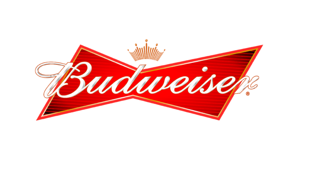
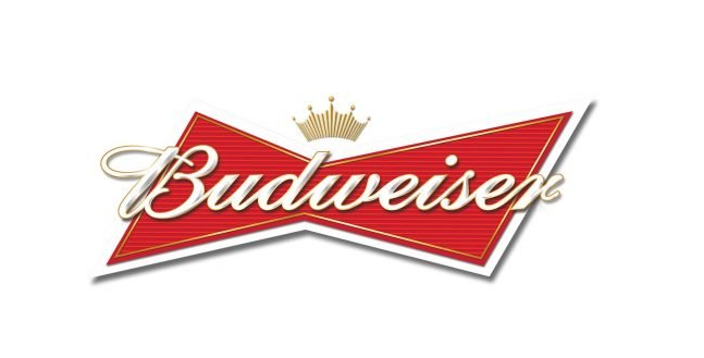
1999 – 2011
The distinctive Budweiser logo is a modern branding model with a vibrant red bow tie design. In the center, the brand name “Budweiser” written in white and elegantly, with a gold outline. This expression gives depth to characters and produces almost three-dimensional effects. Just above the brand name is a stately golden crown that symbolizes the brand’s fame.
2011 – 2016
Over the past 17 years, Budweiser has redesigned the logo several times, but every version has much in common. They all consist of a red bow tie, a white scribe, and a golden crown on top of it. In the first version, the outline was red, but changed to white in 2011.
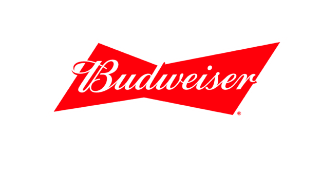
2016 – Today
The current Budweiser logo is a simplification of the previous logo. The flat two-color design has no additional details, with only a red background and white letters. Despite using an old-style script typeface, it looks smart, professional and very modern.
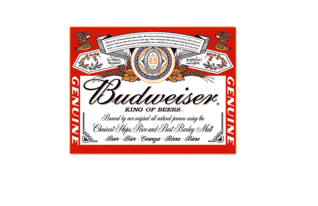
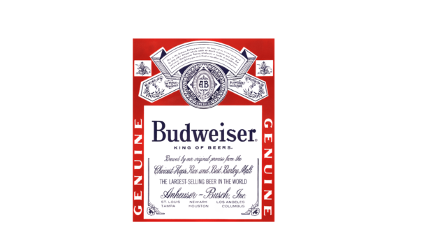
2017 – Today
The more traditional Budweiser labels return to the rich history of the brand. The bold Budweiser name in the center highlights the proud title “KING OF BEERS.” The surrounding text details the brewing process and the company’s credibility. The top of the label is a “AB” emblem representing Anheiser Bush, surrounded by brilliant designs.
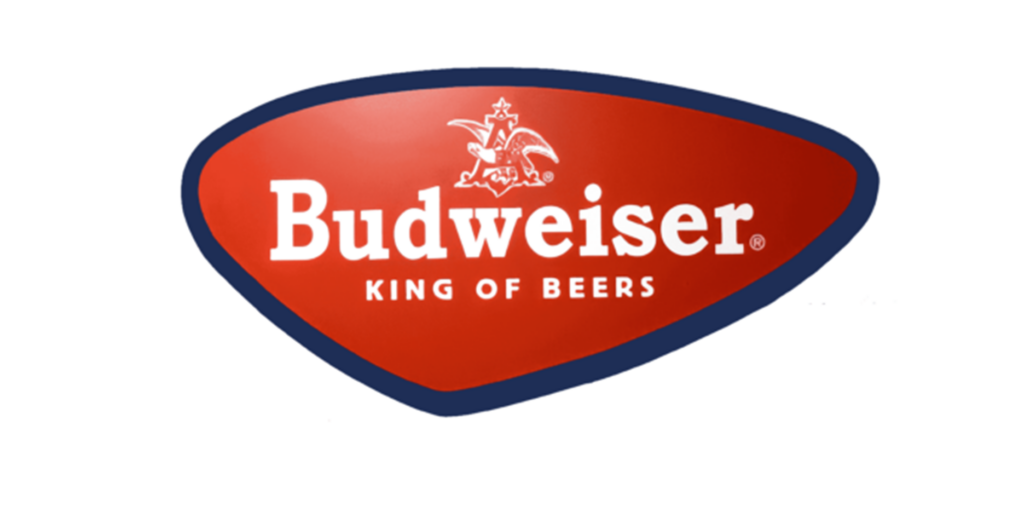
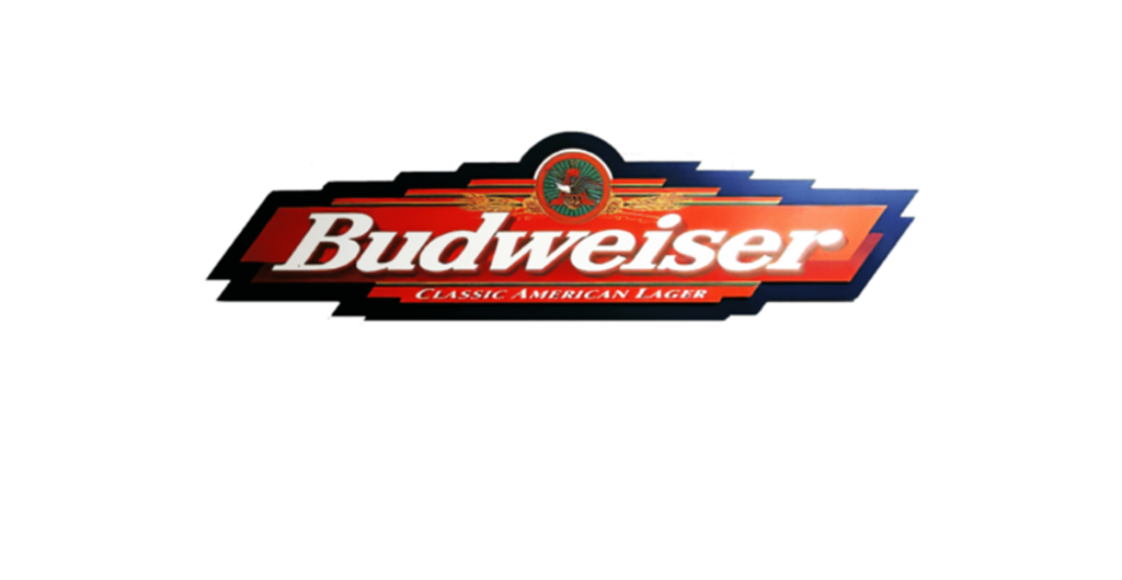
2017 – Today
At first glance you can see that the logo is from Budweiser, one of the world’s most famous beer brands. The design is simple and impressive, and the bold red of the background immediately attracts the attention of the viewer. This vivid red tint makes you feel passion, energy and strength, and coincides with the brand’s long-standing reputation as a robust, full-bodied beer.
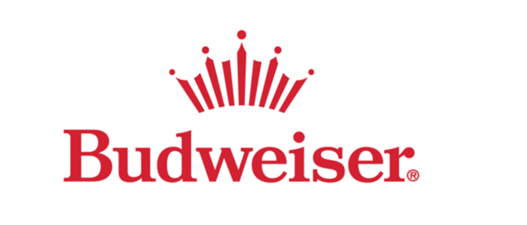
2023 – Today (USA)
A new Budweiser logo announced for the US market in 2023. The elegant serif character of the title case written in dark red on a transparent background, accompanied by an iconic Badweiser crown painted with sharp strokes of the same color.
Part 2: Marketing Strategy Budweiser Logo
Budweiser has established itself as a global leader in the industry through innovative and impactful marketing strategies. From memorable advertising campaigns to strategic partnerships, Budweiser has consistently engaged with consumers, stirred imagination and cultivated a strong brand presence.
Attractive Advertising Campaigns
Budweiser is famous for its creative and attractive advertising campaigns and has become a cultural assay. The famous “Whassup?” from beloved Budweiser Kreisdale These campaigns have succeeded in building emotional connections with consumers, arousing a sense of camaraderie, a sense of celebration, and a feeling of enjoying a moment in life.
Sponsorships and Partnerships
Budweiser has strategically partnered with various organizations, events and sports teams to increase brand awareness and attract the attention of target consumers. Budweiser uses the passion and loyalty of sports fans through his long-established sponsorship with the National Football League (NFL) and Major League Baseball (MLB).
Digital and Social Media Engagement
Budweiser operates with full knowledge of how digital platforms enable customer base interactions. Budweiser links to its target audience through social media by utilizing Facebook and supporting it with Twitter and Instagram and YouTube features. Social media supports Budweiser in showing its behind-the-scenes video content to all customers as its basic platform.
Social Responsibility and Code Marketing
Budweiser actively engages in social contribution activities, and uses its brand platform to raise and support interest in social contribution activities. For example, Budweiser engaged in campaigns for responsible drinking, environmental sustainability, and disaster relief.
Power sports and major events
Budweiser strategically combines marketing activities at major sporting events and cultural moments to maximize brand exposure. For example, the connection between Budweiser and the Super Bowl is a highly anticipated and widely talked-about commercial that is indispensable for the game day experience.
Part 3: What you can learn from the logo?
The Budweiser logo shows the power of great evolution, adaptation and consistency of branding. The evolution of the Budweiser logo, one of the longest-standing beer brands in the United States, reflects the company’s attitude to be true to tradition but innovative. Key points from Budweiser’s evolution include:
- Embrace Change: Budweiser has changed its logo many times in its history, reflecting changes in design trends, consumer preferences and marketing strategies.
- Maintaining the core elements: Despite various changes, the Budweiser logo has consistent elements.
- Tradition and Modern Fusion: Over the years, Budweiser has skillfully balanced the tradition and modern in logo design.
- Story: The Budweiser logo tells the story every time it is made repeatedly. One thing the logo has done consistently is to reflect the brand’s history, values and aspirations.
- Consistency: Despite the evolution of the logo, Budweiser maintains consistency between brand messages and identity.
Part 4: Arvin AI – Your Ultimate Branding Guide
An excellent logo makes a business stand out, gain trust, and make an enduring impression. It ought to be simple, recognizable, and express what a brand represents. Yet, making the ideal logo is challenging. That’s where Arvin AI steps in. Arvin AI is the most ideal logo creator, providing intelligent tools that scan logos, provide AI-based recommendations, and offer market insights.
Key Features of Arvin AI
- AI-Powered Logo Analysis: Learn about your logo’s design, colors, and performance.
- Smart Logo Suggestions: Get AI-based suggestions for improvement.
- Market Trend Insights: Keep abreast of current logo and branding trends.
- User-Friendly Design Tools: Design or edit logos without design skills.
- Flexible File Formats: Receive high-quality logo files for different platforms and applications.
Steps to Use Arvin AI for making Logo
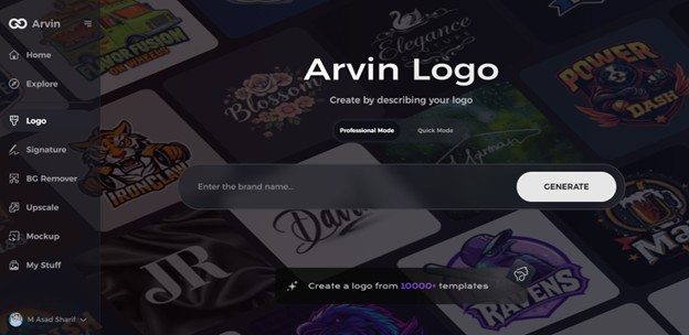
Step 1: Access the Arvin AI Logo Maker
Visit the Arvin AI website using your web browser and navigate to the Arvin AI Logo Maker to begin your creative journey.
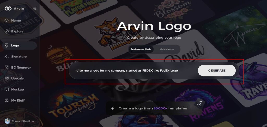
Step 2: Enter Your Business Details
Provide key information about your business, such as the name and category. This helps the AI tailor designs that align with your brand identity.
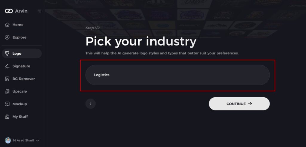
Step 3: Select Your Industry
Choose your industry from the list provided. This step enables the AI to narrow down styles and themes most relevant to your business sector.
Step 4: Choose a Design Style
Explore the available style options and select one that resonates with your brand vision. If you’re unsure, skip this step and let the AI generate inspiration.

Step 5: Review Logo Suggestions
The AI will generate multiple logo ideas based on your inputs. Browse through the options and pick designs that reflect your brand’s essence.
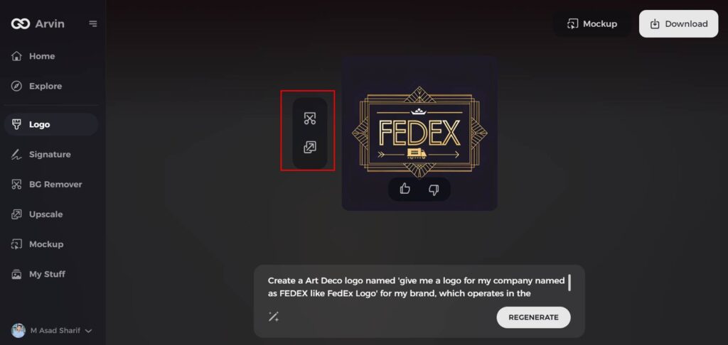
Step 6: Customize Your Logo
Fine-tune your selected design by adjusting colors, fonts, icons, and layouts to ensure it fully represents your business’s personality.
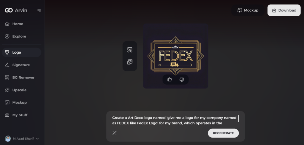
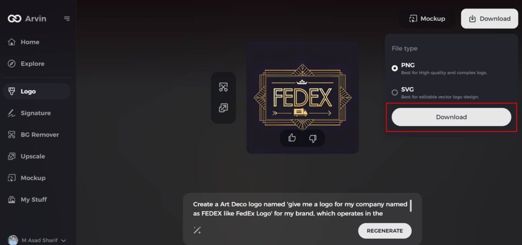
Step 7: Download Your Final Design
When satisfied with your customized logo, download it in high-quality formats like PNG or SVG. These formats are versatile for online, print, and marketing use.
Conclusion
The Budweiser logo evolved over the years but has never lost its shape. A good logo makes a brand recognizable, unique, and reflection of its identity. The history of Budweiser teaches us to respect tradition as well as move with the times. Despite changing with the times, the brand has never lost its roots. Companies can learn from how Budweiser has evolved its logos remaining up to date. An awesome logo is more than a mere design; it speaks and develops a lasting connection. For an effortless and intelligent way to design logos, the best option is Arvin AI.
FAQs
Is Budweiser American or Czech?
Two beer brands both lay claim to the name Budweiser. For decades, an American company, Anheuser-Busch, locked in fierce legal battles with a Czech company, Budvar, over who makes the real Budweiser beer.
Why does the Budweiser logo have a crown?
The crown signifies Budweiser’s excellence and leadership. It upholds its name as the “King of Beers.”
How has digital marketing influenced Budweiser’s logo?
As digital media expanded, Budweiser realigned its logo to perform suitably online so that it is more effective on advertisements and social media.
How can Arvin AI help businesses with branding?
Arvin AI provides AI-based insights, logo analysis, and branding suggestions, allowing businesses to establish effective brand identities without much difficulty.