Soft drink giant, 7Up, is understood by all as refreshingly zesty worldwide. Since its inception in 1929, the brand has used strategic logo design to convey its identity and values to consumers. 7Up, as one of the leaders in the highly competitive beverage market, has evolved with many logo transformations in its course of development that follow changes in design trends, consumer expectations, and branding strategies. This article discusses the history of 7Up logo, from their origins to their modern version. It also goes on to describe how the logo represents the journey of the brand and how it influences branding in the beverage market.
Part 1: The Birth of the 7Up Logo (Early Days)
The Creation of the 7Up Brand and Its Initial Logo
7Up was created in 1929 by entrepreneur Charles Leiper Grigg, as he recognized a need in the soft drink industry. At first, it was called “Bib-Label Lithiated Lemon-Lime Soda” but eventually, in later years it was abbreviated to 7Up; thus, its name became quite catchy yet memorable. The first logo was designed based on a basic idea which became one of freshness and fizz.
First Logo Design: Inspiration, Colors, and Typography
The first layout of the 7Up logo is very simple and relied heavily on the use of text. The logo read “7Up” in bold, simple font with the ‘7’ right up front. It was green and white, symbolizing freshness and citrus, much like the drink, which has a lemon-lime flavor. There is even an old charm to it with its retro script giving it a feel of early 20th-century American branding.
How the 7Up Logo Started in the 1920s
During these early times, the logo would be highly based on American classic branding and an emphasis on using clear and legible typeface. This period, 1920, would be considered to be typographical and packaging material which helps a product become more conspicuous from the store racks. In such circumstances, the logo of 7Up was devised to be unusual yet distinguishable, establishing its future styles.
Part 2: Evolution of the 7Up Logo (Changes Through the Decades)
1930s-1950s: Initial Rebranding and Minor Tweaks
This was the first time that 7Up attempted rebranding. The logo still remained green and white, but the typography became more readable. The name 7Up now appeared in a modern sans-serif typeface that indicated the brand was growing in the market. The logo still remained very simple with only slight changes to make it more aesthetic, thus it became more contemporary with the evolving design trends at the time.
1960s-1980s: The Shift Towards a More Modern, Dynamic Design
7Up, in the 1960s, adopted a highly evolved and modernistic approach to its look by focusing on dynamism and newness. The logotypes became bolder with a new font, and a red and white color combination became a part of the design. The logotype was made lively and full of energy, keeping up with the innovative vitality 7Up envisioned in young taste. The red “7” and green “Up” became an iconic visual in this period, and the logo was used on a number of marketing materials ranging from television ads to print advertisements.
1990s-2000s: Bold Moves Towards Minimalism and Simplicity in Design
The design trends in the 1990s and 2000s witnessed a trend in minimalism and simplicity. Following this trend, the 7Up logo also began to appear much cleaner and sleeker. The playful font of the first version was replaced with a more geometric, modern typeface, and the logo gave up a few of its intricate details in exchange for a visually simpler presentation. The color palette was still green and red, but the design now was more contemporary and sophisticated. This minimalist approach did not deviate from the 7Up brand’s ambition to become synonymous with timelessness, refreshment, and modernity.
2010s-Present: Introduction of New Elements and the Modern-Day Logo
Recently, the 7Up logo is a more modern and contemporary version, yet retaining all the old flavors. The latest logo has bold green writing in which “7” and “Up” are written side by side to symbolize oneness and freshness. The red has been lessened, and it is now well-balanced and sleeker. The modern logo still has the playfulness and effervescence of the original but is now modernized to fit the sleek, global branding standards of today. It shows a brand that has maintained its identity while adapting to changing times and preferences.
Part 3: The 7Up Logo and Its Visual Identity
Throughout the years, 7Up logos have been changing, but the core visual identity of 7Up has been the most powerful symbol in the beverage industry. The section deals with the core elements that define the 7Up logo, its evolution. And how those elements have led to its success.
The Symbolism Behind the Iconic Green Color
The color green is very significant in the 7Up logo and represents an important meaning in the company. Fresh, healthy, and full of vitality are some adjectives that would describe green; these are just what 7Up wants to promote to the world-to be crisp, refreshing, and clean. With this color, 7Up manages to communicate to the public a natural, clean product, differentiating it as a lighter and refreshing alternative for other sodas. The energy and reinvigoration it can offer also make it appealing to customers as a rejuvenating beverage.
The Use of Typography and How It Evolved Over Time
The typography of the 7Up logo has evolved to reflect the changing design trends while maintaining its distinctive identity. Firstly, the company’s logos were the word ‘Dutch’ in a thick and powerful font that reminiscent of solidity. The design changed over time from a sleek rounded typeface to a new clean modern sans serif. It represents new, friendly and professional image. This change in typography let the branding maintain its momentum in relevant market while at the same time making sure customer identify the brand as soon as they see it.
The Circle and Dot: Why It Has Remained a Core Element
The circle and dot element of the 7Up logo is perhaps one of the most enduring elements of its design. A circle symbolizes the idea of togetherness, and the design feature chosen, which is a dot above the ‘7’, is cute and catchy. This has over the time developed into the major logo of the 7Up image and this enhances the theme of the brand of 7Up. In maintaining brand awareness for decades, consistency in this visage motif has made the difference.
Impact on Brand Recognition and Consumer Association
One of the most recognized logos in the beverage industry is that of 7Up. Using color, typography, and the circle-and-dot motif consistently has helped 7Up become part of consumers’ thought process. This logo has successfully associated 7Up with traits of refreshment, vitality, and fun, with a resulting strong consumer connection. In a crowded marketplace where brand loyalty plays a huge role in consumer decisions, recognition is a must.
Part 4: The Impact of the 7Up Logo on Branding and Marketing
The logo of 7Up has created a long-term impact on both the beverage industries and marketing approaches in general. This section reveals how the logo has influenced branding, marketing strategies, and cultural implications.
How the Logo Influenced Other Beverage Brands
It created a trend in the beverage industry for fresh, simple, and modern branding for its logo. Other beverages followed suit by adopting colors similar to those of 7Up and creating minimalist designs, discovering that clean, simple visuals are very memorable to consumers. The identity that has resulted from this logo has inspired many other beverage companies aiming to repute themselves as anything like it.
The Role of the 7Up Logo in Marketing Campaigns and Advertising
The 7Up logo has been central in most of the marketing communication campaigns aimed at the brand over the years. From the iconic television commercials to print adverts, it has been an unchangeable element that instills a consistent and recognizable image of the brand. The minimalist look makes the logo versatile and interpretable by different media, thus directly ensuring its visibility and impact. Whether it is through humor, nostalgia, or refreshing, the logo has helped to solidify 7Up’s positioning as a light and fun soda.
Examples of Successful Branding Strategies Involving the Logo
Campaigns created around the logo of 7Up have been very effective. For example, the “Uncola” campaign, playing on 7Up’s position relative to cola drinks, was very much dependent on the logo for brand differentiation. Further, the logo was highly presentable in product placements, sponsorships, and events, and, therefore, finally settled in peoples’ minds. These practices not only increase brand visibility but also enable long-term brand loyalty.
The Cultural Significance of the 7Up Brand and Logo in Various Countries
7Up’s brand has crossed national borders and today is an international symbol of refreshing drinks. This green color along with the clean look appeals to everyone across the world, adapting according to the specific cultural context without losing its essential identity. 7Up markete as a natural and healthy drink in several countries. Hence capitalizing on the worldwide demand for healthier drinks. Its brand has become a symbol of quality and enjoyment for many cultures around the world and has contributed much to the success of the brand.
Part 5: The Future of the 7Up Logo: What’s Next?
As consumer tastes and design fashions shift. The future of the 7Up logo will undoubtedly be impacted. This section discusses possible new versions of the logo and its evolution from new challenges and opportunities.
Potential Future Updates and Trends in Logo Design
Logo design is fast becoming kinetic and digital-first. For 7Up, this could be the adoption of a more fluid design that will work well with various digital platforms-from social media to mobile applications. The minimalism trend and use of geometric shapes may even make the logo even simpler so it can be more versatile and readable in smaller formats. Further, with more motion graphics content, there is the possibility of coming up with animated versions of the brand’s logo that make it even more appealing for video and digital adverts.
How Changing Consumer Preferences Might Influence the Brand’s Visual Identity
As consumer expectations shift towards healthier and more sustainable consumption, the image of 7Up may actually transform to address such needs by using green but adding earth tones that represent a friendlier approach of environmental responsibility from the brand end. It also shifts the concern of packaging onto more sustainable inputs and designs towards which 7Up becomes sensitive on its visual imagery.
Speculation on the Evolution of 7Up’s Logo in a Digital-First World
In a digital-first world, logos need to be more flexible and engaging across different devices and platforms. The 7Up logo would evolve into features that allow functionality or innovation in creating interaction and identifying with a younger, tech-savvy audience. AR and VR will likely prove to contribute towards the future of the logo. Consumer experiences will be totally immersive because the logo will interact with the consumer in innovative and exciting ways.
Part 6: Arvin AI: Branding and Logo Design Revolution
Arvin AI is changing the face of branding and logo designs. It evolves innovative solutions for branding companies and entrepreneurs through new logo creation. Arvin AI makes the process less complicated in terms of design. While churning out this logo which encapsulates the brand values. For a company like 7Up, whose logo has changed over time, using AI in modern branding has endless possibilities. Arvin AI helps businesses make logos impactful and unique in competitive world by combining creativity for a professional result.
Key Features of Arvin AI
- AI-Driven Logo Generation: utilizes artificial intelligence to generate unique, customized logos based on your brand’s characteristics and industry.
- Highly Customizable: Offers rich options to change colors, fonts, icons, and layouts to make your logo original and related to your brand image.
- Inspiration and Templates: It offers a list of pre-created templates and logo designs for inspiration and to use as a reference for designing.
- Time and Cost-Effective: It will produce original, professional-quality logos rapidly, saving time and money compared to hiring a freelance graphic designer.
- High Resolution Output: Logos are provided in formats to result in high resolutions for both digital and print.
Steps to Create a Logo with Arvin AI
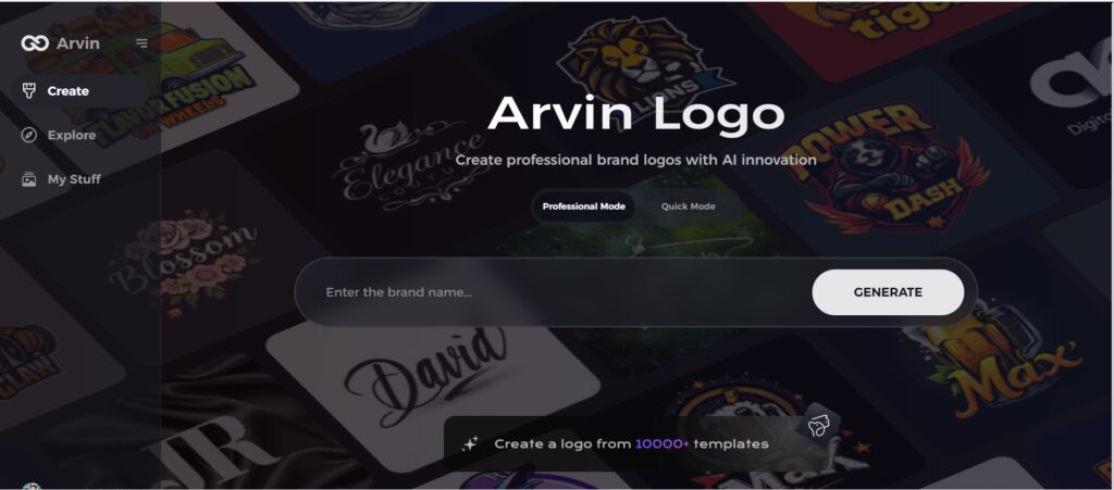
Step 1: Access Arvin AI’s Design Platform
Begin your logo creation journey by visiting the Arvin AI design page at Arvin logo. This intuitive platform offers the tools to craft unique and professional logos effortlessly.
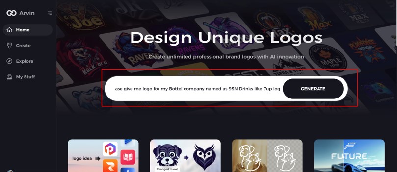
Step 2: Input Your Business Essentials
Give basic information such as your business name and category. These inputs allow the AI to create designs that reflect your brand identity.
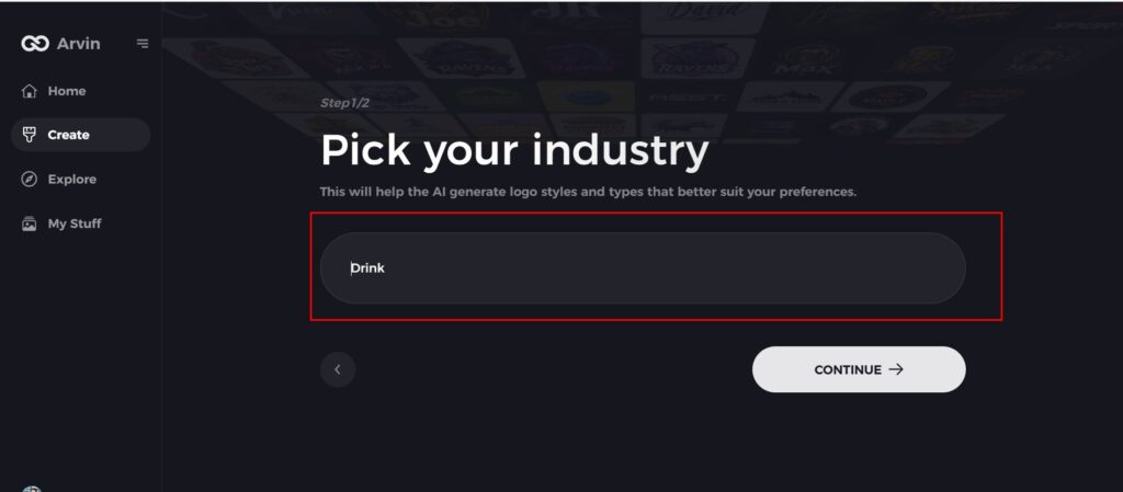
Step 3: Choose Your Industry
Select your business industry from the list. This step helps the AI narrow down the design styles to best fit your niche. So your logo will resonate with your target audience.
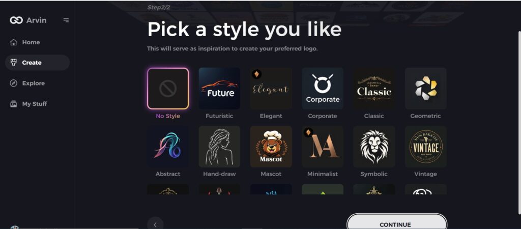
Step 4: Describe Your Style Preferences
Explore the style options available and choose the one that best fits your brand vision. Not sure about a style? Skip this step, and the AI will creatively adapt to deliver a fresh perspective.
Step 5: Customize Your Chosen Design
Customize your chosen design by changing colors, fonts, icons, and layouts. This customization will make your logo unique and a perfect representation of your brand.
Step 6: Download Your Final Logo
Download your final logo in versatile formats like PNG or SVG. These formats are ideal for digital and print applications, making your brand ready for every platform.
Conclusion
The 7Up logo has been very interesting to work on as it reflected a pattern of development and change over time with the brand. The logo develops from its original design to the modern adaptation that reflects the journey 7Up is taking. In today’s fast-changing marketplace, adaptation of changes in branding. Arvin AI enables businesses to create logos that capture the spirit of their brands effectively while still being in the real world. This is because as businesses reach out to build strong brand identities. Arvin AI becomes a price-less asset to help businesses build eternal logos that cut across the game of marketing in the world.
FAQs
What inspired the creation of the first 7Up logo?
The original 7Up logo create with the idea of communicating the refreshing, energetic personality of the brand in a very simple and easily recognizable manner. Its clean bold design, combined with the now-iconic red and white color scheme. It sought to communicate refreshment in lemon-lime soda while standing out within the competitive beverage market.
How many times has the 7Up logo changed?
Over the years, the 7Up logo has been very different because the brand has adapted its graphical identity to reflect trends and changes that have evolved over time. After the initial years, other notable redesigns include the modern-looking logo of the 1960s. And then again, in the 1980s as it incorporated a colorful and contemporary feel. In the 2000s it followed a sleek, minimalist style and adopted modern design.
How will Arvin AI enable me to get a logo as attractive as the 7Up’s?
The platform enables you to input brand values, your industry, and the aesthetic look of your desired logo. With a very clear and effectively communicated logo representing your brand with Arvin AI-driven design tools. Which create logos according to the features of your brand.
Why is logo design particularly crucial for a brand like 7Up?
For a brand like 7Up, a logo is very critical because it would be the point of reference about the visual brand identity. It is an enhancing factor in a brand’s identification and can assist consumers in pointing out the product on store shelves. In 7Up’s case, its logo will have the refreshing and invigorating nature of the drink. It promote positive emotional links with the consumer.
